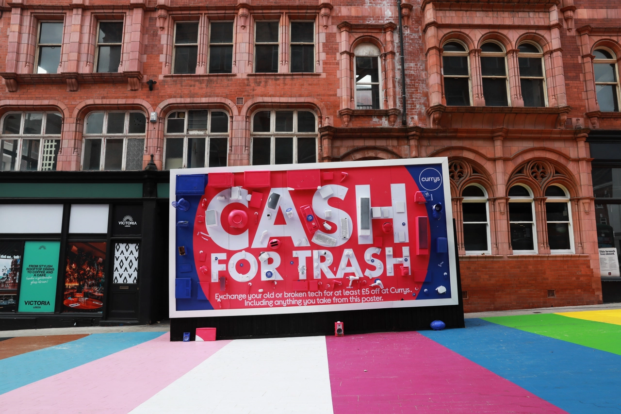
FutureBrand's 'bright and optimistic' rebrand for Currys marks a new chapter for the retailer
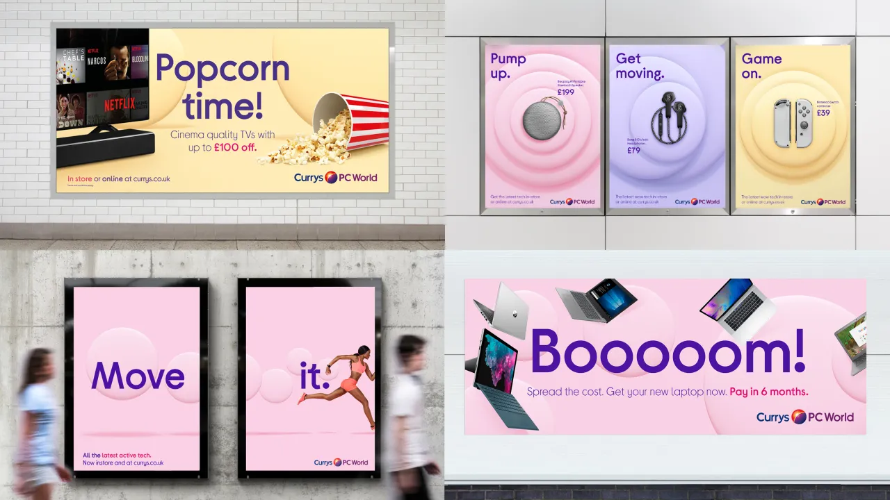
FutureBrand is behind a new logo and visual identity for Currys, the electrical retailer owned by Dixons Carphone. Working in collaboration with the parent company, the fresh look is part of a wider move to merge Currys PC World, Carphone Warehouse, Team Knowhow and Dixons Carphone into a single, "instantly recognisable" masterbrand.
The move comes as Currys PC World was "struggling to clearly articulate its ethos against a backdrop of technology providers who prioritised function over fun," as the London agency puts it. And the decision to merge the four brands under a single "masterbrand" highlighted the need to "signify change whilst still capitalising on existing brand equities within the portfolio".
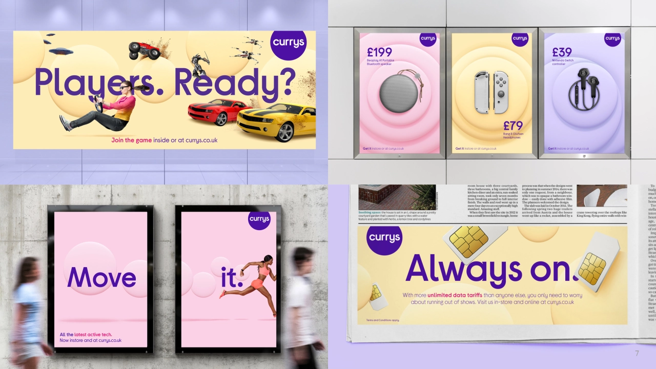
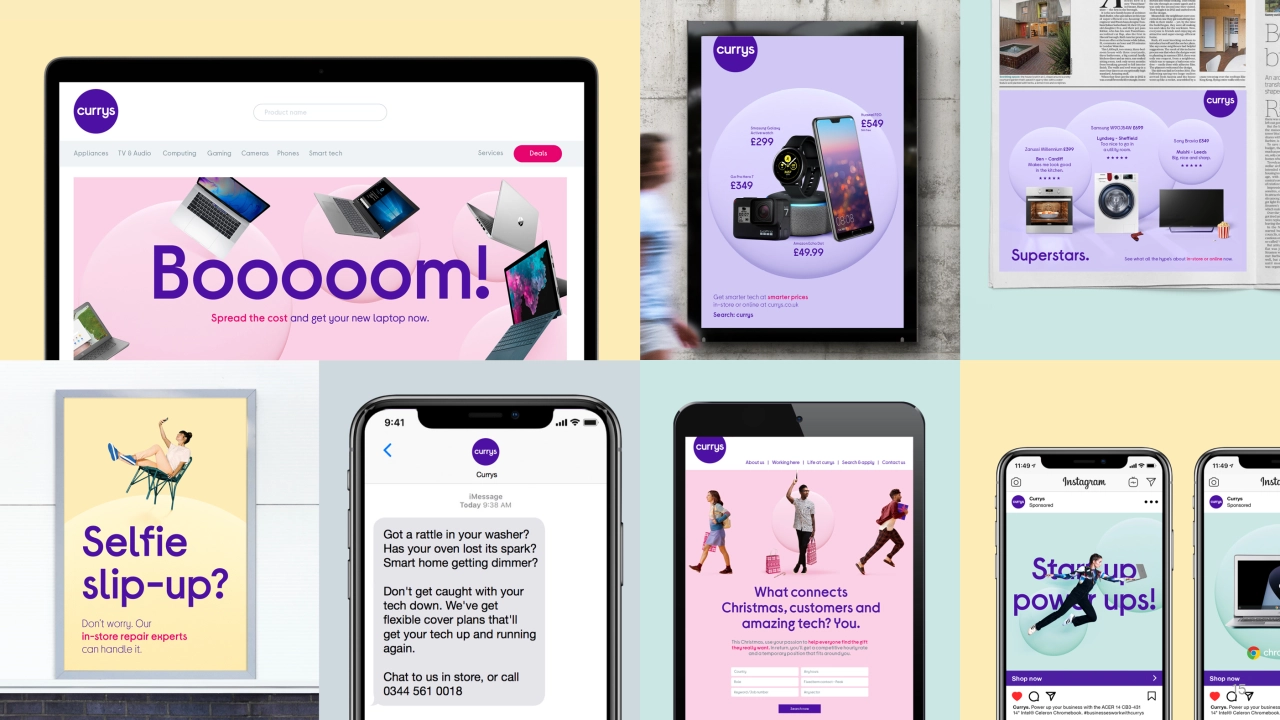
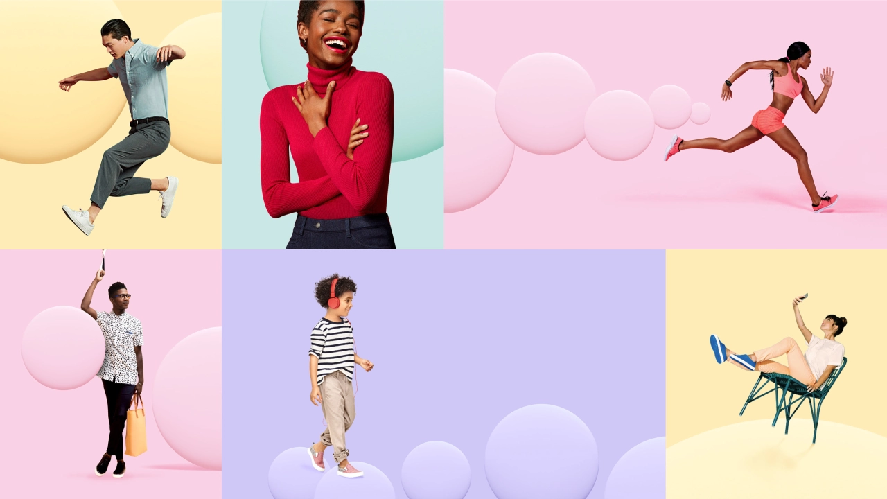
It was down to FutureBrand to create a new brand identity and logo for Currys that stood out from the crowded tech space of "minimalist visual language". Working closely with the Dixons Carphone team over a two-year period, FutureBrand created a "bright and optimistic" identity that reflects the new brand vision and captures the characteristics of the brand: "modern, stunning, infectiously passionate, smart cookie and witty".
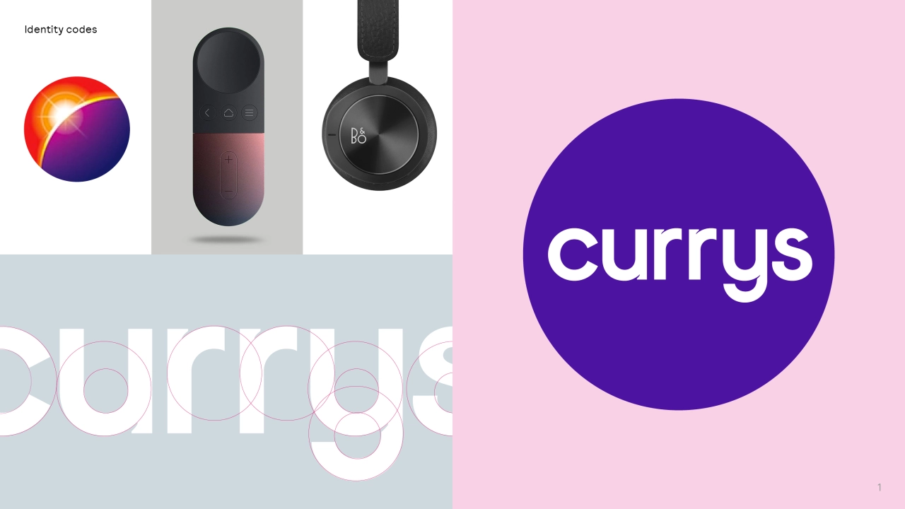
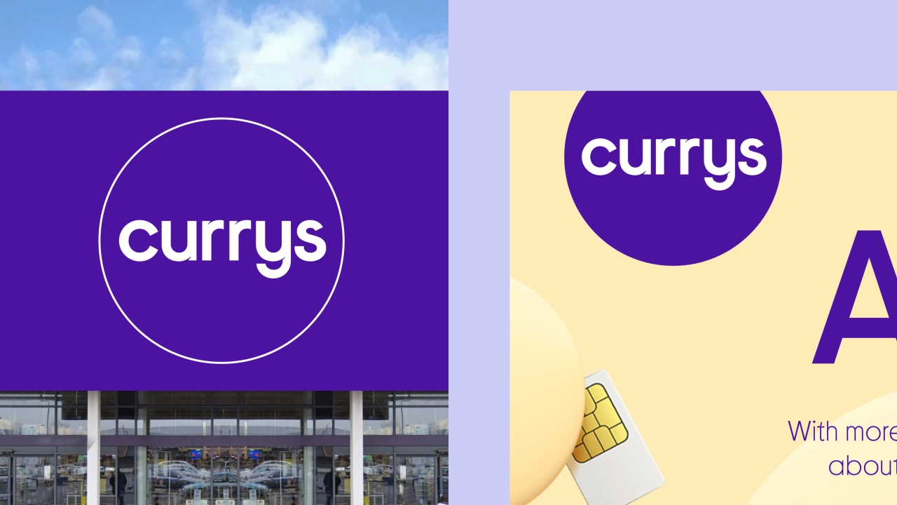
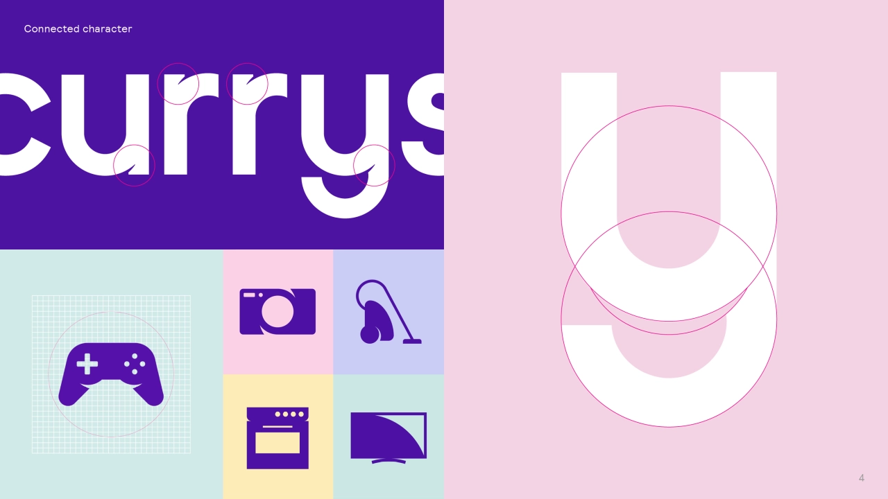
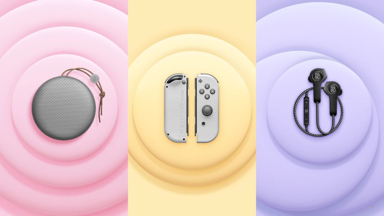
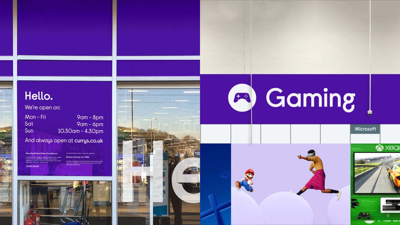
At its heart lies a circular logo, echoing the memorable globe in the Currys PC World brandmark. Present across Currys' "bright new world" identity, this circular thread is representative of "all the shapes and forms of the technological world and echoes the openness and optimism which underpins the Currys' brand," adds Futurebrand. There's also strong and powerful purple, now complemented by a soft palette of pastel colours to bring the "bright world" to life.
Rolled out across digital and physical spaces, from websites and storefronts to staff uniforms and vehicles, the transition from Currys PC World, Carphone Warehouse, Team Knowhow and Dixons Carphone to Currys starts now and will be complete by this October.
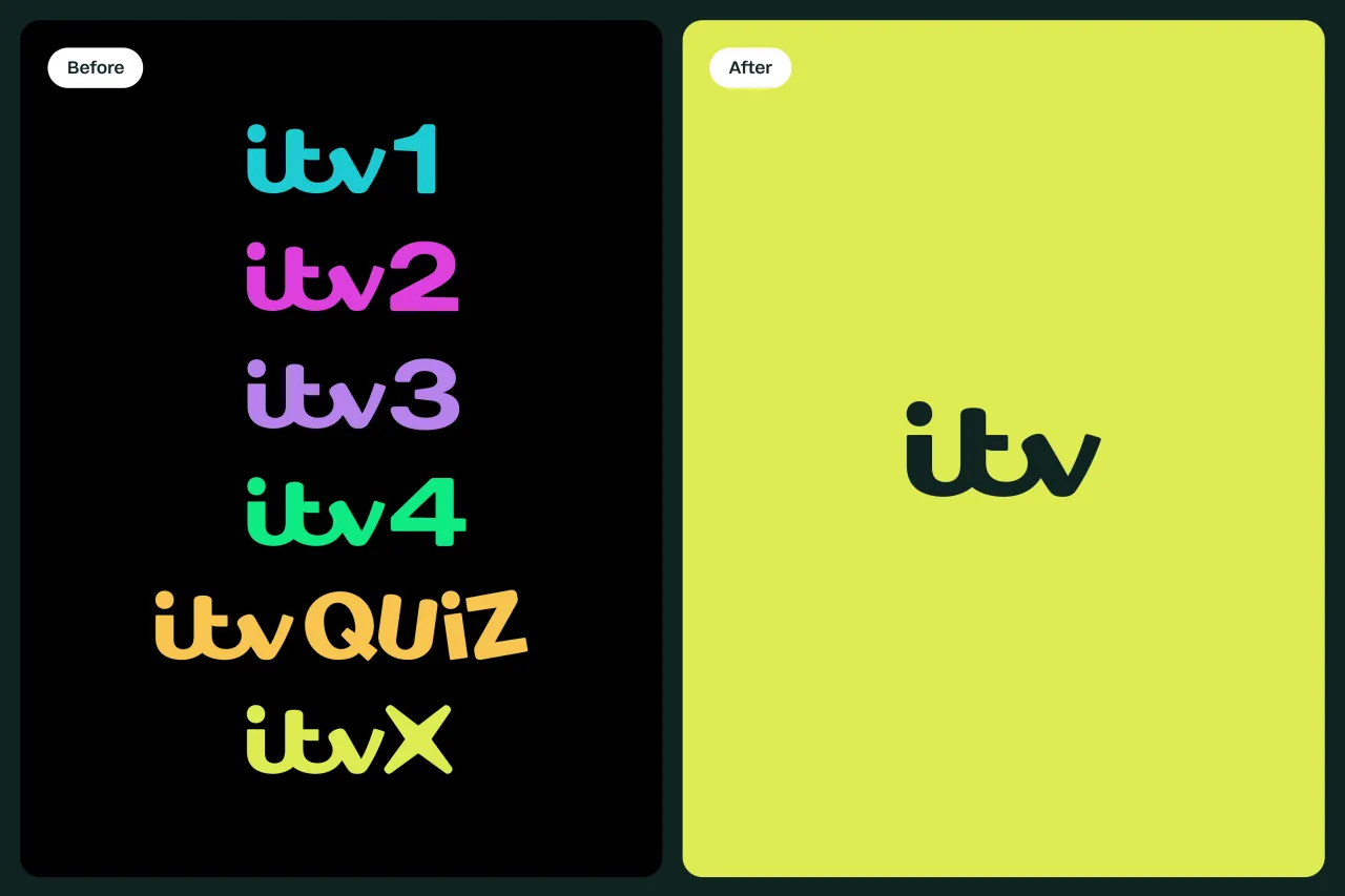
"Currys has accumulated a number of different legacies through the merging of the four established brands which could have led to inconsistent use of logos and consumer confusion in stores as well as online," says Adam Savage from FutureBrand. "Our challenge was to embody all four brands through one logo and brand identity, whilst consistently communicating Currys' unique personality. With a new, ownable visual identity, Currys is able to inject a new bright and colourful energy into the consumer technology industry."

Editor's Picks





Trending




Latest Jobs
Midweight Designer at All Purpose
Full-time·London·£30k–38k
Senior Designer at Creative Spark
Full-time·Manchester·£35k-£50k
Design Director, Opinion at The New York Times
Full-time·New York·$160k–$180k
Talent Agent & Producer at The Jacky Winter Group
Full-time·Los Angeles·$70k-$85k
Creative Social Content Producer at Bompas & Parr
Contract·London·£32k–£40k
Midweight Full Stack Developer at Bureau for Visual Affairs
Full-time·London (Open to remote)·£35k–£50k