Red Antler creates playful, 'inclusive' branding for queer-focused health service Folx
Design agency Red Antler has created the branding for Folx, which claims to be "the first digital healthcare service provider designed by and for the medical needs of the LGBT+ community".
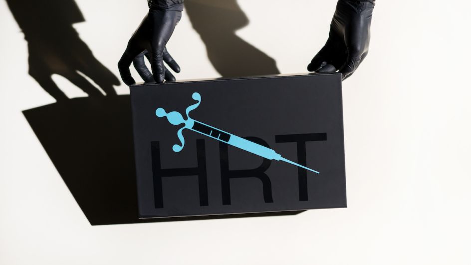
The founder and CEO of Folx, A.G. Breitenstein, is someone who identifies as genderqueer, and the service focuses on hormone therapy, sexual health and family creation; all specifically geared towards the needs of queer and trans people.
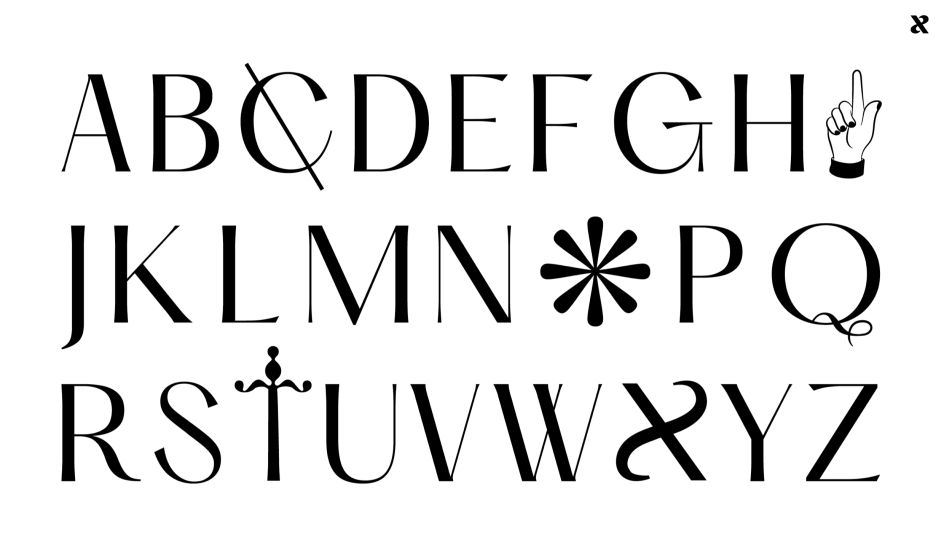
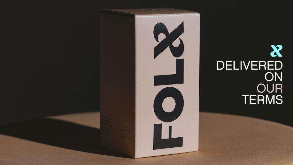
The name Folx is a play on folks, with the 'x' replacing 'ks' to "provide the opportunity for inclusion," says Red Antler. "Queer people are constantly evolving language to be more inclusive and representative. We wanted the brand mark to have the same expansiveness and fluidity."
The wordmark was created to be bold and chunky to indicate pride; with the "x" – internally nicknamed the "ampersex" – designed to represent "togetherness and never-ending variety in the queer community."

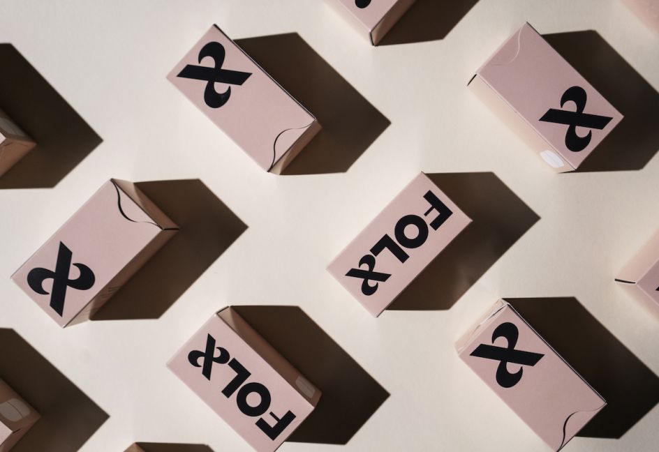
The colour palette uses purple, beige, black, yellow and cyan; inspired by flags and colours used to represent the queer community and create a "contemporary expansion" of the colours usually found on the rainbow flag. "It feels flashy and expressive, but also ownable and trustworthy in order to support the brand's underlying medical offering," says Red Antler.
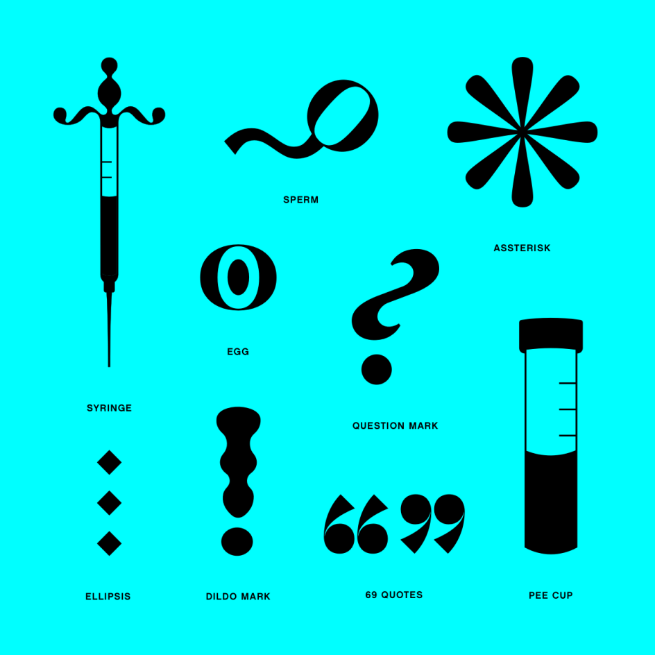
Throughout the graphic system, punctuation is reconfigured in playful ways: quotation marks are drawn to look like a 69, an exclamation point becomes a butt plug. "Each on its own celebrates our lives, but all together creates another visual mechanism to talk about queerness," the agency adds.
Part of the thinking behind the art direction style was the idea of reclaiming fashion and fantasy – industries seen by the Folx founder as having appropriated queer aesthetics. Queer models and photographers were employed for the shoots, aligning the building of the brand with its intended audience.


Editor's Picks


Trending


](https://www.creativeboom.com/upload/articles/90/908fdb6378db1e95d12595416f54e6336d5e80b8_732.jpg)
Podcasts


Editor's Picks
Further Reading