Everland unites vegans and meat lovers with tasty new identity for a plant-based food startup
On a mission to unite vegans and meat lovers everywhere, Scandinavian design studio Everland has given a plant-based food startup, La Vie, a fresh new look that's "edgy yet warm" and celebrates a "universal love of life".
Can vegans and meat lovers find common ground? French meat alternative La Vie seems to think so. Its ambition was, in fact, the driving force behind the new identity for the plant-based food startup, created by Danish studio Everland. "Unlike other brands in the category, La Vie doesn't see itself as an alternative to meat," explains Carl Johan Larsson, creative director and partner at Everland. "They are more like 'the new meat', so there really is not much of a compromise here for meat lovers."
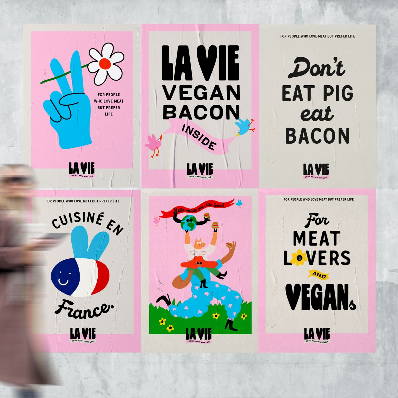
As such, the entire identity, website and packaging seeks to question the "mainstream conventions" that we've come to expect in plant-based food. "Meat alternatives are an ocean of sameness, building on traditional FMCG packaging conventions," says Carl. "It's mostly pale meat patties, happy, yet boring, colours, generic plant icons and then some equally unnoticeable brand name involving butcher, plant, alternative, or meat."
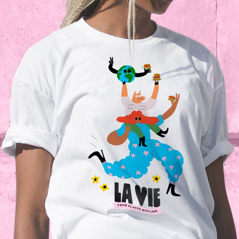
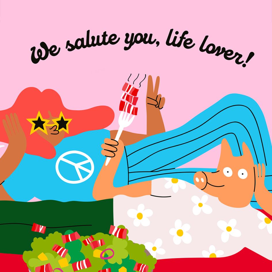
The identity is therefore bold and edgy to give the whole category a good jolt. "It's edgy in the message that you can enjoy bacon together with the pig (made from grass, not from ass)," Everland tells Creative Boom. "Heartwarming in the celebration of life that you can eat bacon and still care for the pig, and the planet. We visualised it in different ways throughout the visual and verbal identity, humans carrying the pig, carrying the planet, enjoying lardons together with the pigs, and more."
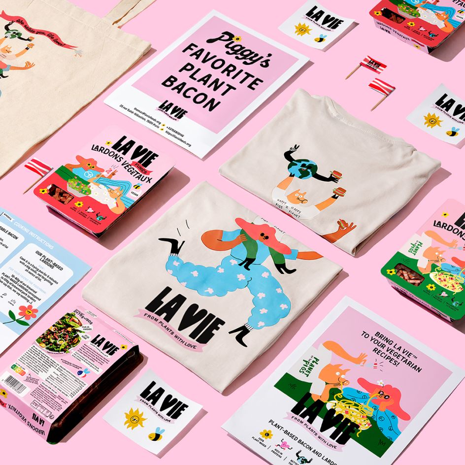
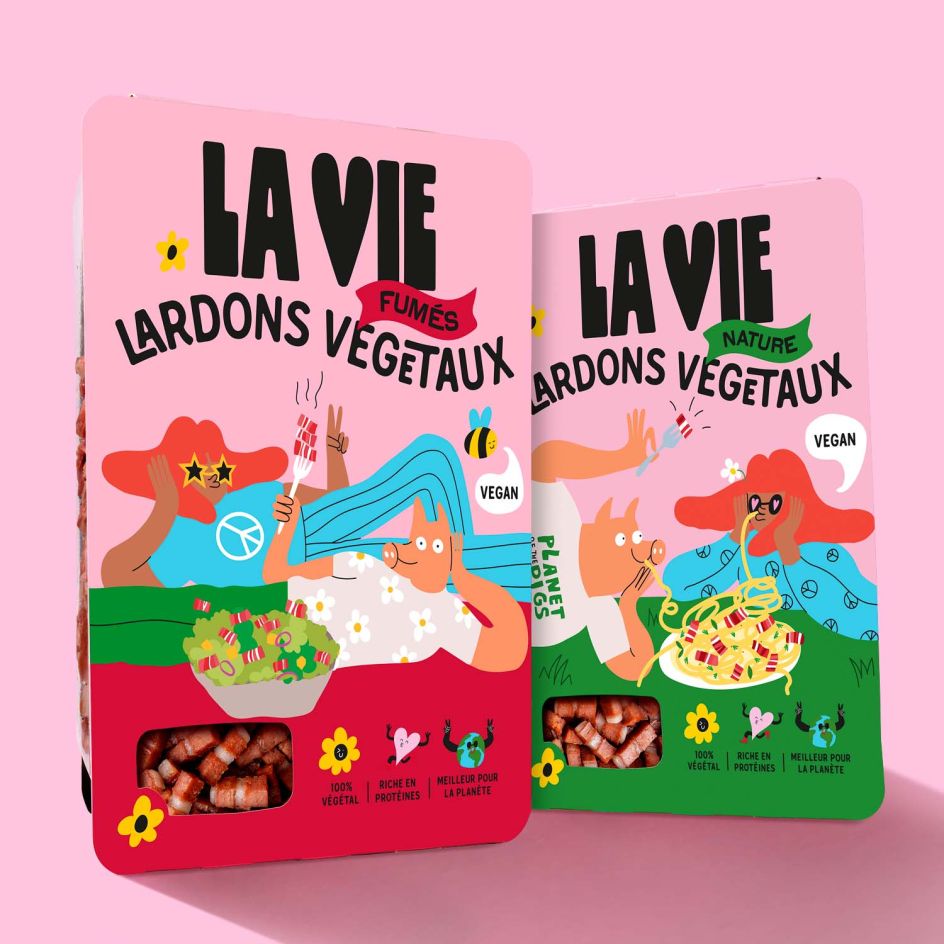
It's also packed with emotions and "positive vibes", and at its heart are illustrations by Lithuanian artist and illustrator Egle Zvirblyte who has created bright and punchy elements throughout – ones that are relatabe and funny. There are also a universe of animal characters and representatives for each type of meat. The first package introduces 'Mr Piggy' and the everpresent 'Hooman', lying and chilling over a bacon pasta dish. "It's colourful, positive, and a true celebration of life, as no animals have been slaughtered to make this meal. Harsh? Yet true. And it's necessary to break with the category – and turn some heads," says Carl.
Every element – from typefaces to colours – adds to La Vie's aspiration: a "celebration of life". The use of two typefaces highlights different aspects of the brand personality. The script typeface is bold and expressive and aligns with the illustration style. Combined with the rounded sans serif typeface, it aims to reflect La Vie's positive attitude towards life. "Pink is positive and powerful and the dominant colour, flirting with the bacon colour," says Carl. "Then we add some green and red to support the main colour and differentiate the products. Finally, some black for contrast and boldness. All in all, it makes a cohesive look that makes you smile and feel energised, just like the food itself."
Christian Halsted, strategy director and founding partner at Everland, adds: "La Vie brings attitude to the game. They share smiles and cheers, which are essential ingredients when you want to change the world. Because you can still be a rebel and make a difference while being a good sport."
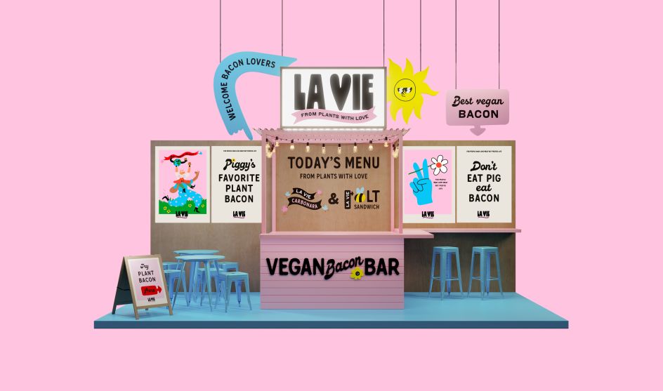
La Vie's go-to-market product is lardon, small strips of fat plant-based bacon, an award-winning and patent product that's available now. More products are in the works. But until then, La Vie is fully available in France.
Editor's Picks


Trending


](https://www.creativeboom.com/upload/articles/90/908fdb6378db1e95d12595416f54e6336d5e80b8_732.jpg)
Podcasts


Editor's Picks
Further Reading