DevRev speaks to 'makers' through a new brand identity by Standard Projects
The Australian studio Standard Projects has developed a strategic positioning, brand identity and digital experience for DevRev, an early-stage SaaS business in San Francisco.
Credit: Standard Projects / DevRev
DevRev is committed to empowering customer-centric companies. Their product, the world's first Developer CRM, combines multiple tools and workflows in one seamless experience, allowing developers and customers to connect through a digital product.
Dan Flynn, designer and partner at Standard Projects, explained the actual scope of DevRev's offering: "For decades, developers (or in DevRev's eyes, 'makers') have been disconnected from both the result of their labour – the customers using their product – but also siloed within organisations, removed from the tangible results generated by their work. DevRev changes all that. By painting a clear picture of customers' needs, it allows developers to shape products to those needs and achieve true product-led growth."
Credit: Standard Projects / DevRev
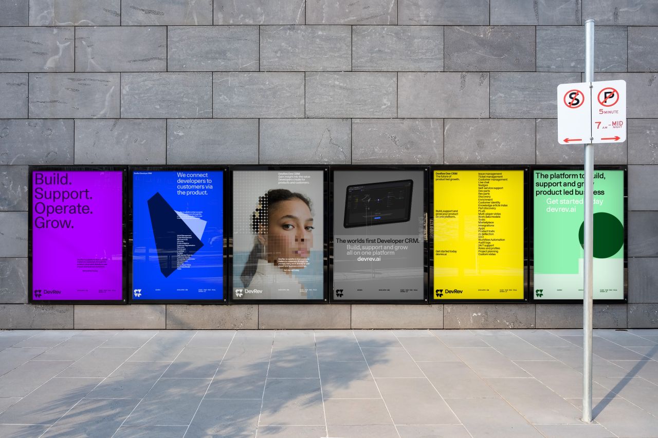
To help DevRev ensure that its groundbreaking offer stood out in a sea of other SaaS products, Standard Projects was tasked to take a somewhat complex B2B offering and find a way to visually and verbally communicate the value, benefits and uses of this multi-faceted platform with clarity and simplicity.
For Flynn and his team, standing out in the saturated SaaS market and showing off the elevated nature of DevRev's product and service meant that the brand needed to part ways with the scrappy, playful aesthetic that many SaaS platforms lean into. DevRev needed to communicate maturity and premiumisation while still speaking to creative minds – makers – about the powerful benefits of the tools.
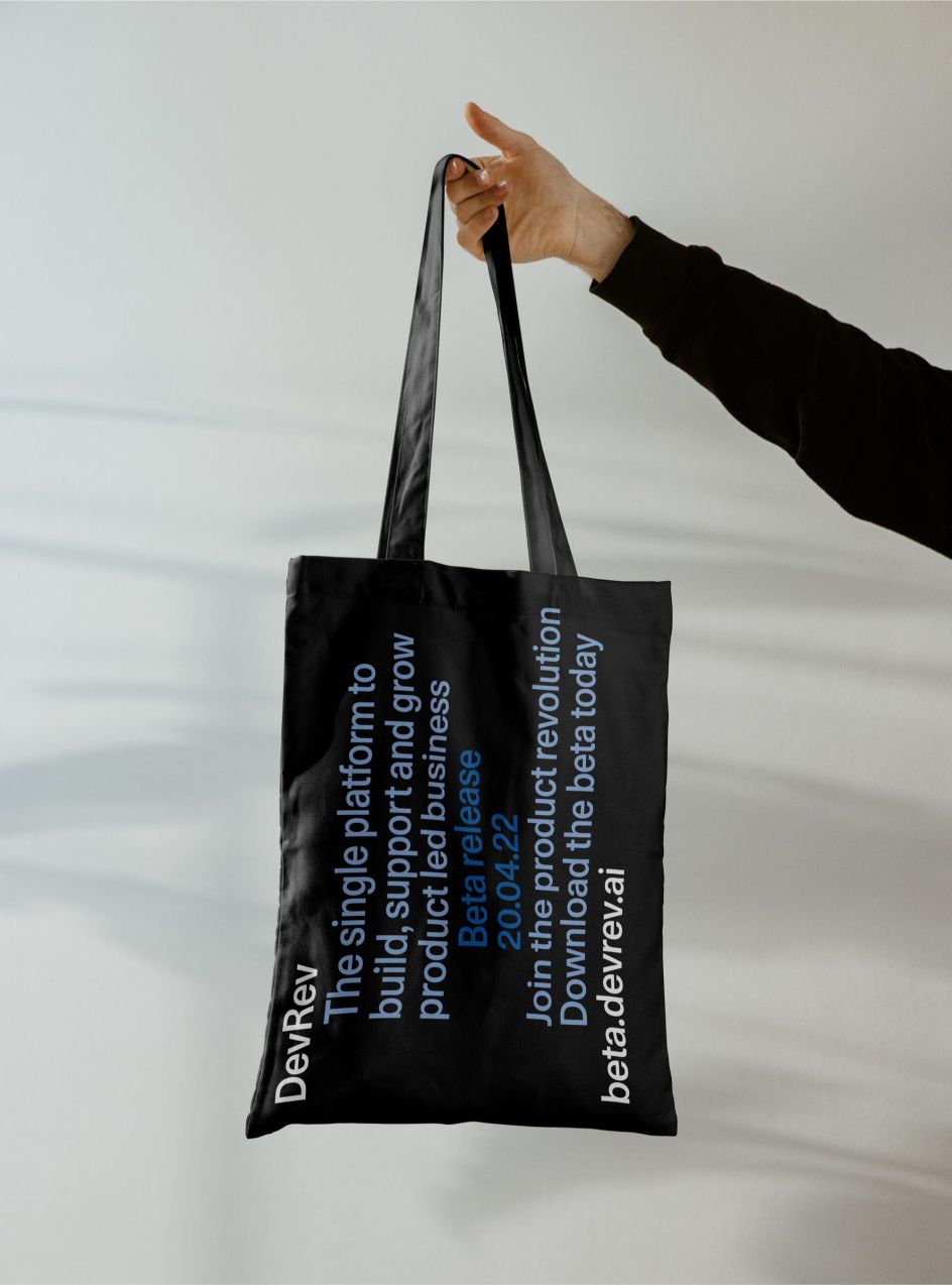
"We didn't want to be pigeonholed as 'yet another SaaS product' and certainly wanted to avoid the category's obsession with juvenile trends, illustration and language," Flynn told Creative Boom. "DevRev has a highly engineered, technical product that is seamless and intuitive. That simplicity doesn't have to be communicated as childish or playful. Instead, we focussed on the net benefit of adopting DevRev – with DevRev, you 'Make Work Matter' by giving insight, purpose and power to developers and customers alike."
Credit: Standard Projects / DevRev
Credit: Standard Projects / DevRev
Credit: Standard Projects / DevRev
"Make Work Matter" became the underpinning idea of Standard Projects' approach to DevRev's brand. Flynn shared that his team asked themselves questions like: "How can we "make" a system that is engaging and clear, a key focus for all DevRev "makers"? How can we create a system that "works" as engineered and elegant a fashion as the product itself? And how can we ensure design components "matter", and are as intuitive and intentional as the resulting user experience?"
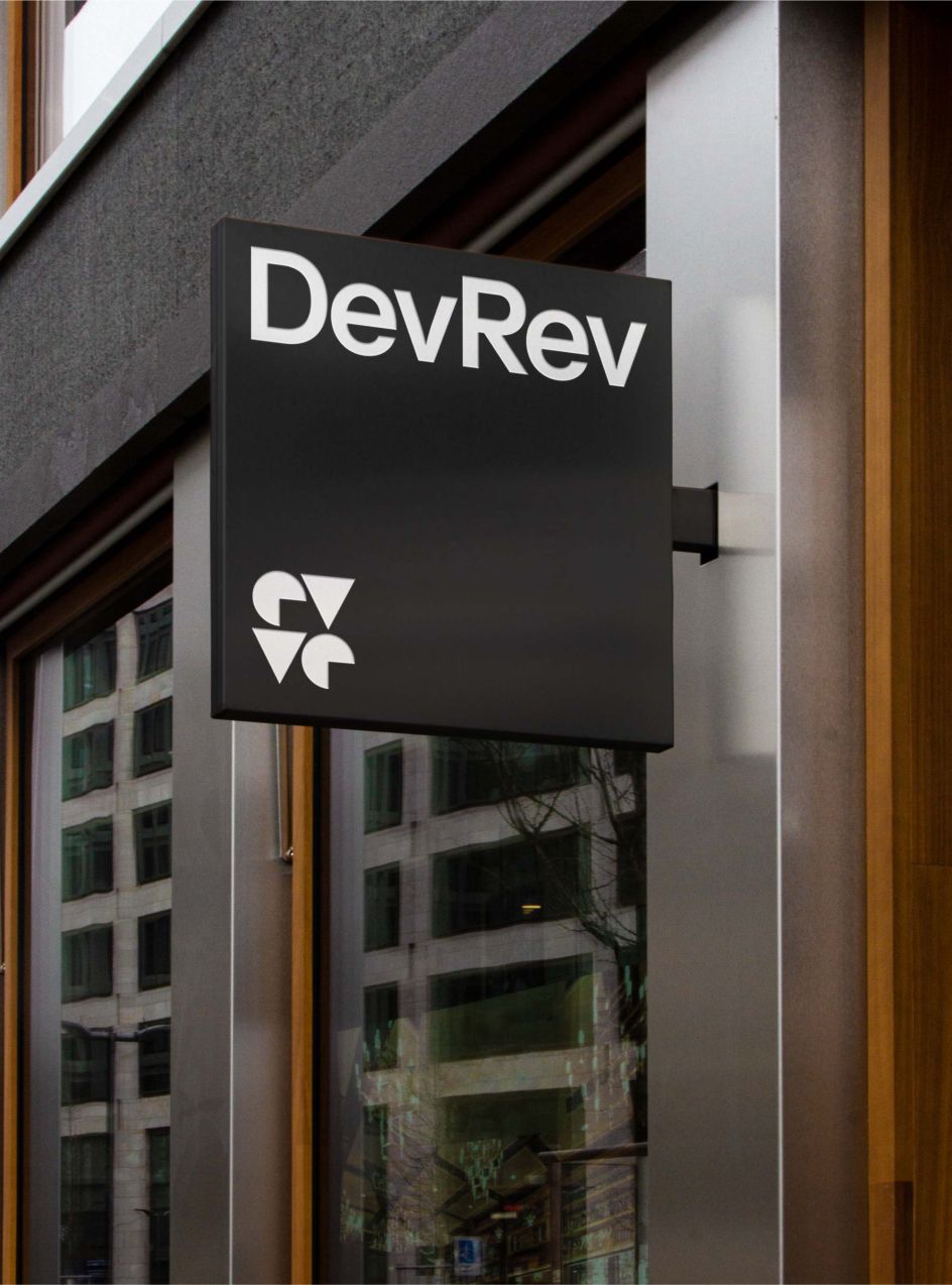
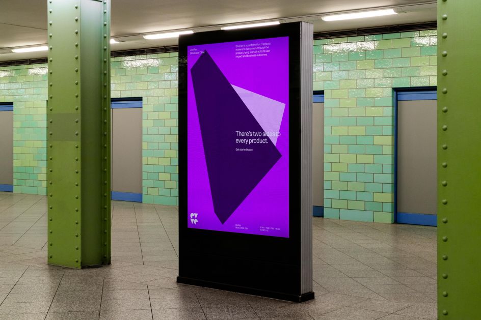
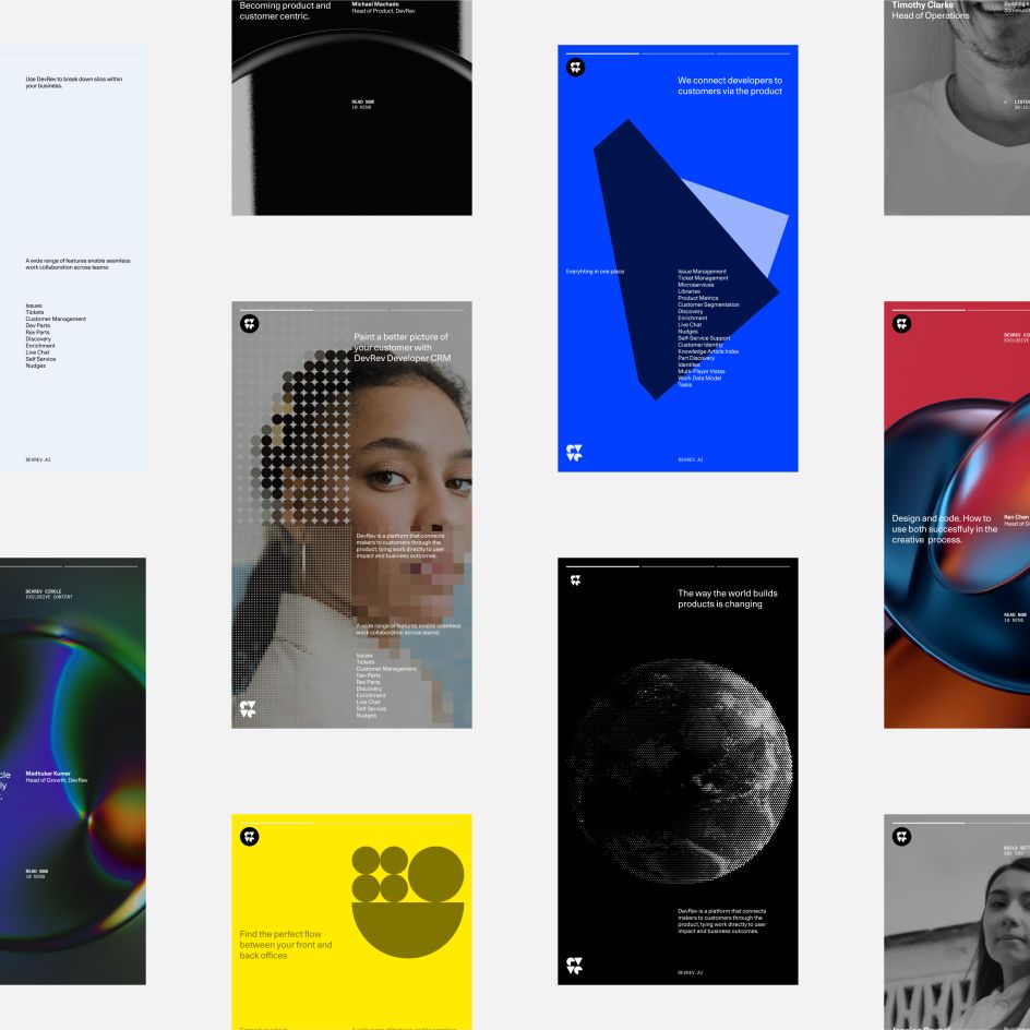
The answers to these questions influenced everything from choice of typeface to colour, graphic language and even copywriting. Working with DevRev's existing logo (triangles and circles), Standard Projects brought harmony to its geometric form with the new wordmark's high x-height and horizontal terminals but maintained some engineered precision with a somewhat aggressive cap "R". Further lowercase letterforms across the DevRev sub-brands also convey touches of a more engineered construction (lowercase "t", cap "C").
Flynn explained: "The geometric graphic language connects to the existing logo. Sub-divided – the simple symbol applied to a more complex grid – cue notions of technical simplicity through a set of infinitely changeable symbols. It is further fleshed out through dot-matrix treatments of objects and images, referencing both logo and the vast swathes of complex data DevRev uses to 'paint a better picture of a customer'."

Credit: Standard Projects / DevRev
Standard Projects and DevRev opted for a colour palette that Flynn describes as "rich, vibrant and arresting." He told Creative Boom: "With a colourway for each of the four main product use cases, the system breaks from the convention of 'owning' a colour, opting for a captivating palette of saturated RGBs, a lateral nod to code editors."
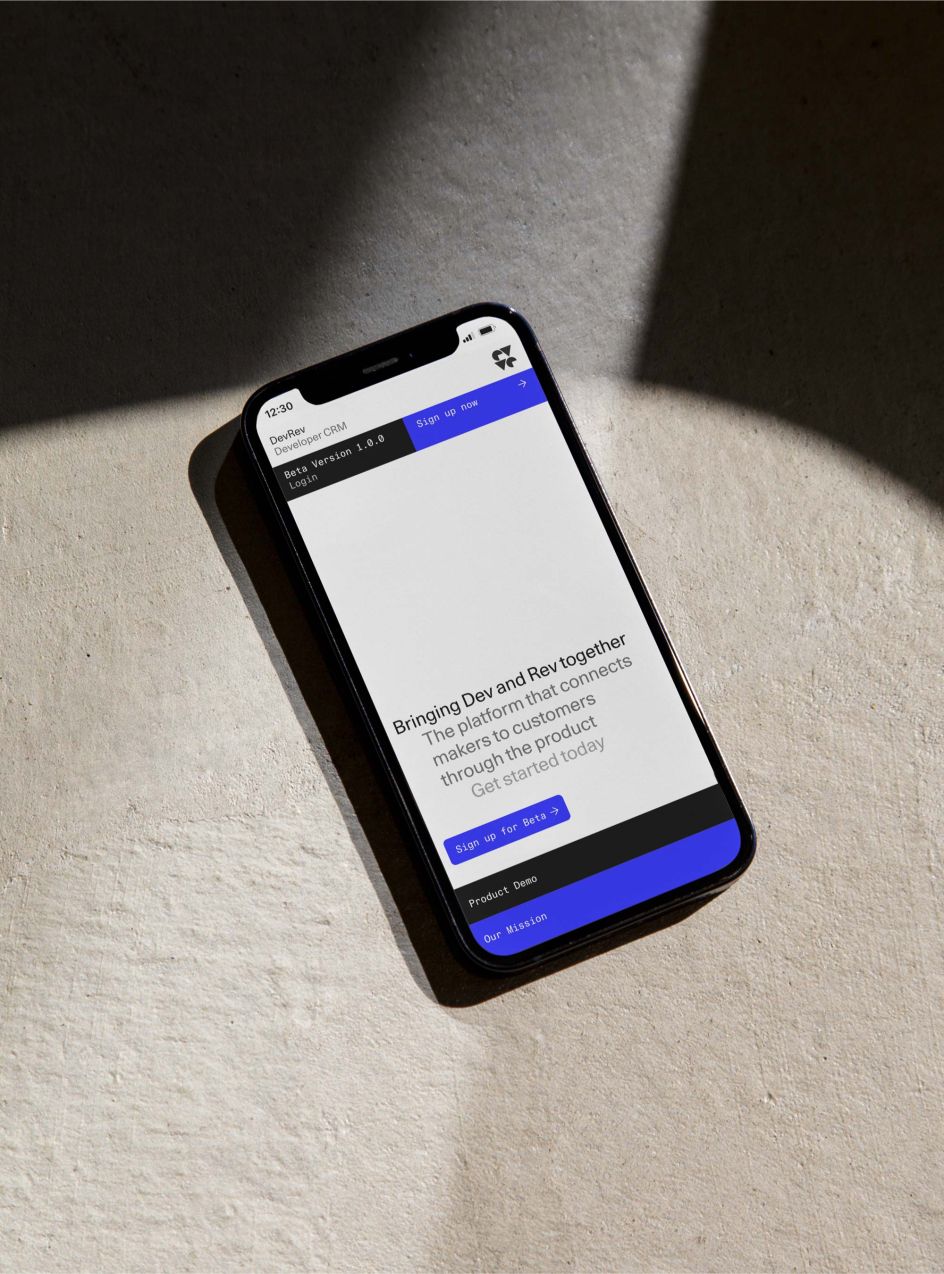
When it came to type, functionality was a top priority. Unica 77 – a neutral, malleable, digital revival of an '80s modernist classic, proved to be the right choice in a system where complex, technical information must be clearly delivered.
Flynn told Creative Boom: "Despite the current trends towards more expressive typefaces, a product with this potential required something more flexible, the ability for language and the design system to carry meaning, rather than the typeface alone. In use, we again make subtle nods to the tabbed structure of code editors in creating headlines and the underlying grid structure itself."
Ultimately, DevRev's new brand succeeds in carving out its unique expression that opposes much of the current aesthetic within SaaS branding. To Flynn, what he and his team have created is "proof that design for B2B SaaS doesn't have to be boring, doesn't have to be childish and that it is possible to create a brand that works as well online as it does offline."
Credit: Standard Projects / DevRev