Design Bridge's evocative, California cool branding for The Palm: a new rosé
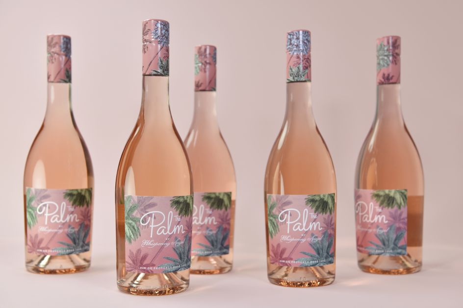
Design Bridge has just unveiled new branding for The Palm: the latest rosé from the Whispering Angel family of wines. Leveraging the success of an existing premium portfolio, the wine producer has created the entry-level rosé to appeal to a younger, fashionable, female audience. Design Bridge’s challenge was to create an identity that epitomised a fun, aspirational "rosé lifestyle" for the American market while reflecting the refined, high quality of the French wine.
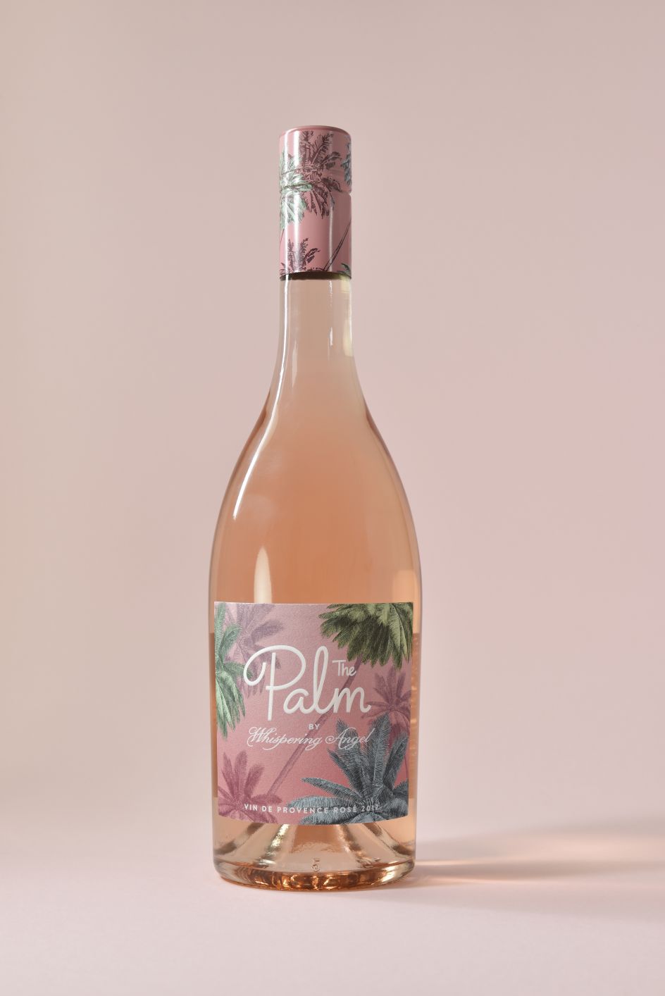
"When developing the design, we began thinking of The Palm as the younger sister within the Whispering Angel family, taking a fun road trip with friends from the French Riviera, where the wine is produced, to the palm tree-lined beaches of the Californian coast," explains Pati Zywert, Design Director at Design Bridge. "We imagined all the sights and places experienced along the way – from Cannes to Coachella – and used them as creative inspiration and reference points for the design."
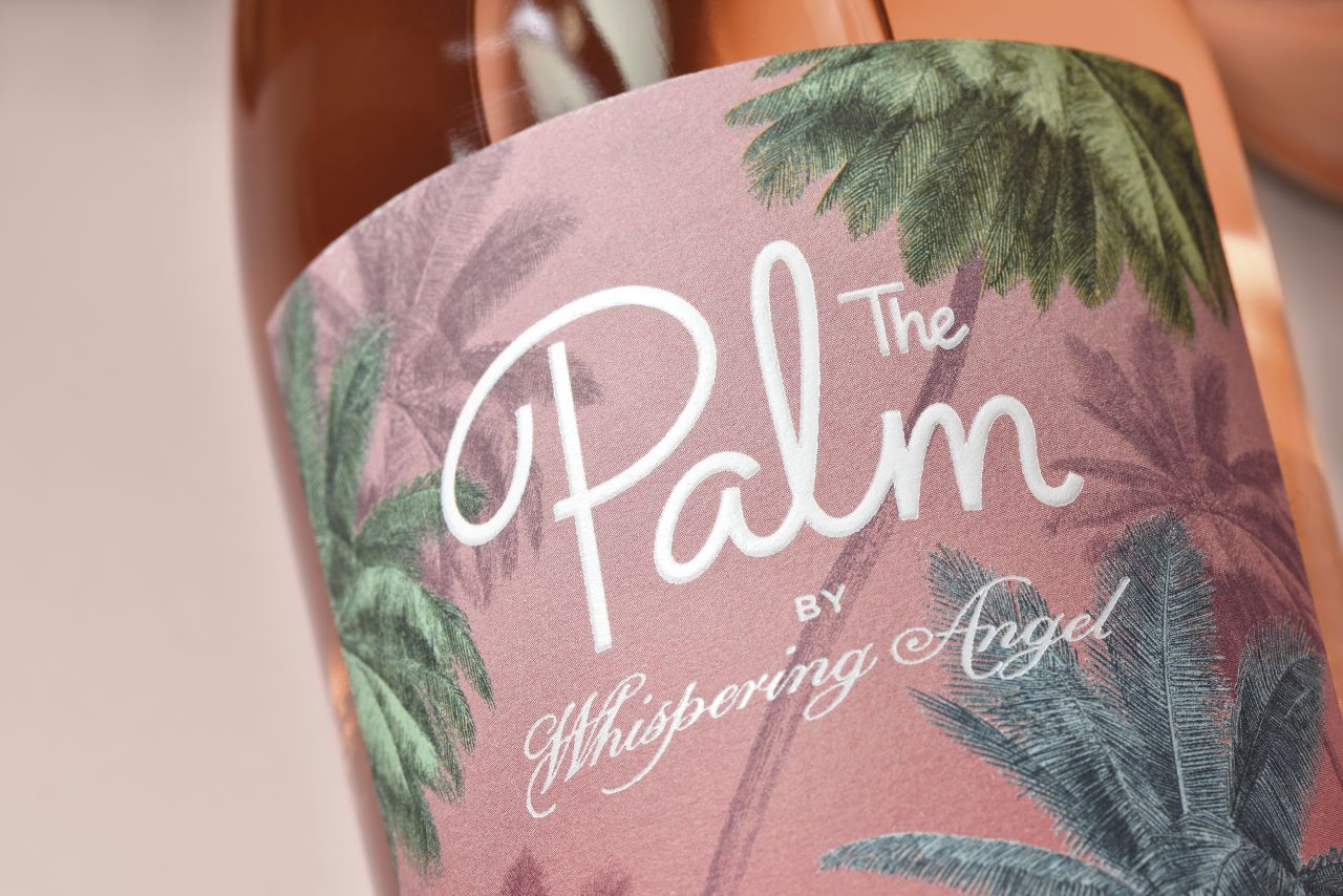
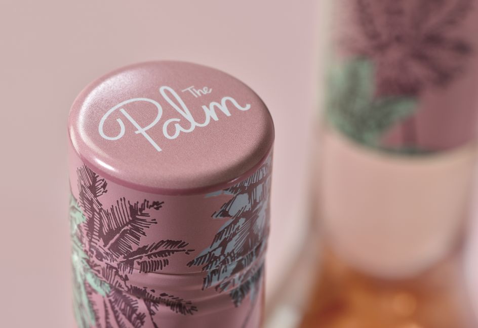
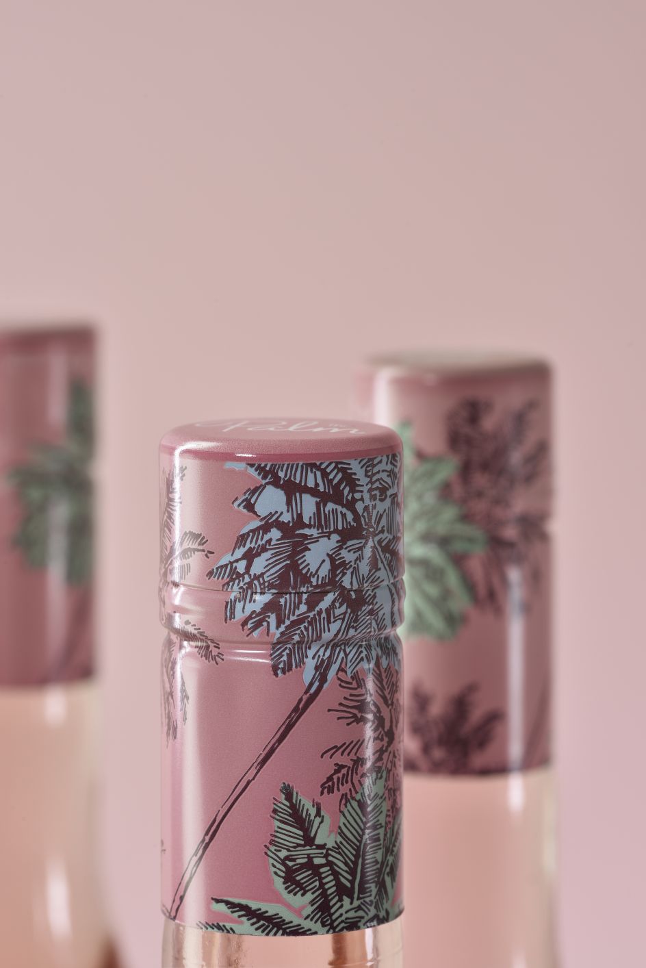
Design Bridge apparently researched vintage travel posters depicting the Côte d’Azur, typography from French brasserie and wine bar signage, design and iconography of mid-century Californian hotels, and imagery associated with the legendary Coachella festival of music and arts. Sunsets and palm trees were recurring themes in the research, and Design Bridge has illustrated an evocative palm tree scene for the bottle that brings together the essence of the French Riviera and Californian coast.
Pati added: "We wanted people to imagine themselves sitting under the palm trees on a balmy evening sharing a bottle of The Palm with friends, watching the shifts of colours in the sky, before going out to party.
"Our illustration was inspired by a vintage botanical etching of a palm tree, which adds refinement and depth to the design, and reflects the French provenance of the wine. For the sky, we’ve tempered the vibrant pinks of a Californian sunset with the subtler hues of sundown in the Côte d’Azur."
The hand-drawn typography is printed in white foiling onto a label of uncoated stock, bringing a tactility and a contrast of finishes that consumers might expect from a high-quality wine. Special versions of the palm illustration have been created allowing it to be tiled and easily adapted for use on off-pack assets, such as social media, digital platforms, point of sale and at events, demonstrating the power of a brand idea to be translated for use across multiple platforms. Nice work.
Editor's Picks


Trending


Podcasts


Editor's Picks
Further Reading