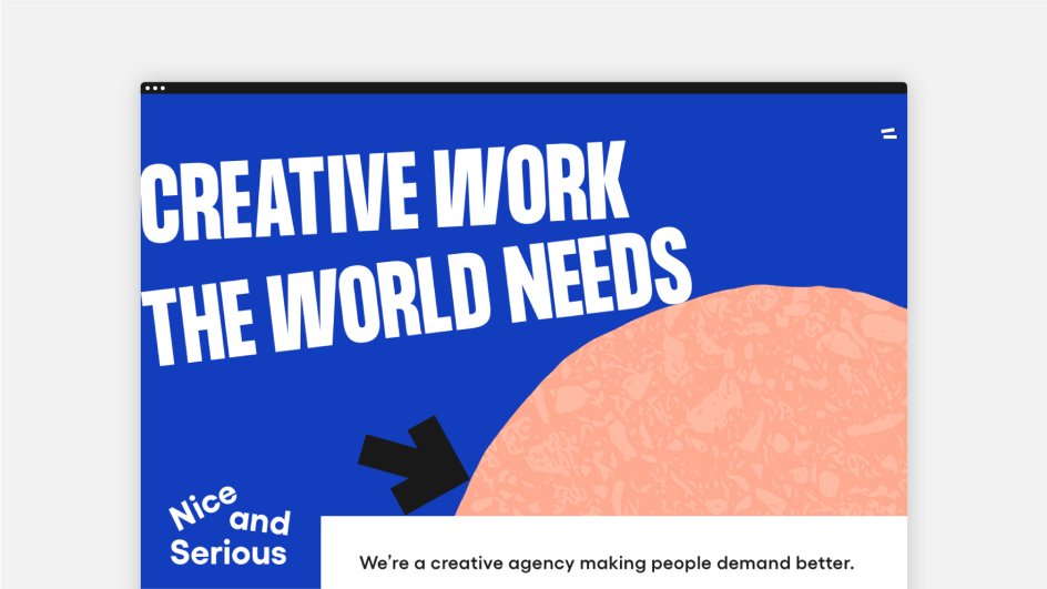
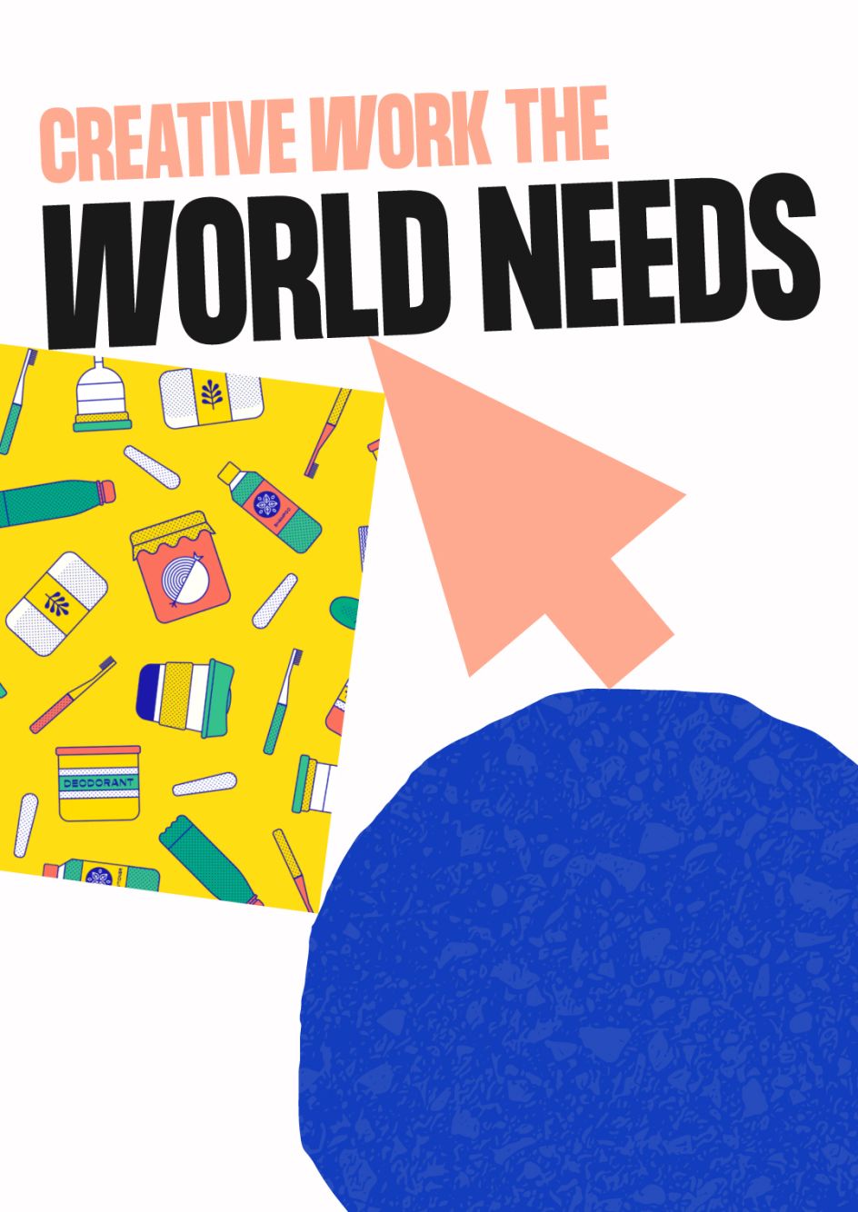
Creative agency Nice and Serious' new branding emphasises 'only creating work the world needs'
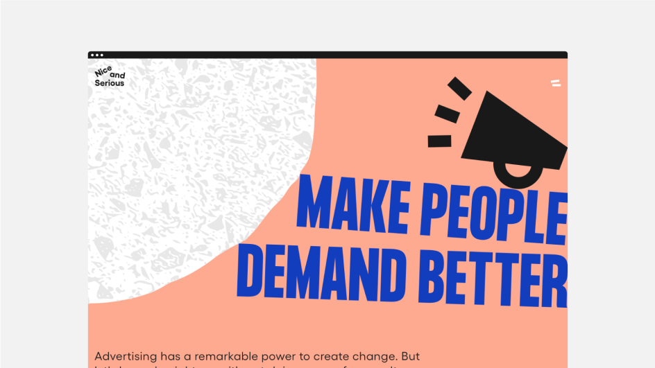
Billing itself as "a creative agency making people demand better", London's Nice and Serious has long worked on design projects with a purpose – indeed, only those that pass what it dubs its 'Moral Compass'.
It means that it takes stock of each client or piece of work in terms of the studio's own value system. "The world doesn't need more of the same," says the studio. "We create brands, campaigns and award-winning content, so the world can get what it really needs."
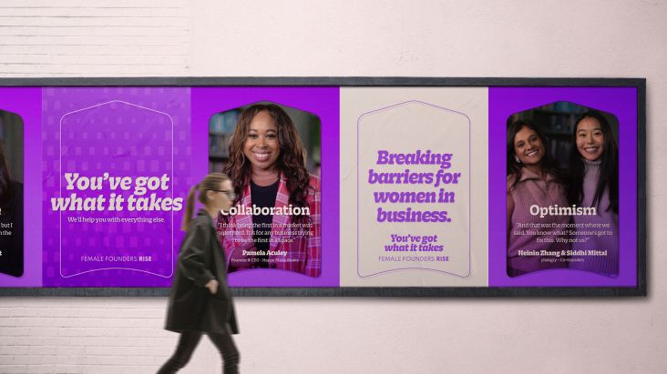
Much of its work is with charities and non-profits, with precious clients including Age UK, Greenpeace and Breast Cancer Now; though it's also worked on projects for companies including Co-op and Unilever.
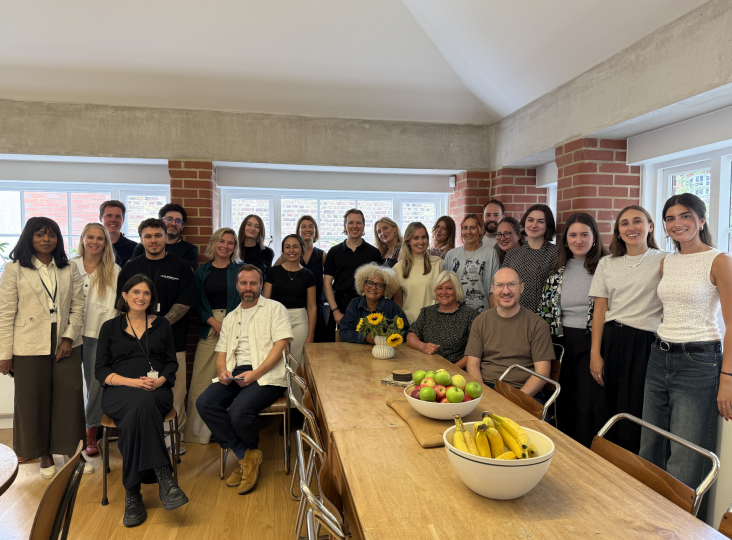
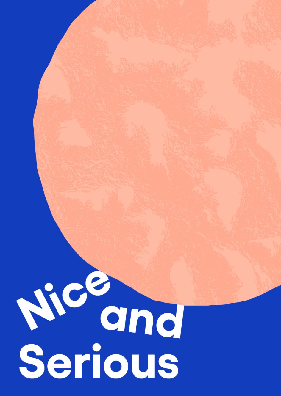
This month, Nice and Serious – which recently became a certified B Corp – unveiled a new look to reflect this belief system, a project it says is "driven by the growing urgency of global challenges".
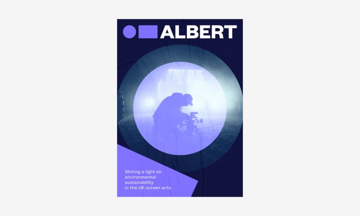
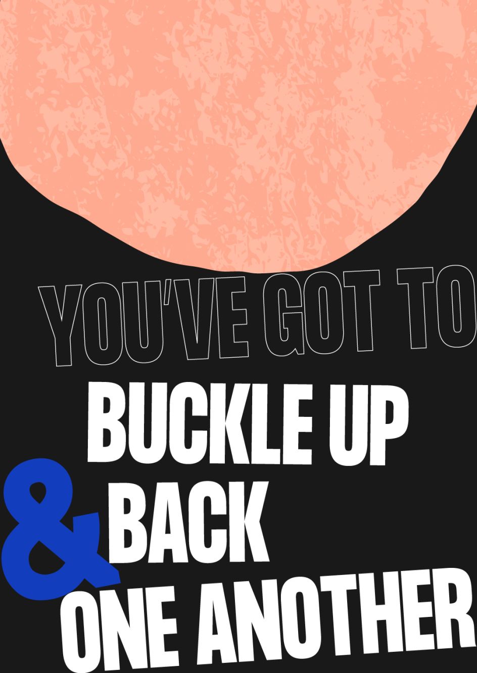
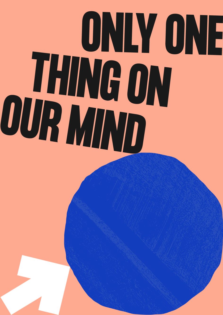
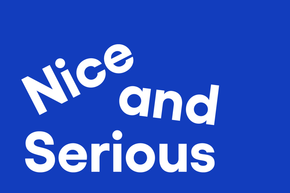
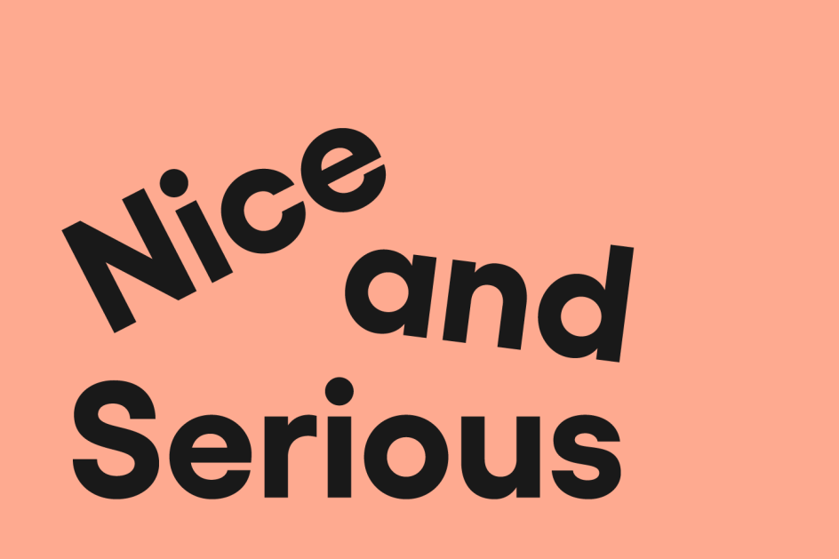
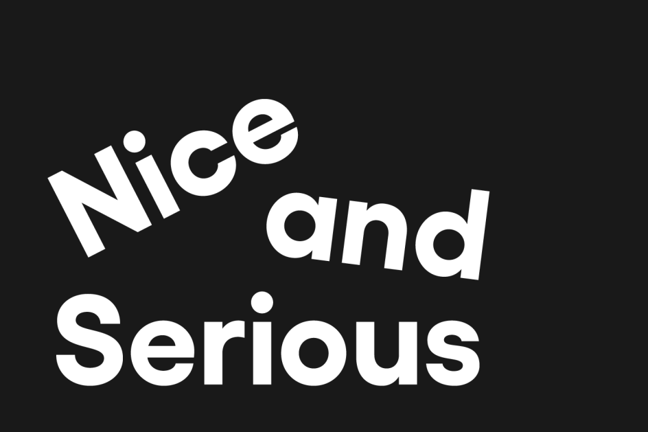
The new design system is based on the concept of gravity, looking to subtly underscore that it's "grounded to reality" and considers broader global contexts in what it does. It means that the logo was drawn to seem as though it's "fallen" into place. A more pared-back colour palette was also introduced alongside a "much heavier, confident" approach to typography.
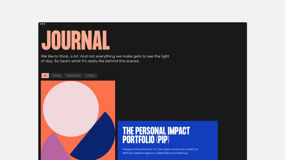
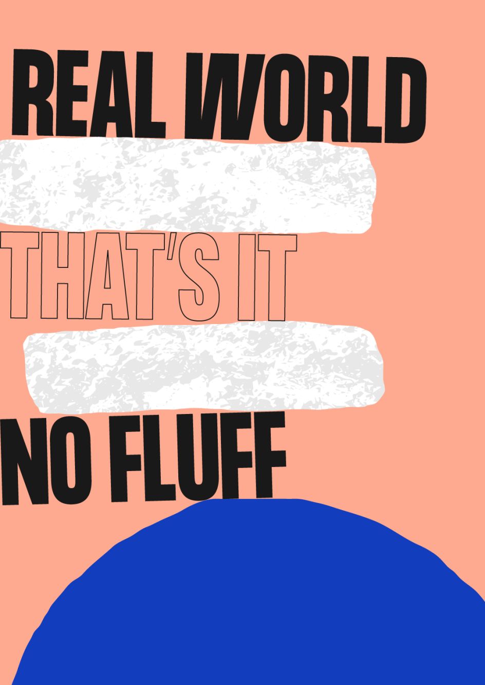
Oversized icons, coloured blocks and an abstract 'world' shape that always features in the frame are used across the visual system to remind people of "what drives the agency forward", says Nice and Serious. The graphic shapes used textures that were created by scanning various physical surfaces. the agency has also introduced a new "confident, straight-talking" tone of voice. "This was based on a new set of values that were developed to reflect the agency's founding ethos: buckle up, back one another, think again and make it brilliant," says Nice and Serious. "Values that have been put to the test in the face of the coronavirus pandemic."
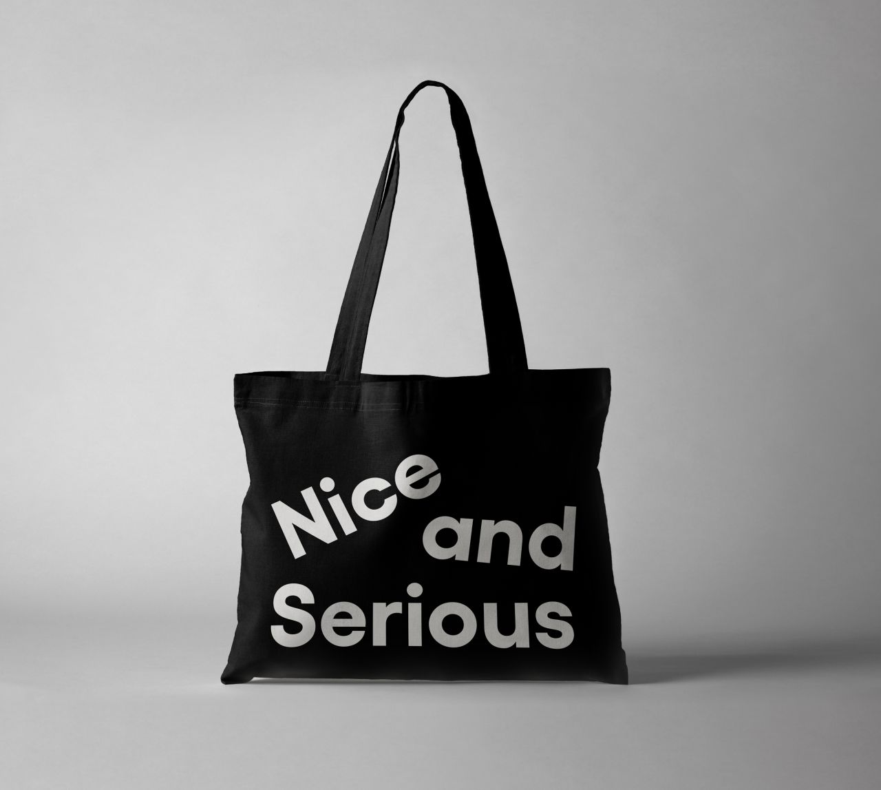
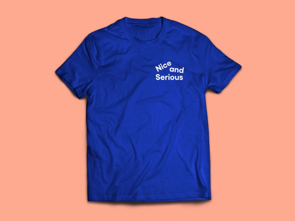
The agency's new look, shown across its website, merch, posters and other touchpoints, aimed to move away from its former presentation since it saw it as being too far on the "nice side"; while the new designs emphasise the "serious".
Nice and Serious creative director Peter Larkin says the new purpose has "given us more confidence to talk about how we want to make people demand better through our work. Whether that's better business, better products for the environment, or better from governments and policymakers".
He adds, "Rather than being our North Star, this idea has become a massive core that keeps us grounded, and ultimately pulled us towards a visual concept based on the force of gravity."
Editor's Picks


Trending


](https://www.creativeboom.com/upload/articles/90/908fdb6378db1e95d12595416f54e6336d5e80b8_732.jpg)
Podcasts


Editor's Picks
Further Reading