Celt Iwan's fresh identity for Sain, the iconic record label for Welsh language music
London-based designer Celt Iwan is behind the brand refresh for Sain, an iconic record label for Welsh language music, founded in 1969. The brief was to "celebrate its illustrious heritage while looking forward to a new age of music".
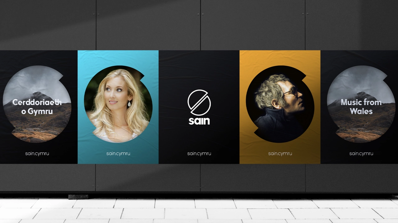
Just like many other small record labels in recent years, Sain has suffered from the streaming-boom and fierce competition from tech giants such as Spotify and Apple. But it luckily has a niche, finding success in Welsh language music. On much stabler ground than others in the industry, Sain wanted to strengthen its brand moving forward.
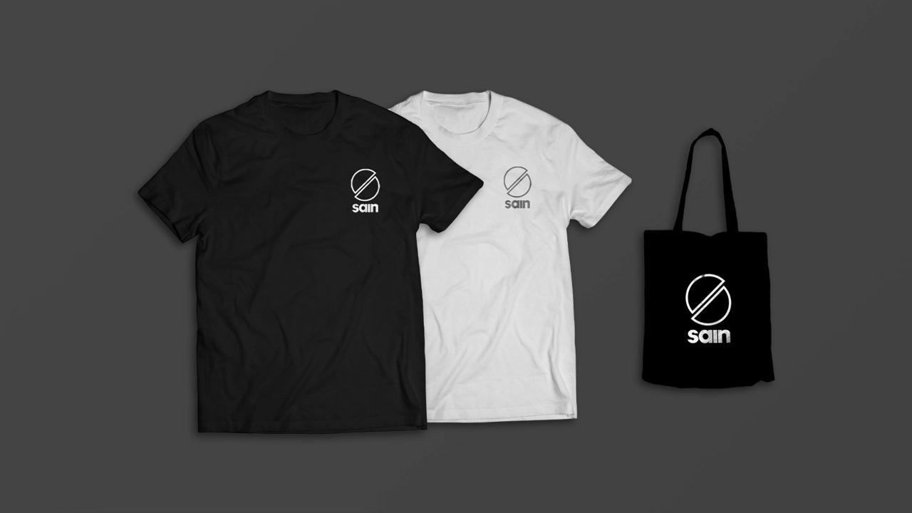
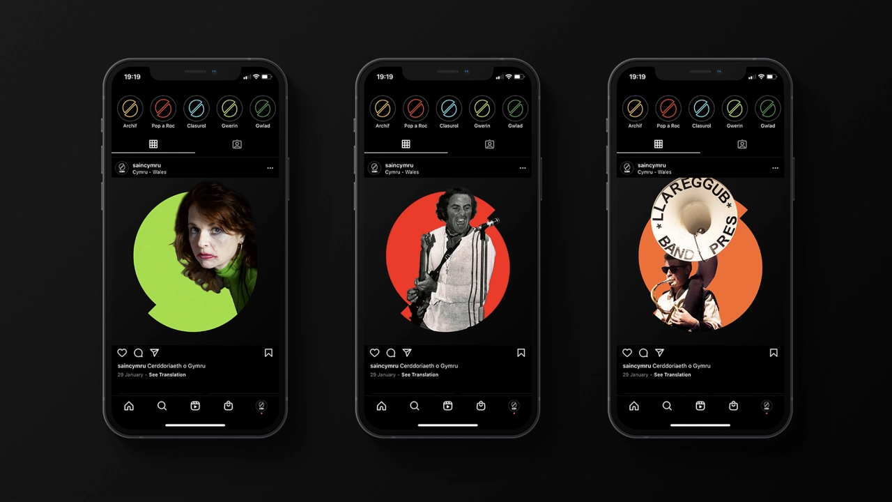
It appointed Celt who crafted a new logo that reimagines the iteration from its 1975 branding, which evokes a vinyl record, split up to suggest the letter 'S'. Celt added 'sound-wave' patterns to reinforce the musical core of the brand and applied colours inspired by classic albums from the company.
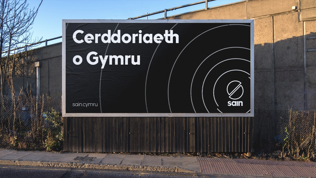
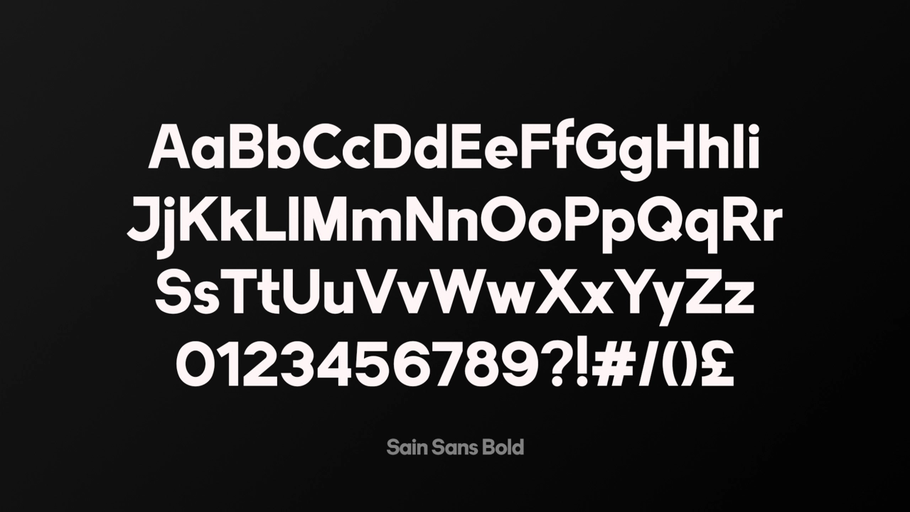
As part of the rebrand, a bespoke typeface was created that champions the Sain's history, something that is also legible across digital platforms. It comes in two weights (light and bold) with angular cuts that echo those in the new logo. It is only the second-ever typeface to be created for the Welsh language (after Cymru Sans by Smorgasbord), with eight unique letter combinations that feature in the Welsh alphabet.
"It is a testament to Sain that the label has withstood the music industry's changes in recent decades," Celt tells Creative Boom. "I very much enjoyed looking (and listening) back through the label’s rich catalogue of music to inspire the new identity’s brand elements. The logo from 1975 was a particular element that I was keen to resurrected as it's such a simple symbol, but one that is iconic in the Welsh language music industry. Its renewed purpose is to celebrate the label's heritage but also serve as a dynamic asset that lives right through the brand."
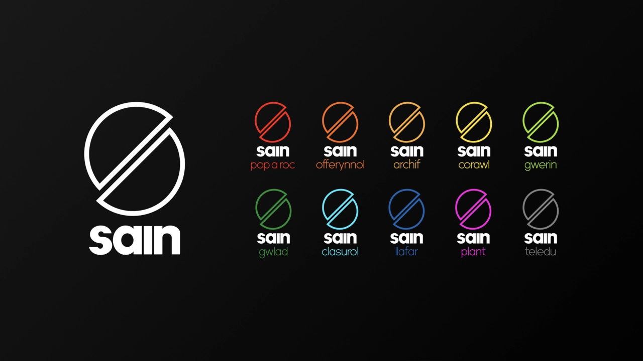
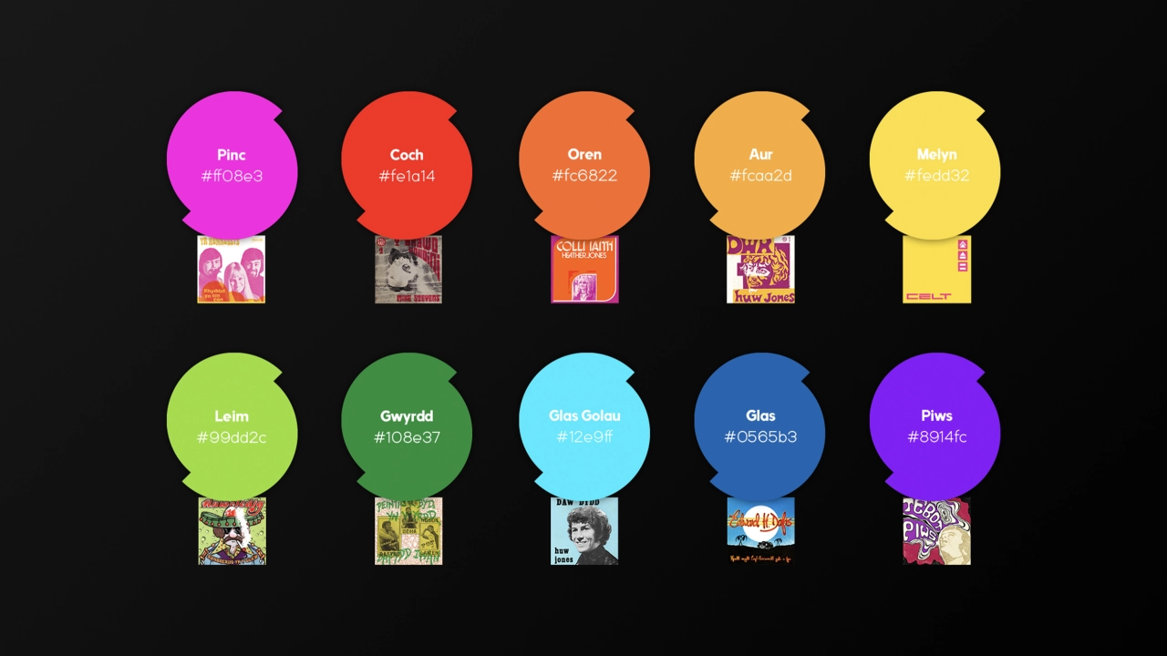
The new identity has been rolled out across all touch-points from merchandise and album covers to digital platforms and stationery.
Originally from Caernarfon, now based in London, Celt is a multi-disciplined designer with a particular interest in brand identities. He currently works for Sky Creative, where he has recently been working on projects such as the Sky News identity refresh. Find out more: www.celt.design.
Editor's Picks





Trending






Latest Jobs
Design Lead at Madeo
Full-time·New York City·$85k–$120k
Midweight Graphic Designer at We Are Your Friends
Full-time·London·£36k–£44k
Creative Content Executive at Cognition
Full-time·Birmingham·£28k–£35k
Senior Digital Designer at 3800
Full-time·Sheffield·£40k-60k
Art Director at The New York Times
Full-time·New York·$120k–$130k
Senior Graphic Designer at MoMA Retail
Full-time·New York·$72k-$80k