Output on its refreshed identity for a charity that unites the UK against suicide
London design agency Output has overhauled the identity for Campaign Against Living Miserably (CALM) to help the suicide prevention charity cut through the noise of a growing, louder conversation around mental health.
The refresh couldn't come at a more pressing time, as 6,000 people in the UK still take their own lives every year, according to ONS figures. CALM exists to change this by "standing against feeling shit, standing up to stereotypes and standing together to show life is always worth living". It appointed Output to help it reach even more people, as well as unite the UK against suicide.
The work began in March with a brief requesting a brand that "recognises the urgency of the situation and the need for change, without losing sight of the need to speak to real people about issues that have long been surrounded by stigma". As such, it needed a modern refresh with an authentic voice.
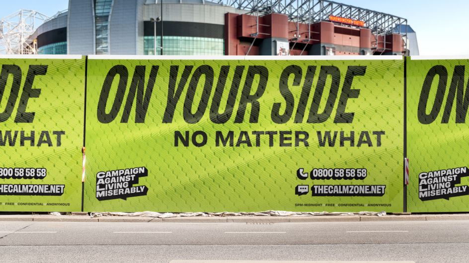
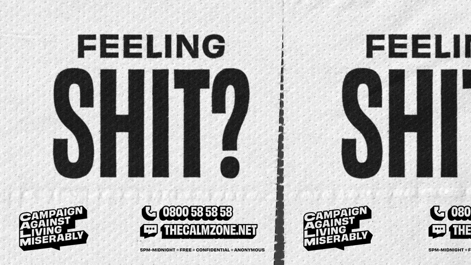
While Output handled the visual identity, Reed Words was brought in to look after wording and tone of voice – its new messaging speaks on a level anyone can understand and relate to. Messages like 'On your side, no matter what' and 'Feeling shit?' give you a flavour of the brand's spirit. "CALM has the kind of voice that would stand out in any sector," says Gemma Wilson from Reed, "and it's particularly distinctive alongside other charities and mental health services. We needed to retain that authenticity and show how it can expand to fit the whole organisation, with all the different moments they meet their audiences in."
"It's an unusual challenge," Gemma continues, "but one with so much potential for strengthening the brand even further. We worked with internal teams to show how their bold, punchy, and much-loved voice can work everywhere – even the toughest topics."
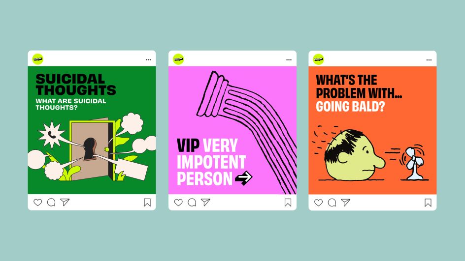
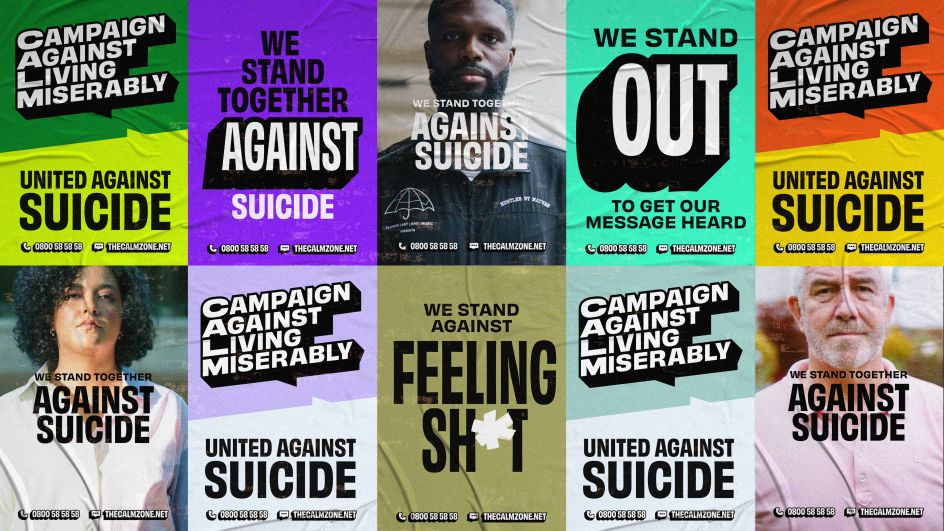
Coupled with a vibrant yet empathetic palette, eclectic styles of illustration, and brand photography that features real people with real stories, it's a fresh new look that hopes to speak to as many people as possible.
"The brand has to do so many different things, from support to activism, but it needs to always feel like CALM," explains Johanna Drewe, the creative director and partner at Output. "We were also conscious that it should be a natural evolution – the next iteration of a much-loved brand, rather than something completely new."
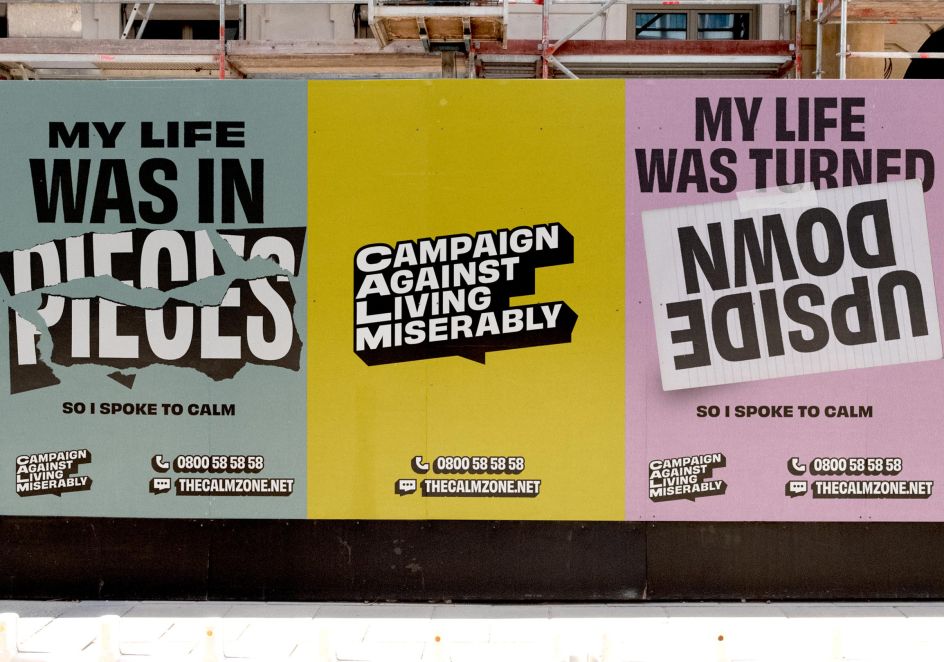
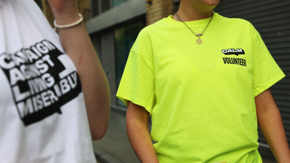
To do that, Output revisited the speech bubble logo of CALM but with some adjustments. "We used an extruded text style to define the graphic language beyond it – the helpline number, website URL and framing devices," adds Johanna. "You don't even need to see the logo to know it's CALM. That structure gives freedom for the brand to flex to lots of different touchpoints – from bringing people together to fight for change to helping someone in crisis – all in the same brand."
Although a serious subject, the identity doesn't feel depressing; instead, it's "youthful and positive", as Johanna puts it. "That's because everything is rooted in CALM's unique character: it's irreverent to conventions, bullish against limitations and empathetic in action. These traits are always present, but one will be dialled up more, depending on the context. This creates an interesting balance between brand cohesion and creative freedom. CALM don't ever want to feel like a corporation – they're a group of people speaking directly to other people. It's more like a magazine because the content always needs to feel new."
What really stands out about Output's identity for CALM is how normalised the topic of mental health has become – something that was considered taboo only a decade ago. "CALM's approach is about showing why life is worth living and why it's worth staying around," says Bahar Shahidi, a senior strategist at Output. "It's a brand that focuses on life, rather than death. To do this, CALM meets people at a level in their lives – it makes things that people want to engage with and be entertained by. Then everyone is already aware of the brand and knows who to speak to, rather than waiting until they’re in crisis. It's a kind of 'Trojan Horse' for deeper conversations when the time is right."
Taking a much closer look at the identity's typography, the headlines and sub-headers are set in Obviously – an Adobe font made by Ohno Type Co. "We mix lots of weights and widths and add an extrusion for real emphasis," says Johanna. Body copy, meanwhile, is set in Degular, also from Ohno.
Chosen colours hope to represent CALM's diverse community with three palettes based on the brand's character traits: The 'Bullish' palette is simply black and white, acting as an anchor for the wider identity while the 'Irreverent' palette is vibrant, bold and bright, representing the way CALM shakes up the charity sector, and 'Empathetic' is more muted and relaxed, to encourage conversation and a sense of safety.
"They add some nuance but aren't over-used, as we want CALM to stand out from other charities," adds Johanna. "For added depth and vibrancy, gradients can be used within, or across, the empathetic and irreverent palettes. It sounds chaotic but is actually really well planned because the black and white anchor allows for almost total flexibility elsewhere."
It's a brand overhaul that has been a real labour of love for Output, working collaboratively with the charity to help make a difference. "Although some of us have recommended CALM to friends at times of need, what really resonated is their philosophy that everyone should care about what they’re doing," says Bahar. "We can all be affected by suicide, and we can all be part of the fight against it."
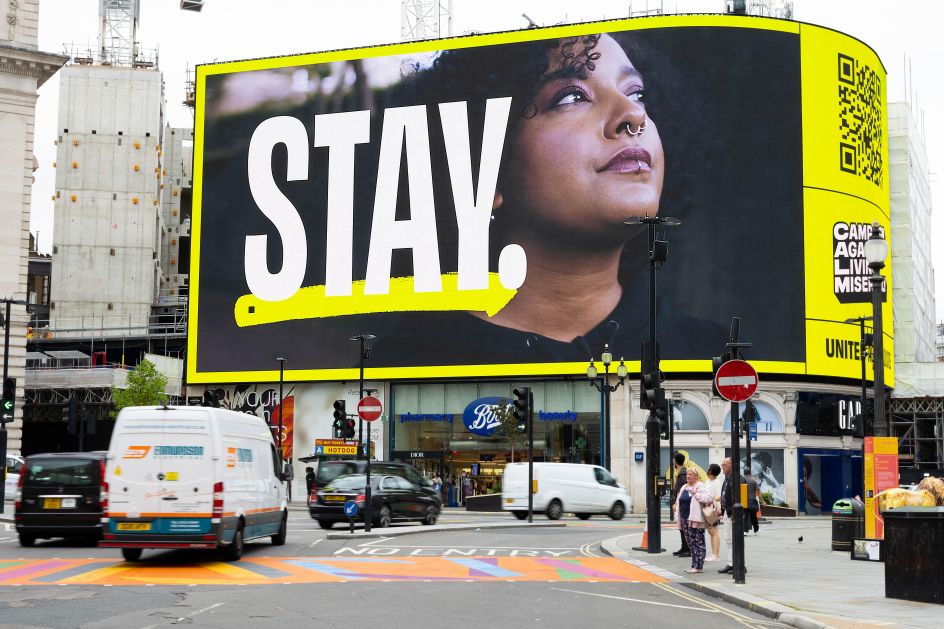
The new identity by Output is being rolled out across various touchpoints, including via CALM's latest campaign, Stay, which launched on Friday at Piccadilly Circus in London. Meanwhile, a new website will be designed and built by Output and is expected to launch by the end of the year.
Editor's Picks


Trending


](https://www.creativeboom.com/upload/articles/90/908fdb6378db1e95d12595416f54e6336d5e80b8_732.jpg)
Podcasts


Editor's Picks
Further Reading