Bulletproof rebrands little Easter icons, Cadbury's Mini Eggs
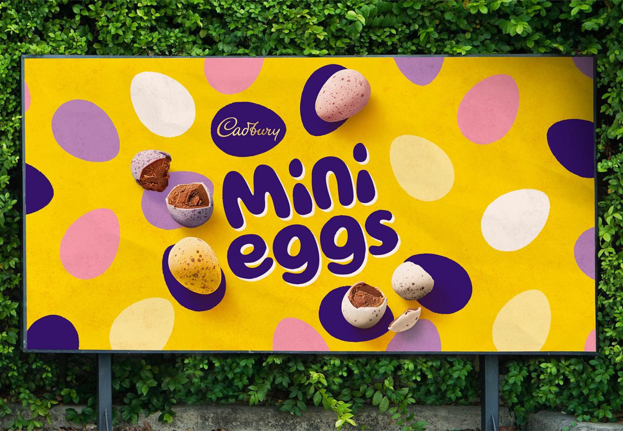
Cadbury has unveiled a new look for its iconic Mini Eggs, created in collaboration with strategic brand design agency Bulletproof that "encourages hiding and sharing, at any time of the year".
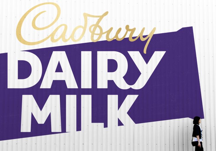
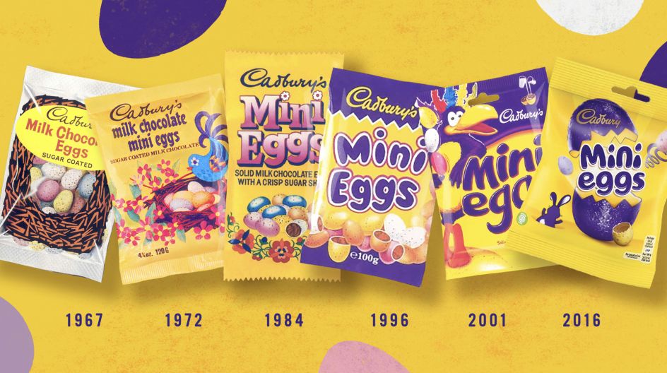
The agency had previously worked with Cadbury on the rebrand for Dairy Milk in 2020. The idea behind the new look is to celebrate "the specialness of the brand," says Bulletproof, and draw out their nostalgic value.
"For many people, it's that one brand that is intrinsically linked to Easter, bringing back happy memories of their childhood and giving opportunities to create new memories with their families today," says Jamie Gandee, creative director at Bulletproof. "Our challenge was to capture that intangible feeling in the brand’s new visual identity."
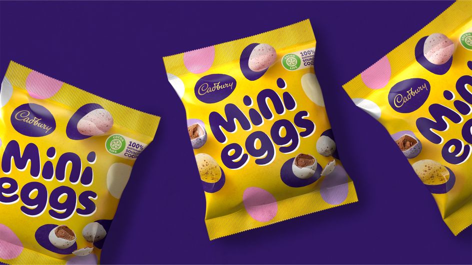
Retaining many of the previous design's recognisable brand elements, such as the yellow and purple colourways and on-pack egg photography, the new identity builds on the "core values of quality and goodness" that it introduced for Cadbury, says Bulletproof.
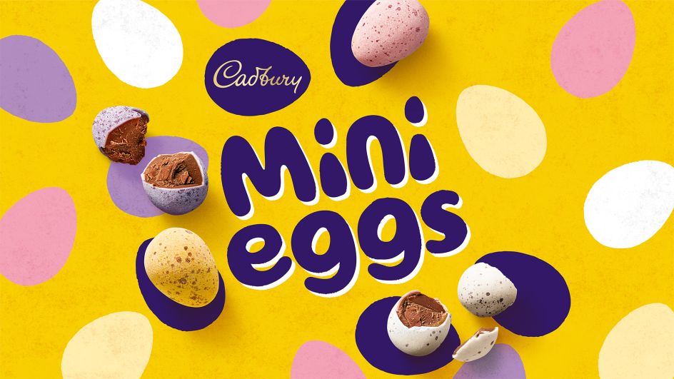
"The new look and feel is clean, fun and familiar," Bulletproof adds. The brand's history inspires the designs, and Bulletproof says the identity is built around four key design elements: a refined version of the Mini Eggs type lock-up, aiming to amplify the brand's playfulness; the Cadbury 'script', housed within a purple egg to "showcase the quality taste of Cadbury chocolate"; the photographic representations of the Mini Eggs; and the colour yellow, which is synonymous with Mini Eggs, Easter and Spring alike.
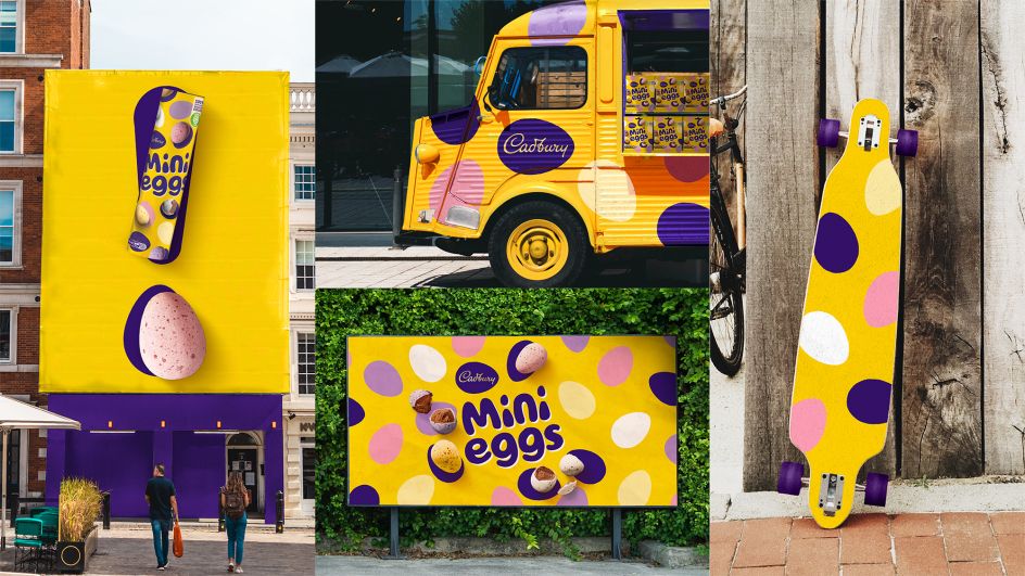
The new identity is being rolled out across a range of Mini Egg products, including the standard pack, Easter egg gifts and new Mini Eggs chocolate bars.
Editor's Picks


Trending


Podcasts


Editor's Picks
Further Reading