BrandOpus goes Scandi for 'coffee giant' Gevalia rebrand
Global branding agency BrandOpus has created new brand positioning and refreshed designs for US coffee brand Gevalia, owned by Kraft Heinz.
Working across Gevalia's identity, packaging and website, the new identity is inspired by the brand's Scandinavian heritage. It aims to appeal to "modern coffee-drinkers at home" and stand out in the crowded premium coffee market.
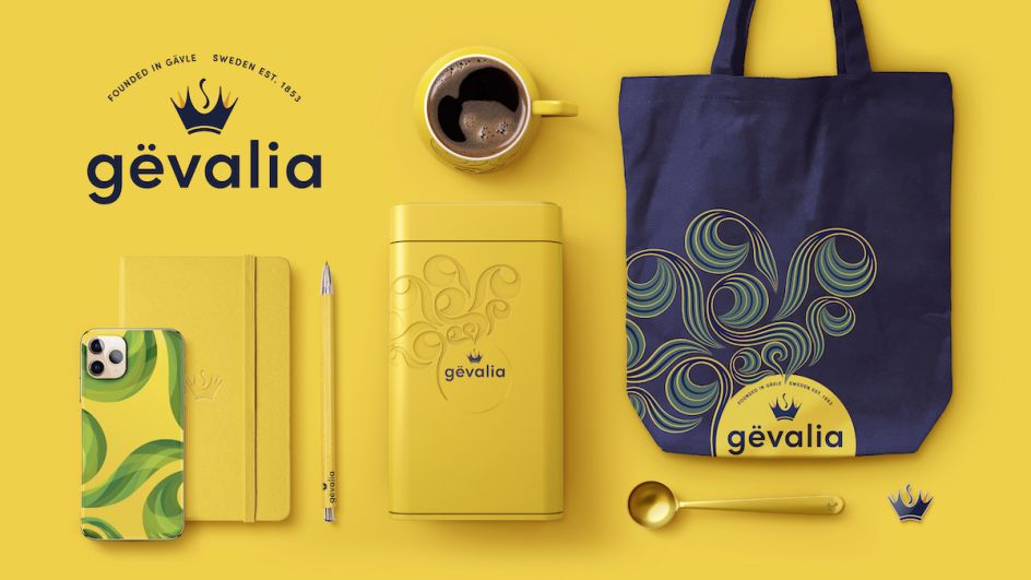
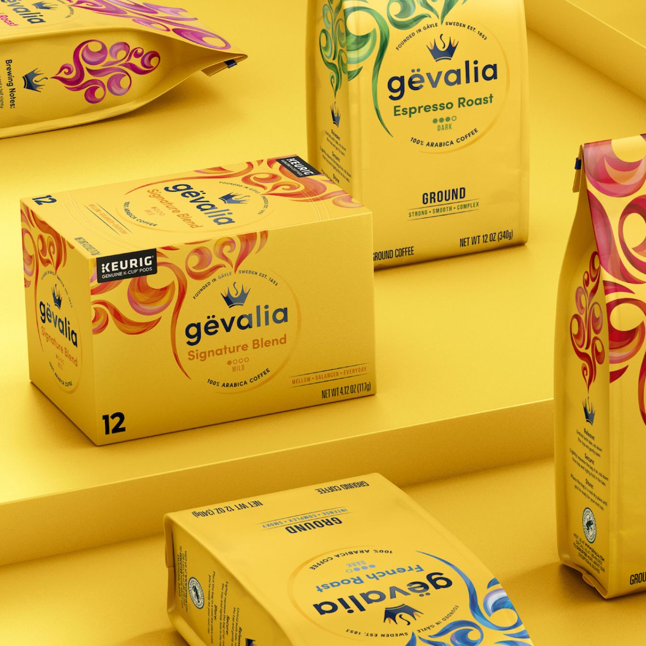
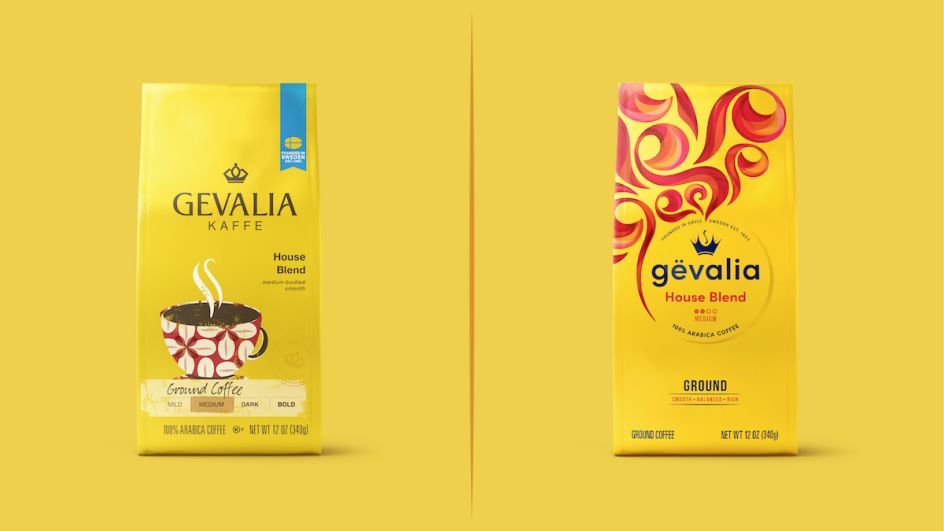
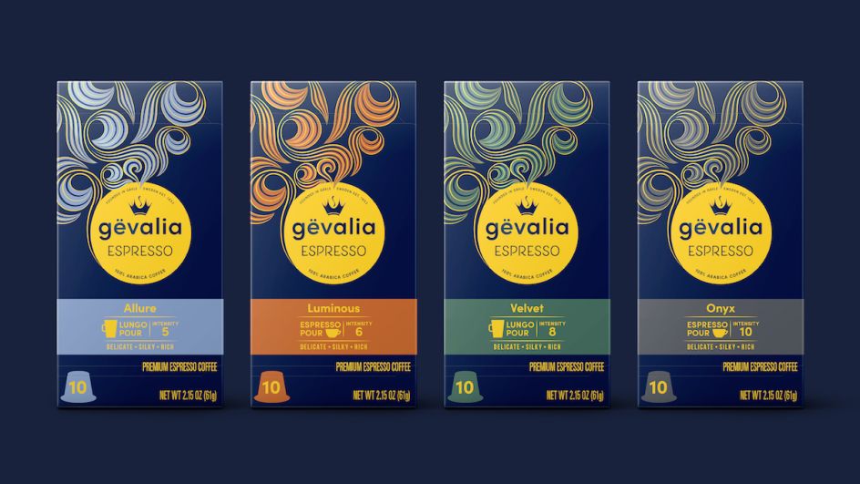
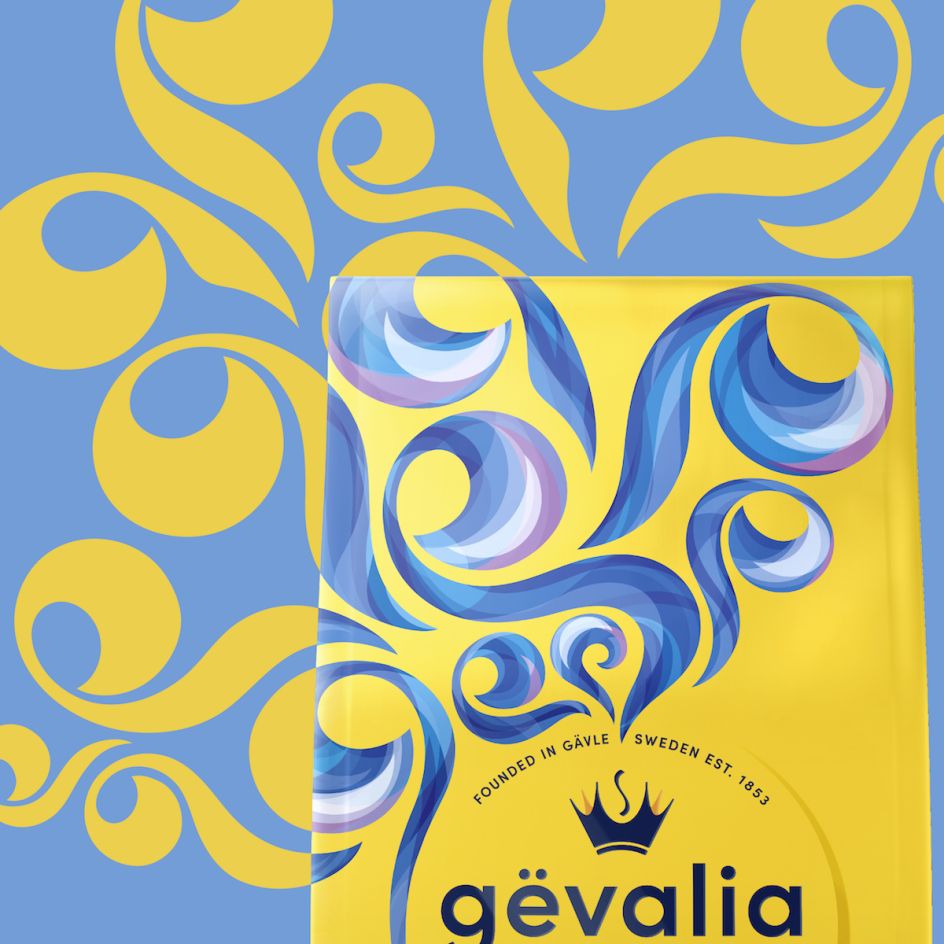
The new designs look to celebrate the brand's Swedish heritage and make the brand look more contemporary. As such, certain design elements have been retained, such as the signature bold yellow packaging. Others have been refreshed: the crown logo mark aims to "embody a more imaginative and fluid expression," says BrandOpus, "driving sensation, emotion and energy back into the brand."
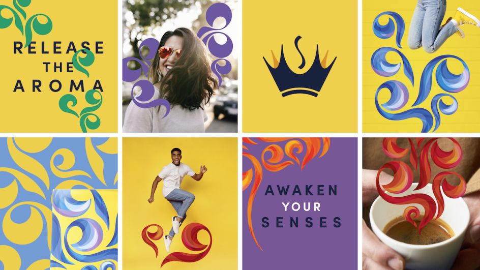
The agency also opted to change the brand's wordmark from upper case to lower case, aiming to aid the pronunciation of a soft 'g', and echoing "contemporary Scandinavian aesthetics." Among the other new design elements is an aroma swirl symbol. "This new distinctive visual connotes the unlocking of rich flavour and aroma and works to give a premium quality to the brand," says BrandOpus, adding that it also aims to heighten on-shelf standout. The swirl can also act as a device to be used across numerous touchpoints in different colours, such as point-of-sale materials or branded wearables.
"We wanted to establish a narrative that felt more attitudinal and less product-benefit focused," says Paul Taylor, chief creative officer and founding partner at BrandOpus. "The new look and feel go against category norms that focus on caffeine fuel benefits or standard taste messaging. It's an evolution that feels more artistic, expressive and accessible—speaking to coffee drinkers today and coffee drinkers to come."
The new branding extends across all touchpoints and will be rolled out across US supermarkets nationwide in April.
Editor's Picks


Trending


Podcasts


Editor's Picks
Further Reading