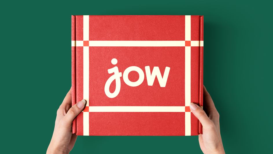
Vintage tablecloths inspired &Walsh's rebrand of French food app, JOW
Jow, a French grocery shopping app, is expanding into the US. Its new rebrand launches today, with creative direction by Jessica Walsh.
Jow originally took France by storm in 2018, combining personalised menu creation with fast online grocery shopping supported by the country's top retailers. The app is now poised to take off in the US, where it comes up against grocery delivery services like Instacart, DoorDash, and HelloFresh.
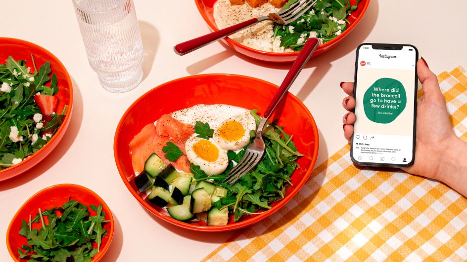
Jow's new brand by &Walsh leans into a bright, homegrown, cosy yet understatedly sophisticated aesthetic that both celebrates the brand's French heritage and positions it as a quintessential ingredient for making meals easier and more pleasurable in Americans' busy lives.
The guiding idea of the Jow brand plays with the app's roots in France. Walsh and her team set out to capture the "Joie de Jow", the exuberant enjoyment of life. As a result, all of JOW's new brand elements champion the everyday pleasures of food that we share with our family, friends, partners, and pets but also nod to the premium service users can expect from JOW.
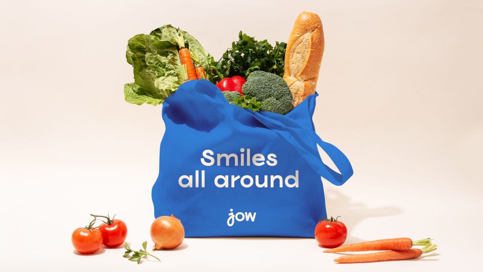
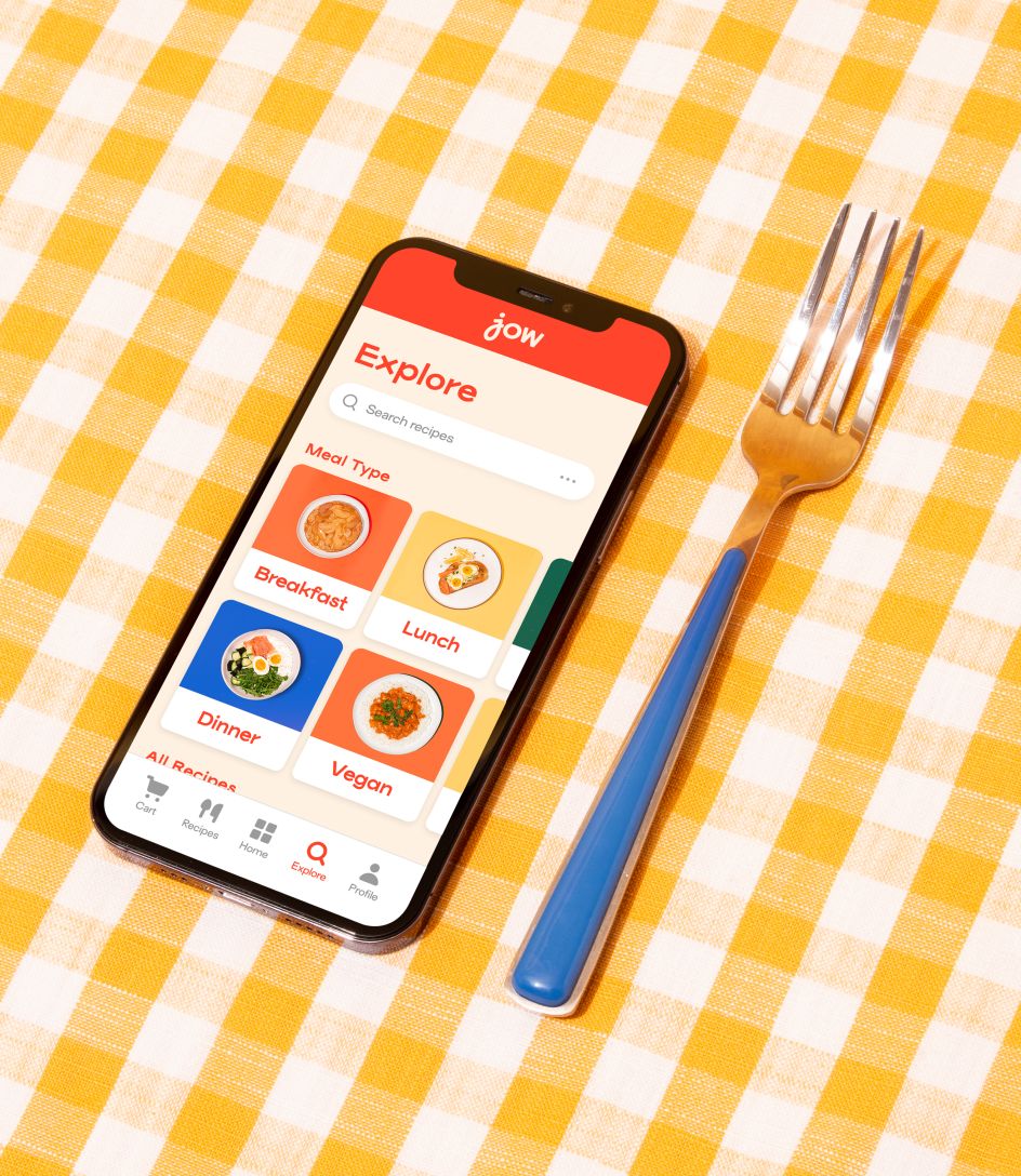
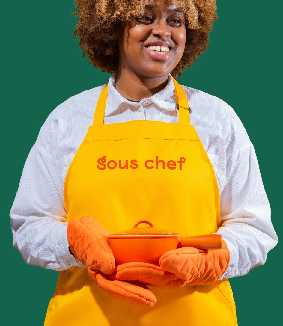
To express that "Joie de Jow" attitude, &Walsh created a visual system that balances big-heartedness and vintage class. A new custom type, Viksjow Regular, bigs up Jow's personality through playful ligatures and squiggles, while the brand's original orange colour palette has been expanded, bringing in colours that are regularly spotted in home kitchens.
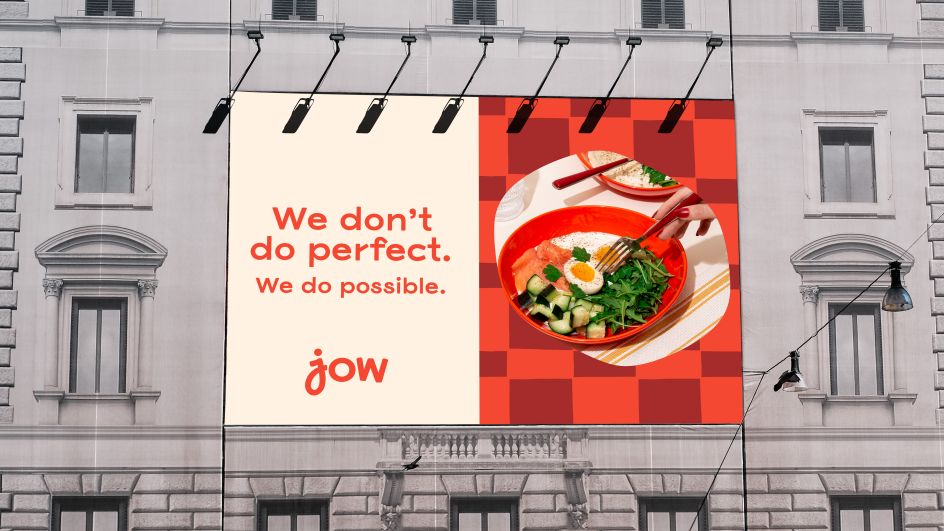
Meanwhile, &Walsh has employed a suite of uneven circles and lines that perfectly illustrate Jow's simple outlook on cooking: "We don't do perfect, we do possible."
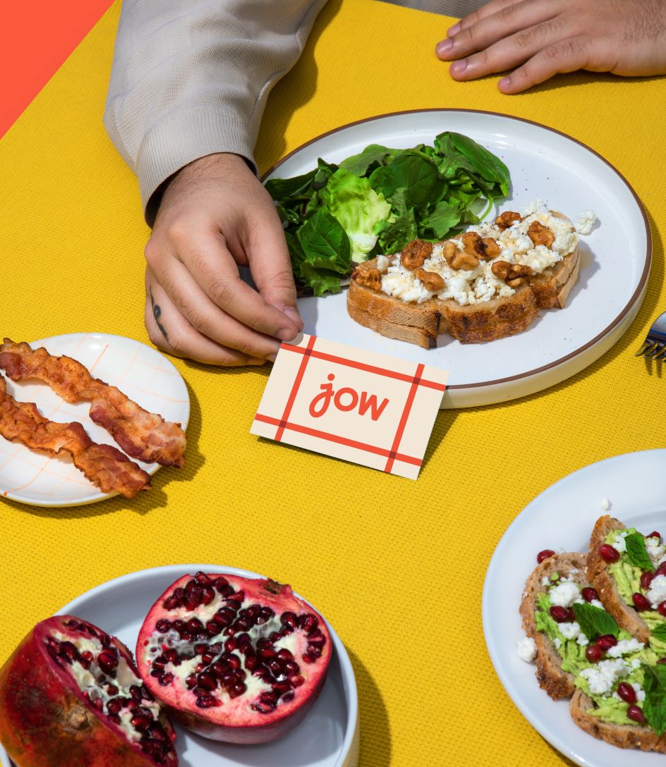
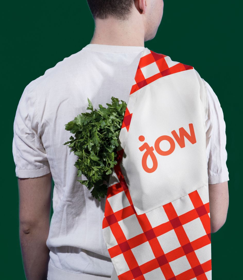
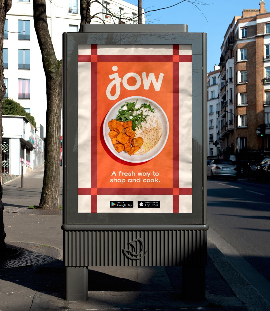
The real highlight of the new brand is & Walsh's use of patterns inspired by classic tablecloths. The woven patterns are used throughout the identity system as backgrounds, wallpaper, and frames for photography, always hinting at the promise, comfort, and ritual of a good meal.
"Tablecloths are iconic in food imagery, and we wanted to bring them back into a modern brand," Creative Director Jessica Walsh told Creative Boom. "By referencing midcentury tablecloths (the 1930s-1970s), but also packaging on tins, for a touch of nostalgia, we wanted to remind consumers of great food memories being sat around the table being together."
The checkerboard tablecloth was used across the 20th century and implies a sense of familiarity while mixing in associations with making mean an occasion. Walsh told Creative Boom: "When we looked back at references for mid-century tablecloths, we knew that this style of design was perfect for Jow. Designs like this were also perfect as they were used in European countries like France (Jow's origins) but also in American homes (Jow's future)."
It's the tablecloth patterns that really weave the whole visual system together – they capture the playful, homegrown elements of JOW's new brand, but they also hint at elevation. The use of a tablecloth speaks to ritual, to meals being events in and of themselves. It reminds users that even if they're busy, they deserve to feel special and elevated, to eat at the table, and to make an occasion of it. They also cleverly add texture and connect seamlessly back to the "imperfect" graphic elements.
The tablecloth patterns offer the connection between the provincial French table and the busy American one, capturing a moment in time that brings people together instead of overburdening them with time-consuming tasks like meal plans. It's exactly what Jow promises its customers it will do.
Editor's Picks


Trending


Podcasts


Editor's Picks
Further Reading