Aardman director Gavin Strange on rebranding the beloved animation studio for 2022
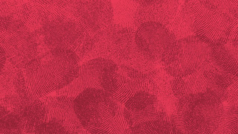
World-renowned animation studio Aardman has launched a new identity this week which celebrates its culture, value and people. Complete with a new website, logo, and fingerprint-studded aesthetic, it's a model example of how to create a brand for audiences and businesses alike.
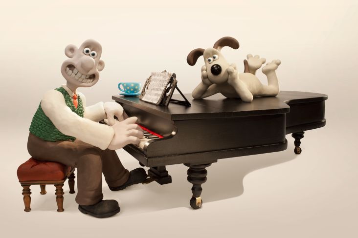
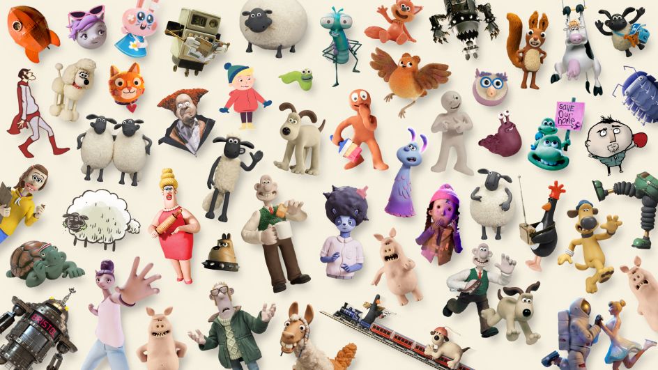
Bristol-based animation studio Aardman has been charming audiences for over 40 years thanks to its distinctive films such as Creature Comforts, Chicken Run, and of course Wallace and Gromit. Perhaps best known for sculpting beloved characters out of clay and painstakingly bringing them to life via stop motion, the multi-award-winning independent studio employs a legion of workers who toil away behind the scenes.
And while this workforce is never seen onscreen, their impact is felt and recognised in the recently-revealed rebrand for the animation studio, which was created in-house. As well as showcasing Aardman's amazing work and those who make it, the new look also celebrates the company's legacy, its future, and its working culture that nurtures creative excellence, including by supporting diverse and emerging animation talent.
The new visual identity comes at an exciting time for Aardman. The studio boasts a growing range of products, and it continues to occupy a unique and cherished place in the modern entertainment landscape with viewers. However, as Aardman director and graphic designer, Gavin Strange explains, a lot of change had taken place in the company since the last rebrand, so an upgrade was due. "The biggest shift being that we're now an EO (Employee Ownership) company," he tells Creative Boom.
"Couple that with the diverse slate of work - from stop-frame films to 3D video games and everything in-between - the branding needed an update to reflect all of that! There are more partners than ever at the company too, so the new look needed to be functional and flexible, giving people the scope to make nice looking branded things easily."
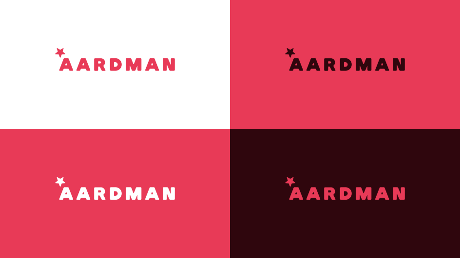
Part of that functional and flexible upgrade has seen the familiar Aardman logo get a softer refresh. Although rather than completely redesigning it from scratch, the new logo is an evolution of the version it replaces. "Our previous logo had a really big star which was quite hard to balance and always felt a bit off-axis," Gavin explains, "so all we've done here really is make the star work for us!"
It's a similar story with the new shade of red, which has now been brought into line with the rest of the branding to avoid confusion. "Now we have one shade, the 'Aardman Red' that works for all! Those tweaks aside, it was all about creating a new logo that looked strong and confident but also soft and warm.
"We're fortunate enough to be a global player in the world of entertainment… but are still a small group of people in the South West of England - so we wanted the logo to reflect both of those things, and that's where the softer red and rounded edges come into it."
Despite being created in-house, the brief still had its complications. Gavin explains that the new look had to reflect the company as it is today and show Aardman's culture, work, and the people behind it. He adds that it also had to: "celebrate the things we've made in the past and to excite people about the things we'll make in the future. To uphold the legacy of the creations that audiences know and love but at the same time showcase the breadth of mediums we work in.
"It had to be many things all at once, but that's why it was so exciting! The new branding also includes a new website, created by Bristol agency True, which had a defining principle of 'be a billboard, not a brochure'."
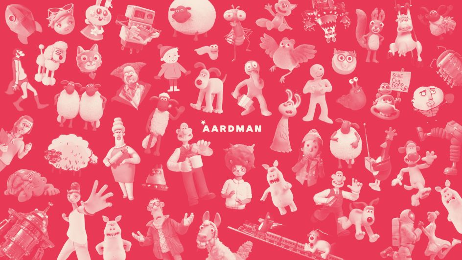
And considering this rebrand is coming from the visual geniuses at Aardman, it's no surprise to see this keen eye for visual flair realised in the updated look. Just take the fingerprint impressions which run through the branding as a clever nod to its clay animation roots. Although, as Gavin explains: "it reflects much more than the tactile craft of stop-frame clay animation, it reflects employee ownership and the people of Aardman as a whole.
"Early on in the design process, the thumbprints didn't feature, as we didn't want thumbprints to make people just think of fingerprints in clay because that's one of the things we do, but it isn't the only thing we do. After a while, though, it just felt wrong to not have it, and as soon as I started incorporating it into the designs, it just made sense and felt right.
"Changing the context of what the thumbprints represented was all it needed for us to fall in love with it. I'm very proud that they're there - it's a nod to Aardman's history and its future, its most-loved creations and the people that made it!"
Capping off the rebrand is the new colour palette. While the Aardman red brings all the various elements of the brand into line, it also opened up the possibilities of secondary and tertiary palettes to help the studio out when Gavin and co are making complicated diagrams or intricate slate slides.
"The secondary palette is my favourite; with olives and creams and pinks," says Gavin, "it's fun to mix them all up and use them next to each other. It can almost look like a tapestry. The Tertiary palette is to be used when you've run out of all the other colours. It's a backup plan for when things get complicated. Those blues and greens, though, are a nod to the colourful vistas of Bristol, the pastel-painted houses dotted along Bristol's Harbourside.
"Ultimately though, with all this branding, it should fall back when it needs to, to let the work itself be the focus. For all our colours and thumbprints and design rationale, it's about the creations that the fine folk here at Aardman have made. It's the branding job to serve that up and to pop it on a pedestal for all to see."
Editor's Picks


Trending


](https://www.creativeboom.com/upload/articles/90/908fdb6378db1e95d12595416f54e6336d5e80b8_732.jpg)
Podcasts


Editor's Picks
Further Reading