Circus school gets fired up by We Make's explosive new identity
Founded in 2004, Ell Circo D'ell Fuego had become a successful circus school, but its branding looked a little dated. Local studio We Make stepped in to craft a dynamic new visual identity for the studio.
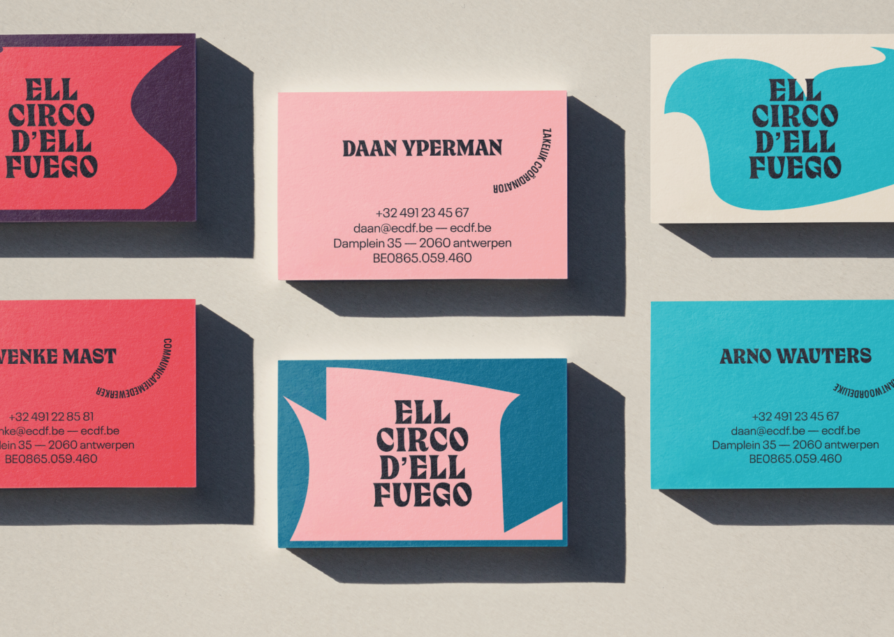
Based in Antwerp, Belgium, Ell Circo D'ell Fuego (which literally means 'The Fire Circus' in Spanish) is a circus school for children and teenagers. After 18 years in existence, they decided they needed a rebrand, and so approached We Make, a local design agency with 11 years in the game and a focus on branding and website projects.
"The starting point for the rebranding was to translate the dynamic – on the edge of explosive – approach and view of circus," explains We Make co-founder Johan Theeuwes.
"The new identity for Ell Circo D'ell Fuego needed to translate all content, sub-operations, projects, and courses within the organisation into one recognisable visual style. We also needed to balance an artistic and creative sensibility with accessibility to a diverse audience."
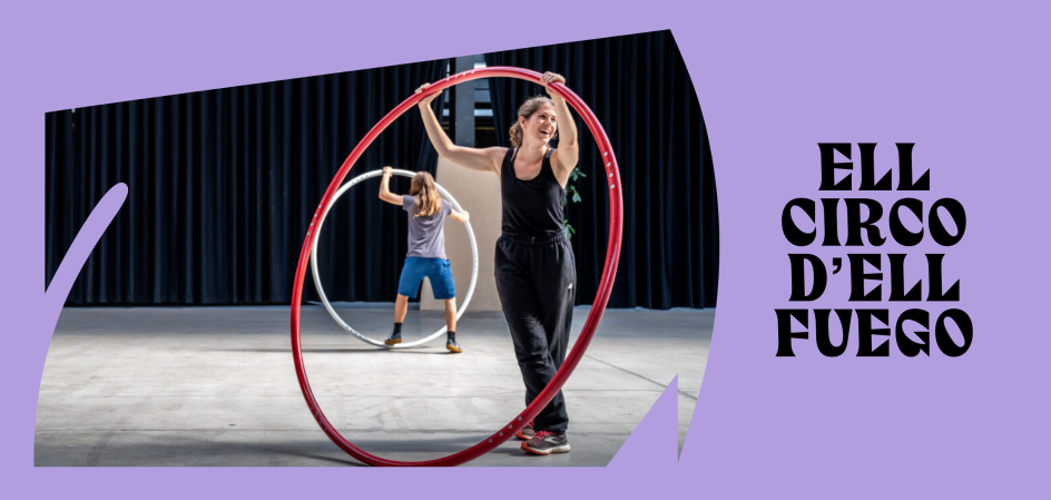
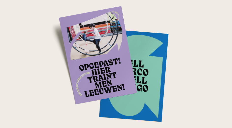
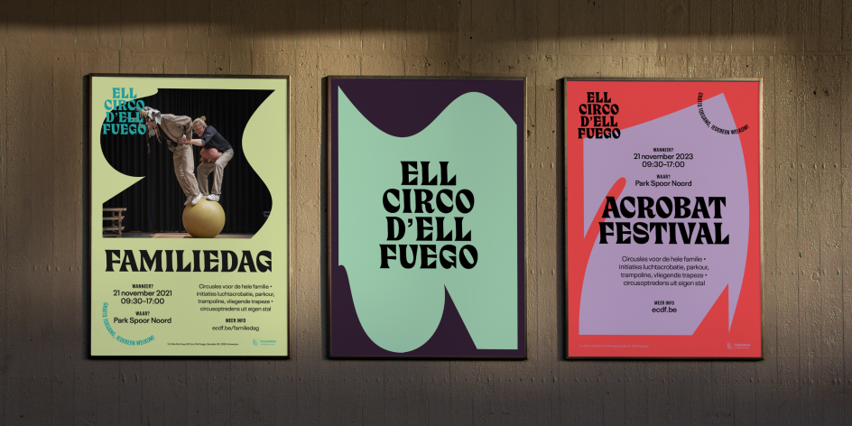
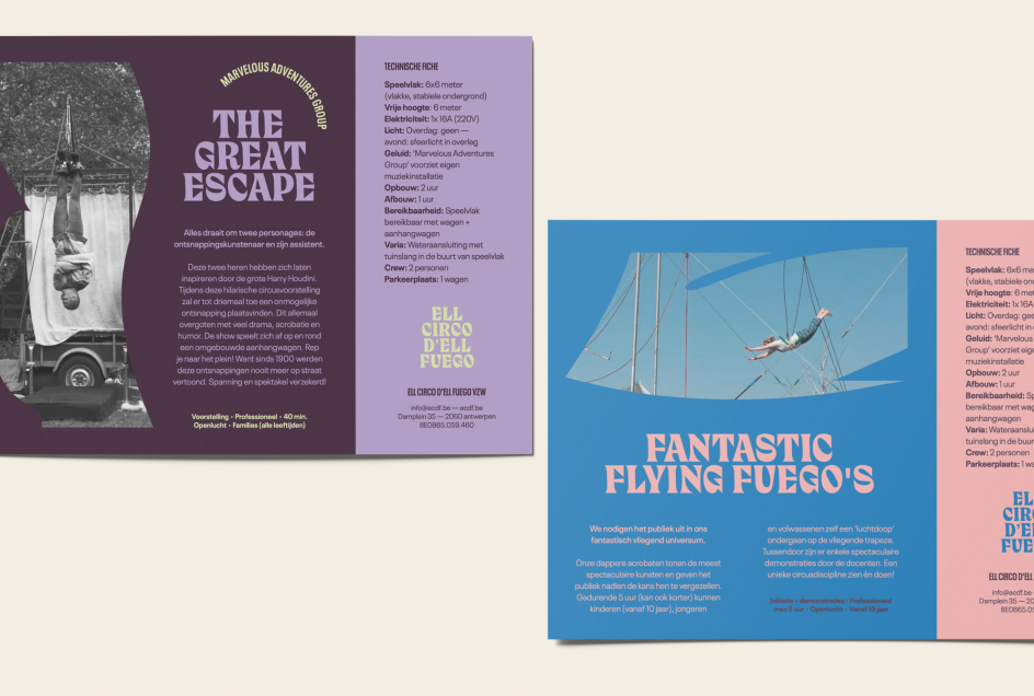
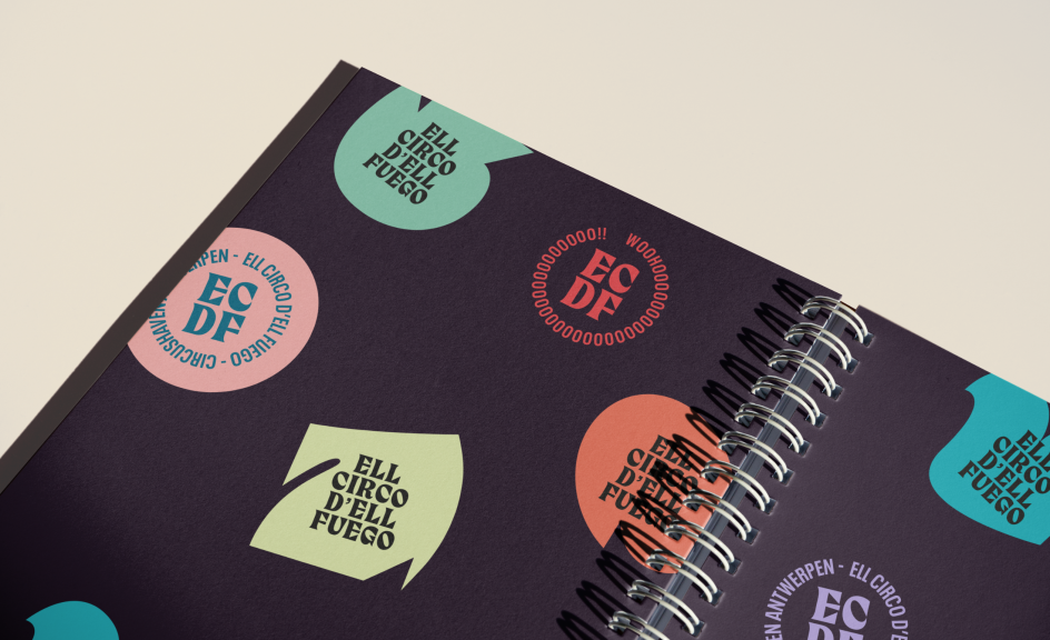
Based on the school's commitment to discovery, development and entrepreneurship, We Make envisioned a dynamic and anything-but-linear "graphic interplay of planes and lines", where sharp angles, rolling lines, whimsical patterns, and gentle curves would work together to form a distinctive and expressive character.
Sense of movement
There's a strong sense of movement throughout the designs, which is both apt for a circus school and no accident. "We wanted to link the intuitive play of shapes to all visual elements of the identity, such as typography, photography, page layout, grid system," explains Johan. "And we felt it was also very much worth translating into moving images in these times of online communication. Our aim was that the view would constantly 'feel' man, movement and man in motion throughout the corporate identity.
"Implementing photography into the visual concept added expression, dynamism, layering and created bold visual concepts that appeal to people," he adds. "To make the visual identity come across as sensory, we use multiple colour combinations within the defined concept."
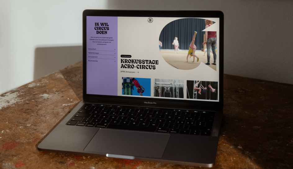
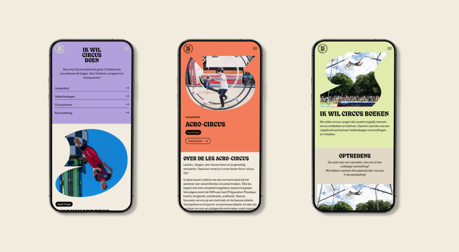
Another key element of the redesign was a new website, he adds. "The Ell Circo D'ell Fuego website had to become a unique platform where all audiences, from schools to parents, to professionals would easily find their way within ECDF's offerings and universe. The main pillars of 'Circus doing', 'Circus making' and 'Circus booking' were christened as the holy trinity of the website in consultation with ECDF's communication team."
All these layers to the new identity work together seamlessly, adding to a bold and eye-catching look that eschews cliches around circus life. Instead, it evokes a strong sense of the modern, the optimistic and the forward-thinking, ready to capture the imagination of a new generation of performers.
Editor's Picks


Trending


](https://www.creativeboom.com/upload/articles/90/908fdb6378db1e95d12595416f54e6336d5e80b8_732.jpg)
Podcasts


Editor's Picks
Further Reading