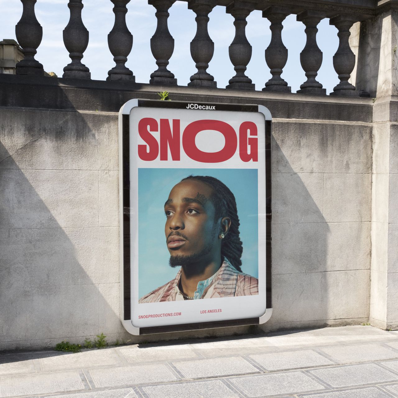
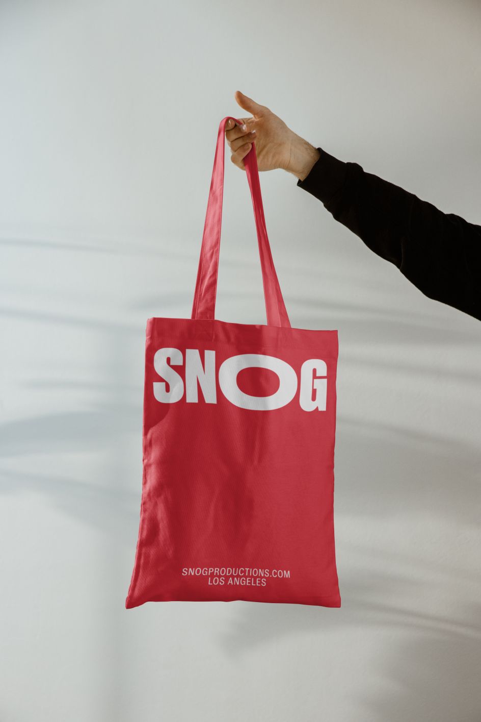
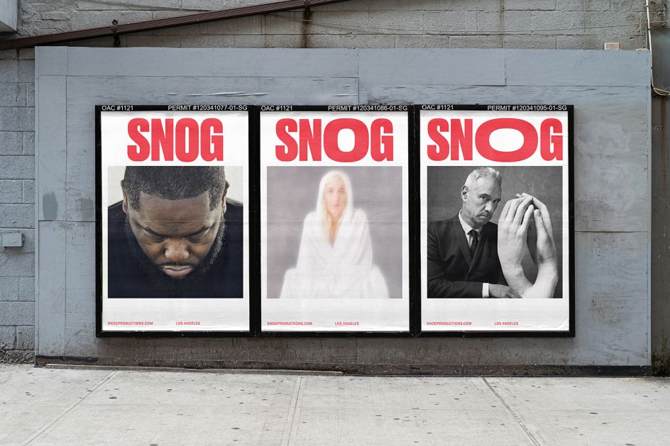
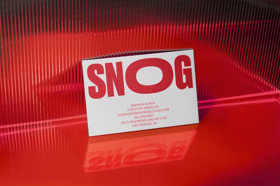
A LINE gives Snog a 'cheeky and passionate' new identity that plays on its name
In Britain, 'snog' is a slang term for 'kiss'. In Los Angeles, it's also the name for a woman-owned, full-service production company that's just enjoyed a brand refresh thanks to San Francisco and London studio, A LINE. The new identity plays on the brand's name with its logotype resembling kissable lips.
Established in 2008, Snog provides all aspects of photography, video, and commercial shoots, and is renowned for its drive for inclusivity, pushing for positive change in one of the most creative hubs in the world.
The brief to A LINE was clear: having worked with some of the world's most successful brands, artists and publishers, including Vogue, Givenchy, GQ, Bose, Ariana Grande, Marvel, and American Express, Snog wanted to create a brand that "showcased its incredible work while capturing the passion and meticulous detail that goes into every project".
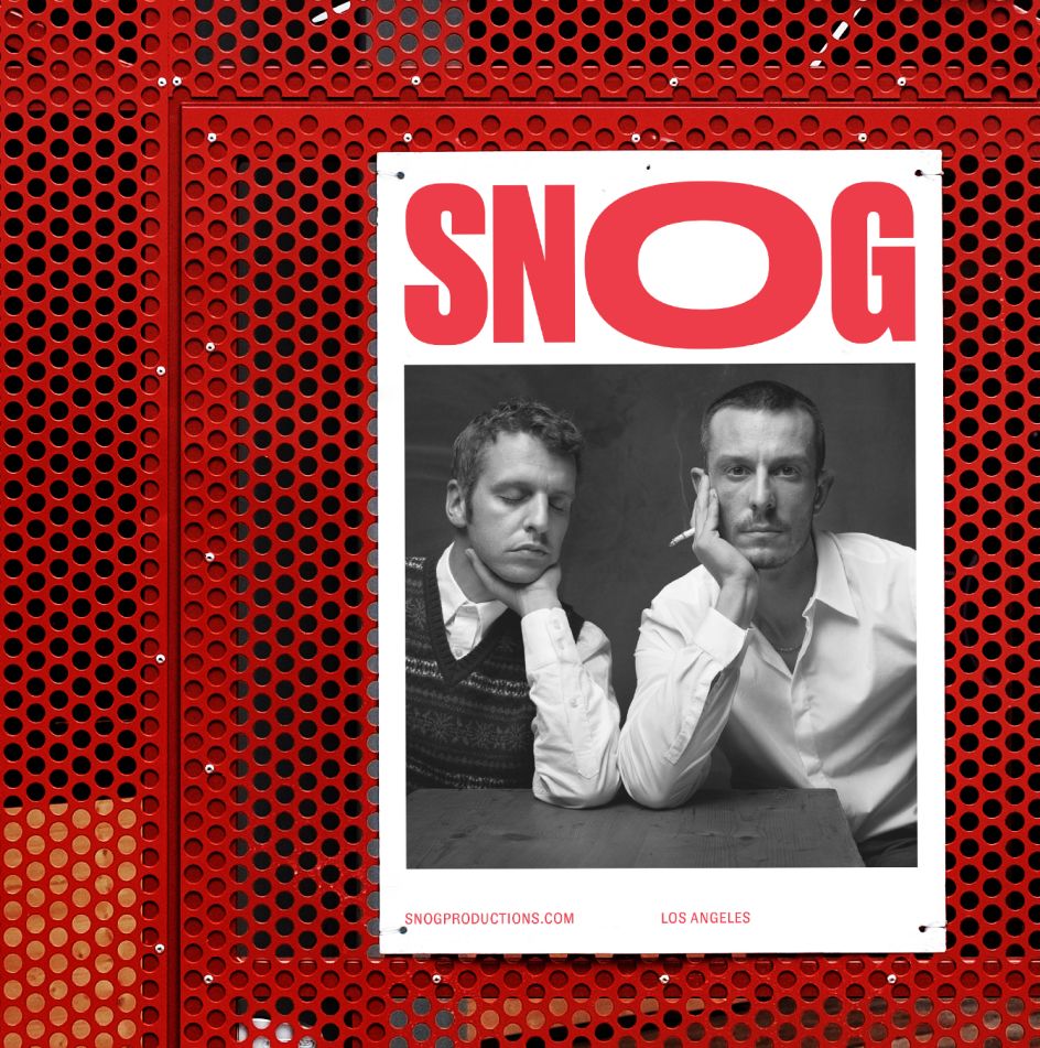
A LINE naturally gravitated towards the brand's name as inspiration, creating a logotype that symbolises a "cheeky, passionate snog". The studio used animation to bring this concept to life, making a playfully approachable logo that represents the character of the business while also clarifying the name for the mainly US audience.
"We kept the colour palette simple and intentional, using a vibrant red to dial up the sense of passion and to emphasise the 'O' from the logotype as lips," explains James Trump, creative director and brand strategist at A LINE.
In terms of typography, Druk and GT Zirkon were chosen as the primary and secondary typefaces, "creating a powerful duo that captures attention without distracting from the stunning photography," adds James. "GT Zirkon is functional with a perfect balance of personality and refinement. Druk is used for project titles where it frames the image while really holding its own."
A LINE was also behind the new website design. "We wanted to showcase the depth and breadth of the work while keeping it simple and impactful," says James. "Homepage imagery reacts to the position of the pointer with a continuous scroll through an amazing back catalogue of projects. On project pages, we stacked images and videos with an endless scroll that feels playful and exploratory. To emphasise personality, we added graphic elements such as an oversized X to exit out of a project, and unique rollover states."
Editor's Picks


Trending


Podcasts


Editor's Picks
Further Reading