SWC's Louise Sloper on the typography trick that most designers get backwards
The executive creative director of SWC and TypoCircle chair shares hard-won lessons from the Bacardi Untameable campaign… including when you should bin the grid.
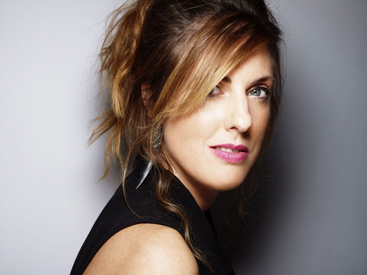
Louise Sloper. Portrait by Rankin
Most designers, if they're honest, treat typography as the bit that happens after the interesting decisions have been made. The photography gets art-directed, the concept gets refined, the layout takes shape… and then the type gets "bashed on", as Louise Sloper puts it; like a garnish on a plate that's already been plated.
Louise reckons this is entirely backwards. "Typography is such a key part of my approach to art direction," she says. "Words have the power, and to me typography is their body language."
It's a conviction she's earned over 25 years in the industry, working as head of art and design director at several London advertising agencies before founding her own purpose-led studio, Here We Go, and more recently taking up the role of executive creative director at the SWC Partnership. She's also chair of TypoCircle, the not-for-profit creative organisation now celebrating its 50th year of championing typographic craft.
In a recent talk to The Studio, our own private network, Louise took a deep dive into the Bacardi Untameable campaign, a global brand reset she worked on at BETC London that turned the rum brand from a sugary party drink into something with genuine heritage and soul.
It was all of that. But threaded through the Bacardi story were a series of practical lessons about typography, process and creative bravery that any designer could steal tomorrow morning.
Build the grid later
Perhaps the most provocative takeaway is Louise's cheerful rejection of the grid system as a starting point. "All the lecturers kill me because I'm not actually a big fan of grid systems," she admits, clearly relishing the heresy. "The grid system in my mind can constrain your typographic play."
Her alternative? Design instinctively first, then reverse-engineer the structure. "Break from the grid to begin with and just see if that frees you up," as she puts it. "Then if you do need to iterate on it or hand it to other designers to understand, build the grid around your instinct."
It's an approach that rewards speed over deliberation. Louise described her own process as relentless, rapid iteration. "Usually, within sort of half an hour, I'll end up with 40 or 50 layouts, just because I've tweaked, tweaked. I just copy, tweak, copy, tweak and go through it that way." She even recommended setting a timer: ten minutes, see what happens before the alarm goes off. "Overthinking it sometimes causes us trouble."
Kill your darlings (all 2,000)
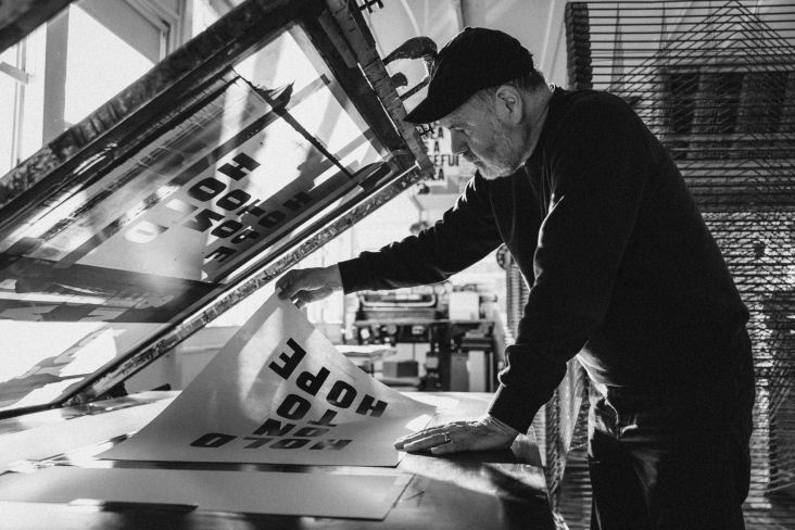
That instinct for volume certainly served the Bacardi project. Louise estimated her team produced around 2,000 visual iterations for the campaign: enough to fill a five-minute GIF, flashing through at a split second per frame. The explorations were wild and varied: layered screen printing in black, red and gold; photocopied distortions; text cropped so aggressively you could barely read it; halftone experiments with portraits of the Bacardi family; even a version where the bat escaped from the logo's circle entirely. "If we're really genuinely talking about untameability, we don't really want the bat confined," she reasons.
One approach got particularly far down the line: a bespoke typeface screen-printed with gold ink that captured the raw, protest-poster energy the team was chasing. The client loved it. Louise still has a print on her wall.
But then reality intervened. The campaign needed to work globally, across dozens of markets and languages, including German, where compound words can run to absurd lengths. "The production houses were tearing their hair out," Louise recalled. "They were like, how can we set this?" The lesson? Fall in love with the process, not the output. "Sometimes you have to do the stuff to fail. It's important not to be scared of failure and just to try loads of different ways out."
Cover up the pretty picture
The solution the team landed on was, in its own way, even braver than the gold-ink typeface. Having commissioned The Wade Brothers to shoot extraordinary, in-camera photography across Panama and Mexico (hundreds of extras, flamethrowers, absolutely no CGI), they then made the typographic decision to cover most of it up.
The launch posters led with enormous capital letters spelling UNTAMEABLE, slightly imperfect in shape, deliberately dominating the frame. The expensive, beautiful photography became a backdrop. "We had to fight for that," Louise said. "We had to really fight to convince the client to cover up all this amazing imagery with type."
It worked because the type wasn't decoration; it was the message. The campaign was resetting Bacardi's entire global identity around one word, and that word needed to hit you before anything else.
"When you have a solid art directional foundational base, everything else is easy from that point," Louise points out. "It's always worth taking the time to get that foundation first."
The comfort zone problem
Asked where designers most commonly go wrong with typography, Louise identifies a familiar default setting. "Black and white, Swiss, Helvetica type, and we default directly to that." There's nothing wrong with this per se, she stressed, but when it's your automatic response to every brief, you've stopped thinking. "That's where we're going wrong. We're not actually being brave to try new things out."
The flipside is equally common. As she puts it: "We give all the love to the photography or maybe the idea, and actually the typography is the afterthought." Her suggestion: flip the hierarchy entirely. "You could start thinking about the typography first before you even do the image, because it's just as important to the story."
Build your references
One thread runs through everything Louise discusses: the importance of having a deep, wide-ranging well of visual references to draw from. When her agency pitched for Campari, she immediately thought of the Italian futurist Fortunato Depero, who'd created bold typographic work for the brand decades earlier. A campaign for Rowse Honey sent her back to Hans Christian Andersen fairytale covers, with their drop shadows and engraved lettering. The Bacardi work drew on Cuban protest posters, Art Deco signage, and the brand's own dusty archives.
"You don't know where those inspirations are ever going to come from," she says. "Having that back catalogue and being curious about as much as possible is really important." It's advice that sounds simple but requires genuine discipline; the sustained, daily habit of looking at work from outside your own discipline, era and comfort zone, and filing it away for the brief you haven't received yet.
Go back to the brief
For all her passion for typographic experimentation, Louise is equally emphatic about what keeps it grounded: the brief. She shares the cautionary tale of a young designer who spent an entire week producing beautiful posters that had nothing to do with the request. "It absolutely broke our hearts, but we had to say: 'What's that got to do with the brief? You're going to have to start again.'"
At the same time, Louise recognises where the youngster was coming from. "We do get seduced," she admits. "The thing is just regular check-ins with what you're being asked to do. And asking other people. Just communicate."
And in a way, that's a fitting summary of Louise's whole approach. Be bold, be playful, be willing to produce 2,000 versions and throw 1,999 away… but never lose sight of what the work is actually for.
Further Information
Want more? We run free Studio Sessions in The Studio twice a month. And so far this year, we've welcomed Véronica Fuerte of Hey Studio, and artist Anthony Burrill. There are loads more brilliant talks coming up. Not yet a member? You're missing out! It's free to join. Sign up below.

Editor's Picks

Trending


Podcasts


Editor's Picks
Further Reading