Sarah Hyndman on type psychology, why fonts are emotional and finding your perfect 'type'
It apparently takes just one-tenth of a second for us to form a first impression when we meet someone. We base this on a wide range of unspoken characteristics that greatly influence the way we respond to that person.
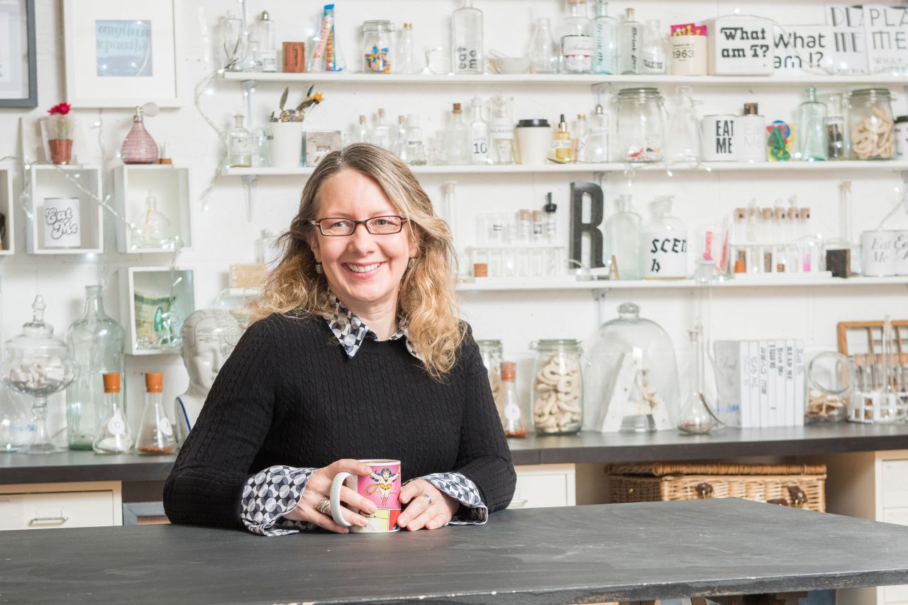
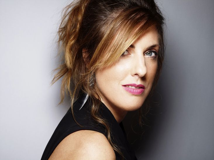
Photography by Ivan Jones
Funnily enough, we do exactly the same thing when we read; we instinctively look for visual clues in the fonts/typefaces, which influence the way we respond to the words. We readily translate visual qualities of type into physical experiences. For example, large, bold letterforms that use lots of ink 'sound' loud, or italic letters appear to be faster, as if they are running. We also know instinctively that angular shapes feel sharp and aggressive, while rounded shapes feel soft and friendly.
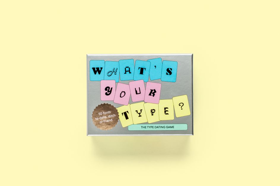
Enter Sarah Hyndman and her latest project, What's Your Type?: The Type Dating Game, which allows you to go on a 'blind date' with different fonts and learn more about type personalities as you go.
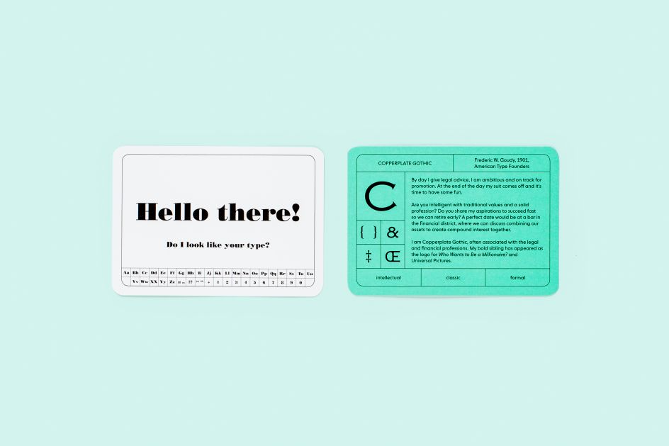
If Times New Roman was a person, would you date them? What character traits would you attribute to Comic Sans? The fifty cards in the game feature different fonts to choose from: make your selection, then turn over to find out what the type you’re attracted to says about the type of character you are. We spoke to Sarah about this and much more.
Tell us more about your own journey so far
At school, I studied sciences, but my very first job was as a signmaker and screen printer, and I really loved doing such a hands-on job. A few years later I became a self-taught graphic designer, worked my way up in industry before running a design business for a decade. In 2013 I reached a point where I needed to take some time out to reassess what I was doing and to fall back in love with my work again.
I had really started to enjoy type when I taught an Experimental Typography course at the London College of Communication (University of the Arts) after studying an MA there in Typo/Graphic Design. I found the expressive nature of letterforms, and how so much could be said by combining nuances and by breaking the rules, exciting.
We love the idea of the Type Tasting studio. Why did you come up with this idea?
The idea of Type Tasting is based on the concept of wine tastings. It’s an approach to teaching typography in a fun and social setting, which is designed to be just as exciting for non-designers.
It has always puzzled me that typography is considered to be such a ‘niche’ subject when we are surrounded by, and interact with, letterforms almost constantly in our modern lives. I create environments and events designed to democratise typography by making it engaging for all. I guess the idea behind Type Tasting is to bring typography to people who wouldn’t previously have known they would be interested.
What has been the feedback so far?
I started to create experiments when I realised that very little research had been published in the area of psychology and typography. There were lots of questions I wanted answers to and so the only way to find out was to do the experiments myself.
To get enough people to take part I create mass-participation events and I make the experiments really intriguing to look at and fun to take part in. This way I gather all the data I need, but I also engage lots of people in really interesting conversations about typography. I do most events outside the design world and quite often people will look at me with an expression of “get me out of here” when I say the word “fonts”, but everybody quickly discovers that they have really clear opinions about, for example, what Comic Sans would taste like or whether they’d snog/marry/avoid Times New Roman. It’s just a case of changing the language and talking about typography in an inclusive way.
All of the experiments are self-funded, which means I can investigate anything I think might be useful, and I have no commercial agenda. The ultimate goal is to publish a beautifully designed book, or series of books, with all of the results for everybody to use. I’m currently applying for funding to make this happen.
Through your own research, you’ve discovered that written language isn’t just seen, it’s also felt, heard, smelt. How is that?
Having started to ask people what different typefaces might taste like, I quickly discovered that there’s actually a whole science to this—crossmodalism—which, once I started reading the research, I realised: ‘Ah, maybe I could look at typefaces and see how they actually influence your other senses.’
The term ‘crossmodal’ literally means that when you experience something with one of your senses it effects one or more of your other senses. In fact, your brain just takes in all of the sensory information and mixes it up together so of course, the senses overlap.
Most people will agree instinctively that more ink on a page (or bigger, upper case letters) sounds louder. Comic Sans would feel like jelly, jagged shapes look sharp, and interestingly jagged shapes will also make you more aware of bitter or sour flavours. Curvaceous, melt-in-the-mouth lettering suggests drizzling chocolate or melting cheese. And when I ask people to pair smells with typefaces there are really clear patterns to their answers, which has been a really interesting discovery.
Early on I was introduced to Professor Charles Spence from the Crossmodal Research Lab at Oxford Uni, the scientist who works with Heston, and we’ve now co-published a couple of studies together.
Can you talk us through an example of how a font might influence our choices?
It’s not a conspiracy theory; typefaces communicate nonverbal information just like clothes, your tone of voice or the soundtrack in a movie. We can choose to pay attention to this at any time, but generally, we look past the type to the experience it describes. We seldom consider the assumptions we have formed or the choices we have made based on the look of the words.
A typeface can make something look more appealing and you’re more likely to buy it; think of a beautiful wine or gin label. A typeface can reposition chocolate to look like a more premium brand; science shows that if you think something is more expensive you will enjoy it more. But a typeface can’t make cheap chocolate taste expensive, in fact, you will be so disappointed it will taste even cheaper.
We are finding that certain typeface shapes will make you more aware of particular flavours; for example, something might taste sweeter if you look at curvaceous lettering. This is exciting and we’re exploring whether we could add ‘typographic seasoning’ to add sweetness through the imagination while reducing the actual amount of sugar.
Fonts can manipulate us in that regard. Do they have the power to make us gamble, for example?
Fonts can’t manipulate you. You might learn to link particular typefaces with certain activities or associations, so when you see that typeface it reminds you of that activity. For example, when I see Cooper Black in a font menu I always think of holidays because it’s the typeface used by easyJet.
Do fonts have the power to tackle things like obesity?
As well as experimenting with the idea of ‘typographic seasoning’, I’m also exploring the language used on food packaging for different products. ‘Naughty’ or indulgent products often feature delicious-looking lettering that evokes, for example, the melt-in-the-mouth experience of the product. By contrast, healthier or unprocessed options often use more neutral typefaces and practical language. I think this provides clues to using more enticing typography and language to make the healthier choices more appealing.
You’ve just released What’s Your Type?: The Type Dating Game. How did that come about?
I’ve been finding ways to make typography exciting and fun for a mainstream audience for a few years. This has meant finding different ways to describe typefaces because the terminology used in the design world doesn’t describe how a typeface makes you feel, or remember, or what it might sound like.
I’ve always had the most enthusiastic responses when I play ‘snog marry avoid’ with fonts. I play variations of this at live events: one year I created a version of ‘font Tinder’ at the V&A for the London Design Festival and realised that the Sunday afternoon was a prime first date setting and have always wondered whether we helped (or hindered) any fledgeling romances that weekend. I also took the Glug Birmingham audience by surprise when I showed them all how dateable they were from the typeface they’d chosen earlier.
The rather brilliant folk at Laurence King suggested we turn it into a card game and I thought it was a great idea and a fun challenge for me to write.
Do you have a favourite type? And what does that say about you?
My favourite typeface varies according to what mood I’m in and what I want to communicate, just like my clothes. Franklin Gothic is my everyday go-to typeface, like my jeans, because it’s a neutral and versatile style that mixes with most things but its back-story reminds me not to take myself too seriously. My current crush is Benguiat Caslon by House Industries with all its delicious ligatures. It’s rather a show-off style so it would only be for very special occasions.
Are there any types that you don’t like... which suggest negative personality traits?
What a typeface conveys is all about the context. Apart from just badly designed fonts, I don’t think there are any that suggest negative personality traits—unless they’re in the wrong time or place and they just feel inauthentic or inappropriate. There are the ‘big five’ that designers love to hate, but these fonts exist because somebody uses and appreciates them. I think we have to remember that fonts aren’t just used by graphic designers any more.
Which fonts were you seeing a lot of in 2018? Which ones did you like or dislike, and why?
I’ve enjoyed seeing all the angles, from the subtle Berthold Wolpe flares to the triangular serifs of faces like Noe Display or the face on the Drake album cover which came straight out of a type sampler from the 1870s. I remember reading when The Guardian redesigned to their new angular-serifed logo that this reflected the world having more of an edge to it.
Can you reveal the fonts you think will be most popular in 2019?
I think there is a global/local thing happening in typography, which we will see more of in 2019. The global superbrands seem to be adopting neutral sans serif styles, from tech companies (in lower case, geometric “trust me” styles) to fashion brands (in bold and upper case “look at me” styles). It’s as if they’re trying to be all things to all people, confident that their brand is well enough known that they can transcend the need for a distinctive logo.
On a local level, I think there are really exciting things happening with type; for example in the craft gin or the bean-to-bar chocolate sectors. Here typography is used to tell the story of the brand; its provenance, its values, how it’s made, to evoke a memory or share its values. This trend that is not about a particular typeface, instead it’s about using type as a storytelling device.
I am also looking forward to seeing what happens as typography becomes more democratised. For example fonts as fashion trends that appear and vanish on Instagram, and emoji technology that lets everybody use custom fonts in their running Twitter or Instagram feeds.
Sarah Hyndman’s new game, What’s Your Type?: The Type Dating Game is now available at laurenceking.com, RRP £15.99.
Editor's Picks


Trending

](https://www.creativeboom.com/upload/articles/90/908fdb6378db1e95d12595416f54e6336d5e80b8_732.jpg)

Podcasts


Editor's Picks
Further Reading