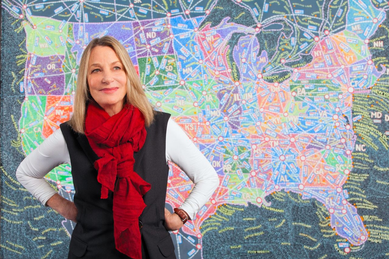
Paula Scher on falling in love with typography, timeless identities and what it takes to become a great designer
If you visit the Museum of Modern Art in New York, pop into a Citibank branch, use Microsoft Windows 8 or walk past Tiffany & Co., then you're looking at the work of Paula Scher.
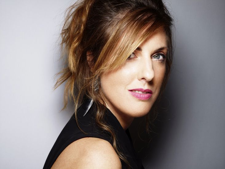
Paula Scher. Image credit: Ian Roberts
One of the most influential designers of all time, Scher's "instantly familiar" yet iconic style is something we all see regularly: in the street, on supermarket shelves, and while browsing the web.
A partner at Pentagram since 1991, she began her career as an art director in the 1970s and '80s, when she earned a reputation for her eclectic approach to typography. Since then, she has worked with a whole host of clients – Bloomberg, Coca-Cola, the High Line – crafting identity and branding systems, promotional materials, environmental graphics, packaging and publication designs.
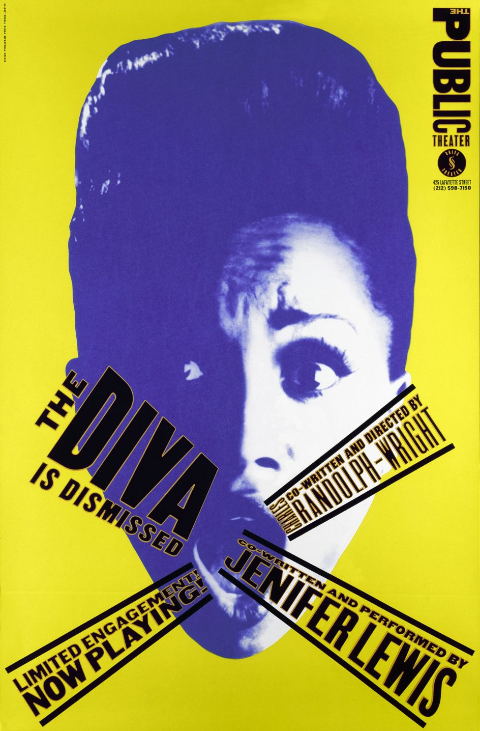
An upcoming exhibition at the Manchester School of Art this November will showcase her poster designs for The Public Theater, an institution she famously rebranded back in the mid-1990s and has been working with ever since.
As one of the lead speakers at this year's Design Manchester conference, we took the opportunity to chat with Paula about her career so far.
Was it an easy path to where you are now?
Well, I had some luck [Laughs]. There's no question about it. I went to art school because I wanted to be an artist. Back then, I didn't know what a graphic designer was. When I started working, they didn't call it graphic design, they called it commercial art.
I was born in Washington, DC and went to school in Philadelphia, then moved to New York in 1970 with a portfolio and sixty dollars to look for a job. I would not advise anybody in the world to do that now [Laughs]. It would be impossible. But I did it. It was easy to get a job in those days because it was a wide-open profession.
And I had a couple of little jobs. I worked for Random House for a while, designing the inside of children's books. Then I got a role in the promotional department of CBS Records (now Colombia Records) where I designed ads. The art director at Atlantic Records saw my ads and liked them, so he hired me to create both ads and record covers. Then CBS hired me back a year later, making me art director for the East Coast where I made 150 covers a year.
I started that route at aged 22, and I had that big job at 25.

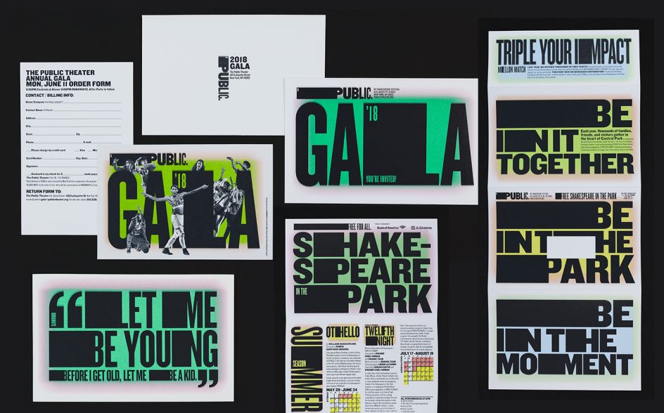
The Public Theater
So when did you fall in love with typography?
Well, that began in art school, but I never felt it was my strong suit. What happened to me was that I originally wanted to be an illustrator but discovered I couldn't draw very well. And I was inhibited by typography because of the technology at the time. Mostly you were making these things with press type. And the only press type that seemed to be available was Helvetica or something like that. And I just thought that type had no personality. And I didn't want to work with it. When I used it, it was messy because I wasn't good at rubbing it down and things wouldn't line up, so it would crackle.
I had this fantastic teacher called Stanislaw Zagorski, a Polish illustrator who said to me, "Illustrate with type!" And when he said those three words, I realised type had spirit and could be differentiated depending on how it was drawn and that when you attached it to words, it gave them various meanings based on what you were looking at. That's where it began.
So when I was an art director at CBS, I began designing album covers, and I would hire illustrators to make images or photographers to take pictures, and I would do the typography on top of it. I would make the typography relate specifically to what that art was. As I began doing this work, the typography became more important to me than the image because the type was the image. Ultimately, the typography took over.
With all the technology there is now, do you think design has to be something you can see and touch in the physical world to create that strong emotional connection?
That's an interesting question. I don't think it's so much about seeing and touching it, as much as how much it repeats. The thing about physical objects in the real world, if you made an album cover, everyone had the album cover – and would look at it while listening to the music. These things made fierce impressions on people in a way that I think is much more difficult to obtain now. Sometimes it happens with a book or an object.
The question is, how much does the digital landscape allow for this? Is there so much there that nothing makes that kind of deep impression? Unless there's a specific website that you follow purely because you like the graphics. Most of the things that I read online – and this might be because of my age – were at first in print and are more established.
The Public Theater
Do you think technology has been good for the design industry overall?
Oh yes. No question. Because there's more that's needed, more that's demanded. There's just more. You're talking about two different things like whether technology matters or whether it makes an indelible presentation.
I'm working right now for a huge software company. Their digital presence, I guess, is recognisable but very often people who use their products don't even know what the company looks like, which I find very strange. I can't tell you more without revealing the brand, so I'll stop there.
Apple you recognise mostly because of its packaging, products and advertising. That's not necessarily purely digital work.
Is it true that technology drove you back to art so that you could make real things again?
I like making things that you can touch and feel, but I also love working in the digital landscape. I love animating as well. My whole day is a complete digital experience. But I do like it when things can last as objects.
How do you ensure your identities stand the test of time? And is that even possible?
Well, it's the goal. I think this is an important discussion. Not just for me but for all designers whose jobs are to create identities and for clients who want to purchase them.
You can not determine the ROI from an identity. It's not possible because you have to gauge it over 20 years. If you make promotions, you can tell right away whether they succeed or fail, as there's an immediate response. Like you go to see a play or buy a pair of shoes because you saw that ad.
But identity is a different thing. It has to resonate, and it has to represent something. What happens to it from the point of its formalistic achievement to being in the real world is that along the way it becomes associated with the product or service it represents. And therefore, it becomes imbued with meaning that can make something instantly recognisable.
For example, if you look formalistically at the old Nike logo when it had the word 'Nike' in it, it was quite terrible. It was over-designed. Nike was in silly typography. And little by little, as the name disappeared from the logo and the swoosh – which looked like a checkmark in those days – became refined over 20 years, coupled with fantastic advertising and a partnership with Wieden+Kennedy, coupled with products that emerged as cool – the whole brand changed. You can't even look at the Nike swoosh and imagine that it might not be a great form because it's become so iconic. That was years of work.
You can do the same thing looking at the old Apple logo. The first version was terrible. The second logo looked like a bad rip-off of Apple Records. And then it became associated with product. If you look at the original packaging design, it was quite awful. It really didn't get any better until the end of the 1980s and early '90s.
If people want to name identities that they think are terrific. It takes absolutely years to establish that.
The Public Theater
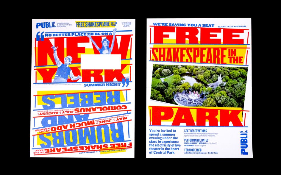
Shakespeare in the Park
Exactly. You've worked for many years on The Public Theater, and that has evolved, too?
That's a 25-year partnership, yes. I've just written a book about it, sharing my journey on the identity and my experimentations and failures with it at different points of time, not understanding what it was supposed to do.
I think that most of us designers make these ambitious claims about how terrific our new identities are going to be, but they're like dresses – they have to be taken in and taken out, let down and pulled up or they're going to be out of fashion.
Sometimes, they have to withstand all kinds of things. Think about poor Chipotle and food poisoning. I mean, how good is that logo now?
You start to think of the things that the identity inherits that is of no fault of the designer.
Would you say The Public Theater is your best work?
I'm really proud of it as a body of work. I don't know if it's my best work. I think it's something that's very associated with me that I love doing and that's an identity system that was designed for that place. But most of my work doesn't look like that.
I mean, there's a lot of it. Plus it's shown on big wall space. [Laughs] It's perfect for me.
You're known for being obsessed with typography. Would you say great design comes from obsession?
I think anything great comes from obsession. My obsession became a basis for visual language and the way I solve problems. Sometimes it's effortless, sometimes complicated. Sometimes with lots of emotion, other times it's neutral, but it can express a certain feeling. And that it's dictated by all kinds of things related to that project that makes it come to be.
It might be that it's representing the architecture of a building, a restaurant or the whole spirit of a large, not-for-profit organisation or a bank – they're all different things that become expressed, but they're related by something that exists externally from the design.
I loved your work with the High Line. Can you talk us through it?
That's a case where the logo and all things related to it came from who they were and what they were doing. They came to me before they really were a park. They were trying to be known as a park and wanted people to give money to it.
The logo is a very instinctive, simple idea using 'H' for Highline and representing a railroad track. It was easy to do – to find a symbol. The typography, which became trendy, was a flat serif font called Rockwell that was actually used in the British railway system.
If you're going to design a logo for a railroad that was going to be turned into a park, it should have railroad type in it, so that's what we did.
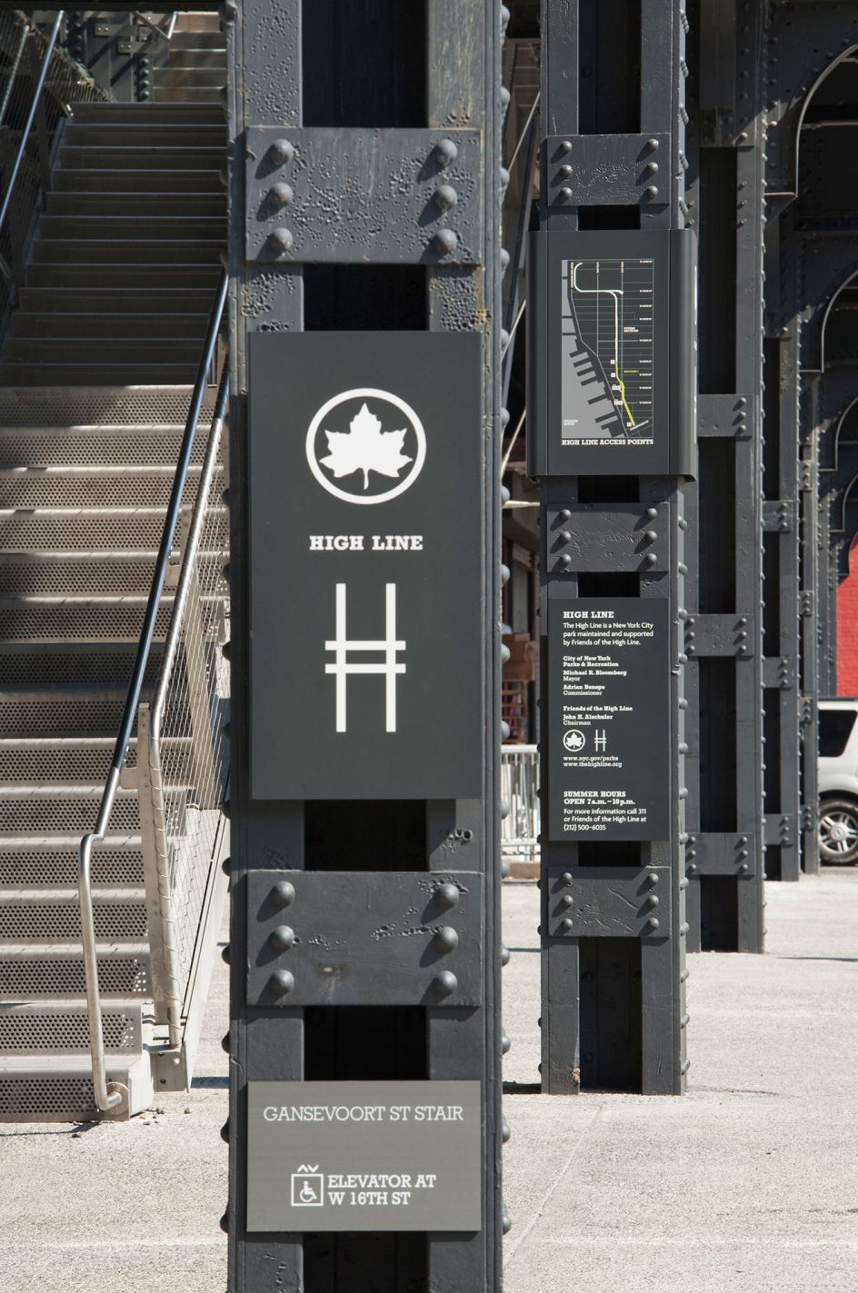
The High Line
Is the biggest challenge of your work, convincing people to go ahead with your idea?
Absolutely! That's everyone's biggest challenge.
I just assumed it would be easier for you because you could walk in and say, this is going to work, and people would listen, as you've got such an excellent reputation.
No, that's not true. [Laughs] No, it's still a lot of work. Sometimes people will call you up and say, "Gee, I really want to work with you because your work is so beautiful, we've seen it everywhere, and we know how great you are as a designer". And they are the worst clients in the world. [Laughs]
People say it changes, but it never does. But you know what, nor should it because the designer's job is to show a client their vision. There are things that they want to express, and they're right to want to express those things. They know their business. And sometimes they don't see or understand why the things you've designed might do so well.
You need to be able to make the appropriate analogies and talk in the right kind of language to help them see.
Ultimately, that's the job of a designer, isn't it!
Absolutely. If you can't do that, you can't design. Or let me put it this way: you can design, but you won't get anything made.
Do you ever get worried that you won't live up to your reputation?
Oh, all the time! [Laughs] Nowhere to go but down, come on!
[Laughs] Do you put yourself out of your comfort zone then?
I have two different types of projects that I take on. Some have a lot of influence and pay good money. I also try and do things that are perhaps on a smaller scale but allow me a lot more creative freedom. I balance the two.
If you only work on large-scale projects, you very often don't get to create the kind of work you want to achieve. Nor do you learn very much because you're doing something that might not break much ground because of the politics and nature of the project. Whereas the smaller stuff might break a lot of ground, but the problem with that is not many people get to see it, as it doesn't have the same visibility.
You balance your life with this if you enjoy working. That's what I try and do.
Do you ever take a break from work?
No! [Laughs] What do I have to do, pretend I have a life? A work/life balance? I mean, who invented this anyway? I think that's silly.
If you love your work and your work is life, then you don't need to take a break?
I mean, if I didn't like it, I wouldn't do it! [Laughs] I also paint. I have three lives, really. Because I have my graphic design work, my three-dimensional environmental graphics and signage work, and my paintings. I have shows, make exhibits, I do it all. I'm really happy to do it. I'm better at that than my personal relationships.
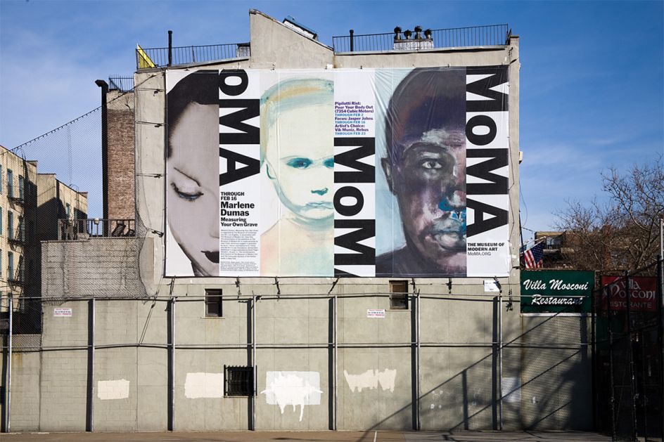
Museum of Modern Art
Looking at your giant map artworks, how do you choose the places you feature?
I create them in groups. They're entirely different from graphic design. They take a really long time. The first set of paintings were based on continents. And then it was cities and roadways. Later on, it was data from the United States. Now I'm doing weather and hurricanes.
Hurricanes? In terms of what they're called?
Yeah, but I'm not quite that specific. You have to know where the hurricanes come from and what they come across, so I paint landmasses and this kind of swilling motion. I painted the Caribbean with the path of the Maria hurricane, from Puerto Rico up to Florida and Texas. I'm working on one now that focuses purely on Florida.
What is about maps that you find so satisfying? Is it about helping to make sense of the world?
I guess so. My father was an inventor and what was known as a photogrammetric engineer, which has to do with the camera and light. When he began his career, he worked for the Tennessee Vallery Authority, which was laying electrical lines for power in the region during the Depression.
He found that the maps were all inaccurate because all the aerial photography maps did not correct the curvature of the Earth when you blew up the images. So you'd be digging in one place, but it wasn't the right spot.
So he had this idea to try and correct the lens distortion. And he invented this measuring device, which as a kid looked like a piece of cardboard with holes cut in it. But it corrected the distortion of the curvature of the Earth. He sold it to the Government for very little money, and there'd be no Google Maps without it. That's something he created.
He then got promoted and worked for the US Geological Survey, where he made all these government maps. They were really beautiful and all over our home. We were always talking about them, and I remember as a kid, I felt that distortion was a form of lying; not putting out the correct information.
Then, as a designer, I realised that a newspaper is fixed because the copy has to fill a certain space. So I started to think about this notion of the control of information. My paintings were sort of a take on that – an abstract expression of controlled information.
Moving on, do you ever get sick of being called "the best female designer"? Why can't you just be called "the best designer"?
I would like that! [Laughs]
You started your career in the 1970s. Was it quite different back then?
Yes, it was quite something. It was a different time. Yet, on the other hand, I think I defied expectations, so that helped me with my reputation.
"Even though she is..." [Laughs] "In spite of the fact..."
[Laughs] I've taken up a lot of your time already. May I finish by asking you what advice you'd give to those who wish to follow in your footsteps? Aside from the pain, mistakes and lessons they have to go through themselves?
I would say make the things that you want to make. Find a way to get them made. If you don't do that, you'll be very frustrated. Usually, that means doing something for free or for less money to ensure that it gets made.
Also, in the early parts of their careers, they shouldn't worry about the money. They should worry about that later because what you make is who you become.
Editor's Picks


Trending


Podcasts


Editor's Picks
Further Reading