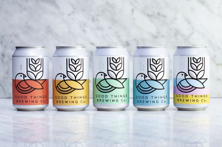
Beer packaging by Nadya Nadya
Whatever area of creativity you work in, packaging design offers an instant window into the world of modern visual culture.
You only have to go as far as your nearest supermarket or specialist food store to see hundreds of brands using inventive aesthetics to grab attention in a crowded marketplace. And that can give you valuable insights into where the creative industries are right now.
To bring you the biggest trends in packaging design for 2023, we've teamed up with people who really know what they're talking about: 99designs by Vista, a leading on-demand design marketplace.
With professional freelance designers in over 150 countries, the creative community at 99designs by Vista has a unique view of what's trending globally, especially with small business clients.
Bird's eye view
Before we get into specific trends, though, let's start with a bird's-eye view.
Given the chaotic social environment, we're in right now – from rising inflation to the war in Ukraine and the ongoing climate crisis – it's not surprising that we're currently experiencing an eclectic mix of trends in visual branding overall. But when it comes to 2023 packaging design trends, there are some identifiable themes that can tie them all together.
Above all, there's a distinct sense of optimism, vibrancy and fun as a necessary counterweight to the melancholy of this unique moment in modern history. A youthful nostalgia and sense of escapism is also a common thread, capturing the comfort of familiarity and the playfulness intended to inspire little moments of everyday joy.
Read on as we explore five trends in packaging design for 2023. Meanwhile, you can check out the full list of 10 packaging design trends on the 99designs by Vista blog.
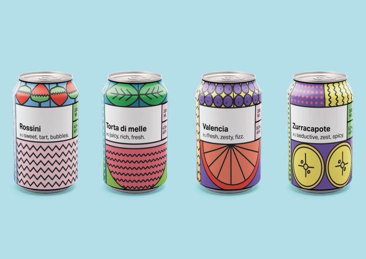
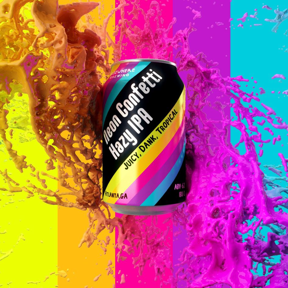
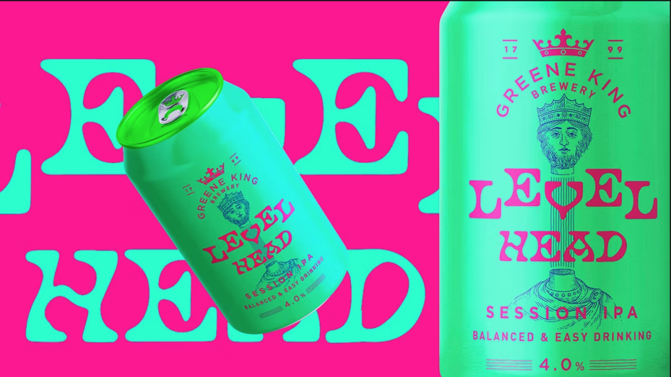
1. Ecstatic colours
Bold, bright colours will help you stand out on supermarket shelves. But if everyone's doing it, you may need to go a step further. Hence the trend for 'ecstatic colours': highly saturated, punchy neons that are equal parts playful, confident and fearless.
We're seeing this trend becoming particularly prevalent in drink packaging at the moment. As Justin Hamra, art director at 99designs by Vista, puts it: "With our visual attention more valuable than ever, being bold, bright and ecstatic is taking over."
Can design by BenTō
Examples of the trend in action can be seen in the can design by BenTō, shown above, and the Mix Drinks packaging by JustOneShyHuman (below).
Strategic design studio Human also put the ecstatic colours trend to good use in their designs for Casa Centinela, one of the most important tequila distilleries in Mexico. These can designs for the brand's RTD cocktails take inspiration from a bold vintage layout that represents the brand's heritage but with a twist in the colour palette representing Mexico's folklore and the vibrancy of the cocktail scene.
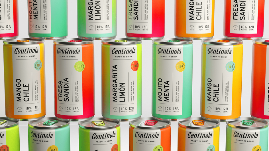
Can designs for Casa Centinela by Human
Designs for Greene King by Design Bridge
Mix Drinks packaging designed by JustOneShyHuman
Another great example is Greene King's new range of craft beer, featuring English folklore and eye-catching, saturated neon hues. These designs were created by Design Bridge, who helped the brand stand out in a super-crowded marketplace by turning up colour vibrancy to the max.
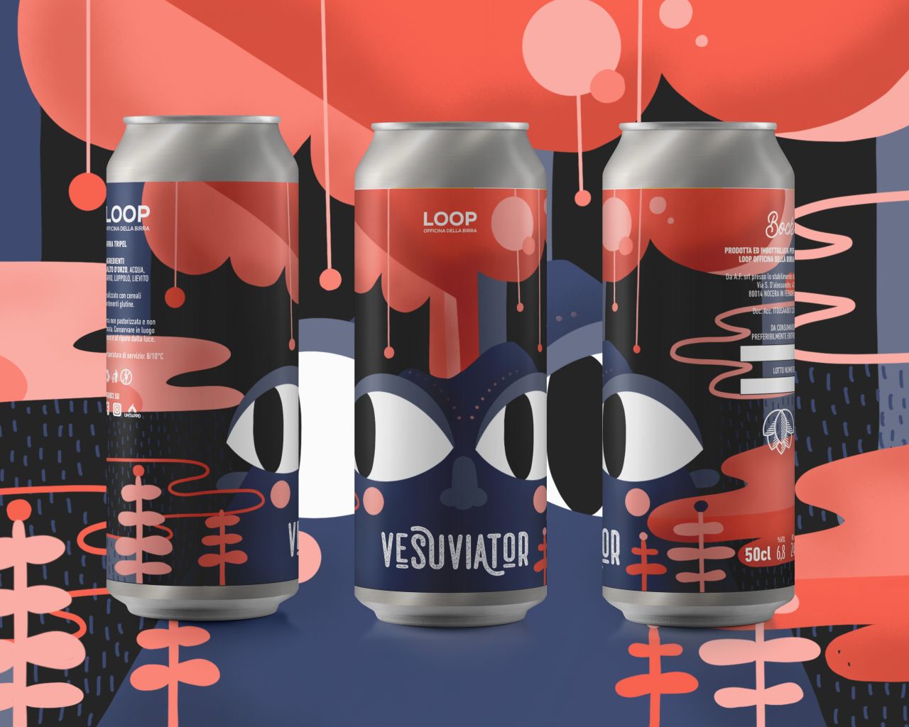
2. Typographic scrawl
Typography has always been crucial to packaging, but there's been a distinctive trend lately for hand lettering with a casual, scrawled feel. This creates a down-to-earth, DIY feeling that stands in stark contrast to the more polished, not-a-hair-out-of-place brands we know so well.
But in a world that's swiftly moving away from the slick, anodyne perfectionism of Instagram and towards the more anarchic and day-to-day vibe of TikTok and BeReal, it's right on time. As Imogen Hill, senior art Director at 99designs by Vista, explains: "This is an easy design trick to immediately make a product have soul, appear homemade and feel down to earth."
Two great examples of typographic scrawl on packaging include the Lite Pack design by Luz Viera Studio, shown above, and the can concept design by Nadya Nadya shown below.
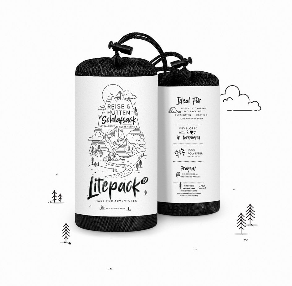
Lite Pack design by Luz Viera Studio
Wine label design by Stolpman Vineyards
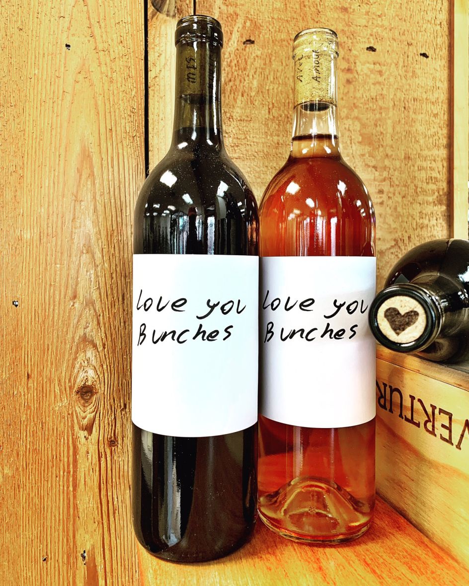
Often the beauty of this technique lies in its simplicity. Another demonstration of this can be seen in Stolpman Vineyards' wine label designs across their Sangiovese range. In the example shown below, Stolpman rebranded Carbonic Sangiovese as 'Love You Bunches' to emphasise the loving treatment they give the whole grape bunches to keep the grapes intact through fermentation. This simple, whimsical label, which shows off the penmanship of vineyard manager Ruben Solorzano, is the perfect fit for this fun, happy wine.
3. Sticker book aesthetics
Every child loves collecting stickers. And this latest packaging design trend borrows from that impulse to appeal to our inner child, especially those nostalgic for the '90s. By marrying sticker book aesthetics with dynamic use of colour, this floating style of composition crackles with irreverent energy. With its focus on bright hues, cute icons, doodles and the like, the vibe is also popular among Gen Z consumers.
"I'm in love with the use of stickers in packaging and branding," says Heloisa Helena, aka TikaDesign. "It gives identity and curiosity to the packaging. And anyone who looks at the packaging will be very interested to see what's inside. Stickers have the ability to make people laugh, and they are just magically fun!"
Two superb examples of sticker book aesthetics in packaging include the bakery branding by goopanic, shown above, and the designs for women's fashion retailer Sense of Shelf by mcrrno, shown below.
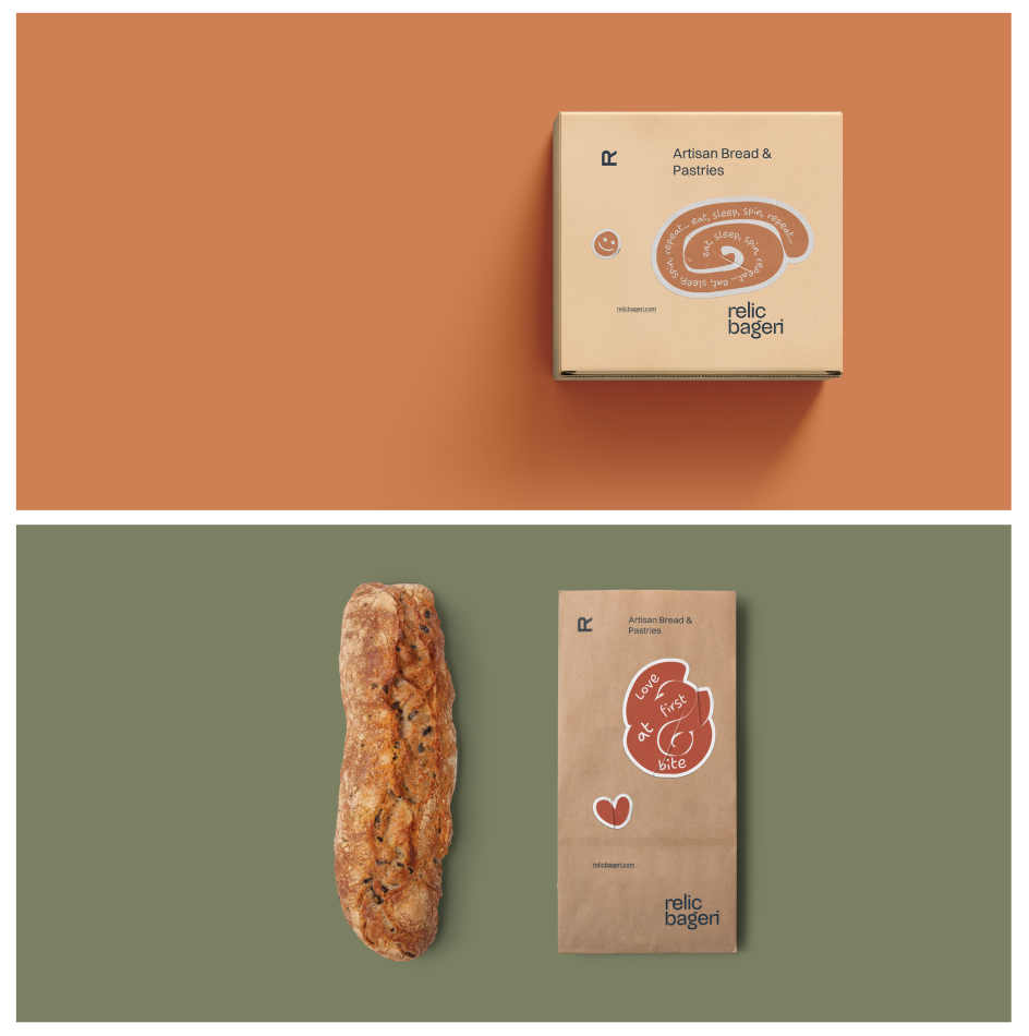
Bakery branding by goopanic
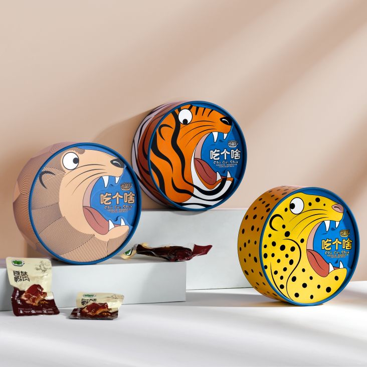
4. Mascot variations
Brand mascots have always been a popular way of tying everything together, particularly on packaging when you only have fractions of a second to engage shoppers. But recently, we've seen designers respond to the increasing sophistication of consumers and move away from portraying mascots in the same rigid and inflexible style everywhere they appear.
Instead, we're loosening up, being more flexible, and allowing mascots to be tweaked depending on the context, with fresh variations on clothes, movements or attitudes for different product types and flavours. Examples include this packaging for gin brand Tiny Bear Distillery by Mila Katagarova. The idea here is to represent the central bear character in different costumes for each gin flavour.
You might even look upon the packaging behind Noble Otter, a soap brand that called upon the talents of Moxie Mason to come up with its charming mascot. In this case, quite literally, a noble otter – complete with a pirate hat, parrot and flamboyant clothing.
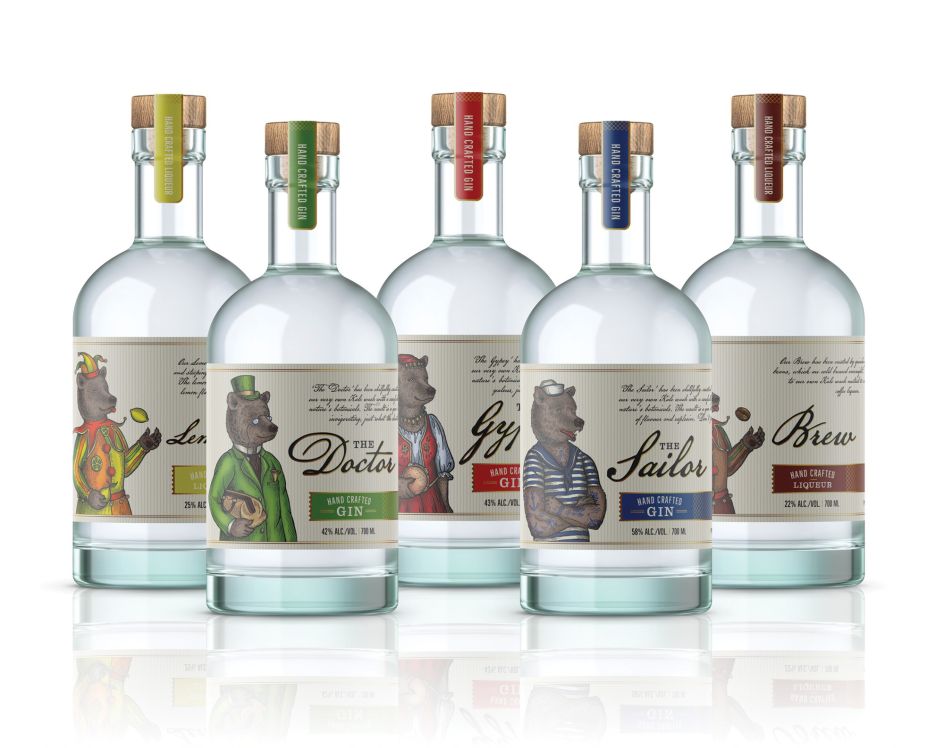
Packaging for Tiny Bear Distillery by Mila Katagarova
](https://www.creativeboom.com/upload/articles/db/db92997677a6c66cc081acba7d2b5a9e1c7201ec_944.jpeg)
Noble Otter, designed by Moxie Mason
5. Cartoon charm
There's something immediately comforting and inviting about cartoons, and it's not all about childhood nostalgia. While there are huge variations in cartoon styles, at its heart, the discipline is about minimalist lines, which effortlessly summon up the underlying essence of a product and the mood around it. Plus, they're generally silly and a bit goofy, showing that a brand is approachable and doesn't take itself too seriously.
So, where have we seen great examples of this? Byron Burgers recently approached Taxi Studio to rejuvenate its positioning and identity system, creating a simple yet expressive brand that taps into Byron's "eclecticism, eccentricity, and verve". To conquer this, Taxi introduced a mascot pickle called George that's full of character and splashed across all of the burger joint's packaging. George also formed the basis of a new tone of voice that "channels the essence of the highly controversial English poet Lord Byron" along with a supporting cast that brings the brand and menu to life with wit and mischief.
Or there's the packaging Surabhi Pitti created for Castleton Coffee Company. Central to its design is a simple line drawing of a coffee connoisseur raising a coffee cup to the drinker and sharing an appreciation of everyone's favourite hot drink.
](https://www.creativeboom.com/upload/articles/53/53af629ccd87acad0b567d536c62e5ea90d23938_944.png)
George The Pickle for Byron Burgers by Taxi Studio
 created for Castleton Coffee Company](https://www.creativeboom.com/upload/articles/6f/6f5ef5d23a1e83f5709b7563eddb22b494cadc64_944.jpeg)
Packaging Surabhi Pitti created for Castleton Coffee Company
Five more 2023 trends
In many ways, as we move from 2022 to 2023, the future has never seemed so uncertain. One thing remains clear, though: in a world where shoppers have to focus more on spending their pennies wisely, packaging design will only rise in importance.
And even if you don't work in that discipline, checking out the best examples is a great way to get inspiration and ideas for your own creative projects. Discover more 2023 packaging design trends from the 99designs by Vista community at 99designs.com.

Editor's Picks


Trending


Podcasts


Editor's Picks
Further Reading