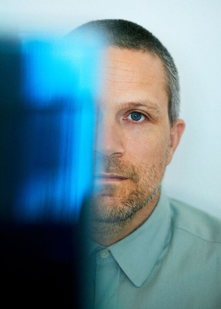
'It's out there: just go and look for it': Denomination's Margaret Nolan on finding analogue inspiration in a digital world
Margaret Nolan has led Denomination as co-founder and Global Creative Director since 2002. We spent a happy hour chatting with Nolan to discover more about her creative passions, inspirations and experience of working for the respected design studio.
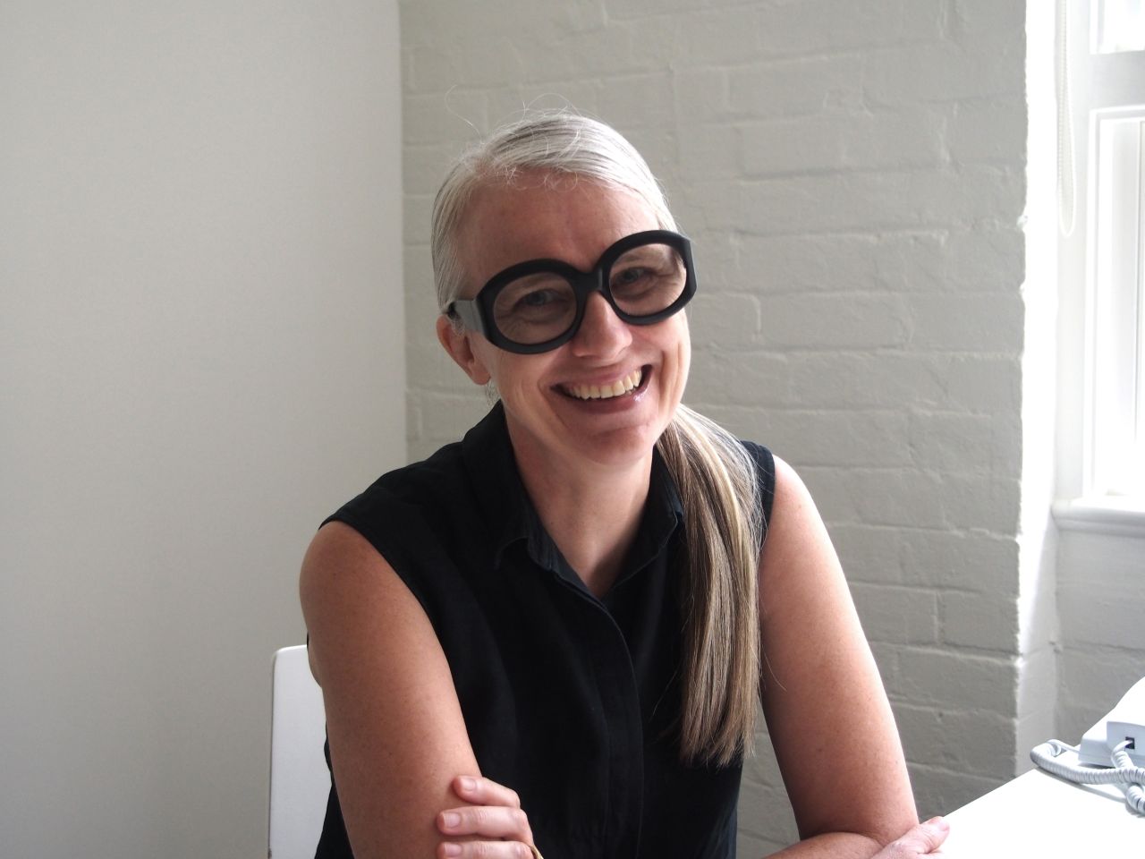
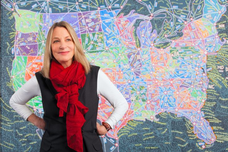
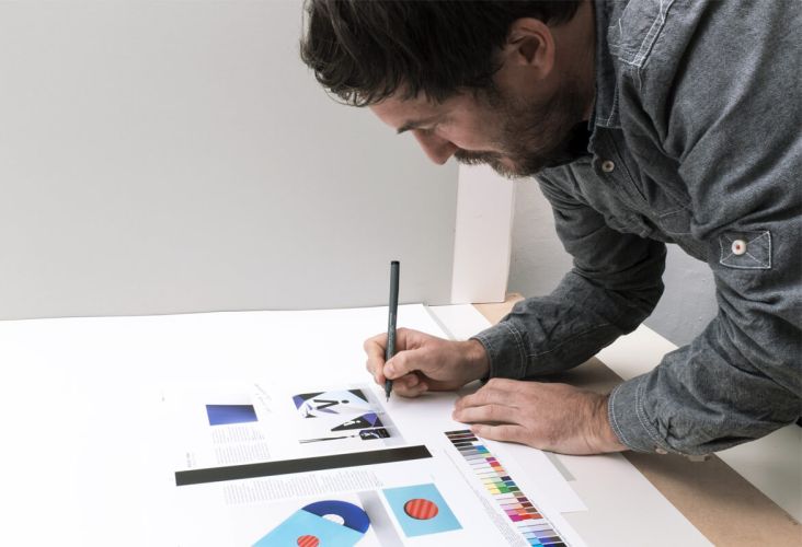
Credit: Margaret Nolan
The Sydney–based designer has nearly three decades of luxury drinks experience and has worked with world-renowned brands, including Penfolds, Chateau Ste Michelle, Duckhorn, Yalumba, Chapel Down and Nieto Senetiner.
Even after over twenty years of leading Denomination, Nolan stays committed to being hands-on in the design process and credits her passion for design and commitment to a holistic approach to brand for Denomination's long-running success. Her frequent reference to other designers and artists across different disciplines shows a breadth of knowledge that allows her own work to be diverse, varied and inspired, keeping the brands she works on alive and responsive to changing needs and trends.
Nolan recently sat down with Creative Boom to share more about her creative process and how she finds inspiration from fashion, art, and literature.
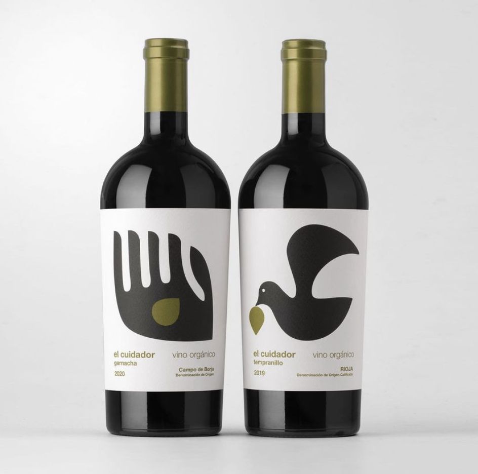
Credit: Denomination / El Cuiador
How would you describe your personal style as a designer?
I would very much like to think that, as a designer, I don't have a style as such: when I'm designing, the brief dictates the style of the design. However, what does go across my work are a few key things that I always try to do. The first is to create packaging that elicits an emotional response. The second is to ensure the type doesn't detract; it has to be seamless with the design. The third is attention to detail. Never underestimate what consumers will notice and appreciate. And the last is language: give the consumer as much clear information as they need, but also use writing to bring a brand's personality to life. As with design, it's adjusting the tone to fit the brief. These four things I think of as the tenets of my work.
When it comes to my personal style of expression, I think I would describe it as simple. I often joke with my daughter that I'd like to start a shop called Plain, where there are no patterns, prints or logos. I love well-cut, comfortable clothes but they are so hard to find. I struggle because many women's clothes and shoes are impractical and uncomfortable. Men can find off-the-rack suits in different arm lengths and shoes in various widths, but there's no consideration like this for women: we are all lumped together in standard sizes.
My bugbear is things like women's trousers with ornamental pockets that are useless. Pockets are essential. I've always preferred to wear men's jeans (much more comfortable) and I love men's shoes too, so I guess I've always had quite an androgynous style clothes-wise. I also love simple interiors: my husband is an expert on antiques and a collector of all things 18th century, so our house is not simple! I've counterbalanced this with our beach house, so we get the best of both worlds.
Are there any notable art/design/culture pieces that inspired you to be a designer? Can you tell me about them?
I think my first awareness of the beauty of design as a child was through Marimekko. My parents were big travellers who always bought back beautiful things: Marimekko fabrics and Iittalla glassware, which I still love. My sister made me some Marimekko curtains and a bedspread when I was seven and I would lie in bed just marvelling at the shapes and colours.
What Marimekko taught me early on was the emotional response you can get from colour as well as the power of solid use of black and white: this has been very influential in my work. I love black and white, and Marimekko's Kivet design from 1956 is fabulous: I had it made into a suit for my 50th birthday. I used this love of strong graphics and black and white when I designed a Spanish organic wine brand called El Cuidador which tells an organic story simply and powerfully.
With graphic design, I grew up the youngest of a large family, and my eldest sister went to art school. She was always making things and doing screen-printing with me, so I was drawn to design at a very early age. Having lots of brothers and sisters meant we had a vast record collection. I loved all the album covers, especially Peter Blake's Sergeant Pepper, Andy Warhol's Velvet Underground cover and Milton Glazer's poster that came with Dylan's Greatest Hits album. These album covers also showed me inventive ways of storytelling and engagement: foldouts and inserts with fantastic photography and illustration. They were fascinating to look at and read, as albums featured the lyrics, too.
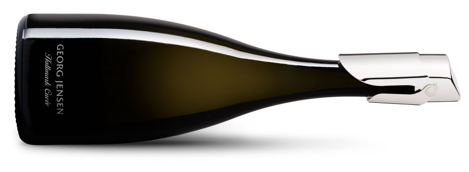
Credit: Denomination / Georg Jansen
You look to a wide range of creative categories to inform your design work today – can you tell me more about how music has inspired you as a creative?
Music is such a rich vein, not just with the album covers but also with song lyrics and names. We do a lot of naming with new product development, and I find song lyrics really poetic and moving. I also love with music and how mashing it up can put a new twist on things, and that's the same with design.
Music also helps you to be open to new things. I love to hear music outside of the mainstream, even if, at first, it can be challenging because it doesn't go in the direction you are expecting. I think that's what great design does too. I also love how music is about exploration: discovering new things. That's the sad thing about many streaming services like Spotify: they make people lazy about discovering with their endless 'suggestions for you'. Exploring is such a crucial part of designing, and it's the same with music for me.
How about fashion?
It's always interesting to see what's happening in fashion, but my challenge as a designer is to create things that last beyond a trend. For many of our clients, design is a considerable investment, so I have to ensure their brands won't look dated within five years. However, I love seeing how luxury fashion brands have won over a new generation of consumers by constantly reinventing themselves. Seeing how old traditional brands can move into a new era when they do it really well is compelling.
The co-lab concepts such as Gucci and The North Face have also been exciting and really clever, tapping into what the contemporary luxury consumer is looking for. Reliable outdoor gear does not have a reputation as being fashion-forward: if, like me, you don't like burgundy, teal or grey, you can have quite a hard time finding hiking gear that won't make you look like a tourist. However, North Face has a big following, particularly with their parkas, and the collaboration with Gucci injected some super cool and real desirability into a pretty conservative category. It gave North Face huge fashion credentials. At the same time, Gucci was seen in a new light and took on far more street credentials.
We did a co-lab with Georg Jensen and Heemskerk wines for a luxury Australian sparkling, and it was an instant success. Australian sparkling at the top level always competes head-on with Champagne, and it's difficult to get Australian consumers to spend the equivalent amount on local sparkling. We needed to give the brand some luxury cues, which would really differentiate it from its competitors. By collaborating with Georg Jensen, we bought a luxury, modern European style to the brand. In turn, Georg Jensen was introduced to a whole new category of consumers outside their traditional base.
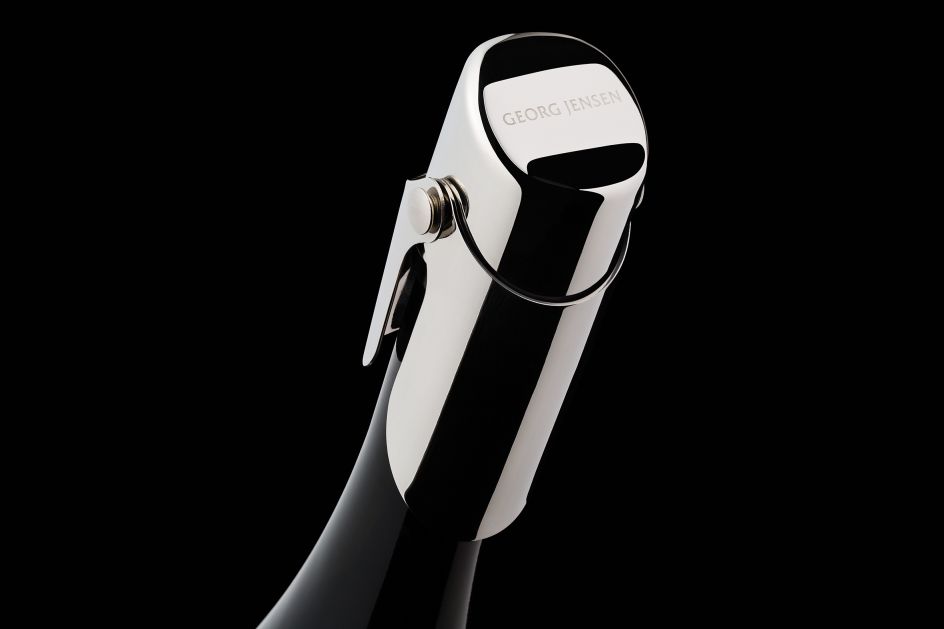
Credit: Denomination / Georg Jansen
Credit: Denomination / Young Poets
Credit: Denomination / Young Poets
And what about finding design inspiration from literature?
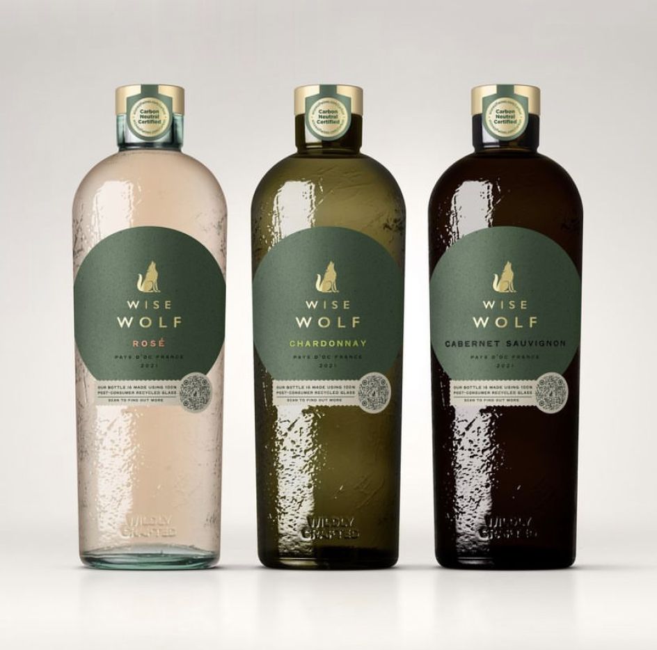
I enjoy writing and am a big reader, so I find much inspiration from books. Again, book titles, poetry, proverbs etc., are such a rich source of creativity for naming for me, not to mention the insight you can get from reading. We recently designed a brand called Wise Wolf, and it just so happened I'd finished a book about rewilding and how important apex predators are to the environment, so we based the graphics on the idea of the wolf at the apex.
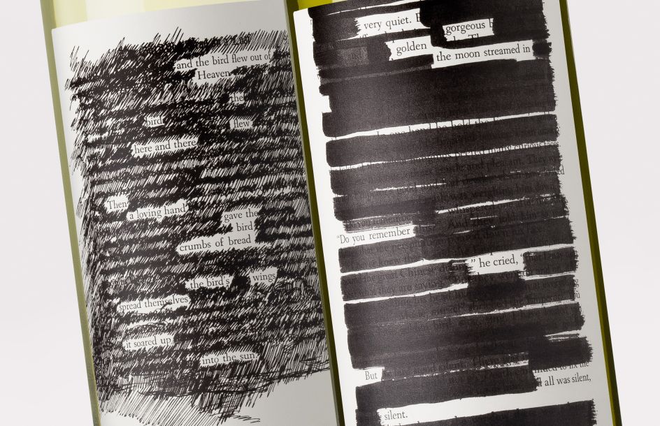
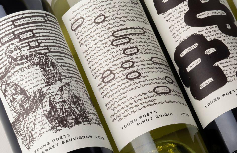
We also designed another brand called Young Poets, inspired by blackout poetry: they were visually striking and beautiful to read.
Art history is also your passion – how does that intersect with your design life?
My husband Ronan is an amazing source of knowledge and constantly shows me such interesting things. Art is an incredible source of stimulation, and I am always energised and compelled to see great art no matter the period. The reflection on social and political issues and how artists use their medium to create a message is particularly powerful. The key thing about interesting art is discovering the story it is telling. The hand holding a bird in a Florentine portrait or a deer with a self-portrait as its head by Frida Kahlo: what does it mean?
Religious art from every culture has always used symbolism. Putting symbolic images on labels is a great way to engage the consumer – but it doesn't have to be images. The power of language in a Jenny Holzer installation shows how words are an amazing visual medium, for example.
The most powerful thing about art today is how it engages the senses and gives you such an appreciation of seeing and experiencing things in real life when so much of what we experience is via a screen. It has taught me a lot about how something simple can be so powerful:
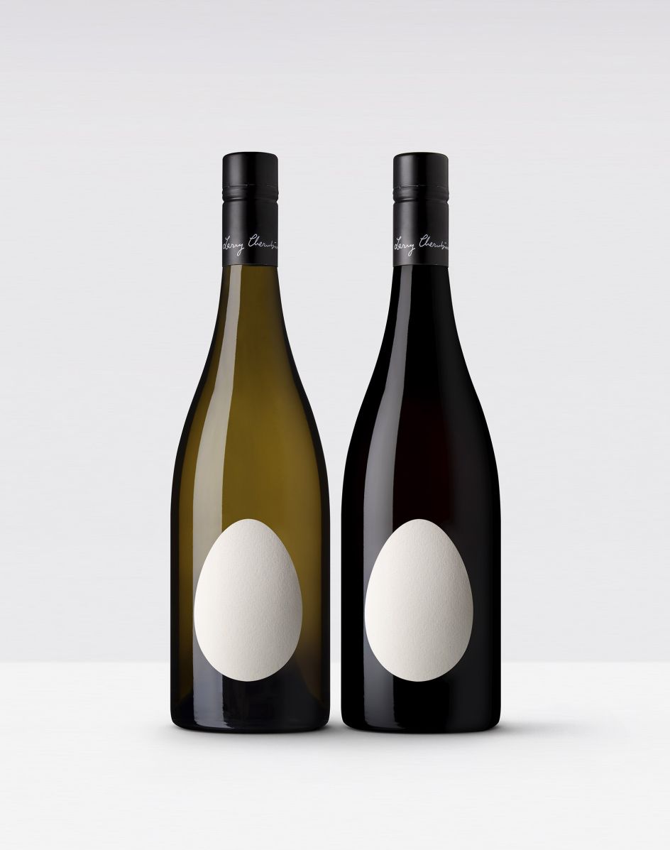
Anish Kapoor 's work, for example, is something you must experience – the textures, the colours. His ability to balance simplicity and complexity was influential when I designed Uovo. The simplicity and incredible beauty of an organic form when seen in isolation are what makes Uovo so powerful, and the dimensionality was key. Once the label was on the bottle, it came to life.
Credit: Denomination / Wise Wolf
Credit: Denomination / UOVO
Are there any other mediums you feel have particularly influenced your work?
I am really interested in architecture: the design for Underground Spirits was based on architect Walter Burley Griffin's plans for the city of Canberra. The move in architecture towards organic forms and materials is fascinating, especially what they can achieve now with exoskeletons, getting a lot of strength with fewer materials. It's interesting because we do much work with secondary packaging, such as gifting and bag-in-box formats. We are always looking at reducing materials and making things more sustainable.
I'm also interested in furniture: a chair by Rennie Mackintosh inspired a Make a Mark whisky project. The project was to showcase drinks design, and as I had just visited Glasgow, with its vibrant design culture, I wanted to design a whisky from Glasgow instead of a Highland or Speyside whisky. Mackintosh's Willow Chair was designed as a reception chair for the Glasgow Tea Rooms, and I loved how the curve of the chair enfolded the sitter.
I thought this was perfect for a luxury bottle of whisky encased in this shape. Not only does it have a protective feel, but the" cage" is highly tactile. I used the design from the Glasgow School of Art doors on the capsule as its sculptural form contrasted with the geometry of the bottle. I also incorporated quotes from Mackintosh's lectures on art on the label as I felt they tied in beautifully with the art of making whisky.
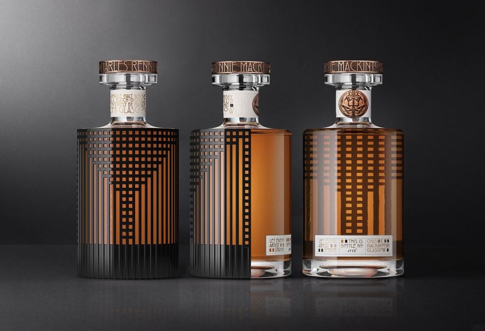
Credit: Credit: Denomination / CRMKurzBeauty
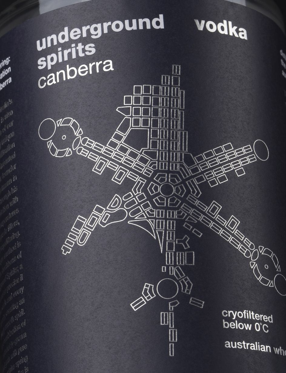
Credit: Denomination / Underground Spirits
Is there an art form you're curious about engaging more with in the future?
Sculpture – I can see really playing with form as a way to develop much more environmentally friendly and contemporary packaging. I would like to learn more about 3D printing and what's achievable on a large scale as it is a way around the limitations of conventional manufacturing.
How do you feel your business benefits from your cultural curiosity and engagement?
Any creative business benefits from curiosity and people being "present". There is so much life and inspiration to be found offline, so much originality and genius. The Meta world fills me with horror. Exploring the world around you physically – all its sights, sounds and smells, and what other creatives do- musicians, artists, writers – is what it is to be human and a wonderful way to get inspiration.
What can up-and-coming designers do better when engaging with different art forms?
In the world of AI, to survive as a designer more than ever, imagination and inspiration are so vital. It's out there: just go and look for it. My favourite quote is from Vivienne Westwood:
"You've got to invest in the world; you've got to read, you've got to go to art galleries, you've got to find out the names of plants. You've got to start to love the world and know about the whole genius of the human race. We're amazing people."
Any final thoughts?
I think Vivienne said it all.
Editor's Picks


Trending


Podcasts


Editor's Picks
Further Reading