Koto evolves GoFundMe's brand as platform expands beyond individual giving
What happens when a progress bar grows up? Koto's latest work for GoFundMe transforms an everyday UI element into a flexible brand system that scales generosity.
Global creative studio Koto has partnered with GoFundMe on a wide-ranging brand evolution, marking a significant moment for the fundraising platform as it continues to expand beyond individual campaigns into a broader giving ecosystem.
Best known for peer-to-peer fundraising, GoFundMe has grown considerably in recent years. Following its acquisition of nonprofit fundraising platform Classy (now GoFundMe Pro), the company now supports both personal and organisational giving, alongside newer tools such as Giving Funds, Profiles and Intelligent Ask Amounts.
As its product offering diversified, the challenge became how to express that growth without losing the clarity and emotional immediacy that made the brand so recognisable in the first place.
Koto's response centres on the strategic idea that help adds up. The premise is that individual acts of generosity, when combined, create collective momentum. The studio translated that concept into a flexible design system intended to work across products, platforms and audiences.
The Progress Circle is the focal point of the new identity, inspired by the familiar fundraising progress indicator that has featured on GoFundMe since its earliest days. Rather than functioning purely as a UI element tied to monetary targets, the circle has been reimagined as a modular symbol of collective action. Broken into segments, it represents fundraisers, donors and nonprofits moving progress forward incrementally, day by day.
Crucially, the Progress Circle is not confined to marketing communications. Koto worked to embed it as a shared visual language across the brand, influencing product design and external expression. The device can scale, frame content, isolate moments or shift rhythmically across motion and static applications, while remaining instantly recognisable.
The GoFundMe logo has also been subtly refined, with the Progress Circle revealed within its existing ray. This adjustment favours continuity with the wider system rather than signalling a wholesale reset. From the same wordmark, GoFundMe Pro has been developed, helping establish a clearer brand architecture between consumer and nonprofit offerings.
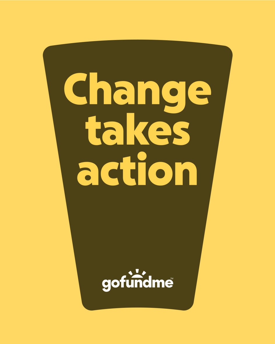
The new colour palette also doesn't stray too far from the original brand's hues. Green remains central, referring to GoFundMe's grassroots origins, but the palette has been expanded into a broader, more expressive spectrum. A duotone approach improves legibility and accessibility while introducing supporting hues that convey optimism and compassion.
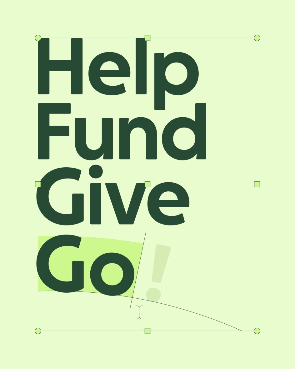
Typography has also been updated with the introduction of GoFundMe Sans, a custom typeface featuring subtle circular forms that echo the Progress Circle. Designed to feel warm and approachable, it aims to support clarity across everything from campaign pages to product interfaces.
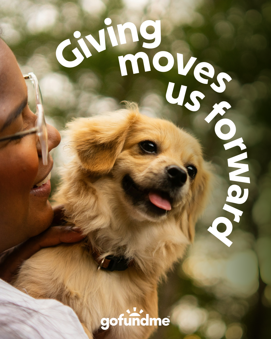
The evolution extends into imagery, motion and tone of voice. Art direction is guided by three principles – humanity, community and optimism – with a refreshed image library that foregrounds real people and shared purpose. A new motion identity brings energy and momentum. At the same time, verbal guidelines distinguish between GoFundMe as a Helpful Guide and GoFundMe Pro as a Helpful Partner, reflecting the platform's increasingly varied audiences.
Koto believes that the project reflects a broader shift in how brands with complex ecosystems can build coherence without flattening nuance. Caroline Fox, creative director at Koto, explains: "The best ideas are deceptively simple – clear enough to explain to a five-year-old, yet expansive enough to carry emotion, complexity, and scale.
"The Progress Circle looks simple, but relying on a single idea to hold an entire ecosystem is one of the hardest challenges in brand design."
From GoFundMe's side, the evolution is positioned as a foundation rather than a final statement. "Our mission to help people help each other holds a powerful truth: lasting change adds up through everyday acts of help," says Dave Carlson, head of brand and creative at GoFundMe. "Working closely with Koto allowed us to expand our toolkit – not just visually, but across product and experience – in a way that can continue to evolve with us."
Fundraising platforms are increasingly operating at the intersection of technology, community and social impact, so GoFundMe's latest brand evolution makes perfect sense in light of that shift. It demonstrates how legacy UI elements and hard-won brand equity can be reinterpreted to support growth at scale and proves that you don't have to disregard everything in the name of modernisation.
Editor's Picks


Trending


](https://www.creativeboom.com/upload/articles/a9/a95f8ea2748ccef642d39e253c9b7ba5f7253a4e_732.jpg)

Podcasts


Editor's Picks
Further Reading