FORM refreshes the Circular Economy Institute with a people-powered identity
With a bold colour palette, modular 'C' system and a renewed tone of voice, FORM Brands Studio's work positions circularity as collaboration in action.
The Circular Economy Institute (CEI) has unveiled a new brand identity by FORM Brands Studio, designed to position the organisation as a global, collaborative force driving the shift beyond waste.
Following the CEI's acquisition by the Chartered Institution of Wastes Management (CIWM) in 2024, both organisations required refreshed identities that could sit closer together strategically while maintaining distinct audiences and purposes. For CEI, that meant striking a careful balance between professional credibility and creative energy.
"The CEI's identity needed distinct assets that would scale across digital and physical localised contexts, worldwide," says Alex Andlaw, creative director and co-founder at FORM Brands Studio. "We wanted to express circularity as an active system rather than a static symbol.
"By creating a central form that could flex and connect across the brand, we've built a system that feels modern, scalable and full of momentum, supported by a contemporary colour palette and a type system rooted in industry and progress."
One of the first decisions the studio made was to avoid the visual tropes that dominate the sustainability space. Rather than defaulting to leafy motifs or predictable greens and browns, FORM sought to reframe circularity as a systems-driven movement grounded in industry, infrastructure and collective action.
"We wanted to change perceptions around the circular economy," Alex explains. "People often assume it is purely environmental, and while sustainability is a vital pillar of CEI's work, social impact, policy and infrastructure are just as important.
"By moving away from visual cues that are typically associated only with environmental initiatives, we created an identity that represents the full, interconnected system behind the circular economy."
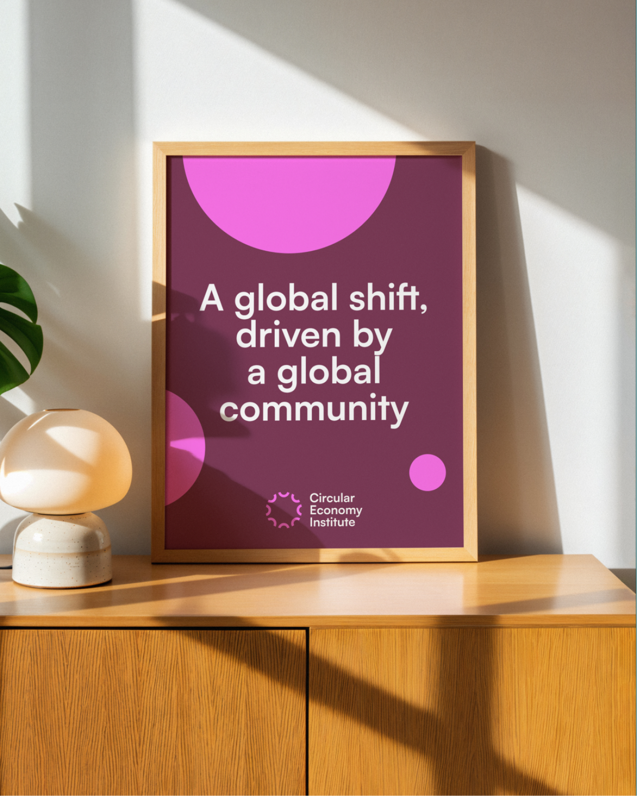
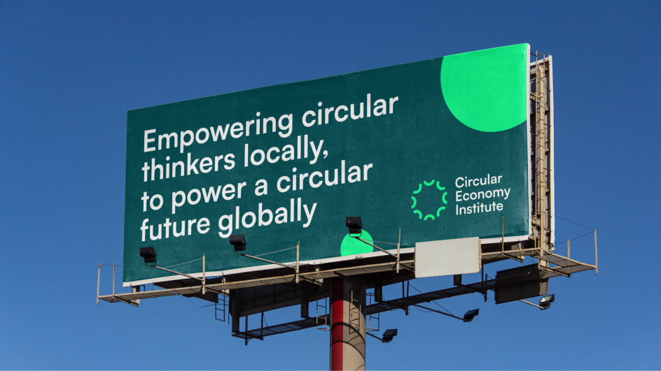
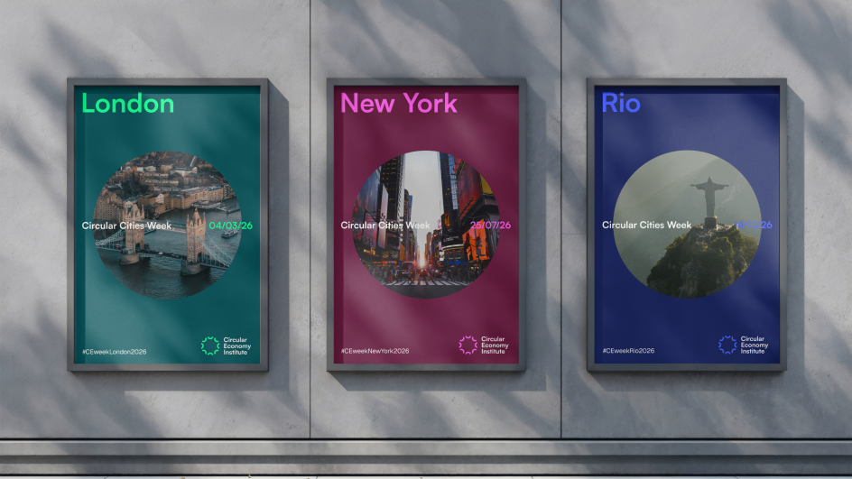
In line with this thinking, the studio went for a vibrant, forward-looking palette that feels contemporary and signals progress and collaboration. The goal was to position the CEI as a professional body with cultural relevance, not just environmental credentials.
A new circular form derived from the letter C is a crucial asset in the new identity. It acts as a flexible building block across layouts, content and communications.
"There are multiple meanings embedded in the 'C' at the heart of the rebrand: circularity as the core idea, community and connection, and cultural representation," says Ales. "This led us to create a circular logo formed through the repeated use of the letter 'C'.
"The system acts as a visual cue for connectivity and collaboration, reflecting the collective action, movement and progression that drive the Circular Economy Institute."
The form is repeated and adapted across touchpoints, conveying circularity not as a closed loop but as an evolving network. It feels kinetic and expansive, reinforcing the idea of a global professional community working towards shared goals.
Typography also plays a defining role. The studio selected Satoshi, a modernist sans serif inspired by industrial-era type, to anchor the system in progress and industry.
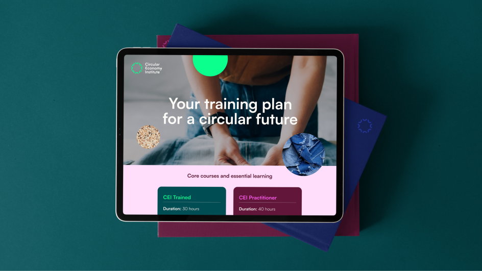
For an organisation built around collaboration, training and accreditation, practicality was non-negotiable. The identity needed to function across strategic reports, partnerships, education materials and real-world programmes.
"The colour palette was central to achieving this balance," Alex notes. "We paired deeper, more grounded tones with lighter, more vibrant accents to create a visual language that feels confident, modern and approachable.
"The wider system was intentionally kept simple, with a clear typeface and a flexible use of colour that can shift depending on the message or context. Ultimately, it's a practical, adaptable design system with a clean and accessible visual language that works consistently across both strategic and everyday touchpoints."
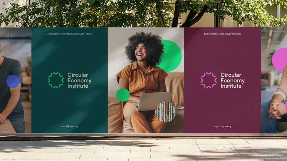
The new brand voice reflects that clarity. Anchored by lines such as 'Powering a circular future' and 'Real people. Real progress', it reinforces the CEI's role as both authoritative and human.
Now live across the CEI's website, education programmes and global communications, the refreshed identity positions the organisation as a convenor of a global movement, powered by people, systems and shared ambition.

Editor's Picks


Trending


Podcasts


Editor's Picks
Further Reading