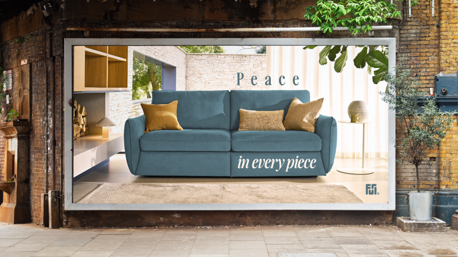
Derek&Eric reshape Furl's brand around clarity, calm and the quiet power of great design
The London studio has introduced a refined, emotionally driven identity for the British furniture maker, shifting the story from pure function to the feeling of living with cleverly engineered, beautifully made pieces.
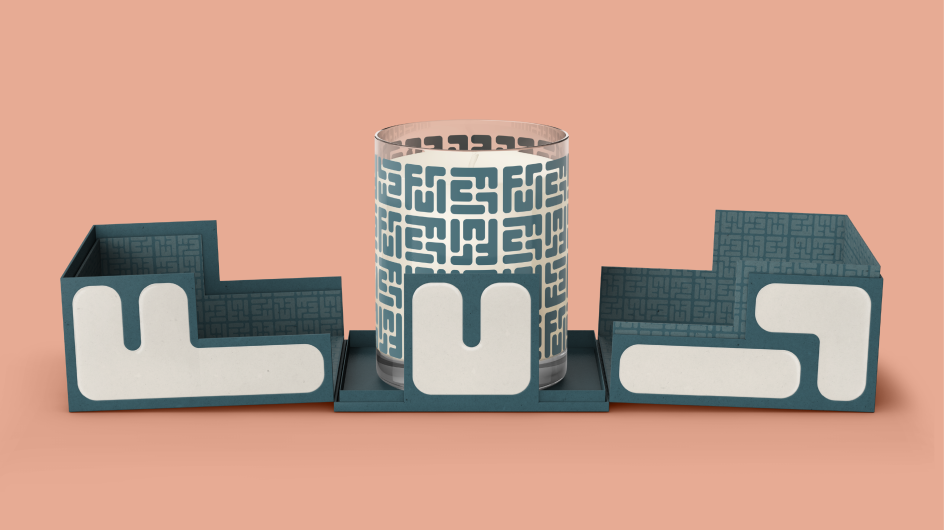
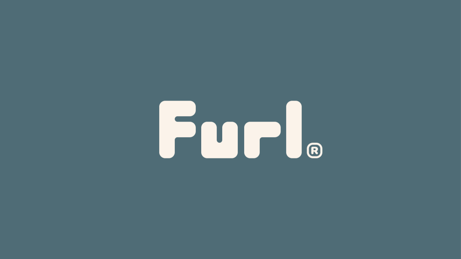
Derek&Eric is behind the new identity for Furl, complete with a logomark that shows furniture pieces slotting together perfectly.
Furl has built its reputation on furniture that works hard behind the scenes, but its new approach focuses not just on the quality engineering behind the products, but on the headspace it gives back to the end user.
The British company is best known for its high-end storage beds, sofa beds and space-saving designs, all made with meticulous care in the UK. For years, its communication focused heavily on practicality and performance, but as buyers grew increasingly cautious about spending, the team recognised that technical features alone wouldn't be enough to persuade people to upgrade.

"Our job was to shift the conversation from practicality to possibility," says creative director Alex Stewart. "Furl products already solve real-world problems beautifully. We wanted the brand to show how that can translate into emotional headspace and everyday calm."
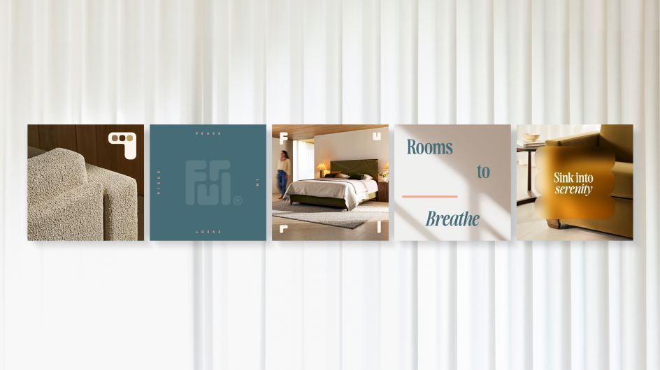
To make that desire a reality, Derek&Eric began with the notion that, in a world that is always noisy, the home can be a rare source of clarity. It's based on the idea that Furl's furniture doesn't just create space, but creates a sense of ease. From that starting point, the studio built a visual language that feels both warm and unusually restrained for the category.
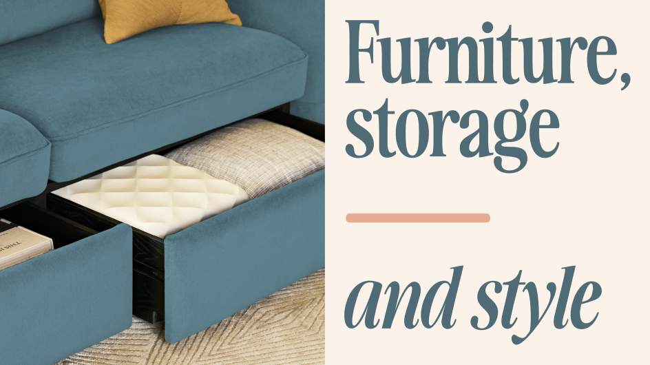
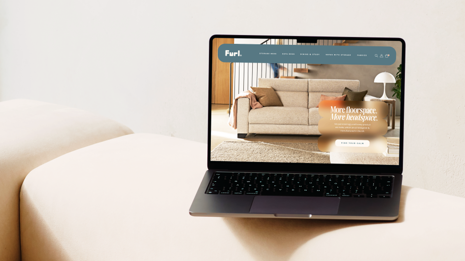
A modular wordmark forms the backbone of the system, echoing the foldable, adaptable nature of the products and giving the identity a sense of movement. Around it sits a palette of soft neutrals, sunlit photography and finely tuned typographic choices.
The combined effect is deliberately unhurried. Jon Gibbs, managing director of Derek&Eric, describes it as "designing for clarity", explaining that "spacious typography, soft neutrals, refined patterns and sunlit photography all work together to reduce visual noise".
Balancing that with Furl's long-standing emphasis on craftsmanship was really important for the team, too. "We softened the atmosphere, not the precision," Jon says. Structural discipline and careful detailing remain evident in the layouts, ensuring the brand continues to communicate the engineering rigour that sets Furl apart.
Furl agrees that the shift feels like a natural evolution rather than a reinvention. Founder David Norman believes that the identity finally captures what customers have always appreciated about the products, even if they didn't say it outright. He says: "We've always focused on craftsmanship and service, but the new identity gives us a clearer way to show people the real-life impact of that. It's not just about storage or engineering.
"It's about creating a space that makes you feel more at home, and Derek&Eric completely got that."
On a more strategic level, the move opens new doors for the business. Jon sees potential for Furl to expand its conversations well beyond functional furniture and into broader lifestyle territory. He notes that the refreshed positioning "reframes Furl as a premium lifestyle brand rather than a purely functional one", making collaborations in interiors, wellness and small-space living feel more natural.
In short, the new brand world gently encourages people to imagine what life looks like when clutter is out of the way, and every piece earns its place. It's understated but confident, and it gives Furl a platform to talk about value in a more human way. Not only how the furniture works, but what it's like to live with it in your home day in, day out.
The timing feels right, too, as people are increasingly craving more clarity at home. Thanks to the new identity, Furl can be part of the solution while staying true to its roots.

Editor's Picks


Trending


Podcasts


Editor's Picks
Further Reading