Clemens Chocolate rebrand: when the best creative decision you make is to go to the library
Brazilian studio MELT Design turned one family's extraordinary migration story into chocolate bar packaging no rival brand could replicate.
There's a version of the Clemens Chocolate project that never gets written about. In that version, MELT Design takes a brief about artisanal organic chocolate, reaches for the usual vocabulary (warm browns, botanical illustration, a tasteful nod to Brazilian heritage) and delivers something competent, pretty and entirely forgettable. The client is satisfied. The work disappears into the shelf.
In reality, that version didn't happen. What happened instead was that a small studio in Campinas, Brazil, asked enough questions to uncover one of the more remarkable back stories in recent packaging design, and then dared to use it all.
The story behind the story
Clemens is an artisanal chocolate brand using fine organic Brazilian cocoa, and when the client came to MELT, they had a clear ambition. More creative packaging, something that could communicate the irreverence and quality that defined the brand. In all honesty, this is a pretty standard brief. But studio co-founders Juliana and Marjorye, who lead MELT, pressed further.
"Throughout our conversations with the client, we discovered an extraordinary story," says Ana Luíza of MELT Design. "The brand's name is a tribute to the owner's grandfather, and his migration journey from Siberia to Brazil has become a book."
That sentence alone is worth pausing on. The brand name wasn't a founder's first name repurposed for charm, or a word chosen from a mood board. It was a tribute to a specific man who had lived an extraordinary life. A man who left Siberia and, over nearly a decade, made his way to Brazil, arriving in 1933. His adventures were so numerous and vivid that they had been committed to print.
MELT got hold of a copy.
What the book gave them
This is where the project becomes genuinely instructive for any creative thinking about the relationship between research and originality. The brief, at this point, essentially wrote itself... but only because the studio did the work of finding it.
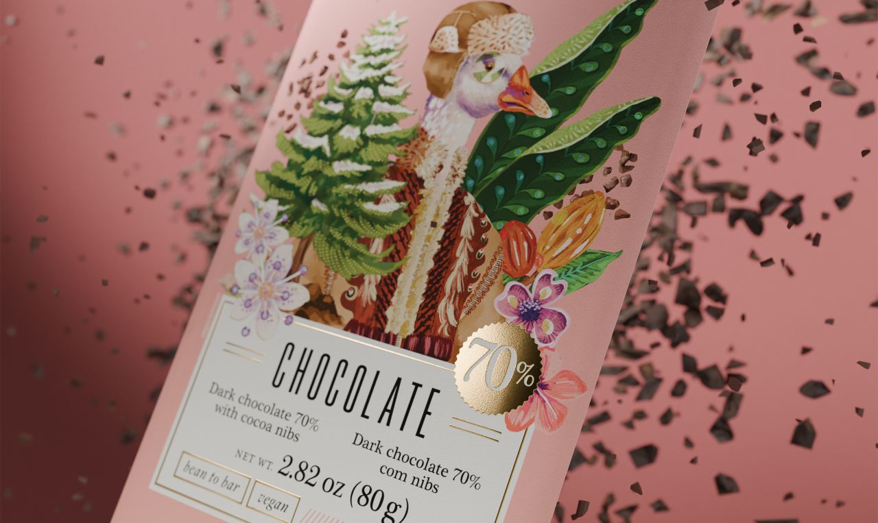
MELT immersed themselves in the text, identifying characters, settings and objects that carried emotional weight. A goose that represented the happiest moment of the grandfather's life. A Russian coat that kept him warm on brutal winter days. A snake that frightened him on his travels. A pine grove where he camped. A jaguar that crossed his path.
These weren't mood board references or stock illustrations. They were specific things drawn from one man's lived experience, filtered through a book, and now being translated into packaging for a chocolate bar.
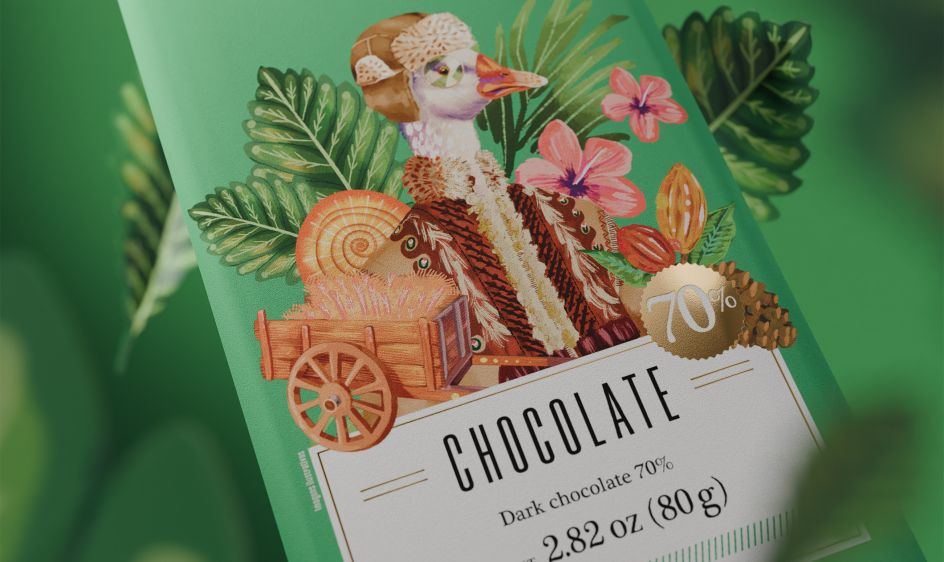
"We immersed ourselves in this story rich in characters, settings and elements that shaped Clemens' childhood and youth," says Ana Luíza. "We then decided it would be incredible to bring them to life in the new packaging."
What they created
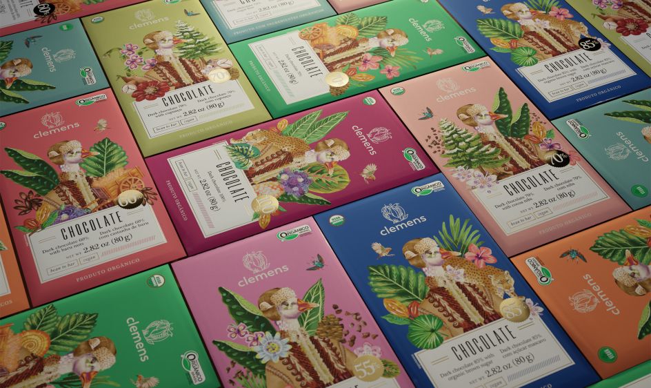
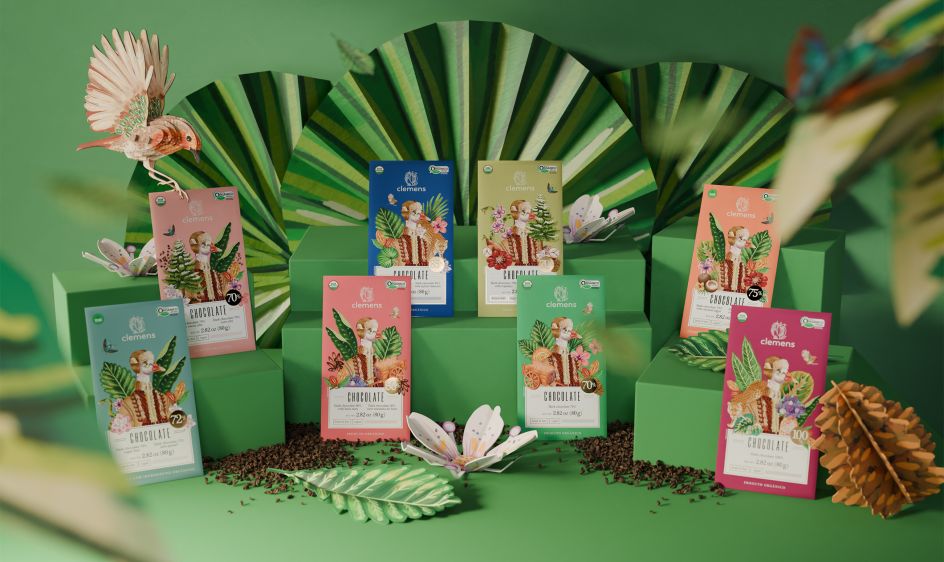
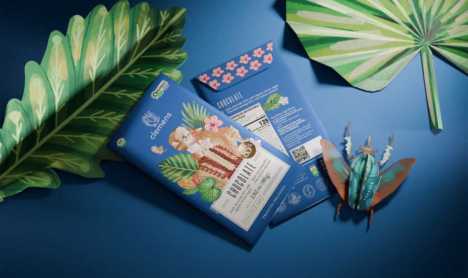
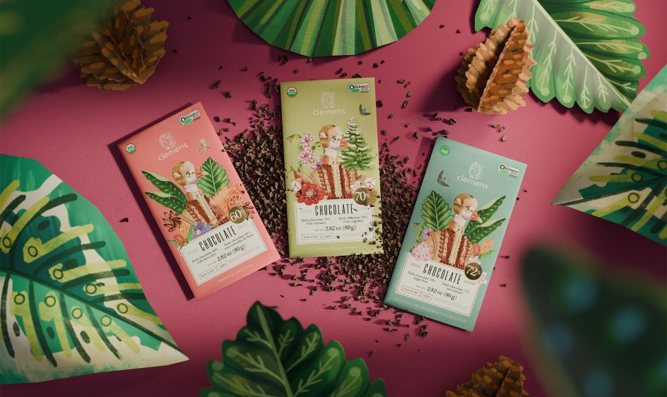
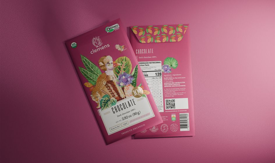
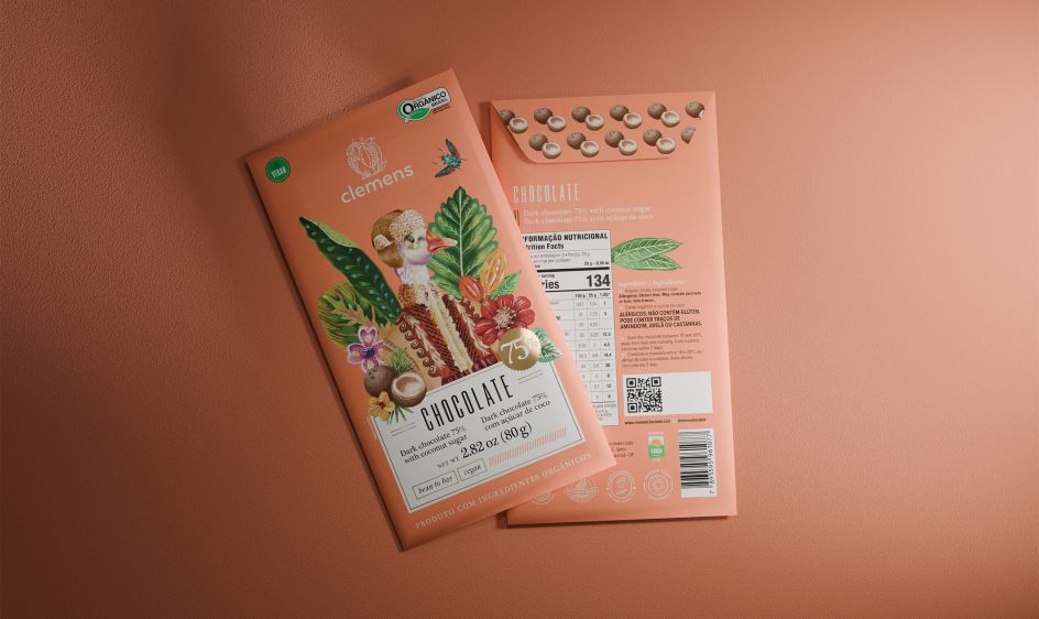
The resulting illustrations are bold and characterful; loose, expressive brushwork that gives each character a presence without tipping into the flat precision of contemporary food branding. Each bar in the range features different ingredients, and these too were woven into the compositions, meaning every product carries its own specific visual universe. No two bars are identical. The collector's instinct that this creates is not accidental.
What makes the work hold together visually, and what gives it its distinct energy, is the collision at its heart. This is, in every sense, a story about worlds meeting. Siberia and Brazil. 1920s Russia and tropical South America. European migration and Amazonian ingredients. The packaging reflects that collision honestly, blending the warmth and vibrancy of Brazilian colour sensibility with imagery that is clearly rooted in a colder, older, more European world.
A jaguar shares visual space with a Russian coat. Tropical flora frames pine trees. It shouldn't work, and yet it does, because the logic behind it is not aesthetic but biographical. These things belonged together in one man's life, and now they belong together on one brand's shelves.
As Ana Luíza puts it: "The outcome is a standout portfolio of products that effectively communicates the distinctive personality of the brand, carrying the blend of elements and cultures that would only come together in a surprising story like this one."
The lesson
For creative professionals, the Clemens project is a useful reminder that the most original work rarely comes from the brief as first presented. It comes from asking what lies beneath it. The client knew they had a good product. They knew the brand name had personal meaning. What they may not have fully understood, until MELT started asking questions, was just how much story they were already sitting on.
That's the skill. Not the illustration, not the colour palette, not the typography (though all of those are executed beautifully). But in recognising that the most powerful design direction lay hidden in a book about someone's grandfather, and being curious enough to actually read it.

Editor's Picks


Trending


Podcasts


Editor's Picks
Further Reading