Avenir Next World builds on Adrian Frutiger's legacy with a truly global typeface
A much-loved geometric sans-serif, Avenir is one of the world's most famous fonts. Originally designed by Adrian Frutiger in 1988, it was given a new lease of life in 2002 by the Swiss typeface designer alongside Monotype's Akira Kobayashi with the launch of Avenir Next. Two decades later, five years since Frutiger's passing, Kobayashi has released its latest update, Avenir Next World.
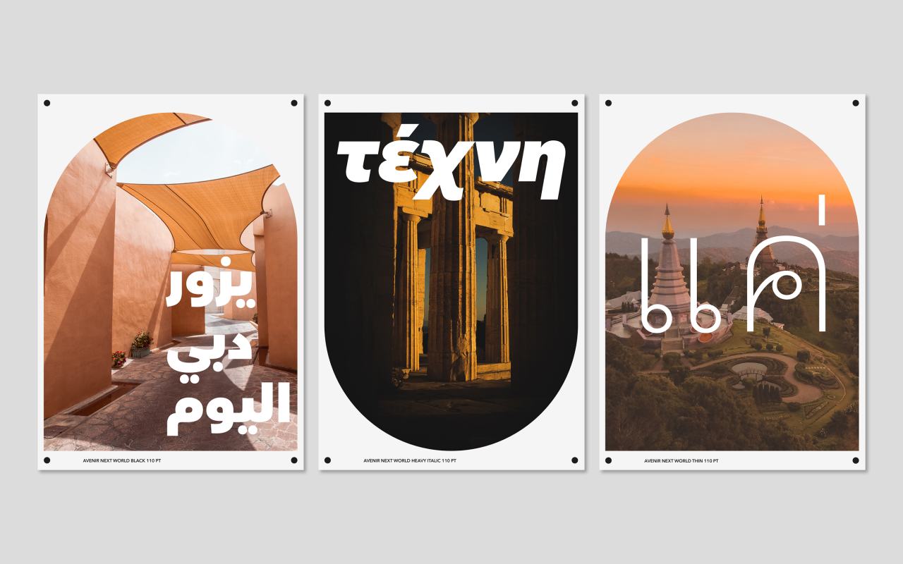
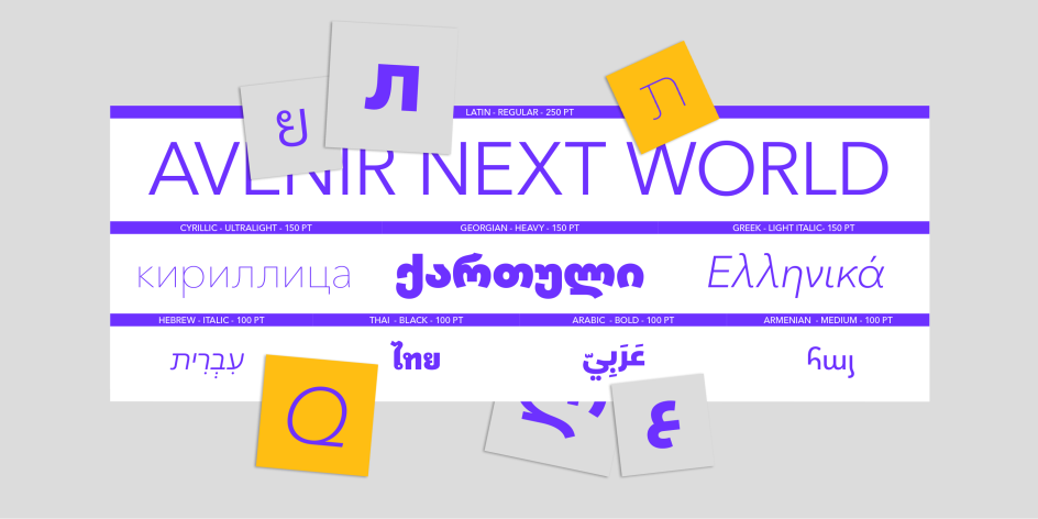
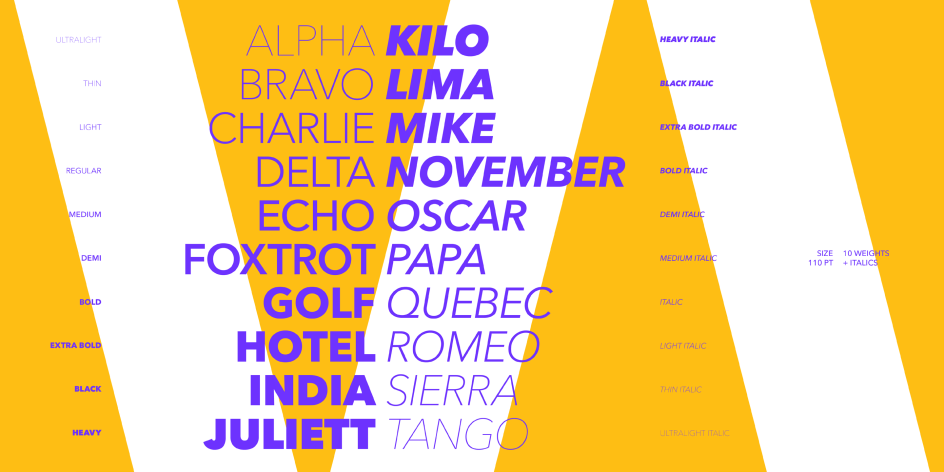
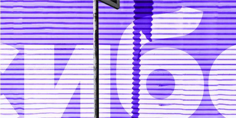
The expansive family of fonts offers support to more than 150 global languages and scripts, including Latin, Cyrillic, Greek, Hebrew, Arabic, Georgian, Armenian and Thai. It also contains 10 weights from UltraLight to Heavy, and two brand new styles: Avenir Next World Black and Avenir Next World Extra Bold.
Of course, to create such a global typeface, Kobayashi couldn't do it alone – even with his deep familiarity with existing iterations of the Frutiger designs. To understand the nuances of various languages and character sets, he worked alongside leading designers Yanek Iontef, Nadine Chahine, Toshi Omagari, Akaki Razmadze, Elena Papassissa, Anuthin Wongsunkakon and the Monotype Studio.
Yanek Iontef led the development on the Hebrew character set: "A Hebrew geometric model that is as classic as Avenir simply doesn't exist," he says. "This is why in some cases the geometry was overridden by subtle humanistic touch, for example in Zayin, and Gimel. On the contrary, geometry suggested that letters like Men and Tet become especially wide. It was always about finding the sweet spot that makes the proportions, weight, and texture as close as possible, without overriding any unwritten rule that would make the Hebrew look unnatural, or 'Latinised'."
For the Armenian character set, Elena Papassissa took inspiration from Robert Granjon's Armenian type and other fonts used by the Mekhitarists in Venice in the 19th century. "It also took into account readers' preference for upright rather than a slanted typeface, to be used as the main style, and some other typographic conventions that have changed through centuries, ensuring legibility and modernity," she says.
Avenir has come a long way since its initial release 33 years ago. In an interview with Linotype, Frutiger said he felt an obligation to design a linear sans in the tradition of Erbar and Futura, but to also make use of the experience and stylistic developments of the twentieth century. Its later release, Avenir Next, was about modernising the family and offering a technical standard to allow its use in both print and digital. Today, Avenir Next World expands the iconic family further, offering support for more than 150 global languages and scripts.

Alongside Avenir, Frutiger's best-known fonts include Univers – which was used in the 1976 Summer Olympics and features in many London borough street signs – and Frutiger, an incredibly popular sans-serif typeface described by type designer Steve Matteson as "the best choice for legibility in pretty much any situation".
As someone who influenced the direction of type design in the second half of the 20th century and was passionate about making the world legible, this development, without doubt, adds to Frutiger's legacy.
Single weights of the Avenir Next World typeface are available for $149 or €165 each. The complete typeface family is available for $499 or € 549. It also can be licensed through MyFonts.com at an introductory promotion of 50 per cent off on the complete family through to 12 March 2021. Watch the video launch for more information.


](https://www.creativeboom.com/upload/articles/90/908fdb6378db1e95d12595416f54e6336d5e80b8_732.jpg)


](https://www.creativeboom.com/upload/articles/7a/7a527d53fefe4f354e8489365e89db422567f281_732.jpg)
](https://www.creativeboom.com/upload/articles/1b/1bafd6401df7c7b55c0632369cb360a7832e3014_732.jpg)