Art&Graft helps Line Mobility design belief in the future of transport
How the London studio helped turn an ambitious urban transport idea into a brand people could trust and see coming to life.
Cities are busier than ever. Our roads are heavily congested, and public transport is increasingly overstretched. Getting from A to B has never been so challenging, which is why it's interesting to learn of a startup born out of that frustration, with a bold idea to rethink how we get around in future.
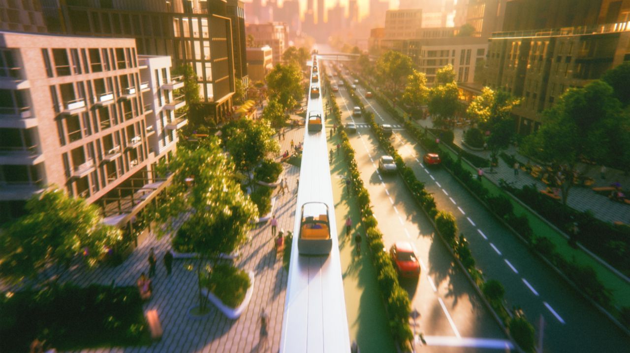
But rather than improving existing infrastructure, Line Mobility proposes an entirely new approach. Something that you might expect in a Back to the Future film. They hope to bring a personal, point-to-point transit system made up of automated pods running along elevated guideways above traffic. No timetables or transfers, and no dreaded congestion. Just direct, on-demand travel designed around people, not cars.
It's a bold idea we can't even imagine. So the biggest challenge might be convincing us of its reality – especially when the product doesn't yet exist.
That's where Art&Graft came in. Partnering with Line Mobility ahead of launch, the London-based studio was tasked with shaping the entire brand experience from the ground up. Not just how it looked, but how it felt, sounded, and earned trust. In which case, you can forget surface-level aesthetics. It was more about making a futuristic transport system feel believable, reassuring, and achievable.
Following early strategic groundwork by Fazer, Art&Graft translated Line's brand pillars into clear design principles to guide everything that followed. From identity to motion, film to web, every touchpoint needed to balance optimism with realism.
At the heart of the brand sits a bespoke triangular logo. A mark that speaks to structural stability and forward motion. Because let's face it, the most you're going to want to feel from looking at Line Mobility is that it'll be safe and reliable. The logo's smooth, intersecting paths also represent a choice: stay on the current track or take a new route entirely. That same geometry extends to the design of Line's transport pods, tightly linking the digital brand with the proposed physical infrastructure.
It's why the launch film had to become a central storytelling tool. Structured around the "why, how, and what", it guides us through today's broken transport systems, explains how Line would function in practice, and ends with a tangible vision of what cities could become. Early visuals feel speculative. But by the final act, they feel lived-in and real. It's a deliberate move to take us from curiosity to confidence.
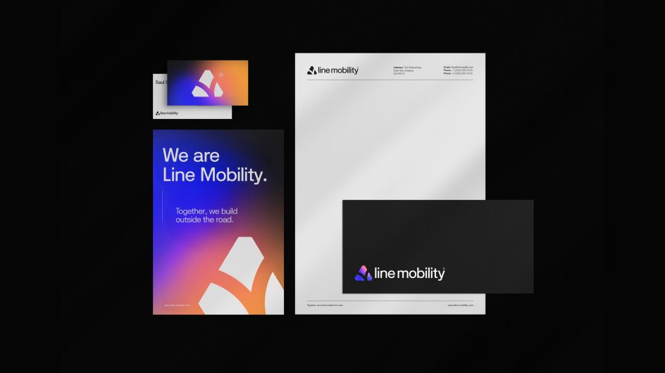
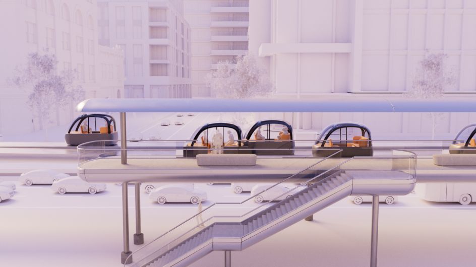

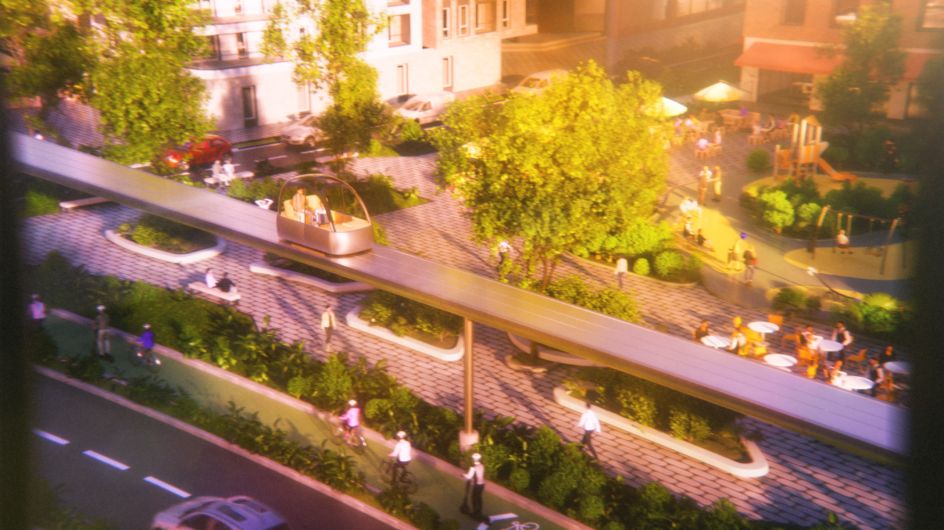
Throughout the campaign, design is used to build even more trust. Soft gradients and elegant typography create a sense of calm and clarity. Detailed 3D visuals ground the technology in reality. Photography brings a human perspective, allowing us to visualise this innovation in our future cities. And music & SFX by Zelig Audio adds that final flourish.
As a startup without an in-house design team, Line Mobility also needed a system it could actually use. Art&Graft delivered a clear, practical brand bible, along with modular charts and data tools that enable the team to communicate complex ideas simply and consistently as they grow.
The visual language carries seamlessly into Line's website, where a clean, intuitive layout mirrors the brand's promise. There's a lot of optimism, naturally, along with a friction-free user experience that builds on the theme of reliability.
In the end, this wasn't just a launch, but an act of world-building. By shaping how Line Mobility looks, feels, and tells its story, Art&Graft helped turn a speculative idea into a credible vision for the future of urban transport. One that we can believe is possible, and see ourselves using day-to-day.

Editor's Picks


Trending


Podcasts


Editor's Picks
Further Reading