Upperquad's identity for Patagonia's new film looks at the power of the community energy movement
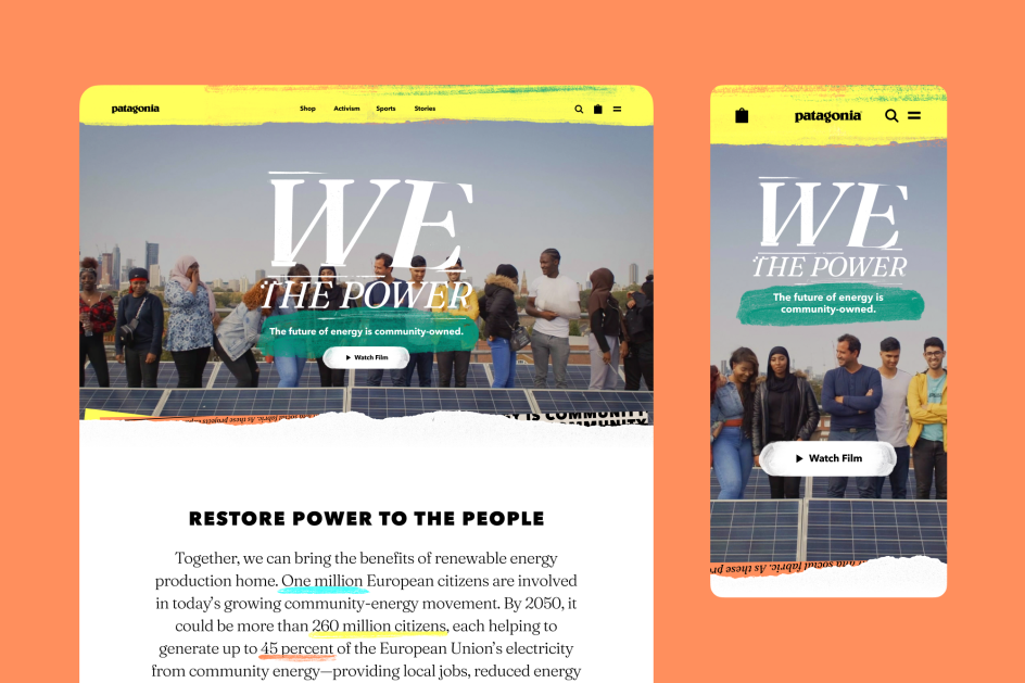
We The Power is a new film and initiative by Patagonia that imagines a future of citizen-led, community energy schemes to help combat energy poverty. To prepare for its launch, the outdoor brand teamed up with San Francisco-based studio Upperquad to craft an identity that celebrates the spirit of the movement.
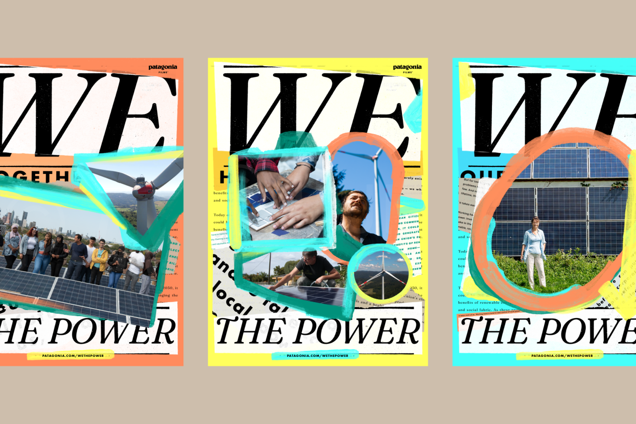
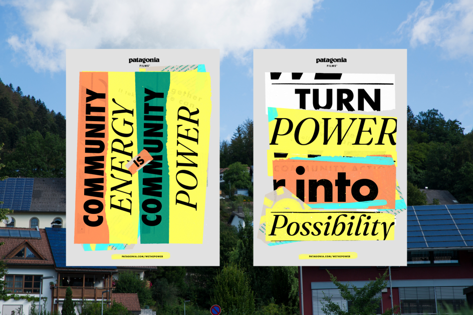
Featuring lively brushstrokes and torn-paper textures, there's an organic DIY-aesthetic to the work, reflecting the grassroots, community-led movement. Typography plays a leading role: the bold serif and italics from Undercase Type's Fraunces give the campaign messaging a "high-spirited mix", which according to Upperquad is "approachable" with "positive energy blended with the urgency of this moment". While the accompanying Future PT gives it a solid anchor and demands attention.
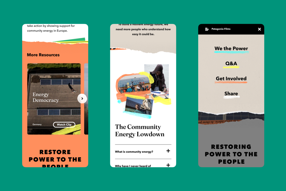
"Like the movement, the identity is freeform," explains Upperquad. "You can split it apart, change colours, and resize elements based on whatever the canvas is or whomever's got their hands on the scissors. Print and marketing runs maximalist, putting the full colour palette to use. Film and photography use a toned back alternate. The goal of this non-uniform approach is to reflect community made energy: custom local power solutions, built by the handy work of its members."
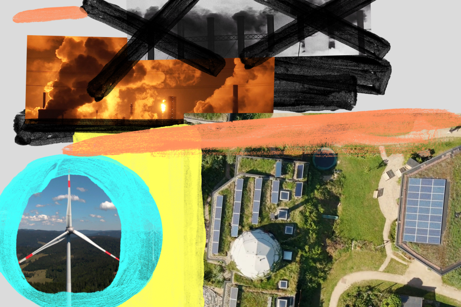
The colour palette of highly saturated tones adds yet more energy to a series of mixed media collages of "hometown heroes" and community groups affecting change in their neighbourhoods. These collages have been set in motion, where Upperquad says "nothing can ever quite sit still" which gives another clue to the active and energetic movement at play.
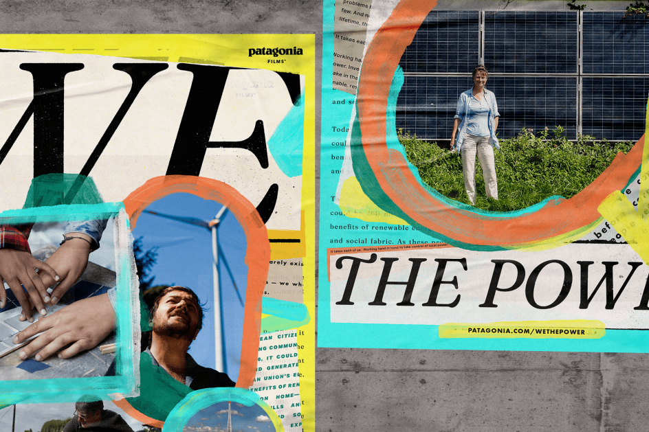
It's a brave, often brash graphic look that reflects the community schemes that are throwing out the rulebook and pushing back against monopolised power-generation. As Upperquad explains, it's "built to echo the DNA of the film and the movement – a pulsing drumbeat of heroes and hope, confidence and positivity, and most importantly, collaboration and community action".
The identity kicks off with a teaser campaign in select spots throughout the UK and Europe, and is featured on storefront displays, street posters, social media, websites, as well as community outreach.
Editor's Picks


Trending


Podcasts


Editor's Picks
Further Reading