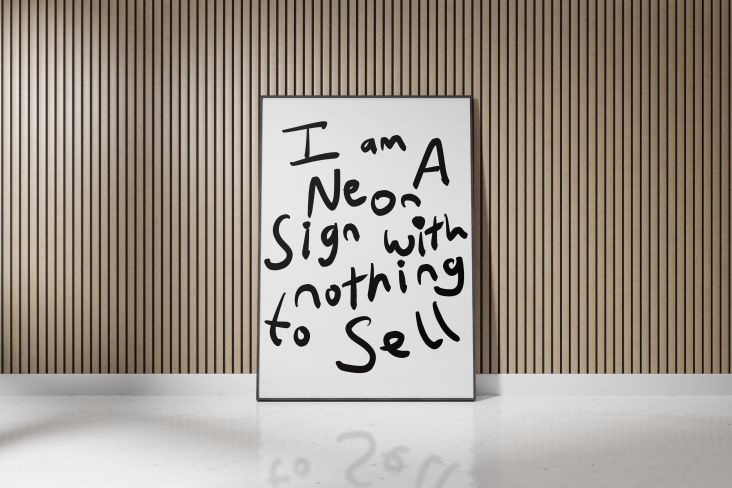
The naturally refreshing visual language of Sour Soda Studio
From graphite on paper to digital drawing to vector brushes in Fresco, illustrator A has developed a new visual alphabet through experimentation and dubbed it Sour Soda.
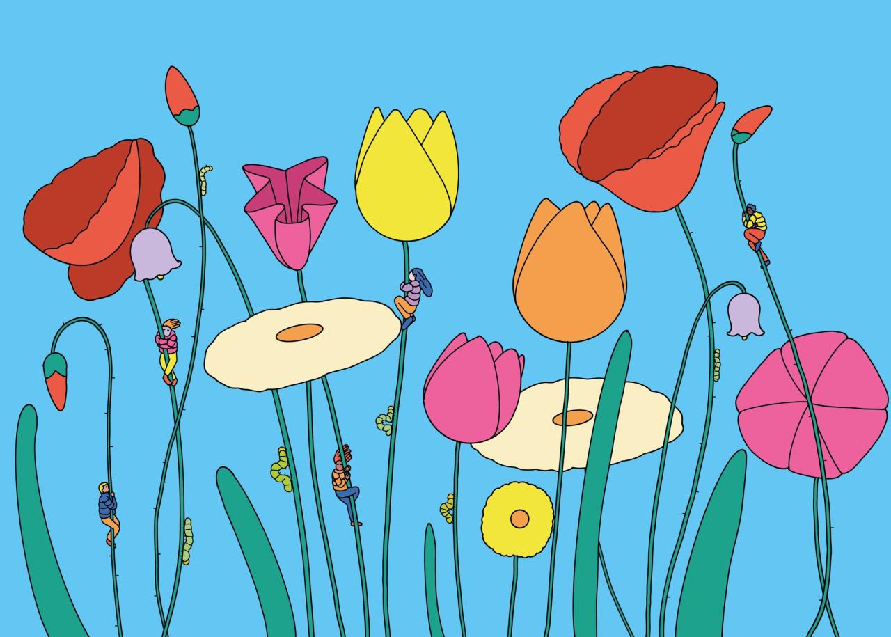
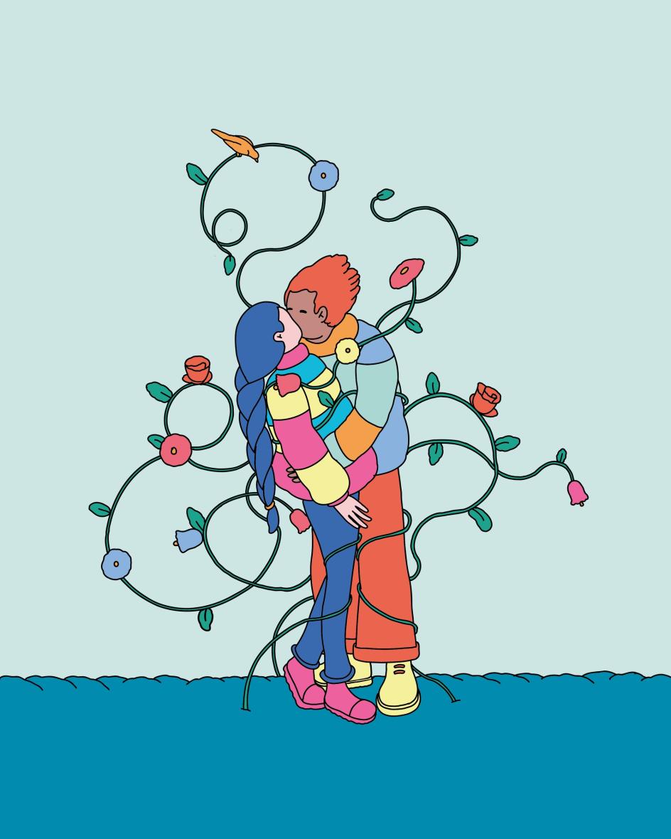
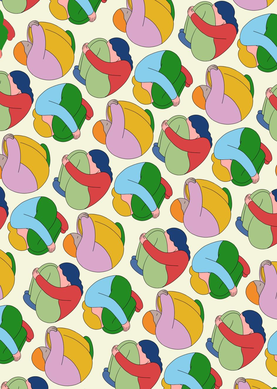
Flower Huggers
Being an illustrator is a wonderful job, but it can be easy to get into a rut. Clients look at your portfolio, see something they like, and commission you to create similar work. It's a good thing! You get to work consistently with people who understand who you are and what you do. But it's a bad thing when the artist inside needs the freedom to produce something fresh, different and entirely unattached to any established style.
Sour Soda Studio is a new initiative by an already successful illustrator to break out of the confines of a more or less set way of working – an anonymous project that refuses to be bound by what's come before. We'll call them A, for clarity.
"It is a project that explores a colourful, surreal and slightly strange language, where simple forms and full colours are used to build images that are poetic, decorative and narrative at the same time," says A.
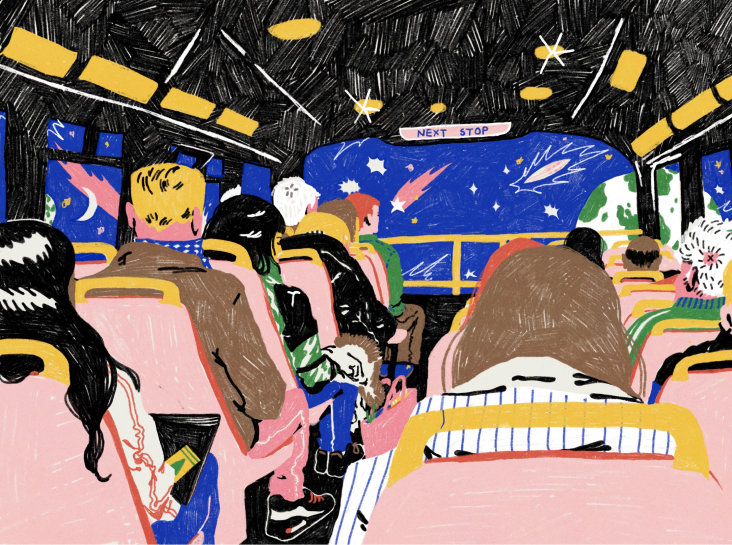
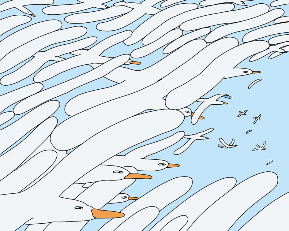
Curving, organic line work and a lack of hard corners give it a gentle, natural feel, while the simple forms and colours nevertheless lend impact. The subject matter in the Sour Soda portfolio so far has focused on nature, the environment, resources, consumption, and sustainability. But it was the visual language that came first – something that has been gradually shaped over the last four years or so, and that steps away from the two styles A has previously worked in.
"The first two came more from the gut. This one was built much more from the head. It differs in many ways," says A. "First of all, it is made in Illustrator, so it is vector-based, not pixel-based. I use brushes in Fresco that allow me to draw freehand in vector, and that is where the line came from. I wanted a black line that almost felt engraved."
Immigration
Toxic Net
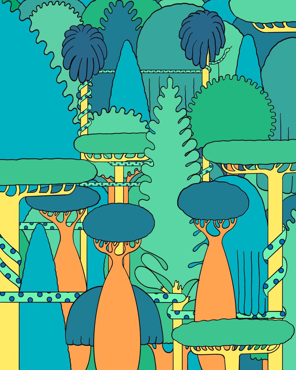
Playground Forest
Second Hand Body
A continues: "There is also an internal visual code: the way I draw trees, clouds, people, clothes, hair, grass, animals. A kind of grammar. If I had to describe the general feeling, I would say it is a world where sharp edges almost do not exist. The forms feel as if they were made of rubber or clay, something soft and malleable."
After honing the aesthetic, A looked for a topic to apply it to and chose something that matters to them and to nearly everyone else on the plane right now – the environment. Applying the newly created style to narratives about climate, resources and consumption was the next step. Still, A wanted to go one further and introduce a decorative approach alongside the storytelling. It's a move cognisant of illustration's changing role in today's media.
"I think illustration is moving further and further away from its old role of accompanying articles in magazines. Magazines are not read or sold in the same way they once were, and illustration is slowly taking on a different function," says A. "Translating a concept into an image through a visual metaphor, that remains fundamental, and it is still very important to me. But today the decorative dimension has to be considered as well."
As a result, throughout the Sour Soda portfolio, you'll see forms repeated, not quite as patterns, but decoratively in ways that create a pleasing regularity and cadence in the images. This often adds to the sense of calm they convey and chimes with the theme of nature once again.
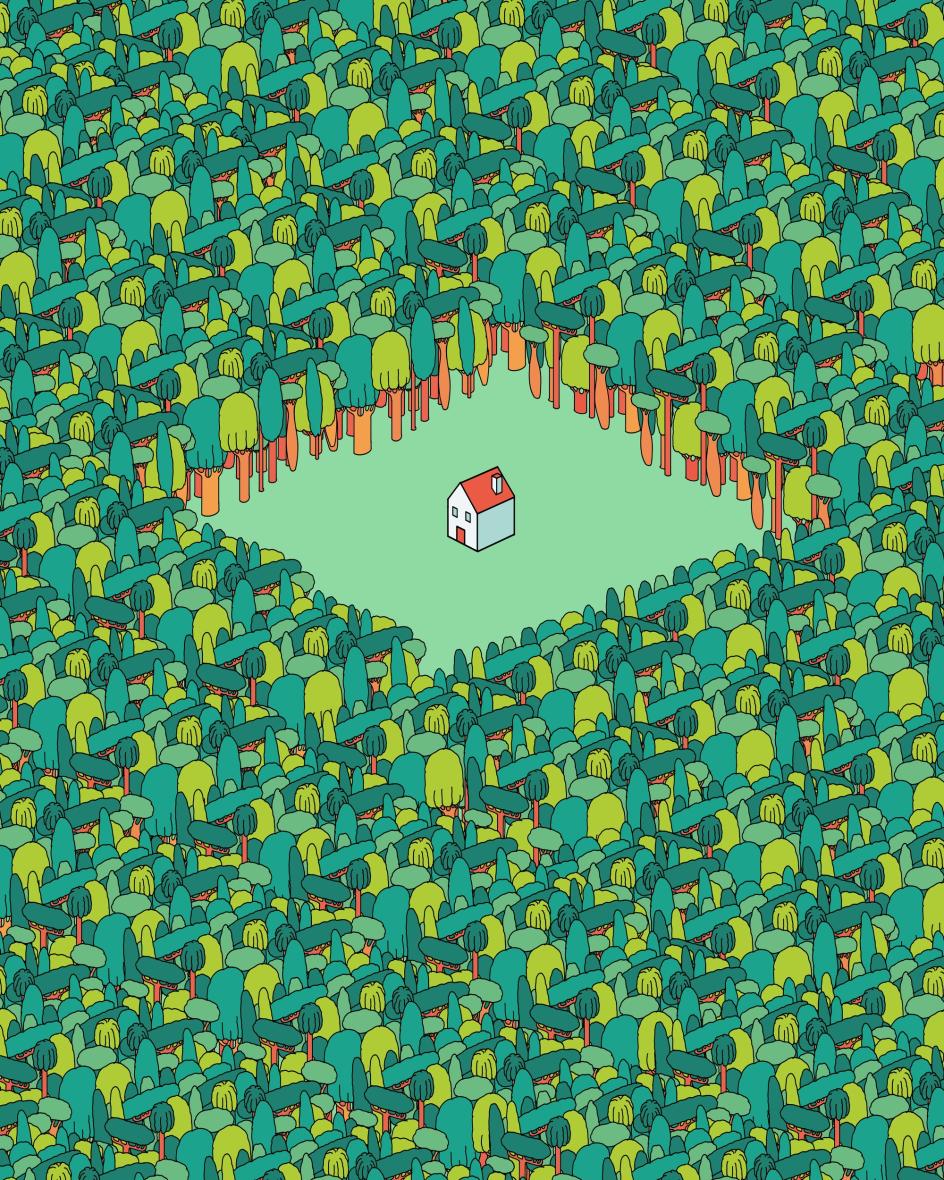
Clearing
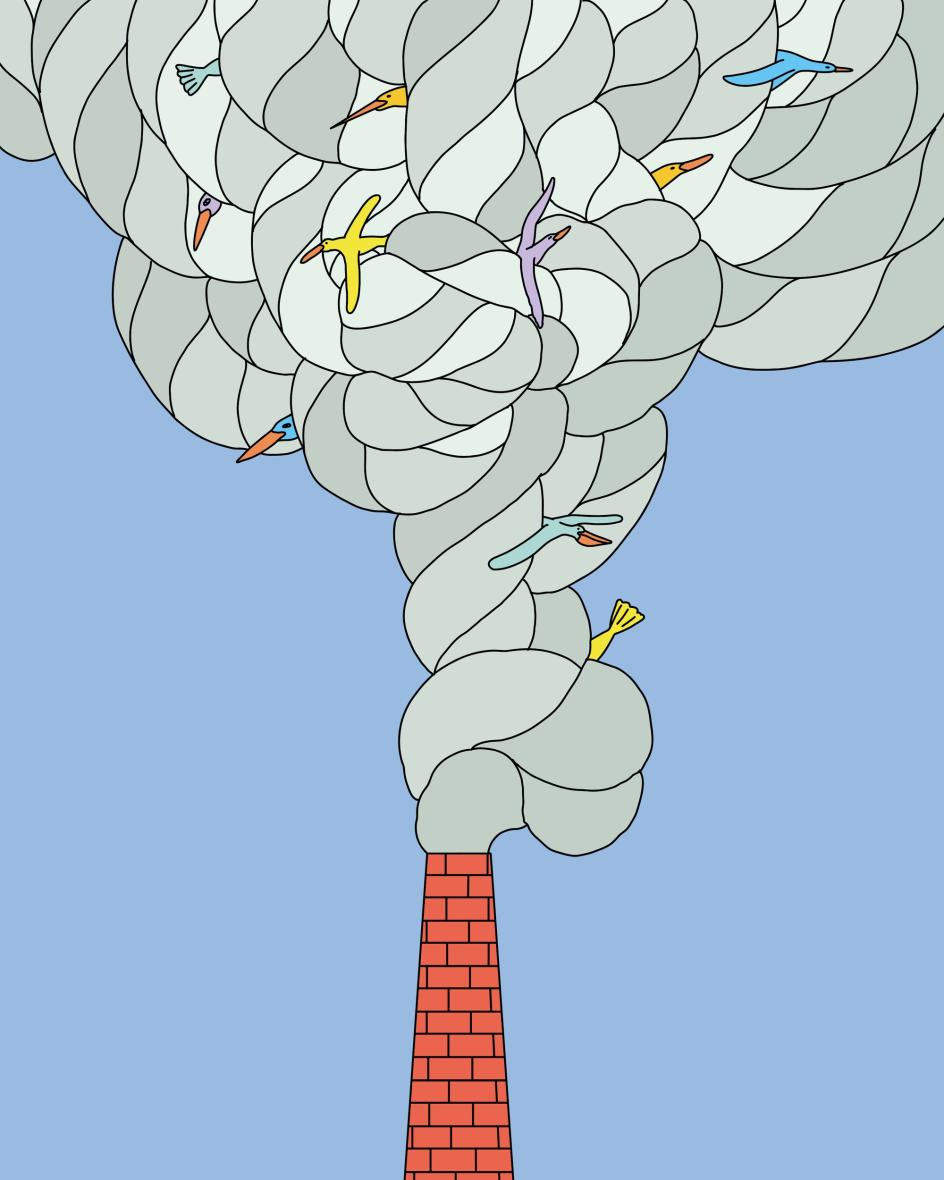
Trapped Clouds
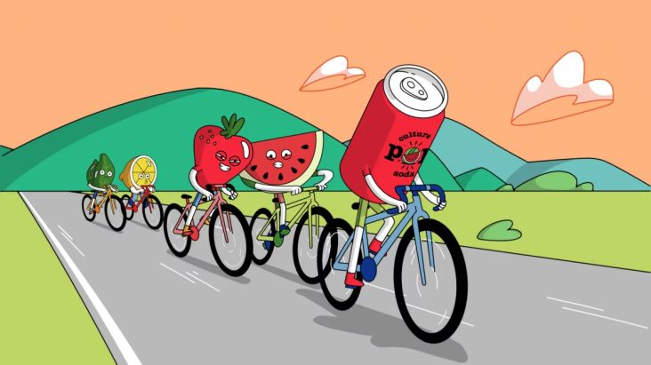
Consumption
All the Sour Soda art so far has been self-initiated, but moving forward, A hopes to start attracting clients to the look and feel they've developed. The intention will be to apply the style to a range of topics, not just the environment, and that's when its flexibility will be tested. The door is wide open regarding future directions.
Finally, if you've been wondering why A's project is called Sour Soda, well, that expresses the duality A sees in the work. "I also liked the idea of alternating lighter images with harsher ones. The figures curled up on themselves, almost egg-shaped, and repeated until they start to form a pattern, belong to the 'Soda' side of the project – lighter, more playful, more immediate," says A.
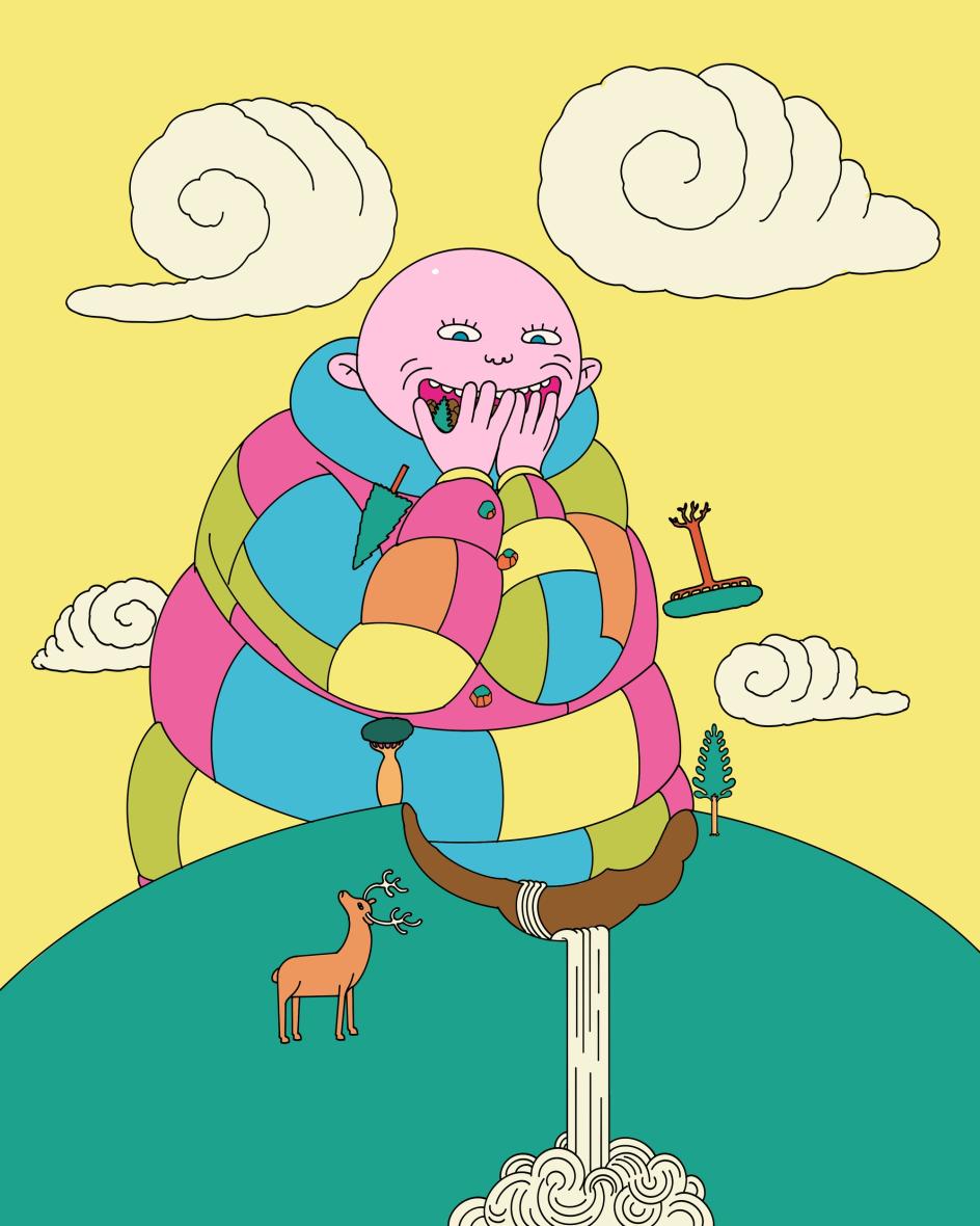
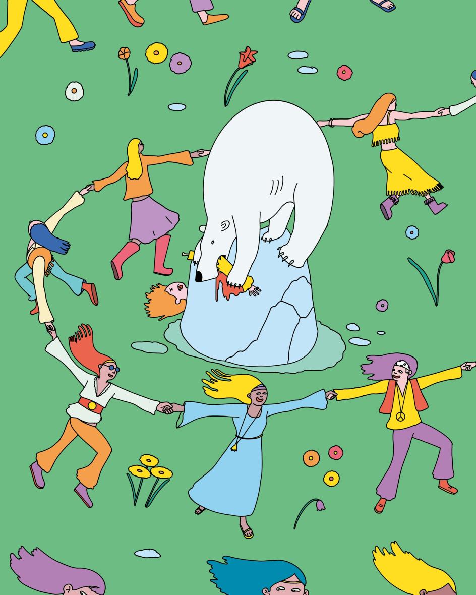
"Other images are more acidic, more 'Sour' – the giant devouring natural resources, the polar bear on a melting iceberg eating a flower child while people dance around it. The name Sour Soda comes from there: from the attempt to make the sweet and the sour coexist in the same language."
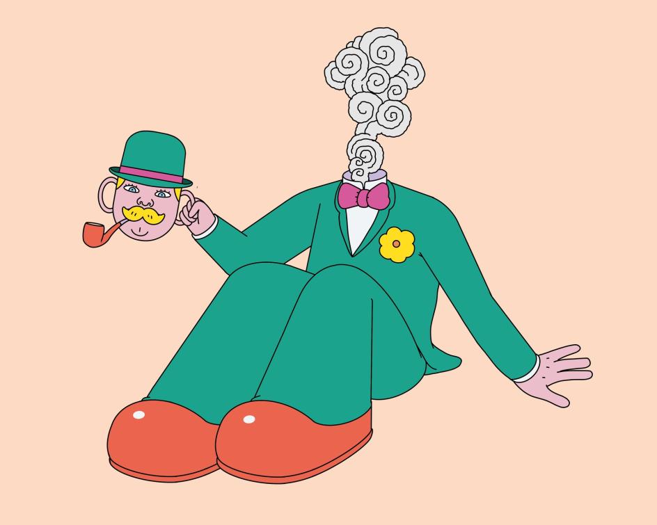
Huggs
Further Information
Editor's Picks


Trending


Podcasts


Editor's Picks
Further Reading