Seymourpowell creates new designs for iconic squash brand Ribena
Design agency Seymourpowell has worked with Ribena to create new bottle designs across its range of squashes, fruit cordials and more.
The work with Ribena began two years ago when Seymourpowell was tasked with helping the brand cement its position in the competitive drinks market in the future. The agency ended up working across both the 2D graphics and the structural packaging across the flagship Ribena Ready To Drink bottle (RTD) and 2D redesigns for Ribena's Core Squash, No Added Sugar (NAS), and Botanical Fruit Cordial.
One of the key challenges in the partnership with Ribena, which is owned by Suntory Beverage And Food GB&I (SBF GB&I), was to differentiate itself in the minds of consumers while also "retaining the identity consumers know and love".
Before and After
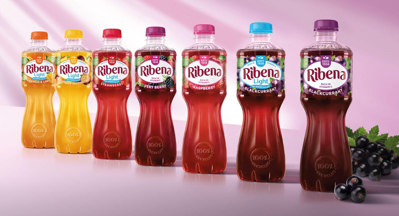
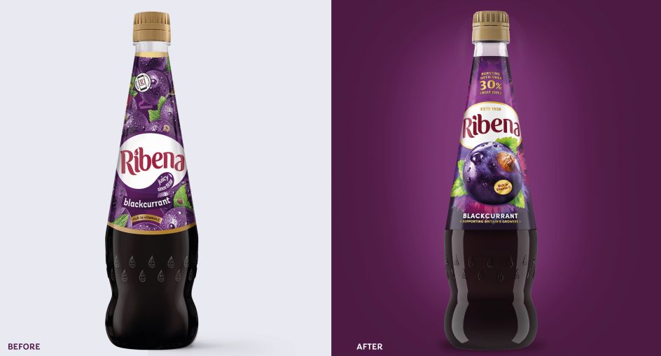
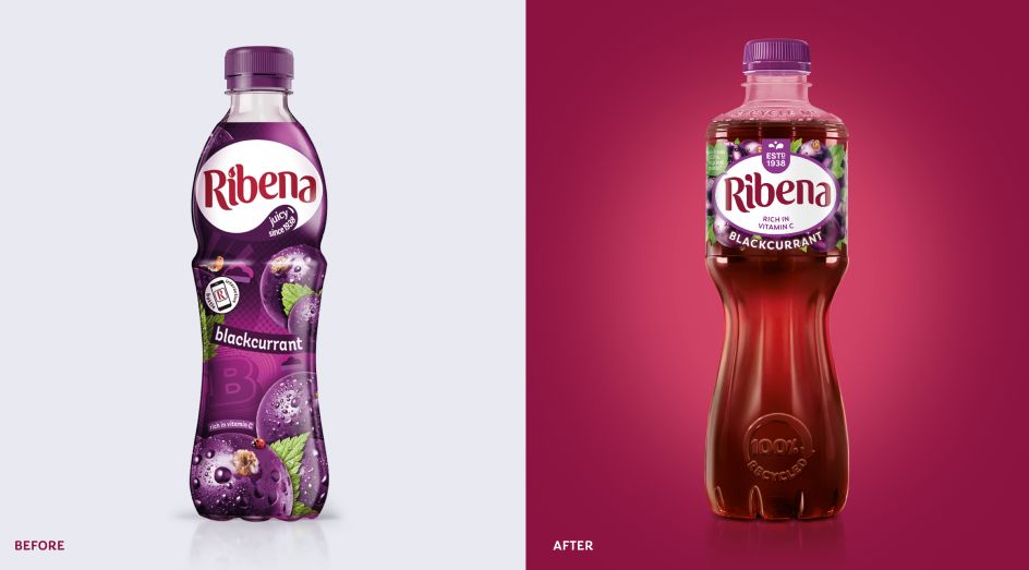
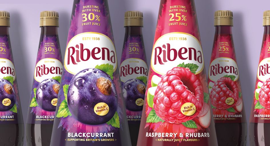
The RTD product bottles central to the Ribena range have been modernised with a new, more elegant bottle shape, aiming to "appeal to an ever more sophisticated market and audience" through a design that references the look of cut glass retaining elements from the brand's heritage.
On the labelling, fruit illustrations are used around the Ribena brand mark to suggest the drinks' taste, while the brand's history is made all the more prominent by placing the "Estd. 1938" at the top of the mark as a "quality seal".
The label itself is deliberately small and transparent to showcase the colour of the liquid. This also contributes to the project’s sustainability goals: the former clear bottles were recyclable, but their sleeves' colour and length meant that some recycling plants couldn't identify them as such. The new bottles are more sustainable in other ways since the shrink sleeve has been made smaller so that the bottle can be easily recycled with the cap and sleeve on.
According to Seymourpowell, the redesign makes Ribena "the largest drinks company in the drinks category to be made from fully recycled material and also fully recyclable." These cues are demonstrated on the bottles through an embossed "recycle me" message on the neck.
Before and After
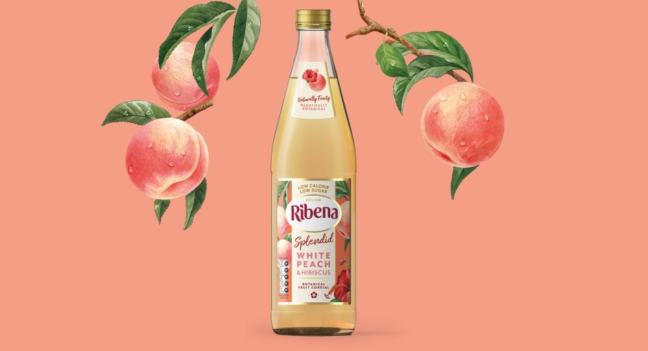
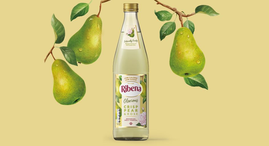
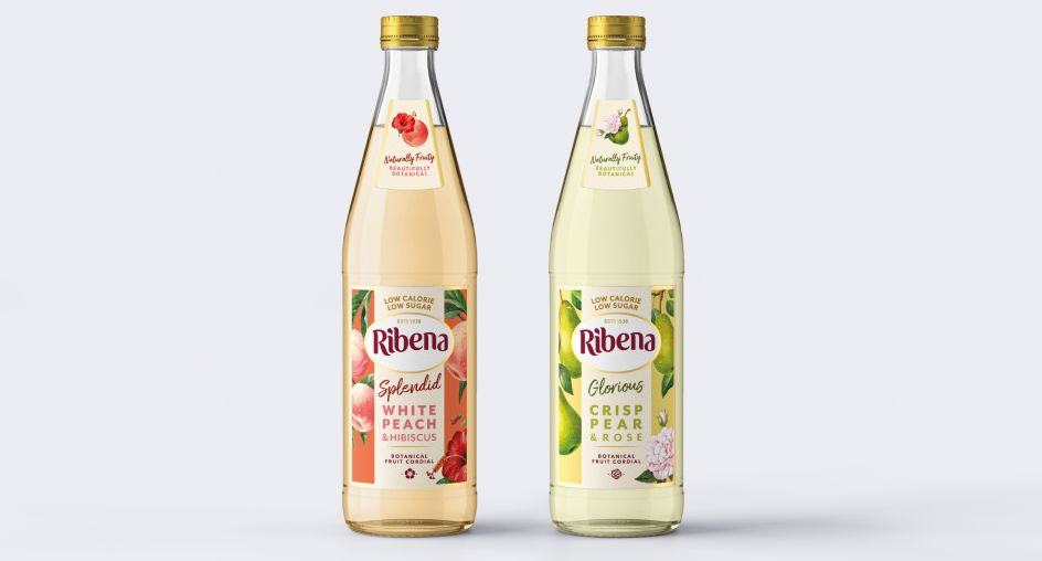
For the Botanical Fruit Cordial range, Seymourpowell used a softer colour palette and textured paper labelling with fruit and botanicals illustrations to "provide lighter and more natural cues for the consumer," says the agency. The more premium sensibility of the range is hinted at with gold accents.
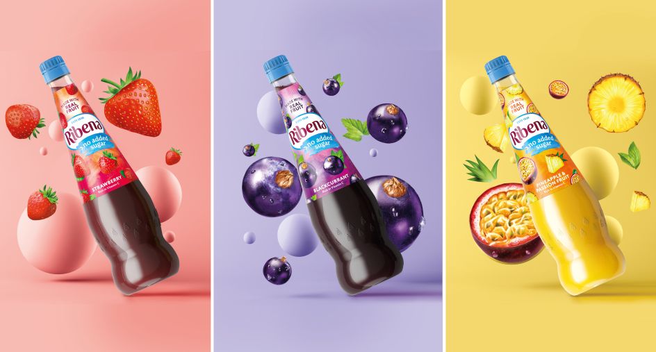
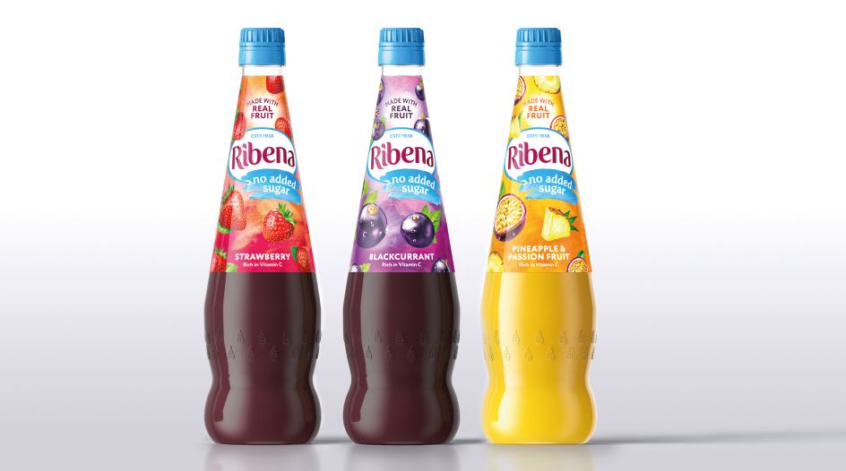
The squash packs' new designs aimed to "magnify the rich and juicy flavours," says Seymourpowell, while the bold background highlights the "fruity and impactful taste." Finally, the No Added Sugar range bears a sky blue brand mark set on a watercolour background to denote the drinks' lighter nature.
The new designs launched in UK supermarkets last month and will be rolled out into early 2021.
Editor's Picks


Trending


](https://www.creativeboom.com/upload/articles/90/908fdb6378db1e95d12595416f54e6336d5e80b8_732.jpg)
Podcasts


Editor's Picks
Further Reading