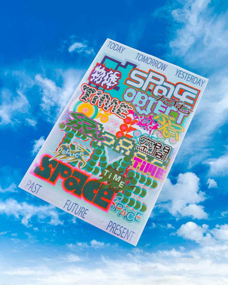
Dynamic and bright work from No Rocket across branding and explorations of hallucinations
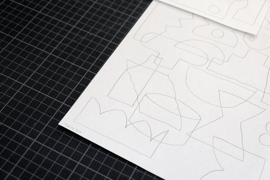
According to the founder of Amsterdam-based graphic design and illustration studio No Rocket, Francesco Zorzi, the agency “prefers pencils to keyboards, paint to colour palettes, paper and scissors to copy-paste.”
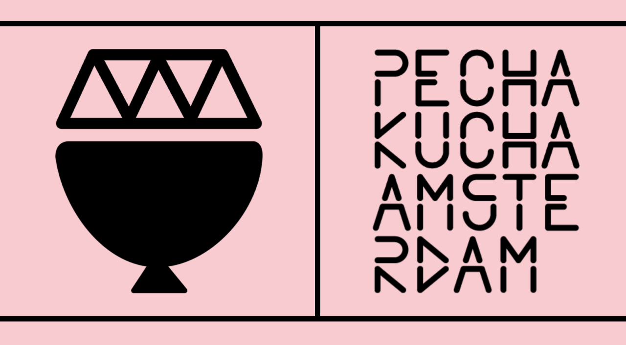
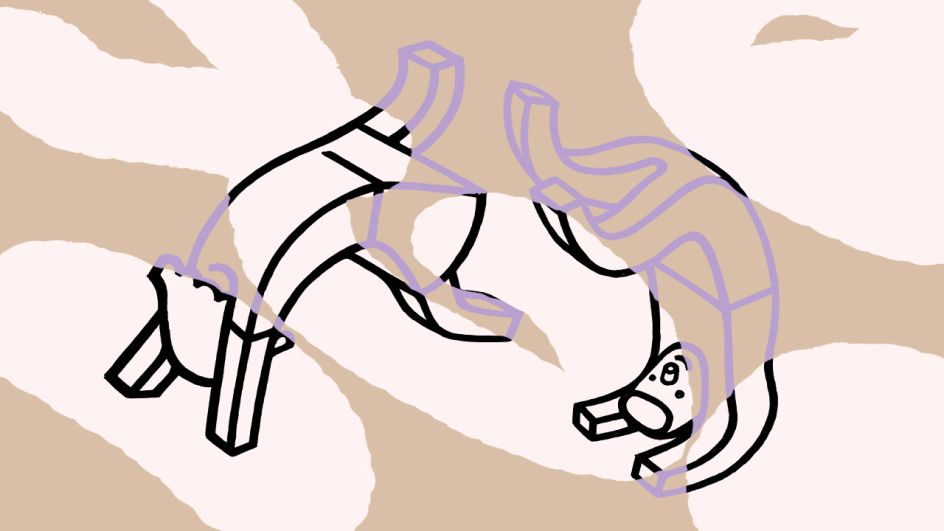
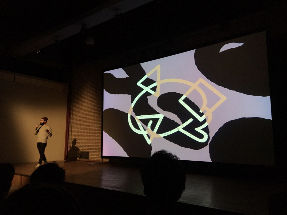
This manifesto becomes clear as you look at No Rocket’s work: while it’s bold, dynamic and graphics, there’s a touch of the handmade about all its work. This year Zorzi was asked to speak at Amsterdam’s Pecha Kucha event, and took the opportunity to present his new work in progress, Macula. The project is about “vision and perception, describing how powerfully interconnected our brain and our eyes can be,” he explains. “The development of Macula will be a tour into phantom visions and visual hallucinations and the beginning of a path that will try to bring awareness to a whole spectrum of experiences related to hypo-vision and vision loss.
“The world of visual hallucination related to these pathologies is very often feared and misrepresented. People can agonise for years never mentioning that they hallucinate.”
Visually, these fascinating explorations manifest themselves in the form of lively splits of purple, pink, beige and black; an unusual palette perfectly suited to an unusual topic. These are coupled with illustrations using thick black lines that reference aspects of the human body associated with hallucinations, such as the eyes.
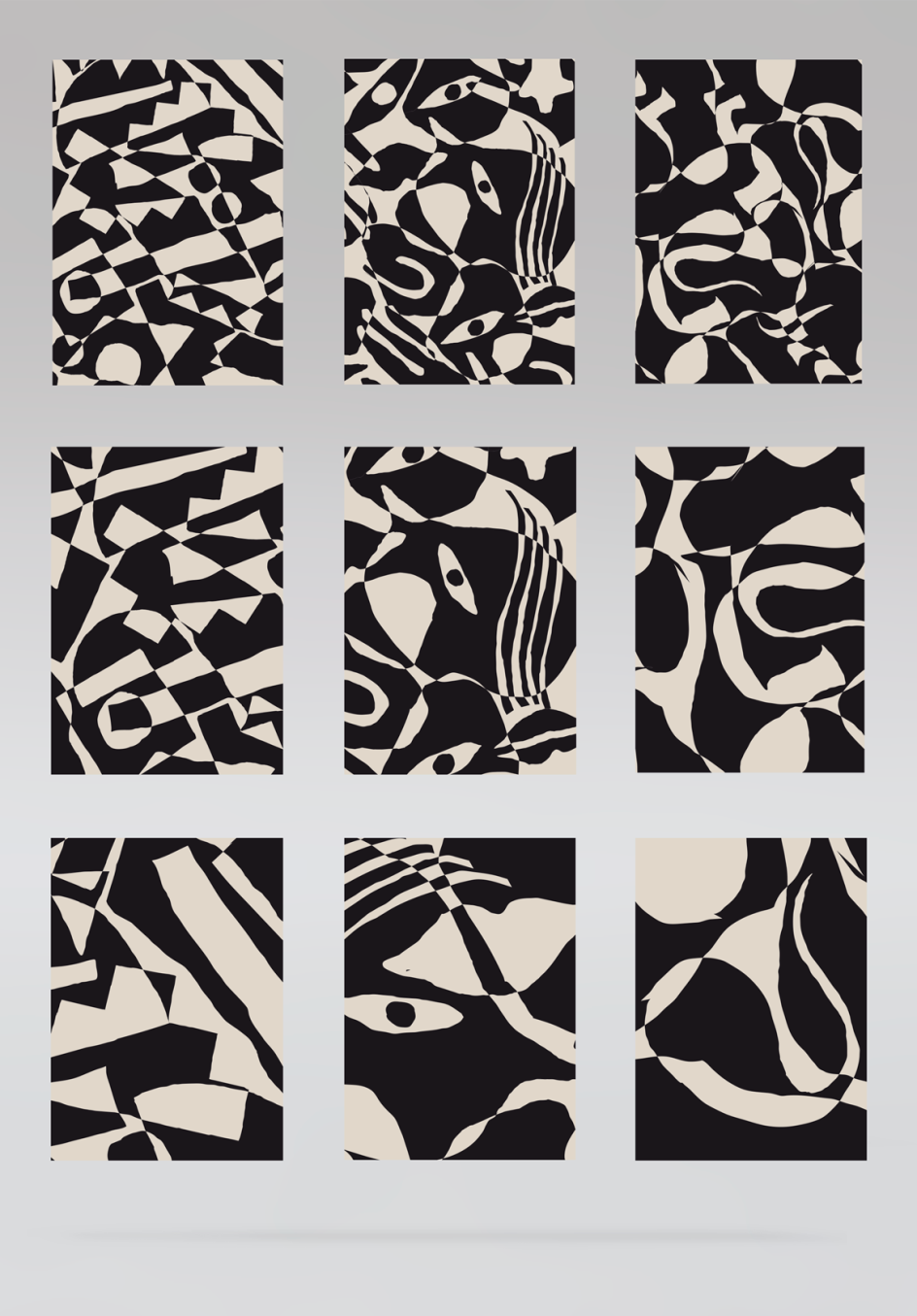
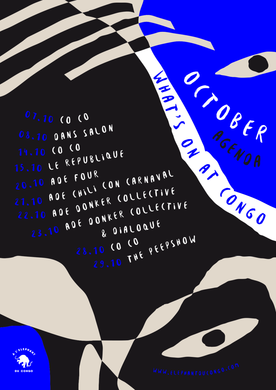
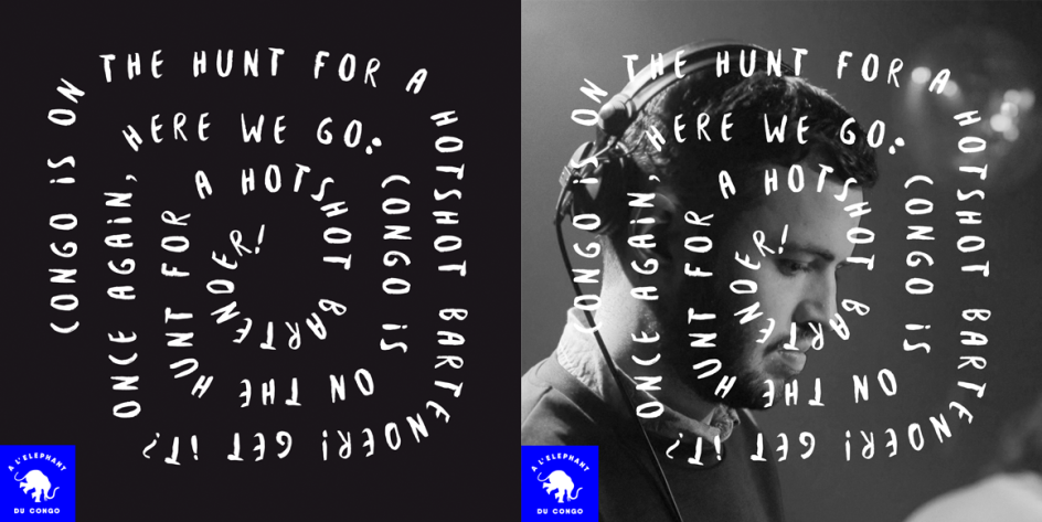
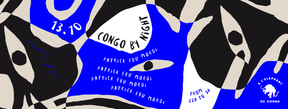
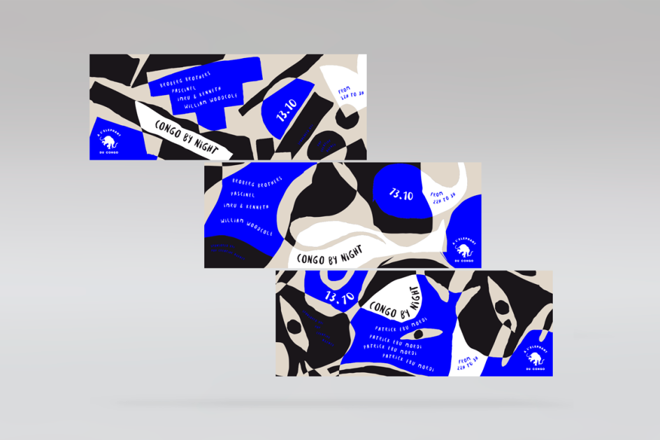
The rest of No Rocket’s portfolio is just as arresting, and a highlight for us is the bradding and graphics for A l'Elephant du Congo, a new clubhouse in the centre of Amsterdam. The brief was to create a “fresh and popping” identity that communicated the idea of “a place where the local creative crowd would gather and spark collectively, blurring the boundaries between clubbing and nightlife,” says Zorzi.
He explains: “The visual system is based on an intricate mix of colourful illustrated patterns, hand-drawn textures and a fluid freehand typeface. Black and white cropped photographs are placed right next to bright blue splashes, layered with bold letters and freely arranged text lines.
“It’s not a brand identity, it's illustration becoming system and composition becoming layout.”
Editor's Picks


Trending


](https://www.creativeboom.com/upload/articles/90/908fdb6378db1e95d12595416f54e6336d5e80b8_732.jpg)
Podcasts


Editor's Picks
Further Reading