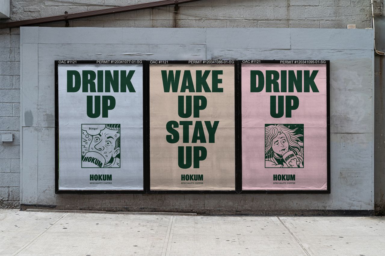
Glasgow studio Jamhot stirs up a 'no-nonsense', comic-strip identity for a speciality coffee company
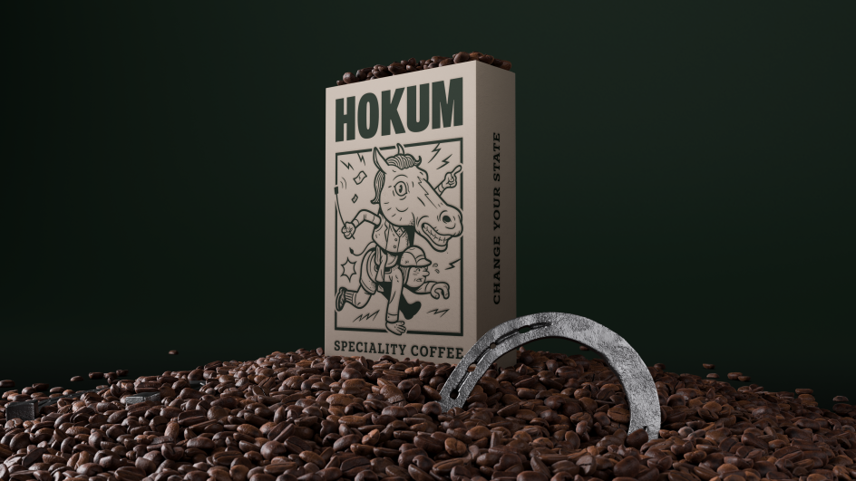
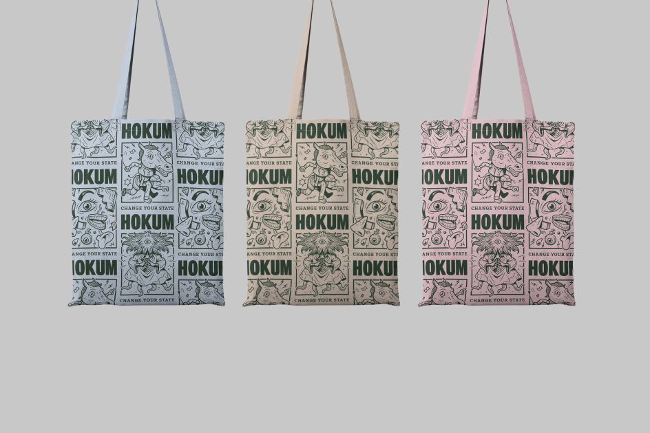
Glasgow creative studio Jamhot has launched a new identity for Hokum, a specialist coffee company that offers a premium, single-origin selection of roasted blends.
Set to launch in early 2021, Hokum will sell directly to its customers via its new website, also designed by Jamhot, and will provide a subscription service – much to the delight of all you discerning coffee drinkers out there.
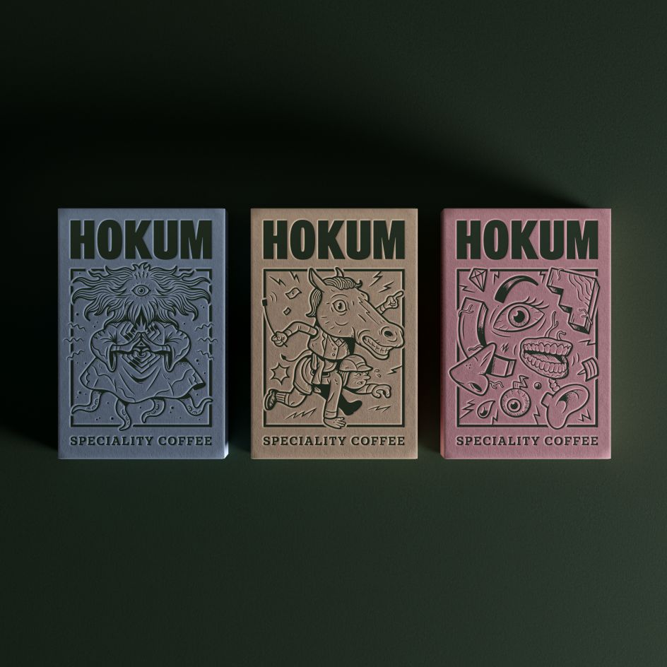
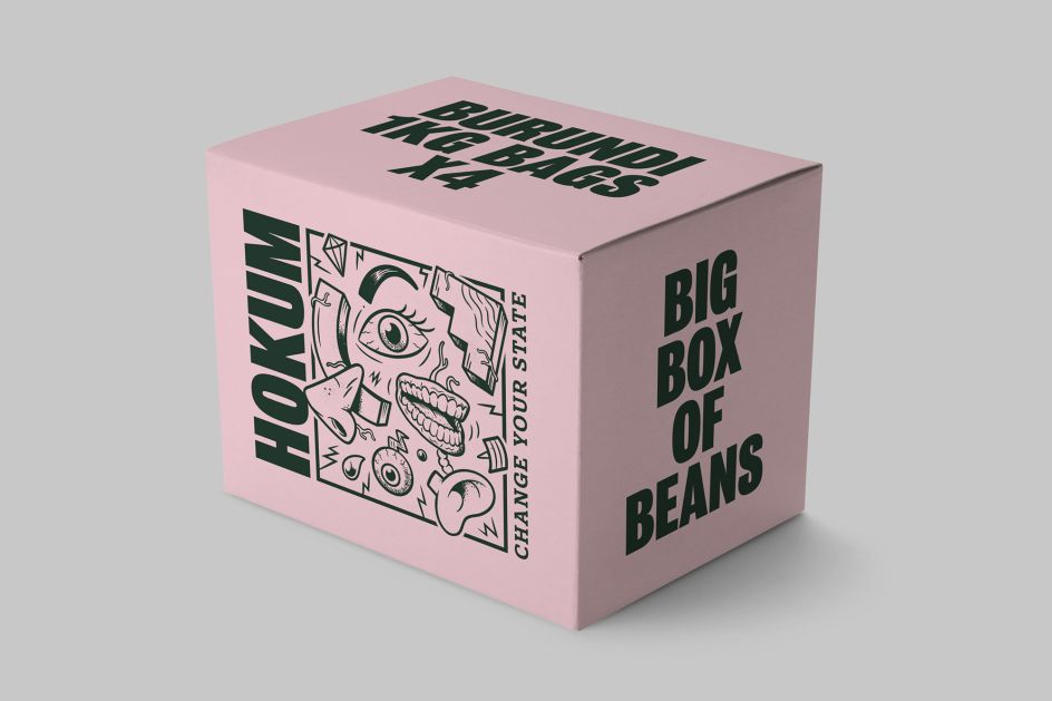
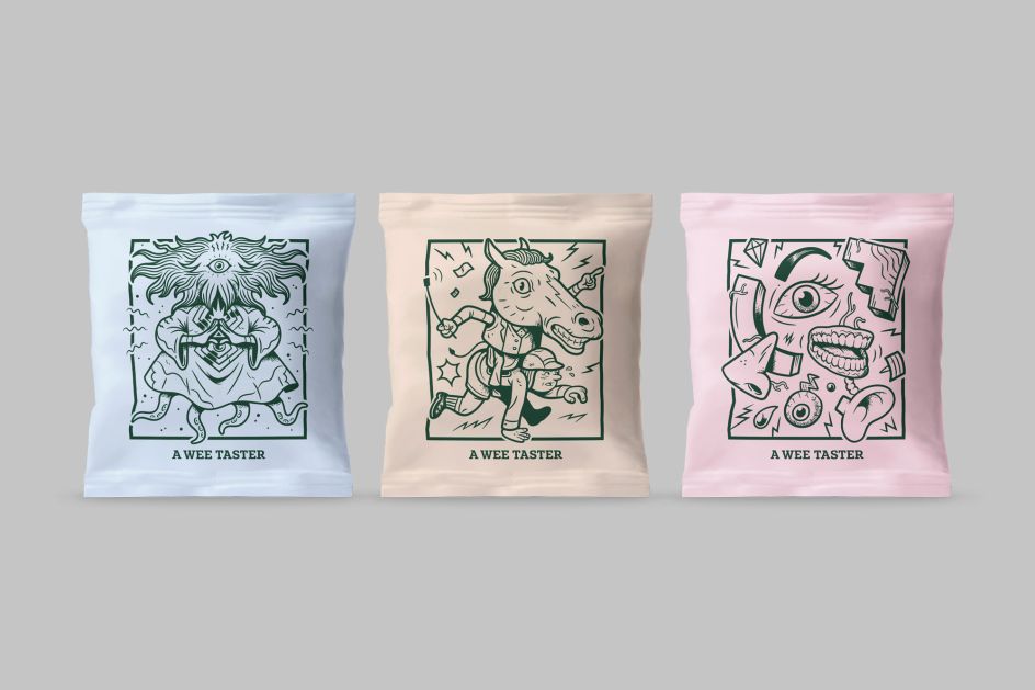
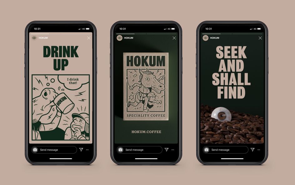
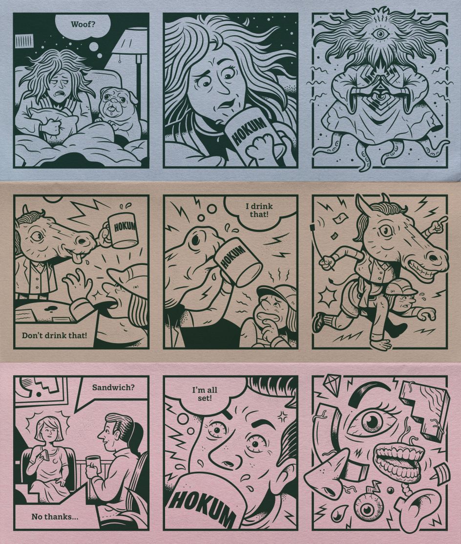
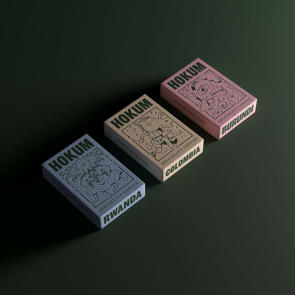
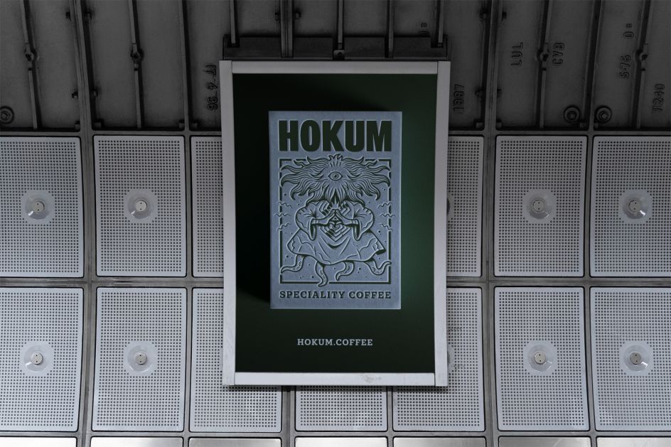
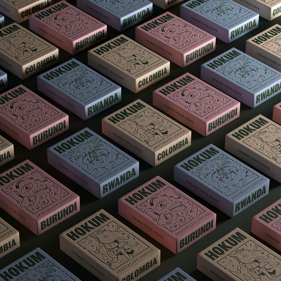
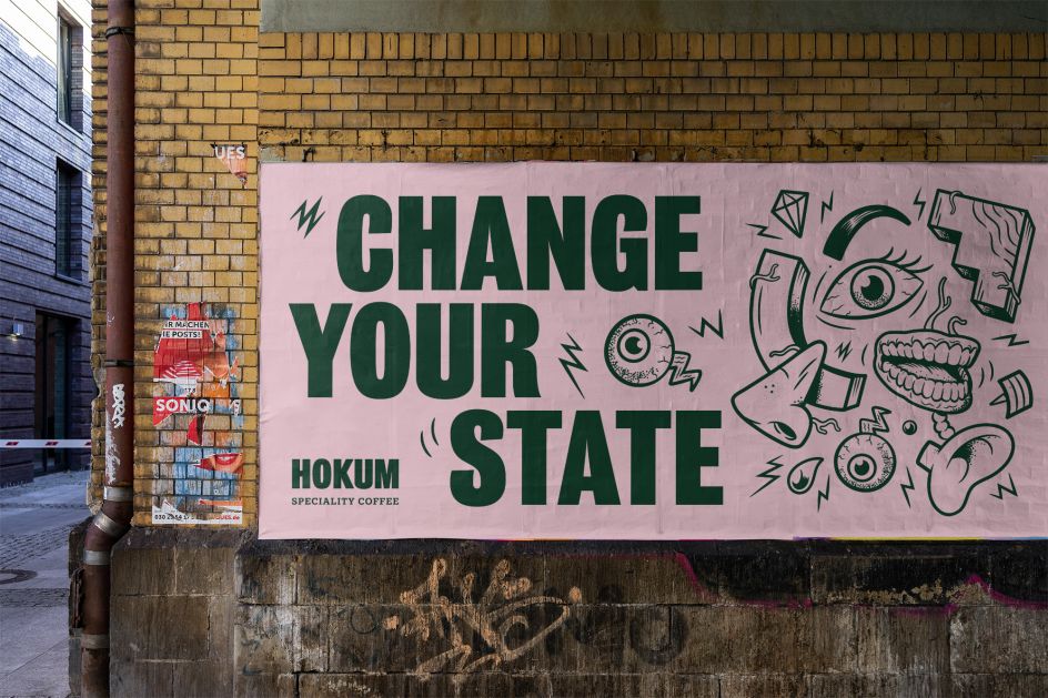
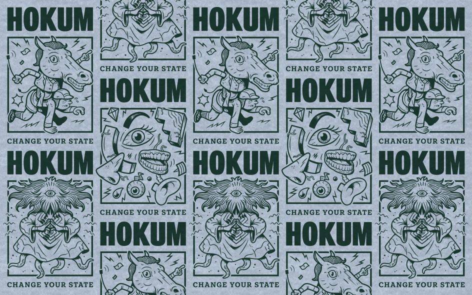
Hokum means "nonsense", so this inspired the identity, something that features comic strips, bold statements and bonkers characters against a gorgeous pastel palette backdrop. "While taking their coffee extremely seriously, the brand is attracted to the nonsense in everything else – encouraging adventurous coffee connoisseurs to try something new and embrace a change of state," explains Graeme McGowan of Jamhot.
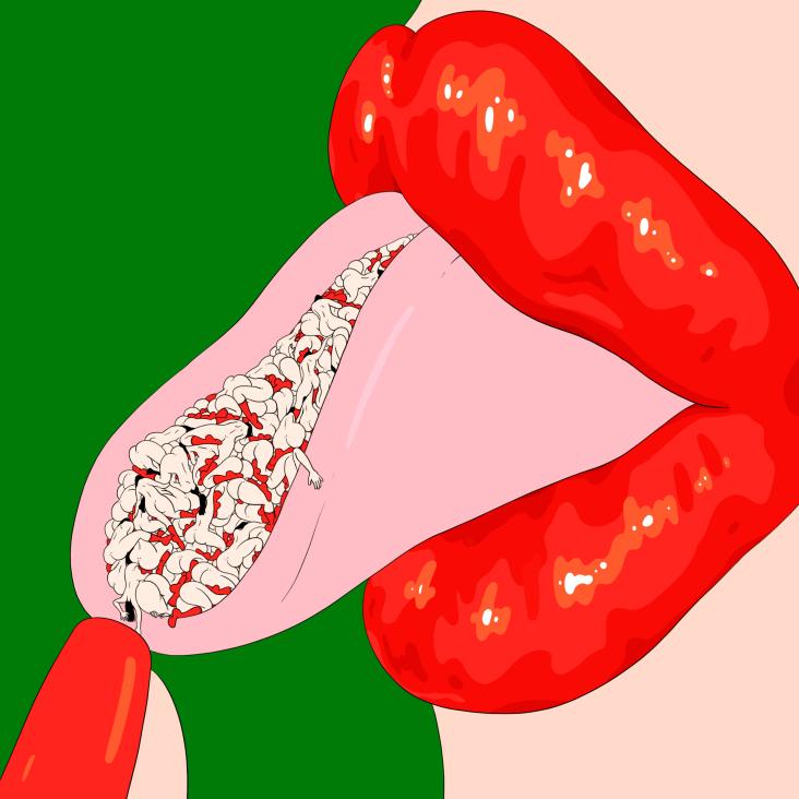
The positioning line, Change of State, is a rallying cry to people who want to mix it up and do things differently. To bring this to life Jamhot partnered with long-time creative partner Dave Morrow to create a series of bold, offbeat illustrations with a series of 3D renders and animations by the team at Render Studio.
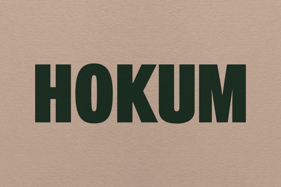
The nonsense inspired name and illustration style was contrasted with the use of the bold, no-nonsense title font Bureau Grotesque.
Jamhot's Craig Laverty adds: "There's so much amazing work within the coffee category but we wanted to do something different that would stand out and appeal to folk who are looking to mix it up. The project was a pleasure to work on, with space to really push ideas & execution, and it’s been nice to have something positive to focus on during this crazy year."