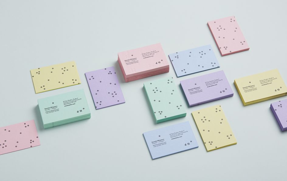
Creating a playful and positive identity for Dotto
For the branding of independent design studio, Dotto, there was one designer more qualified to create the unique identity then anyone else. Founder Danielle Molyneux came up with a logo and palette that is playful, positive and reflective of the studio's work.
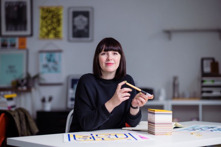
Photography by Laura Hutchinson
Danielle explains: "The project came about when I decided to create a studio name to separate and concentrate on my own direct work with clients rather than my freelance work in-house with design agencies. The main challenge was being my own client. And deciding what on earth to call the studio. This delayed the project by about a year while I toyed with an endless list of terrible and embarrassing names.
"When I decided to set the studio up properly as a limited company, that gave me an actual deadline. So Dotto was born. I’d love to have a cool design-y meaning behind the name, but alas, I was listening to Joga by Bjork and it's got this line 'all these accidents that happen follow the dot’ so I googled Dot in Japanese (as you do when you really like Japanese stuff) and it was Dotto. It sounded boingy and I could imagine all these fun things you could do with the Os so thought I’d go for that.
"I wanted the Dotto identity to feel playful and positive—and suggestive of bouncing around ideas, the feeling of never staying still and a sort of giddiness for creating stuff. I wanted the Os to always be trying to move around and mess about."
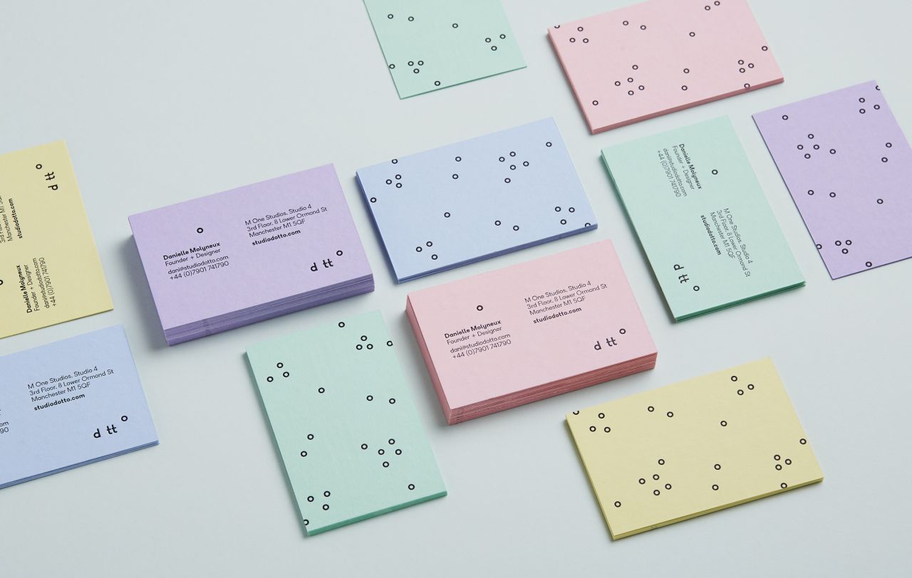
Danielle worked with James Huson to create the animations, Phil at EE Chrisp letterpress printed the business cards and Jane Crowther helped source the GF Smith Colorplan pastels.
Editor's Picks


Trending


Podcasts


Editor's Picks
Further Reading
](https://www.creativeboom.com/upload/articles/90/908fdb6378db1e95d12595416f54e6336d5e80b8_732.jpg)