Bespoke typography provides the branding backbone for microbrewery Diagonale
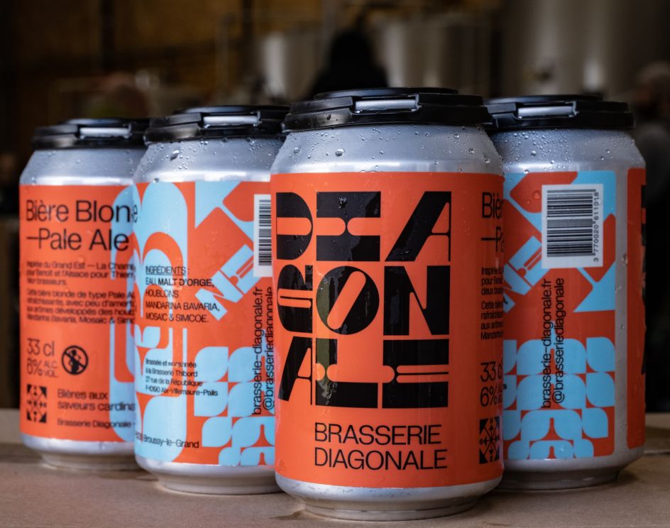
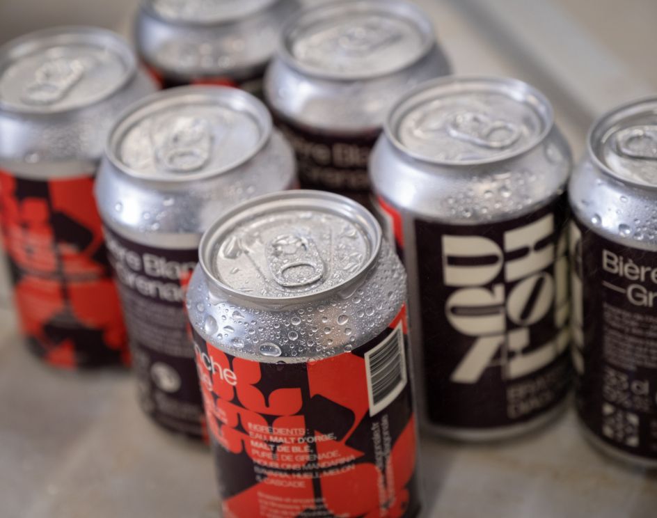
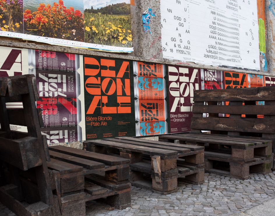
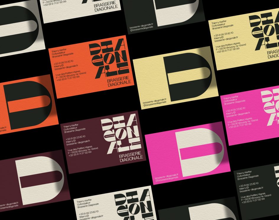
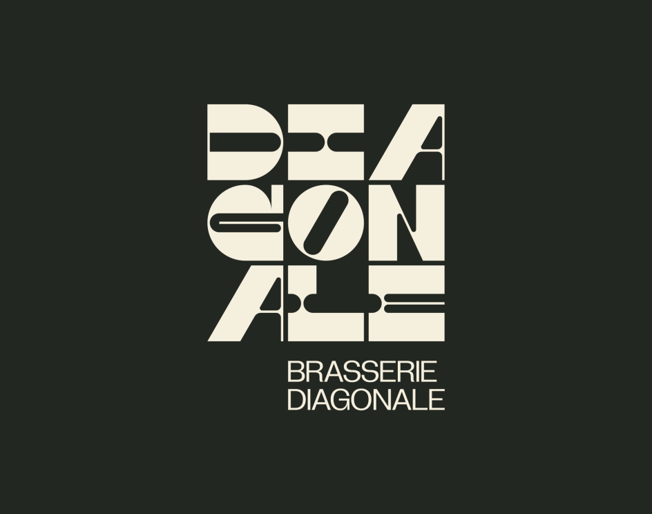
Launched in 2019, Diagonale is an independent micro-brewery in Broussy-le-Grand, Marne, in northeastern France. At the end of last year, they asked Brand Brothers to craft a visual identity for the project. And the Paris-based design studio decided to harness the power of typography to express this young company's brand story visually.
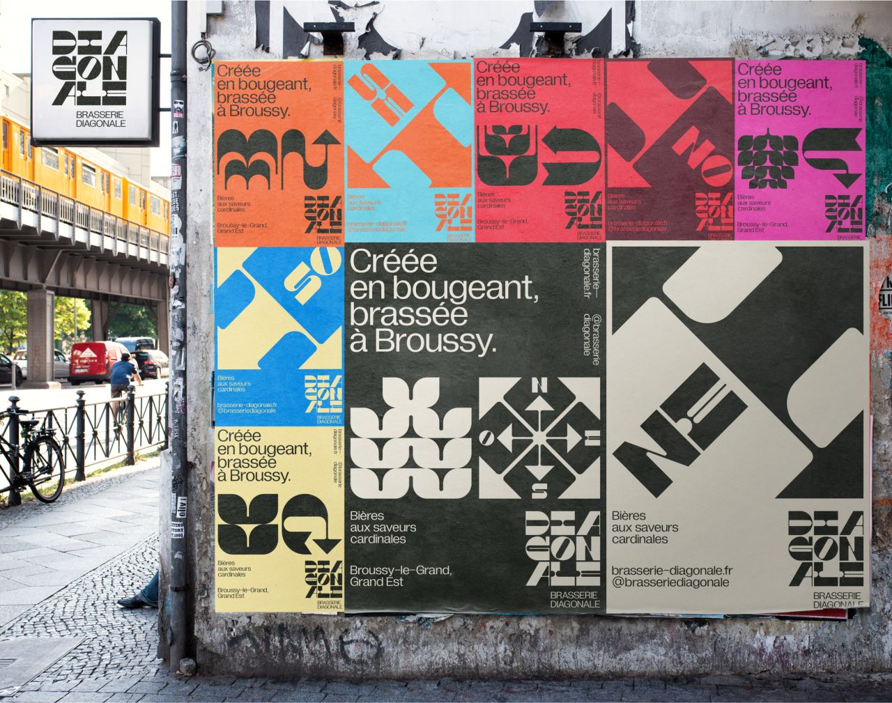
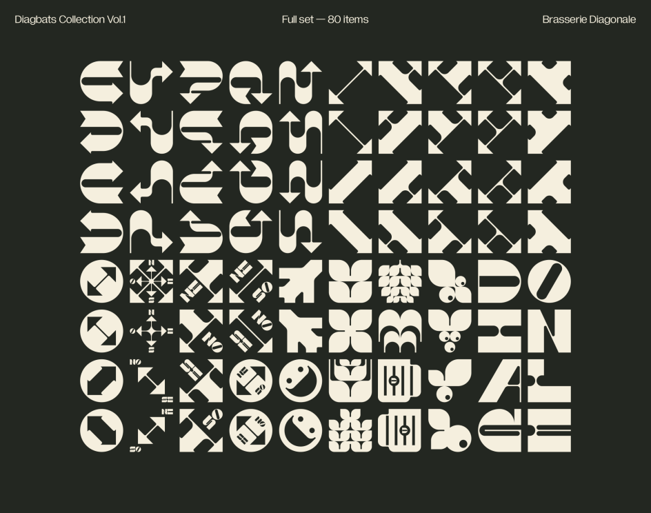
"Our graphic proposal revolved around an extensive typographic and symbolic language," explains Johan Debit, co-founder and graphic designer at Brand Brothers. "The logotype, composed of letters with very pronounced inverted contrasts, was designed especially for the occasion, and serves as the basis for a collection of glyphs that considerably enrich the narrative and the imagination around Diagonale beers."
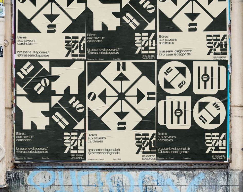
Designed in the style of the original Dingbats, these symbols form a graphic backbone to the visual identity, making it fully extensible. "This language is developed on the first two cans of the brand, a series of posters, and an ecommerce site," Johan adds. "The collaboration between Diagonale and Brand Brothers will continue with the release of new beers, permanent or ephemeral."
Editor's Picks


Trending


](https://www.creativeboom.com/upload/articles/90/908fdb6378db1e95d12595416f54e6336d5e80b8_732.jpg)
Podcasts


Editor's Picks
Further Reading