20 boutique packaging projects by design students you must see
It's not always the most celebrated – or even noticed – disciplines in the creative world. But the importance of packaging design simply cannot be understated.
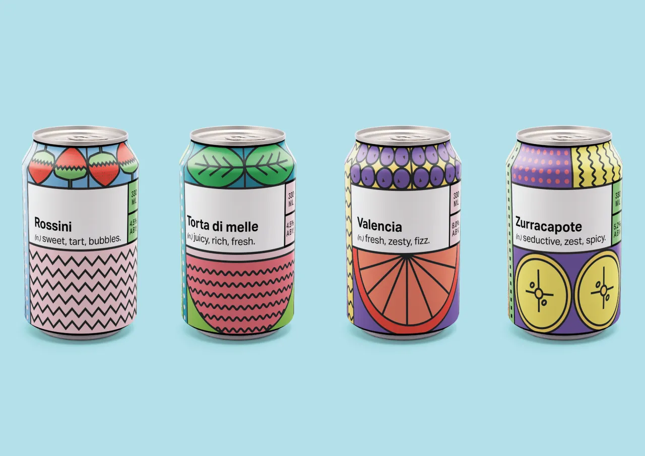
Packaging design by Minka Marriott. All images courtesy of Shillington and its students.
Drawing on a variety of typography, graphics, illustration and photography to grab people's attention on the shelves and instantly convey a product's ethos and story can be a huge challenge. But getting it right is vital to the success of a new brand, especially a high-end, boutique one.
With that in mind, graphic design students at Shillington are challenged each year to create unique packaging designs for a fictional product. We've selected 20 of the best, and the imagination and execution behind them will knock your socks off. Read on and prepare for a surge of creative inspiration!
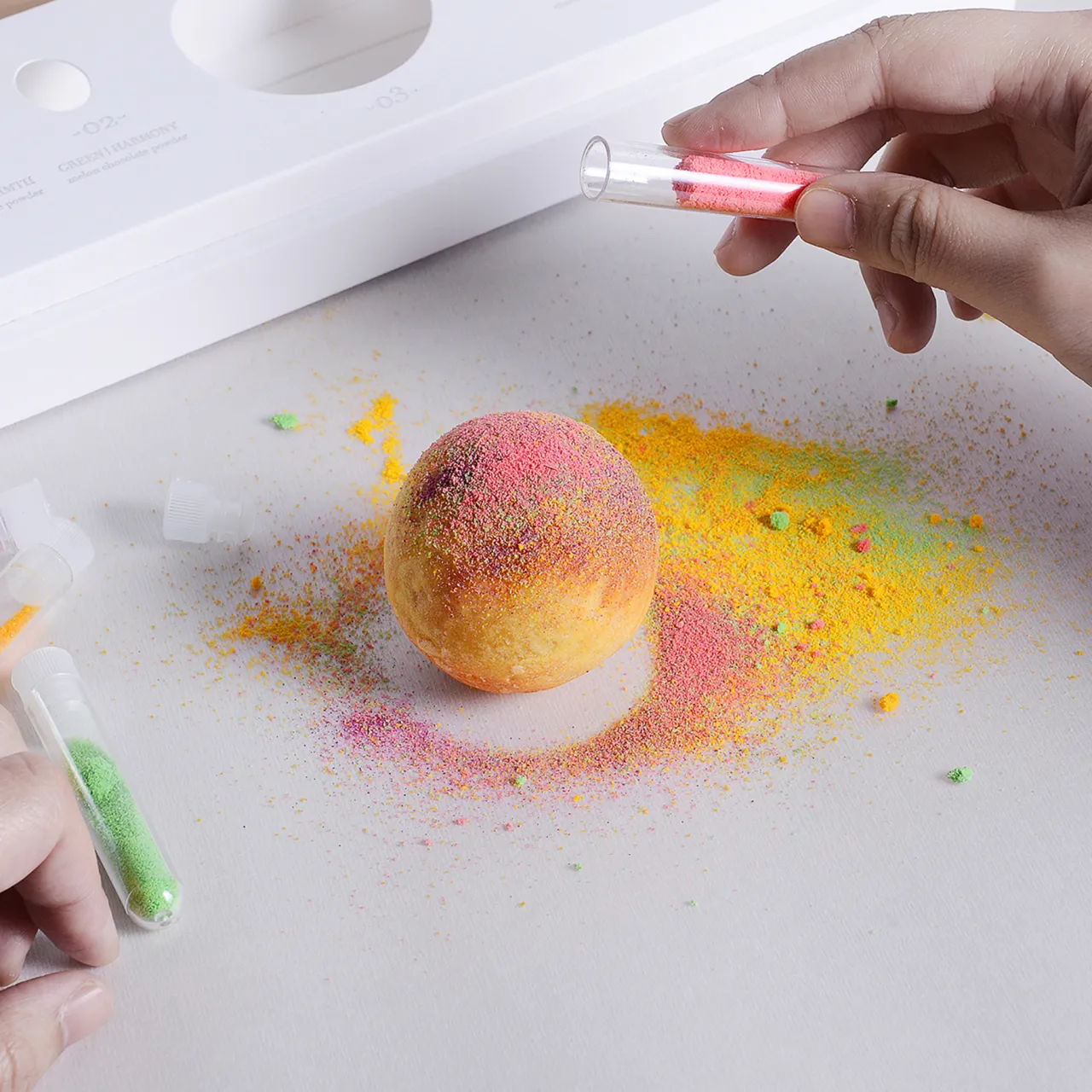
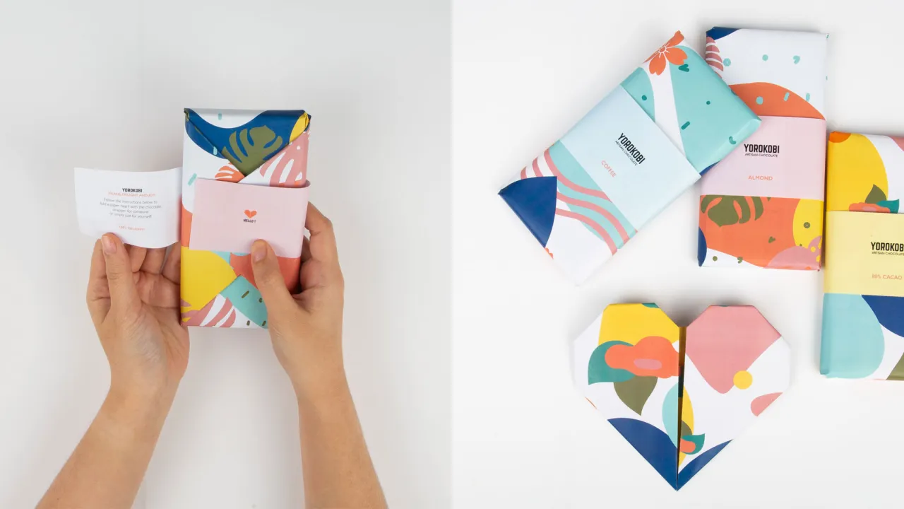
1. Yorokobi chocolate by Sheena Chong
Yum! This gorgeously colourful branding and packaging design for a fictional chocolate artisan in Melbourne made our mouths water. "I aimed to create unique packaging that promotes user interaction and fun," explains Melbourne student Sheena Chong.
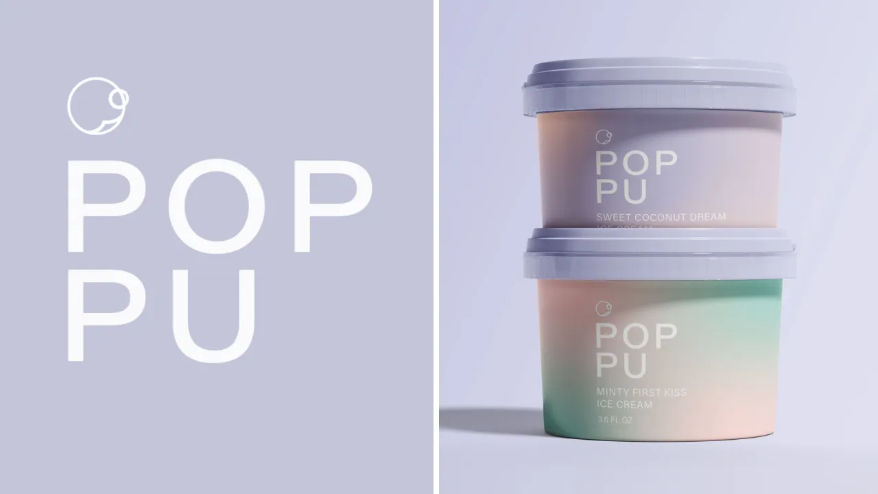
2. Poppu ice cream by Linh Luu
Check out this cool (in both senses of the word) boutique ice-cream brand. New York student Linh Luu named it "Poppu", the Japanese for "pop". "The idea refers to both pop art and pop culture," she explains.
The pastel palette perfectly matches its identity as ice cream for romantics and its unconventional flavour titles. “It was a fun experiment to create a brand that could feel elevated with a feminine angle, and stand out from the general ice cream brands in the market,” Luu adds.
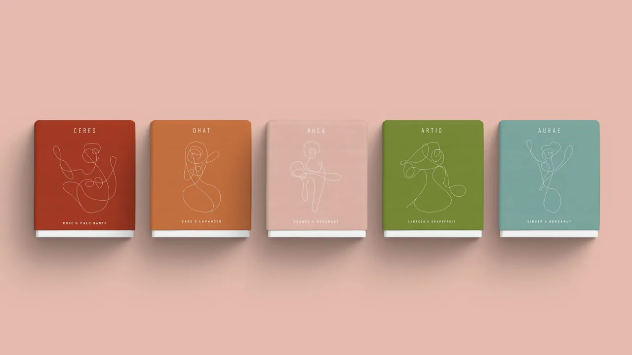
3. Botanic candles by Majo Crespo
Another great use of colour to tell a story, this new (pretend) candle brand draws on botanical elements to create a unique product, with varients including Rose & Palo Santo, Sage & Grapefruit, and Ginger & Bergamut. New York student Majo Crespo describes it as: "A brand inspired by nature for the empowerment of women".
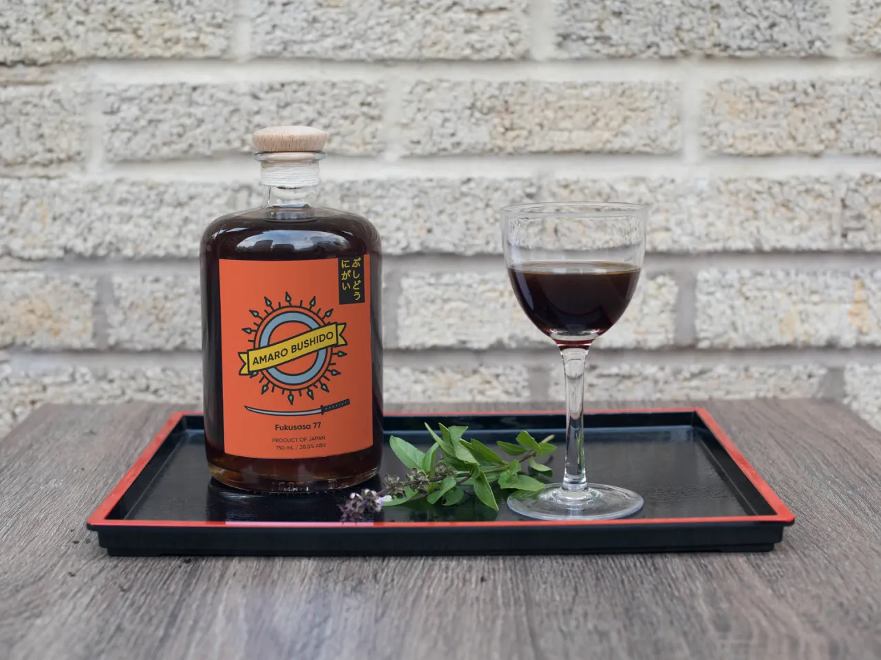
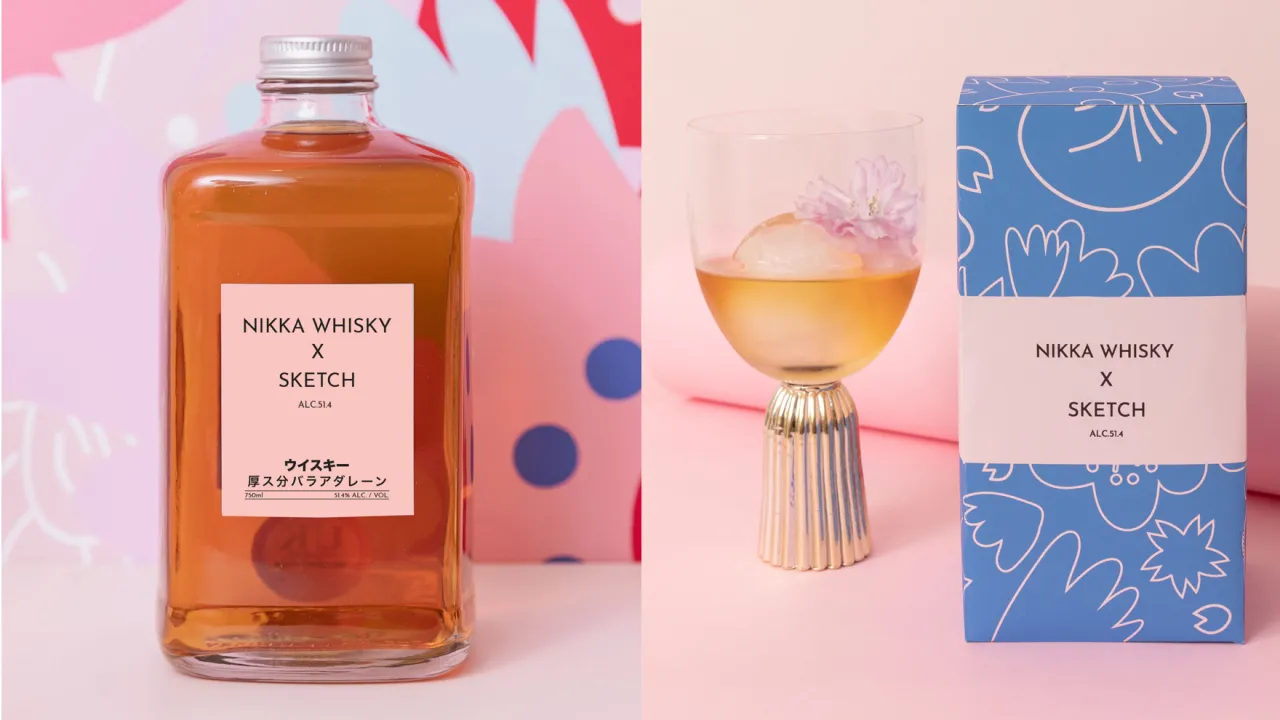
4. Nikka Whisky X Sketch by Maria Vazquez
This campaign for Japanese whisky brand NIKKA targets women and aims to quash the idea of whisky as a "men's drink". London student Maria Vazquez describes it as: "A fun and vibrant multi-channel campaign designed to engage and interact with the target audience. Partnering with Sketch London, the campaign will run in Spring, during 'sakura' [cherry blossom] season."
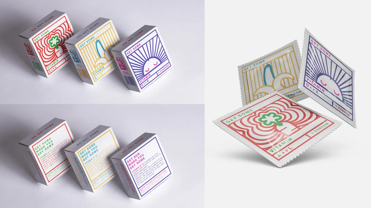
5. Go Get Some Condoms by Jade Loh
This bright and colourful packaging houses a new brand of condoms coated with vitamin-infused lube, for health-conscious millennials. "The packaging design is simple and clinical but with a playful touch of crude innuendo," explains Brisbane student Jade Loh.
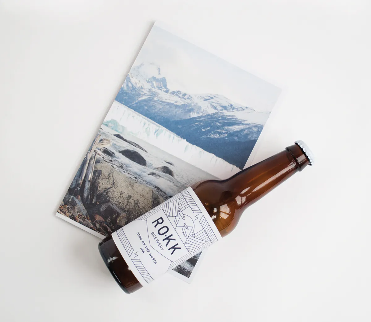
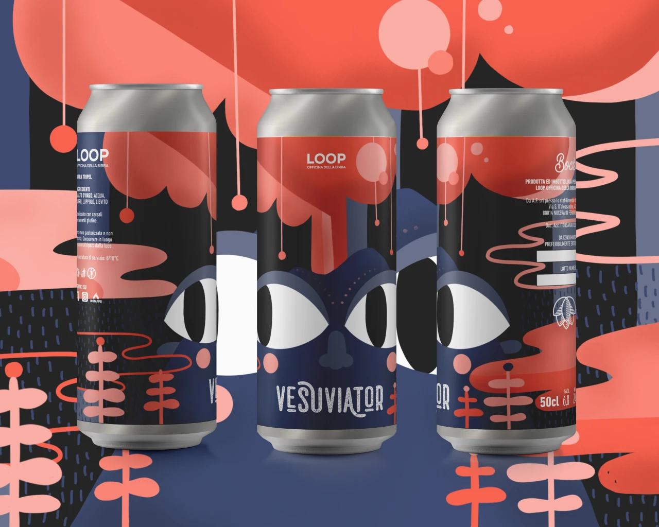
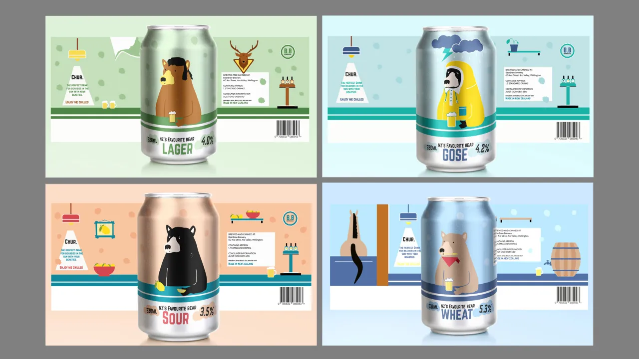
6. NZ’s Favourite Bear beer by Emma Askin
This fun and pretend brand of beer celebrates the brewing scene in New Zealand with a perfectly judged slice of self-deprecation. "It's inspired by our struggle with the pronunciation of 'beer', often confused with our grizzly mates," explains Melbourne student Emma Askin. "I wanted to create a series of cans that are playful and celebrate the charm of New Zealand humour."
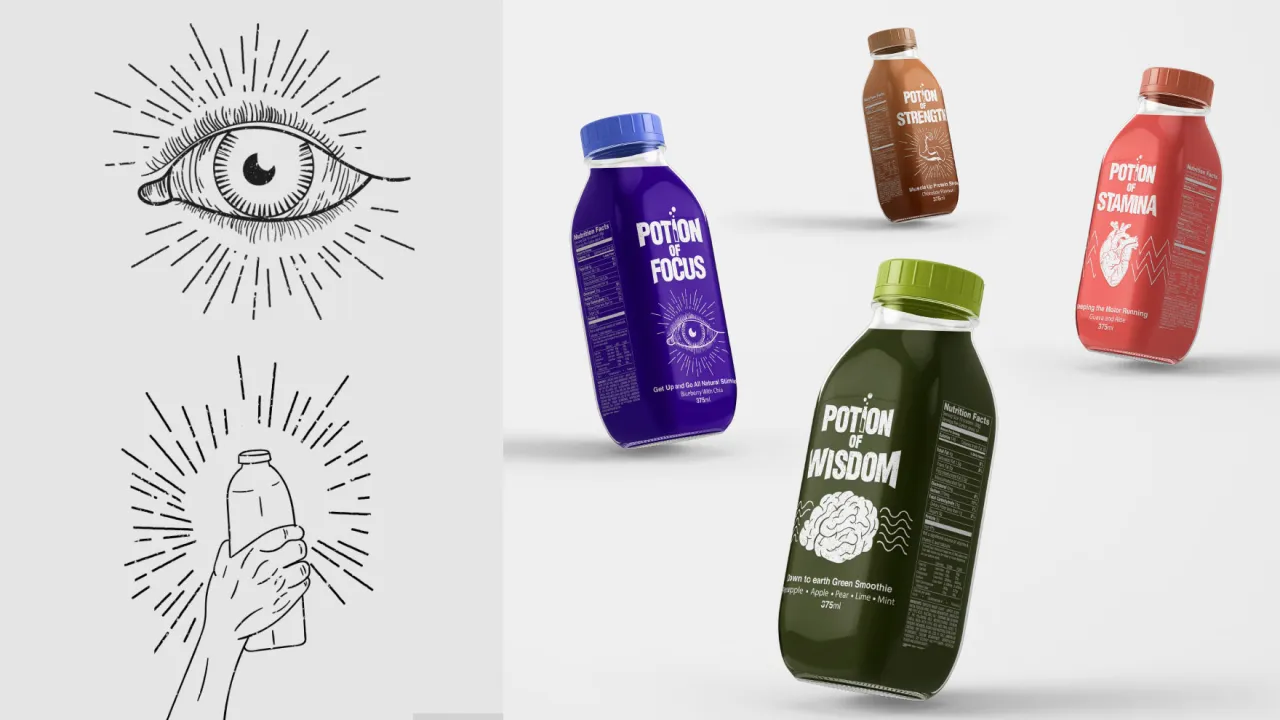
7. Potion of Wisdom smoothies by Timothy Potts
With so many unhealthy drinks on our supermarket shelves, recent Sydney student Timothy Potts decided to come up with an alternative, specifically designed to captivate the eyes and imaginations of preteens. "The packaging aims to inspire healthier life decisions by tapping into the fantasy realms," he explains.
Each drink has an ability and a focus, he adds. "The illustrations draw from 16th and 17th-century wood carvings depictions of witchcraft. The type is modern and was set out to compliment the dynamic moving nature of the illustrations."
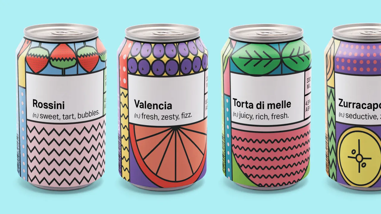
8. Seasonal beer by Minka Marriott
Get a load of this refreshingly playful branding for a new beer company from the Adelaide Hills, South Australia. "The client required branding roll out for their mouth-watering beers that played on the traditional recipes but mixed with seasonal fruits," explains Melbourne student Minka Marriott.
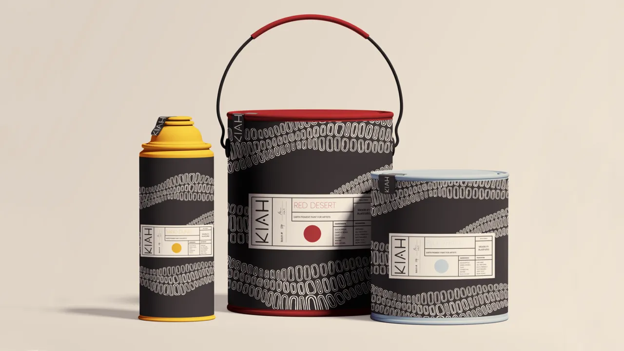
9. Kiah artist paint by Bracken Bollaan
Targeting the Australian market, the unique selling point for this eco-friendly artist paint is that all ingredients within are completely organic and all sourced from Australia itself. "I wanted to play on the whimsical feel of native Australian art to bring about this essence of nature, history and creativity," says Manchester student Bracken Bollaan.
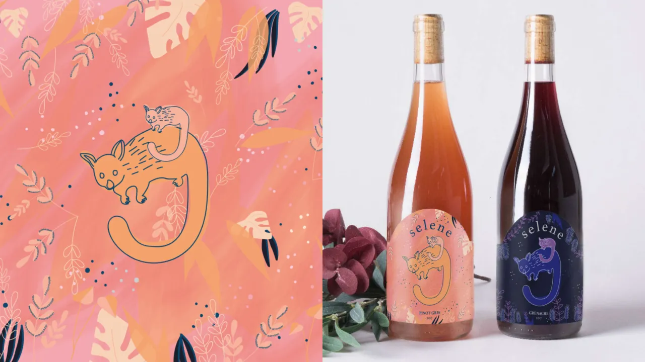
10. Selene wines by Becky Mccollock
Now here’s a great idea, perfectly executed: wines targeted at mothers of newborns. "The brand story for Selene appeals to its target market by 'being in it with them'," explains recent Melbourne student Becky Mccollock. "The wine is harvested and made at night when most others are asleep."
As new mothers are often up alone and exhausted at all hours of the night, Selene offers comfort in that they’re not alone. "This also gets the consumer thinking about the brand, at times outside of when consuming it." Illustration was chosen to give the brand a softer, handmade feel, and an Australian animal was chosen to represent that the wine is made locally.
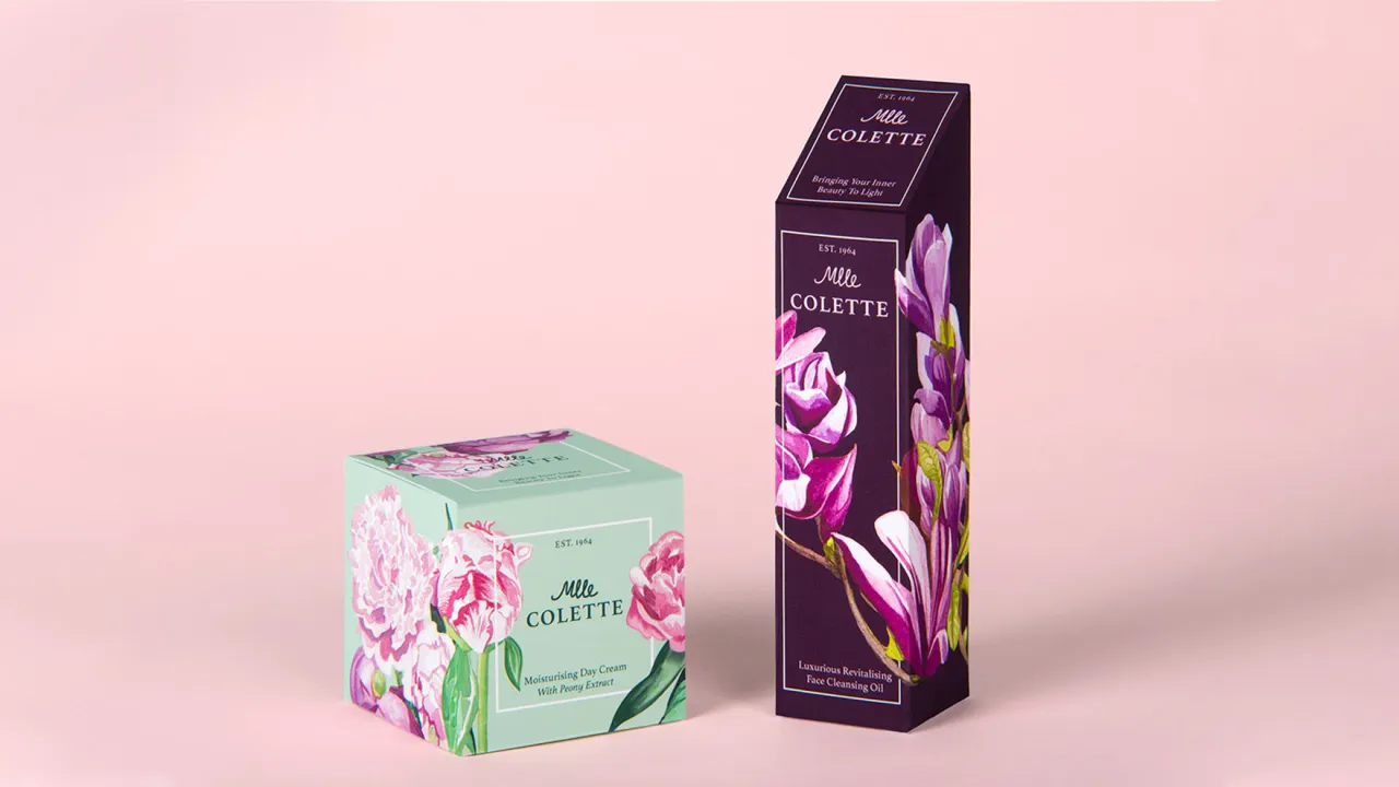
11. Mlle Colette cosmetics by Jessica Goodall
This fictional cosmetic brand takes its name from Mlle Colette, "a French botanist and beekeeper est. 1964 in Provence," explains London student Jessica Goodall. "My target audience was 30 to 60-year-old women who can indulge themselves in luxurious and beautiful cosmetic products. Inspired by botanical illustrations, I used my watercolour paintings within the packaging design for a timeless, feminine and elegant range of beauty products."
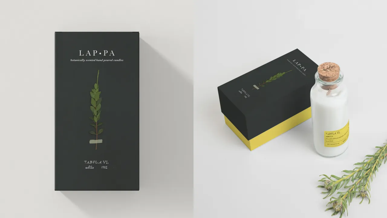
12. LAP•PA candle by Amy Sil Mil
LAP•PA is a high-end candle, botanically scented and hand-poured; a brand inspired by the famous Swedish botanist Carl Linnaeus. "He formalised the classification of plants, inventing the dual name method for organisms called binomial nomenclature," explains recent New York student Amy Sil Mil. "This achievement did not blossom overnight. It was through his empiricism — for Linnaeus didn't believe anything he didn't see with his own eyes — and his interest in how plants functioned in the world that led him toward this end."
During university, Linnaeus landed a grant to go on a six-month expedition in 1732 to Lapland, the northernmost region of Finland. "He travelled 3,000 miles on foot or horse with his journal, botanical manuscripts and sheets of paper for pressing plants in hand. It was there in Lapland (Lappa in Latin) that he discovered over 100 new species of plants and started forming his methods on classification. This is the adventure in Lapland retold through our senses."
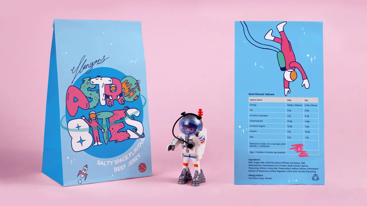
13. Astro Bites beef jerky by Georgia Duckett
Beef jerky is kind of an old-fashioned snack, but here’s a new made-up brand aimed towards children that brings it bang up-to-date. "In my research to create the brand, I discovered that astronauts eat jerky in outer space for a source of protein," explains Manchester student Georgia Duckett. "So I chose to create a brand story around this, about an explorer named Sir Thomas Flanigan who discovered the jerky in outer space, to help make the snack more appealing to a younger audience."
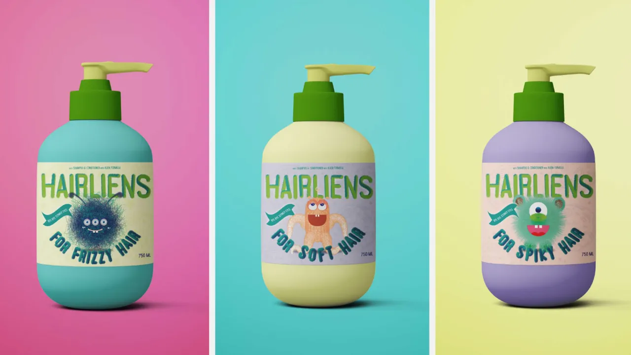
14. Hairliens shampoo by Nano Mariano Palomares
Another fun and funky brand for kids, Hairliens is a shampoo for pre-schoolers. Recent Sydney student Nano Mariano Palomares relates the back story, which is simple but brilliant: "Three aliens with very good hair visit planet Earth and realise that Earth children could use some intergalactic help in the hair department."
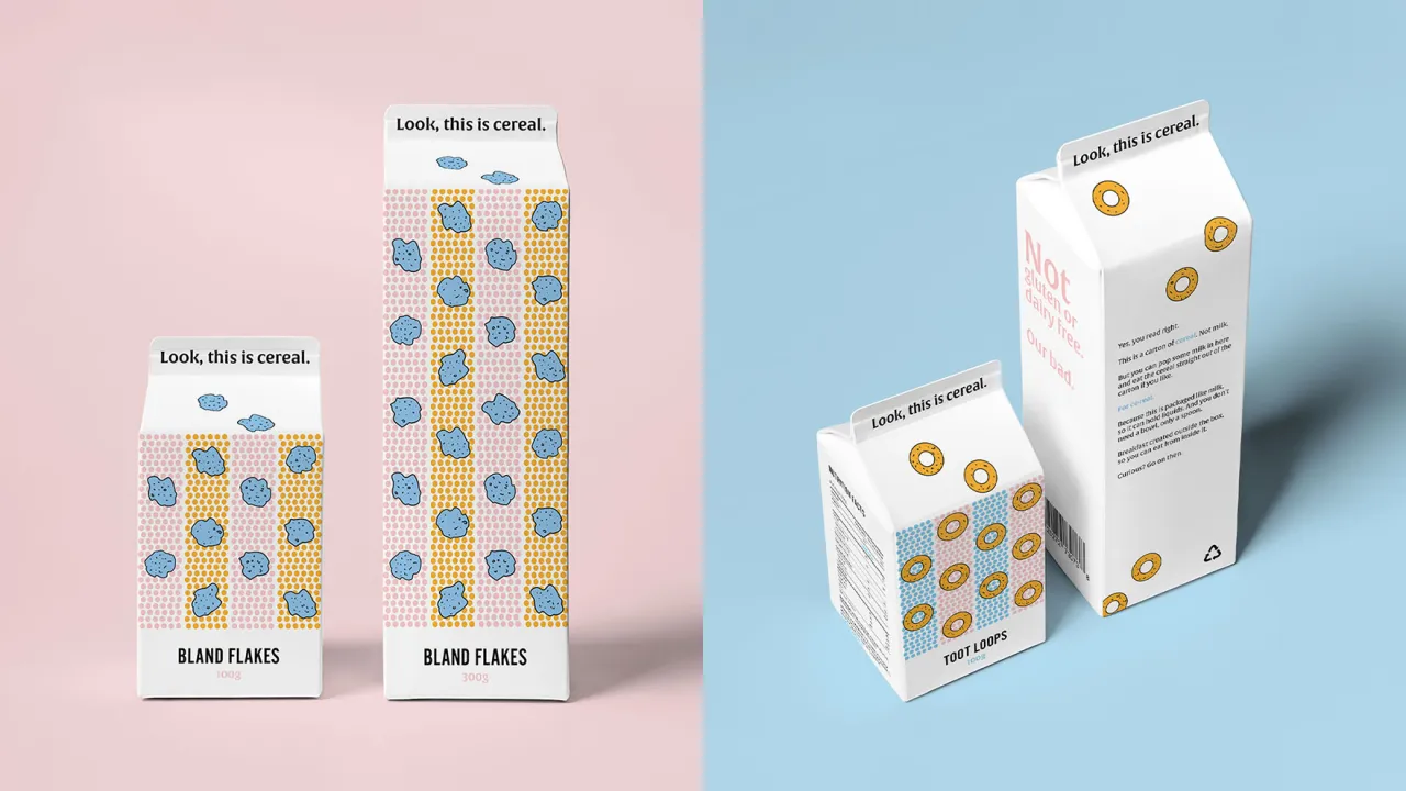
15. Look, This is Cereal by Melody Soan
“The Australian cereal market is flooded with predictability!” complains Melbourne student Melody Soan. “Children only eat ‘this’ and adults-only eat ‘that’. Boring. So why not create and package a cereal for the adventurous anybody and deliver it in an unexpected but practical way?”
That’s exactly what she’s done, and it immediately makes you realise how cliched cereal packaging really is. As this new brand, in contrast, is unique, the tone of voice and the package design had to be strong and complementary to one another, personable, and appeal to every human eye, graphically speaking.
"The Lichtenstein-inspired illustrative style meets somewhere between child and adult – neither too grown-up nor too young," says Soan. "Likewise, the tongue-in-cheek tone of voice is a play on commonly used phrases such as 'look, this is serious' and 'for real', and speaks directly to the consumer as 'you'. Overall, it’s not just a product designed to look good, but also create a sense of adventure and practicality at breakfast time."
16. Caviarra caviar by Rachel Murray
Caviarra is caviar from the Yarra Valley in Victoria, Australia. "Sustainably farmed caviar has recently taken off in Australia, and I was excited to imagine how this could look," explains Melbourne student Rachel Murray. "I wanted the overall look and to exude a simple modern luxury feel, whilst still referencing some of the bolder imagery of traditional caviar packaging."
![Three circular tins of Caviarra caviar packaging displayed against a mint green background, featuring navy and coral fish illustrations with white labels
[Edited to better fit requirements]
Caviarra caviar tins with navy and coral fish-patterned designs](https://media.creativeboom.com/e947a359-1a77-4bc1-9140-52884849c550/conversions/49d2dbfc12d56fd5eed7e1ee24443890816f2cab-medium.webp)
17. Poppy Champagne by Kat Soriano
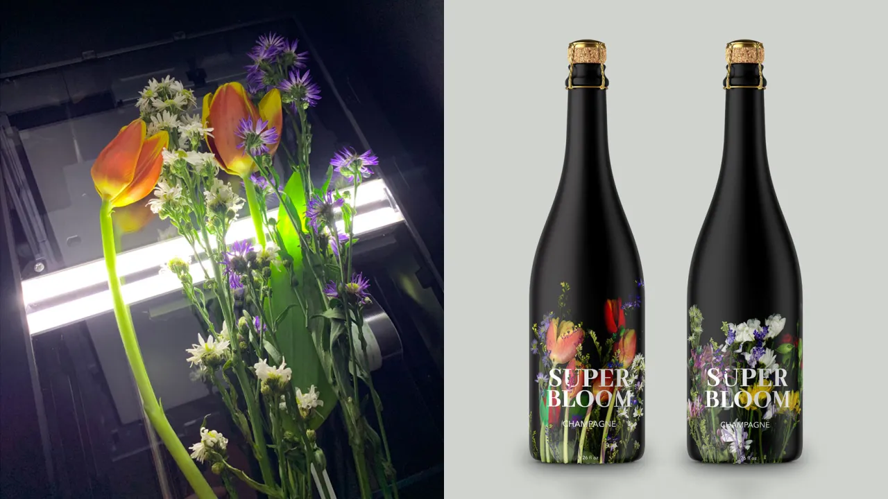
Here’s a champagne packaging design that’s going to draw attention on the shelves. "Inspired by the California super bloom, Poppy was created by scanning flowers and overlaying those scans to create a dramatic and colourful label," explains New York student Kat Soriano.
18. Gigantar guitar strings by Justin Millard
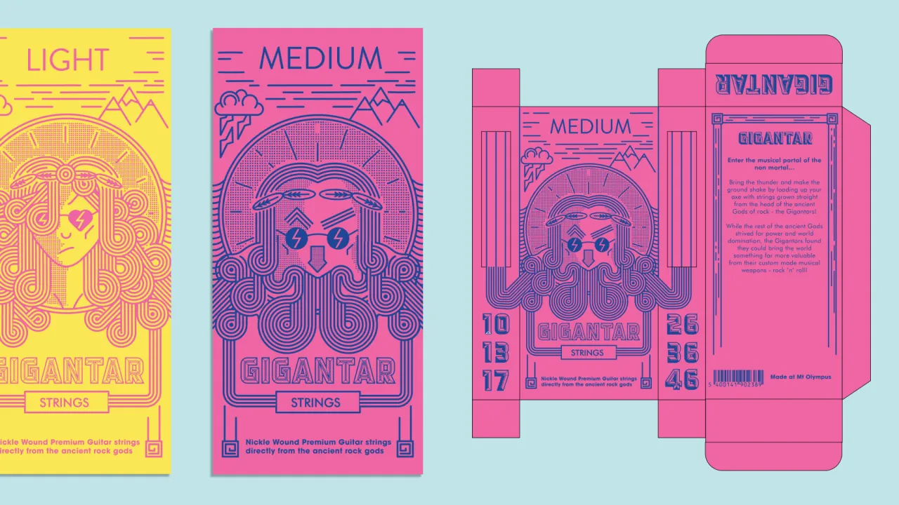
Recent Manchester student Justin Millard chose a pretty unusual product idea for this boutique branding project: guitar strings. "These are grown from the heads and beards of ancient Greek rock god family the 'Gigantars', which when played by a mortal will enhance their playing style to that of divine influence," he explains.
19. Full Moon Soap Company by Kathrin Vonlanthen
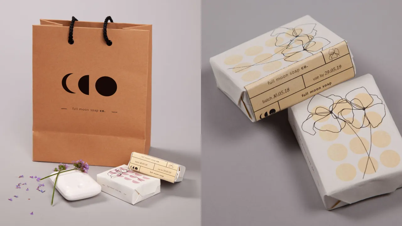
London student Kathrin Vonlanthen designed this restrained by beautiful packaging for the Full Moon Soap Company. "The brand inspired by the moon phases which bring nature to life," she explains.
20. Jaybird flavoured nuts by Merel Calkoen
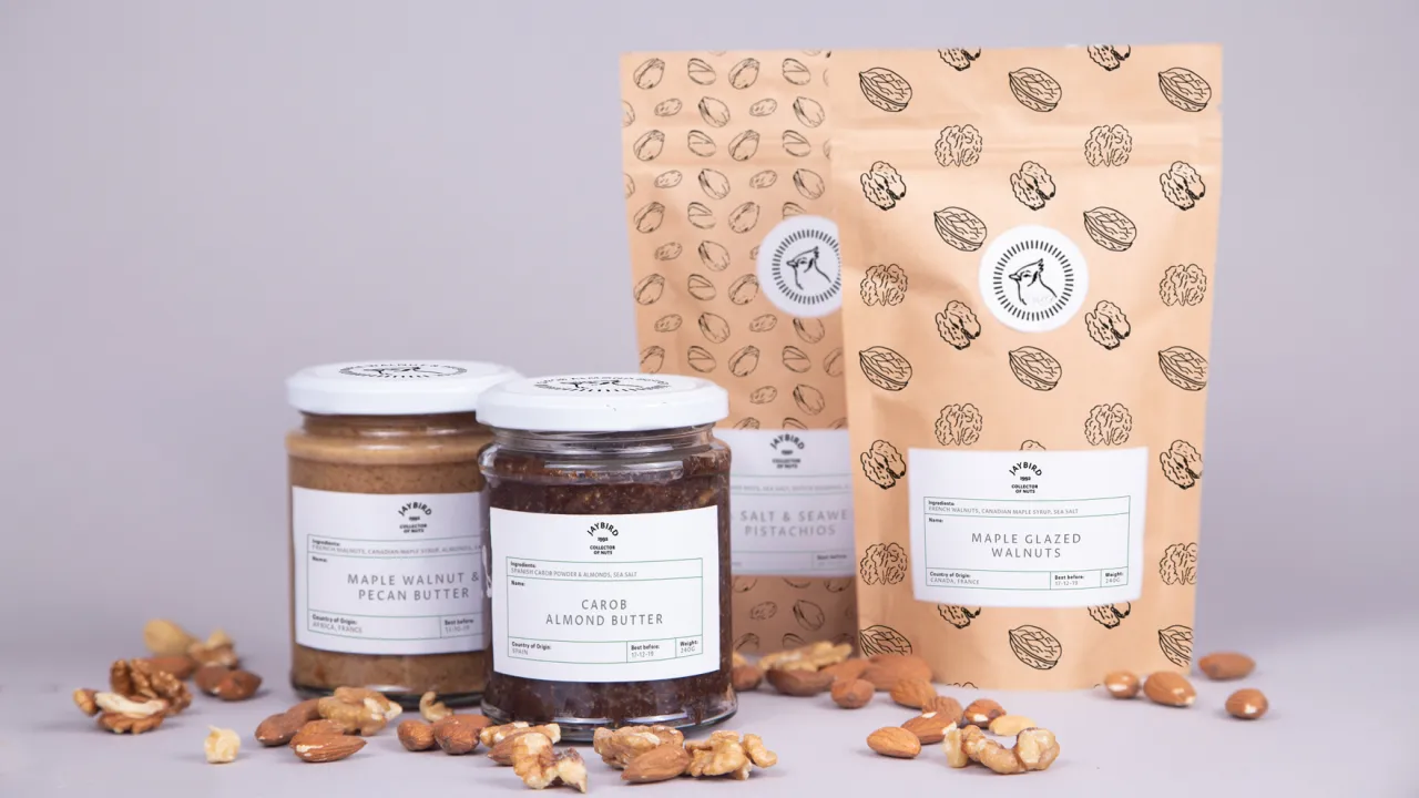
There’s a fantastic back story to these sumptuously packaged flavoured nuts. "Jaybird is an artisan bird whose curiosity led him to various flavours in the world," explains Manchester student Merel Calkoen. "The nuts are a source of energy to inspire and initiate spontaneity."
Editor's Picks





Trending



Latest Jobs
Brand Strategist at DNCO
Full-time·London·£45,000 – £60,000
Senior Visual Designer at Scout Motors
Full-time·Remote·US$130,000 – US$160,000
Senior 3D Motion Designer at Art&Graft
Full-time·London·£50,000 – £65,000
Designers / Copywriters / Art Directors / Creatives at Hatched
Full-time·London·£25,000 – £55,000
Copywriter, Developer at Anthropic
Full-time·San Francisco·$200,000 – $255,000
Lead Digital Designer at Together
Full-time·£55,000 – £75,000