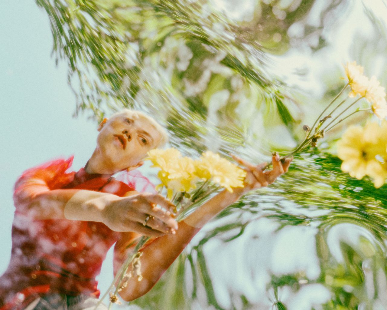
Wide Angle: Distorted © Molly Strohl
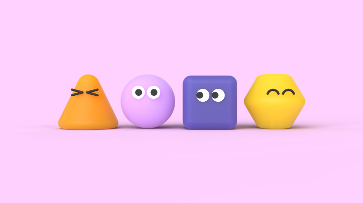
Amid a world drowning in sameness, the work that cuts through isn't the work that plays nice; it's the work that gets playful. That's the core message from Stills' Photography in Design Trend Report for 2026, and it arrives at a crucial moment for creatives. Because as audiences scroll past increasingly perfect, AI-polished imagery, the appetite for work that feels genuinely human has never been stronger.
The report focuses squarely on trends that help designers inject character and push past safe defaults. More texture. More detail. More colour. More weirdness. More intention. These are trends that reward experimentation and give creators permission to try ideas that feel alive.
For designers and art directors seeking to create work that resonates in 2026, here are the key trends reshaping the visual landscape. You can download the full report to explore these trends in greater depth.
Design trends
Scrapbook/scanner
Scrapbook and scanner aesthetics involve designing digitally, printing physical assets, cutting them out by hand, then reassembling them into compositions that are scanned back into digital form. The result carries all the artefacts of this process: scanner grain, slightly misaligned edges, shadows from paper thickness, tape marks, and the subtle distortions that occur when you drag images across the scanner bed mid-scan. It's design that feels lived-in, prioritising human touch over pixel-perfection.
Cyber goth
Cyber goth blends gothic darkness with futuristic metallics and hyper-saturated colour. Common elements include chrome finishes, deep blacks, electric purples, and acid greens, combined with angular typography, heavy layering, digital noise, and distortion. It's the aesthetic of underground raves meets dystopian sci-fi, now polished for commercial application. This trend is 2026's dark horse.
Future medieval
Future medieval combines historical elements (blackletter and gothic typography, heraldic imagery, ornamental flourishes, symbolic iconography) with contemporary design and digital execution. This aesthetic fuses old-world ornamentation and mysticism with digital precision, resulting in dark, symbolic and richly detailed work that stands apart from both minimal modernism and nostalgic vintage design.
Skate/surf shop
This aesthetic draws directly from DIY skate and surf culture—photocopied flyers, hand-cut collages, halftone screens, scanner artefacts, visible tape marks, and aggressively bold colour choices. It's the look of grassroots promotion: loud, immediate, and assembled with whatever tools are at hand, then pushed to extremes. Born of necessity in underground action-sports communities, this cut-and-paste approach is now a full-fledged commercial design language.
Scribbles
Scribbles refers to hand-drawn, painterly marks integrated into design and photography—literal scribbles, brushstrokes, gestural marks, imperfect lines and organic shapes created with actual physical media. The evidence of human involvement matters increasingly in an age where AI can generate perfect imagery instantly. These marks prove that someone made this, thought about it, and touched it.
Index/catalogue
Index and catalogue layouts organise multiple images in structured grids or carefully arranged free-form compositions, often with images cut out from their backgrounds and placed on solid colours. This is the visual language of product catalogues, museum collections and specimen displays; curated order rather than visual chaos. These layouts allow viewers to browse and make connections at their own pace.
Maximalism © Freddie Roach
Photography trends
Direct flash
Direct flash photography uses on-camera flash fired straight at the subject, creating bright, evenly lit images with hard shadows and vivid colours. Unlike carefully diffused studio lighting, it's immediate and raw; the kind of lighting you'd get from a disposable camera. Once seen as merely a quick, inexpensive fix, this approach has now become a campaign-defining style in its own right. Whilst polished studio lighting still has its place, audiences increasingly gravitate toward work that feels real... and direct flash injects that life back into design.
Maximalism
Maximalism is design cranked up to 11: layered imagery, saturated colours, dense typography and complex compositions that reject the "less is more" philosophy. It's visual abundance: patterns clashing, colours competing, elements overlapping until you're convinced it's too much. Then adding more. When this year's Pantone Colour of the Year feels more like a void than a statement, it's time to return to what moves people: colour and complexity that demands attention.
Sensory storytelling
Sensory storytelling uses imagery that prioritises texture, temperature and tactile qualities over literal representation. Think close-ups of fabric weaves, water droplets on skin, the grain of wood, or steam rising from a cup. These images communicate through feeling—softness, warmth, tension, coolness, comfort—before conveying any specific message. Rather than showing, these images make viewers feel.
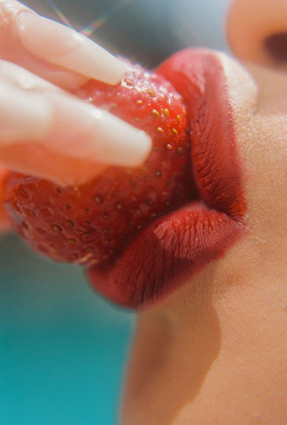
Sensory Storytelling © Ashton Davis
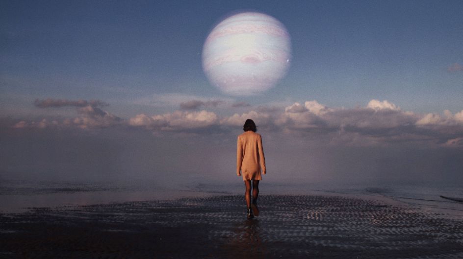
Distorted wide-angle
Wide-angle and distorted photography uses ultra-wide lenses (typically 24mm or wider) that exaggerate perspective, making nearby objects appear dramatically larger whilst pushing background elements away. Straight lines curve, faces stretch, and spatial relationships become warped—effects that can be further emphasised through in-camera techniques or post-processing. Rooted in the '90s and early 2000s, this aesthetic continues to dominate design and advertising. Just now, with modern refinements that make it feel fresh, rather than nostalgic.
Grunge
Grunge imagery embraces intentional imperfection. Think grainy film stocks, scrapbook textures, hand-drawn scribbles, torn edges, and found moments captured without concern for technical perfection. It's photography that shows the rough edges: visible grain, slight blur, imperfect exposure, the authentic wear and tear of lived experience. As reality becomes harder to distinguish in an age of AI-generated content, rawness proves that something is real. People want to see dirt under fingernails. They want honesty and evidence of human presence.
Surrealism
Surreal imagery places familiar objects in unfamiliar contexts, plays with scale and physics, or creates impossible scenarios that challenge viewers' expectations. A figure floating mid-air, objects defying gravity, dreamlike colour palettes, unexpected juxtapositions... anything that makes the viewer pause and question what they're seeing. This approach flips the ordinary, sparking curiosity and adding conceptual depth to campaigns. Its power lies in subtext, expressing complex ideas visually without lengthy explanations.
Surrealism © Ellie Pellgrini
Americana
Americana photography captures the texture and character of rural and small-town American life. Think weathered barns, open landscapes, working-class portraits, vintage trucks, dusty roads and the kind of lived-in details that tell stories about place and people. Based on documentary-style imagery rooted in authenticity, this aesthetic is an antidote to the homogenised visuals of much contemporary design.
Learn more! Download the report
Today's audiences are exhausted by sameness. They scroll past anything generic or overly perfect. When everything blends, the only way forward is risk; bolder choices, stranger textures, louder colours and authentic imagery that brings real presence to a layout.
With its curated collection of authentic, pre-cleared photographs and limited licensing availability that prevents the same images from appearing across multiple campaigns, Stills continues to empower creative professionals to produce work that stands out. Because the work that cuts through in 2026 isn't the work that plays nice—it's the work that dares to play.
The complete 2026 Photography in Design Trend Report is essential reading for designers seeking to create work that resonates in an era of visual saturation. Because designers aren't chasing rules right now, they're chasing feeling. Work that carries a pulse.
Further Information

Editor's Picks

Trending

](https://www.creativeboom.com/upload/articles/a9/a95f8ea2748ccef642d39e253c9b7ba5f7253a4e_732.jpg)
Podcasts


Editor's Picks
Further Reading