Experts weigh in on Walkers' biggest rebrand in 80 years
As the British crisp giant replaces its iconic crisp with a sun-inspired mark, creatives are asking whether this is a confident evolution of heritage or a risky departure from a much-loved asset.
Walkers crisps. I-Wei Huang - stock.adobe.com
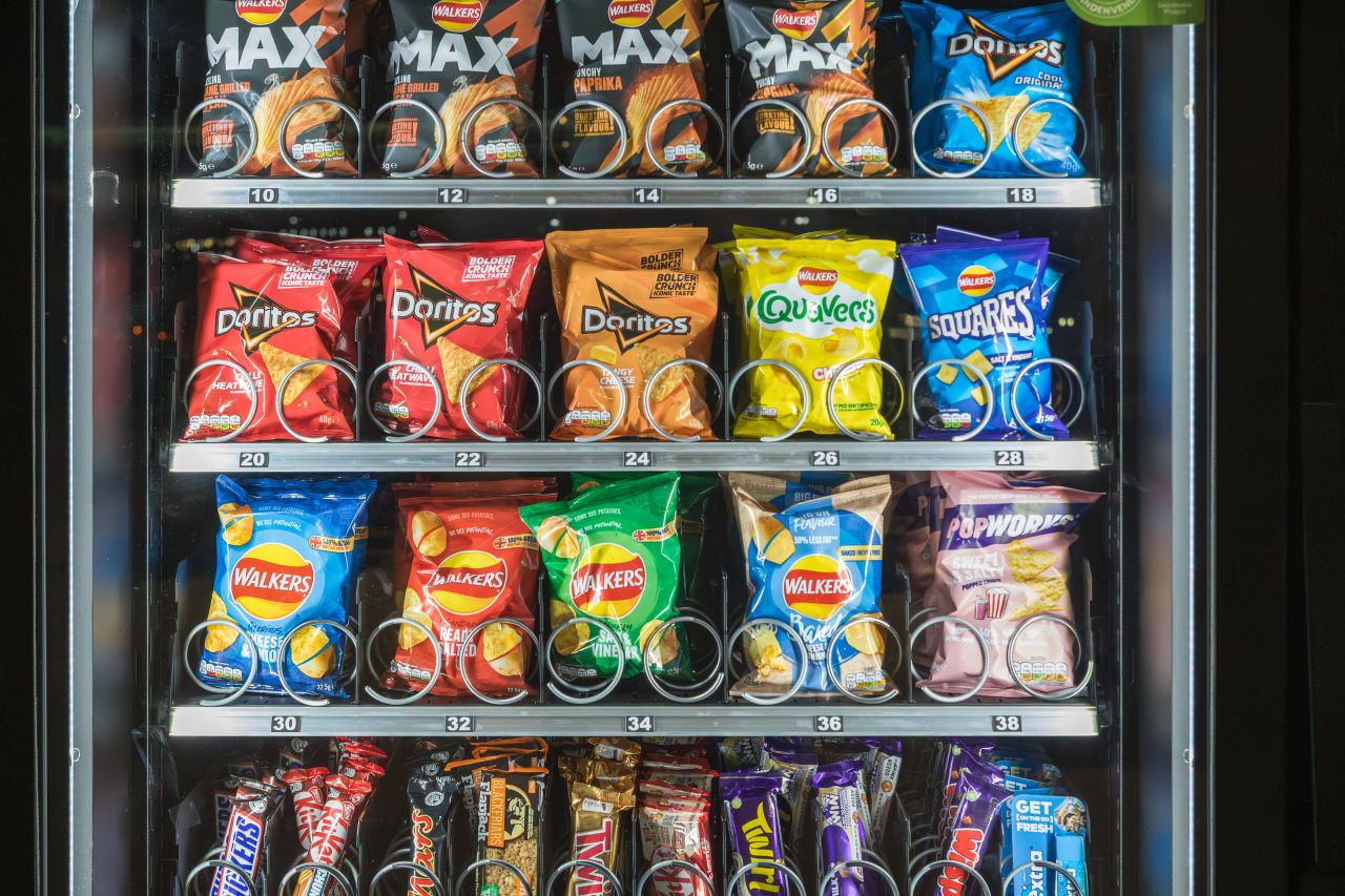
At the start of 2026, Walkers is wasting no time reminding shoppers of its presence. Alongside a new flavour launch, the brand has revealed what it's calling its biggest redesign in almost 80 years. The most striking change is also the most symbolic. Out goes the familiar yellow crisp at the centre of the logo, replaced by a radiating sun designed to champion "real ingredients" and 100% Great British potatoes.
For a brand whose visual identity has been subtly tweaked rather than radically overhauled for decades, it's a notable shift. Walkers has long relied on familiarity as a strength, with its red packs, bold flavours, and a logo that felt as dependable as Cheese & Onion itself. So why change now, and why this much?
According to Walkers, the new mark is about warmth, quality and provenance. Each pack will also carry the signature of founder Henry Walker, a nod to heritage and a reassurance of the long-standing commitment to quality. It's a move that places history front and centre, even as the brand continues to expand its range and flavour repertoire.
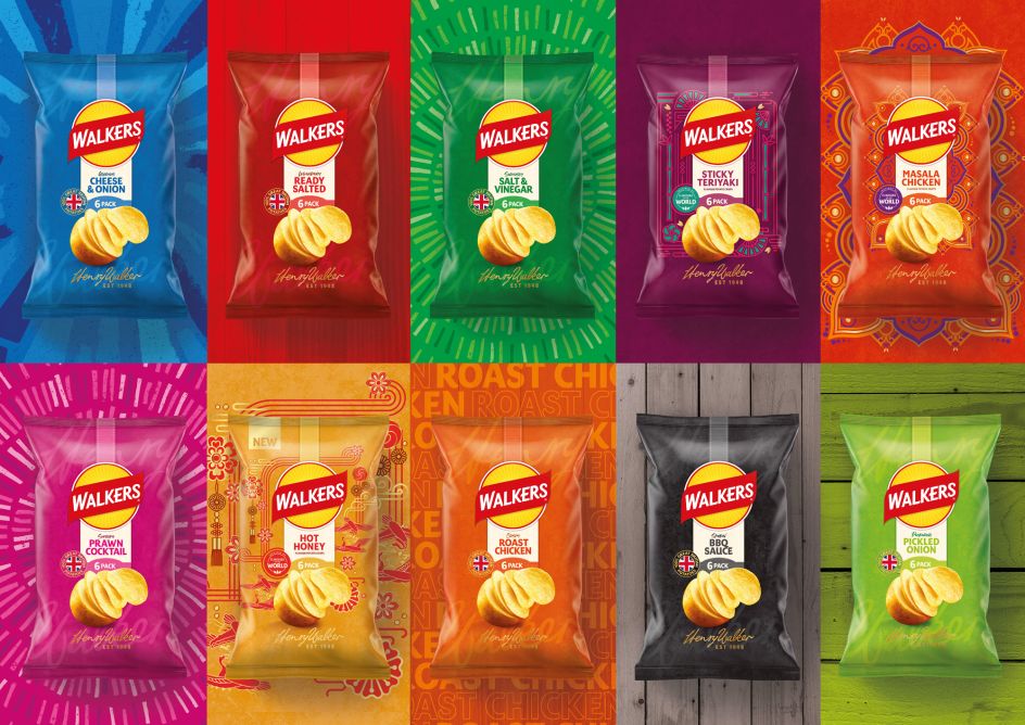
The new look Walkers. Image courtesy of VCCP / Walkers
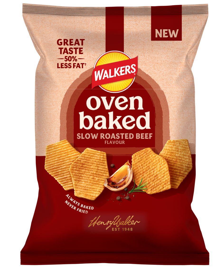
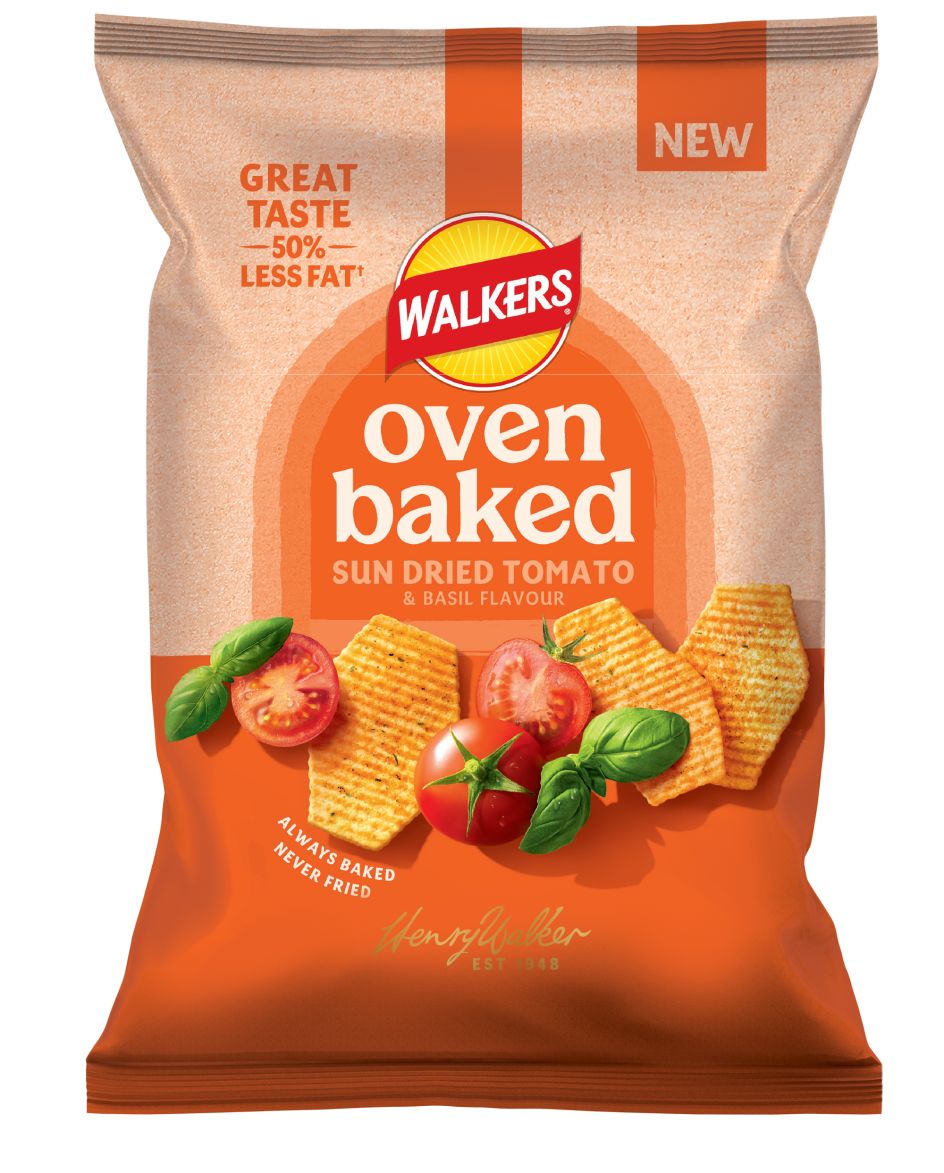
The timing is telling, as the revamp lands alongside updates to the Oven Baked range, the introduction of Walkers Lightly, and the launch of Hot Honey (yes, sweet and spicy is still having its moment – and deservedly so). Add to that recent Flavours of the World additions like Sticky Teriyaki and Masala Chicken, and it's clear this is not just a cosmetic refresh. Walkers is actively repositioning itself for a more crowded, global and premium-leaning crisp aisle.
From a design perspective, the response has been mixed, thoughtful and occasionally sceptical. Andrew Lawrence, global executive creative director at Elmwood, sees the rebrand as a clear break from recent FMCG trends. He says: "Walkers' rebrand represents a decisive rejection of the minimalist orthodoxy that's dominated FMCG for the past decade.
"This isn't cosmetic refinement; it's strategic repositioning for a category where provenance now matters more than polish."
For Andrew, the addition of sun rays, British iconography and Henry Walker's signature is more about legitimacy than nostalgia. "In 2026, heritage isn't nostalgia – it's proof of authenticity in an artisanal-led crisp aisle," he explains. "That signature isn't symbolic, it's a competitive advantage."
That said, the new logo is undeniably busier, and Andrew acknowledges the risk. "The busier mark risks clarity at a small scale, certainly. But shelf standout isn't about minimalism anymore, it's about storytelling density." In a supermarket environment packed with colour, claims and limited editions, Walkers appears to be betting on richness rather than restraint.
Not everyone is fully convinced, though. James Ramsden, executive creative director at Coley Porter Bell, questions whether the change is more aesthetic than strategic. "Without any immediate story or clear signal of change, this feels more aesthetic than strategic," he says. "The identity is doing most of the work."
Still, James sees intent in the execution. "The evolved look does suggest Walkers is reinforcing its position as a populist, quality choice, leaning into its farm-to-pack story and a sense of freshness and wellbeing." In his view, the identity feels like a set-up rather than a conclusion. A signal that more change could follow.
At shelf level, James believes Walkers has been careful not to lose recognition. He notes: "The formation of the graphic elements and the combination of colours still read as immediately Walkers. "If anything, the new version feels lighter, cleaner, and crisper than before." On screen, however, the finer sun-ray details may prove more challenging, particularly on smaller devices. Recognition should hold, but optimisation will be key.
The heritage play also raises a broader question. Is leaning into founder stories and provenance the right move for a mass-market brand in 2026?
James thinks it can work, with caveats. "The signature is a classic device used to signal founder values and quality assurance," he says. "On its own, it's a small gesture, but in food and packaging, these small additions accumulate." The real test, he argues, will be whether Walkers backs this up through action. Ingredient sourcing, innovation and behaviour will determine whether the heritage cue feels meaningful or merely decorative.
There's also an undercurrent of nostalgia anxiety running through the industry reaction. Jon Dignam, creative director at OurCreative., questions whether the new identity truly captures what Walkers once was. He points to similarities with the global Lay's masterbrand and wonders whether something distinctly British has been diluted in the process.
Jon's concern is that, while the rebrand layers Walkers' name and Henry Walker's signature over a more global system, it doesn't quite hit the nostalgic note some consumers may expect. In a market where emotional memory is a powerful driver, that's a delicate balance to strike.
Ultimately, Walkers' sun-swapped logo feels like a confident, if contested, move. It reflects a brand trying to stay relevant without pretending to be small-batch or niche. Whether shoppers embrace the change will depend less on design discourse and more on what they experience when they open the bag.
Andrew reinforces that "the critical question isn't whether the design justifies itself – it's whether product innovation and business transformation deliver on the promise." For Walkers, the sun is rising on a new chapter. Whether it shines or scorches will become clear at the shelf.

Editor's Picks


Trending


Podcasts


Editor's Picks
Further Reading