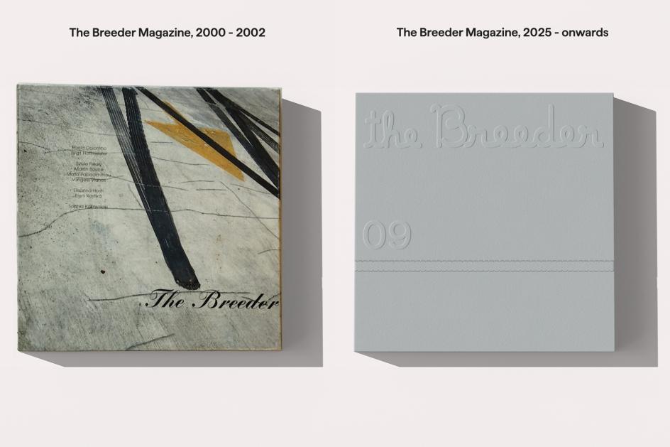
Marlon Tate turns The Breeder's magazine into a fragmented universe in a box
The Athens- and London-based creative agency, known for its offices in space, has reimagined a legendary art magazine as a curatorial object that doesn't sit on a shelf.
Marlon Tate, founded in 2022 by Greek-British art director Nikos Georgópoulous, is a particular kind of creative agency that refuses to behave like one. The agency's offices are listed as Athens, London, Jupiter and Mars – the last two, they note, are fictional.
Previous works involve branding Greece's first coliving concept as an imaginary country, and launching East London's biggest urban regeneration project as a festival of electronic music. They won a Red Dot Communication Award, three Ermis Awards and a Greek Communication Design Award – then went back to building a fictional universe. The name itself is borrowed: Marlon from Brando, Tate from Sharon. "It's entirely made up," Nikos has said, "just like our offices in Jupiter and Mars."
Nikos first came to international attention in 2019 with his Time Travel Branding trilogy, a series of surrealist concept projects developed with photographer Polly Brown. The first chapter, Xeniz, premiered at the prestigious ATyp1 conference in New York to reviews that called it "fictitious but brilliant" – a phrase that might as well be the agency's tagline. Since launching Marlon Tate, the studio has built its reputation on narrative-driven work that sits between branding, fiction and something that doesn't quite have a name yet. Nikos also teaches at the London College of Communication, and he has been described as a "popstar art director". And now, he – alongside his incredible team – has produced what may be its most ambitious project to date: the relaunch of The Breeder magazine.
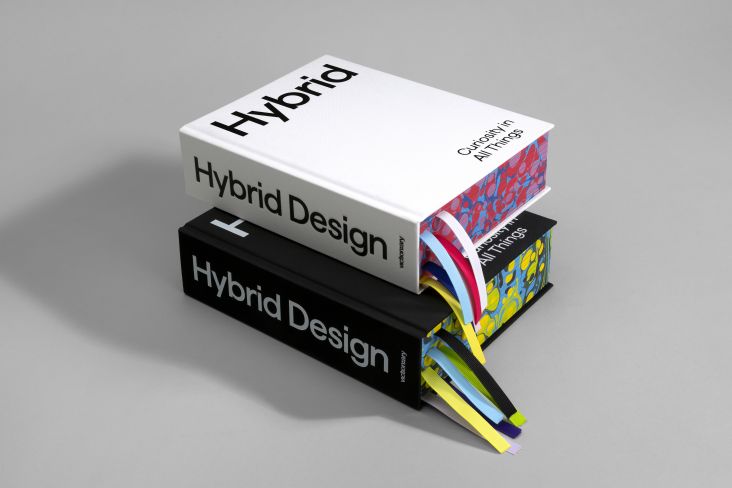
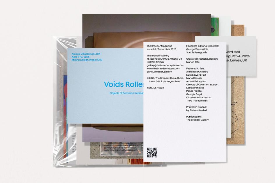
The Breeder Gallery in Athens is, as Nikos puts it, "one of the most successful and dynamic commercial galleries in Europe". What fewer people know is that, before it became a gallery, it was a magazine with eight issues published in the early 2000s, radical in its approach to art publishing. Twenty-five years on, the gallery founders, Yorgos and Stathis, decided to publish issue nine and relaunch it as their editorial platform. They commissioned Marlon Tate to take over creative and art direction, with a brief essentially to make something worthy of the original spirit, without repeating it.
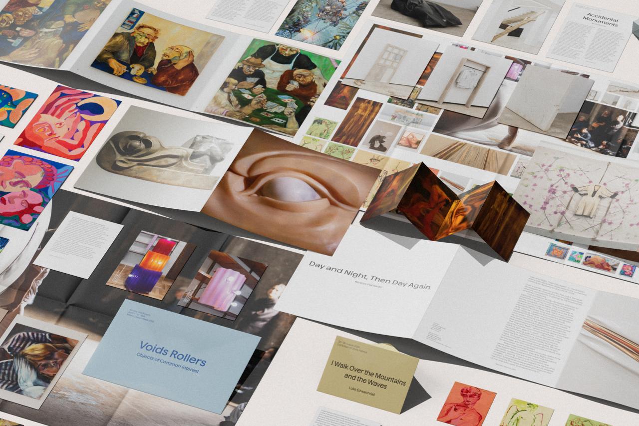
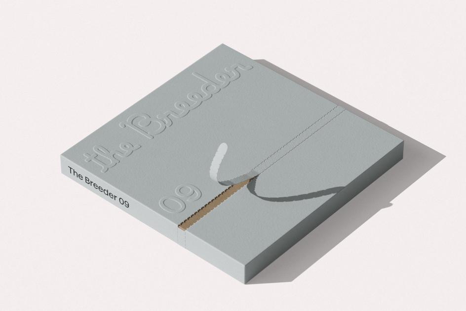
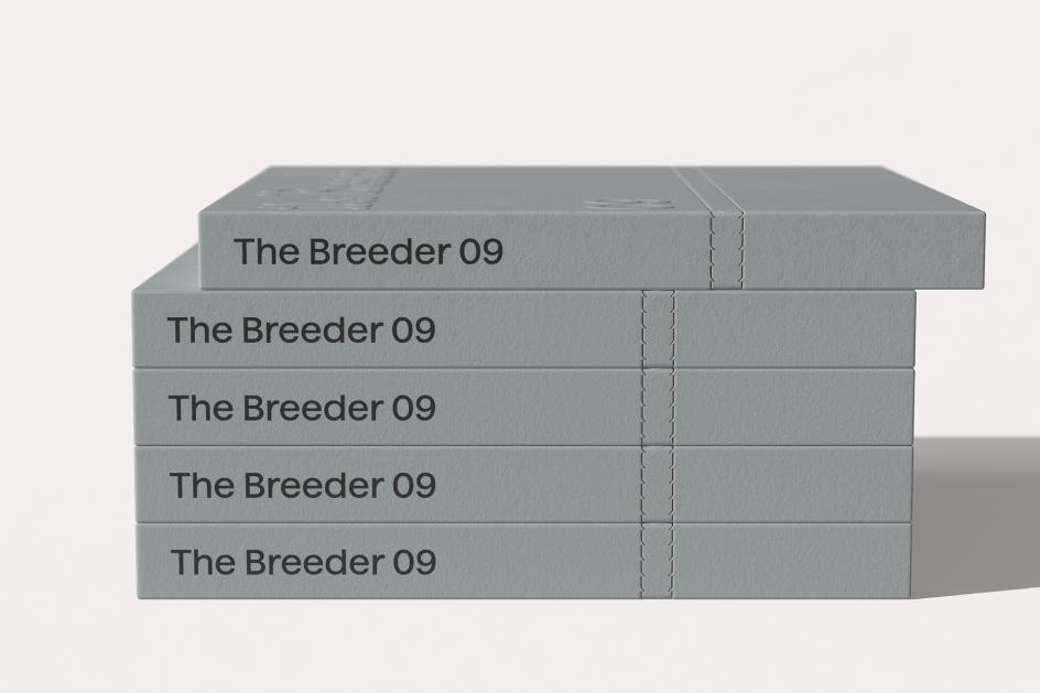
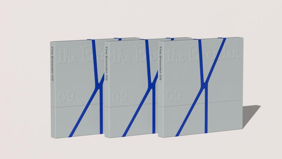
"Something radical 25 years ago can't be considered radical in today's world – that's the nature of the radical itself," Nikos explains. "So instead of continuing the same design language from the 2000s, we wanted to subvert its original subversion; we wanted to translate its ethos into a radical curatorial object for 2025." The solution they arrived at was far from a typical magazine in the more conventional sense. It's a box. And inside this box are unbound pages of varying sizes and paper stocks, folded posters, a coloured rubber band, and no fixed instructions for reassembly. The box itself is also the cover; the reader is the editor.
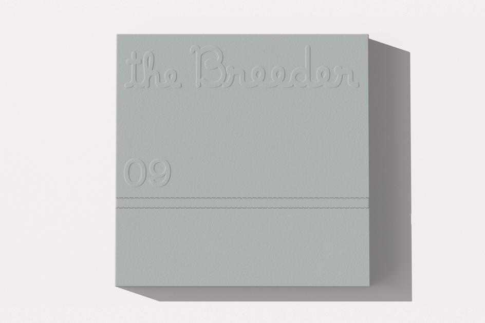
The references that shaped this are telling. Marcel Duchamp's La Boîte-en-valise reimagines the archive as something portable and personal. Public Image Ltd's Metal Box from 1979, with its unconventional packaging that dared to challenge what a record could be. And Jonathan Anderson's Show in a Box for Loewe's Spring/Summer 2021 collection, which translated an entire runway into an intimate, at-home experience during lockdown. "We came up with the idea of creating a fragmented universe in a box pretty early in the process," Nikos says. "Retaining its signature square format, we repositioned the box not as packaging but as the publication's cover and integral structural element."
The typography on the cover is custom, drawn entirely in-house at the Athens studio. It's a deliberately untidy, handwritten script that we at Creative Boom personally adore. It also serves as a homage to the original magazine's logo, while being completely different from it. "Juxtaposing the perfection of a neater cover with the sloppiness and playfulness of a handwritten typographic title felt like the right way to capture the energy of the magazine," Nikos adds. "It wouldn't have landed the same if we'd used a beautifully designed sans serif. Inside, a large editorial poster originally typeset in the custom typeface had to be abandoned – "you literally couldn't read a fucking thing" – and replaced with Haffer, a clean modern sans serif by Display Type Foundry.
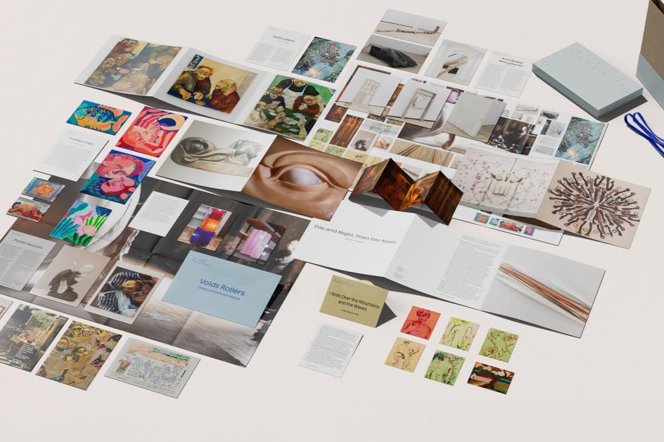
Among the many beautiful design decisions, one stands out in particular. For Luke Edward Hall's contribution, who is "probably one of the most prominent artists working in visual culture right now," says Nikos, the studio created a miniature envelope. "The tiny size feels like the complete antithesis. But the goal wasn't to reflect his talent or star power – it was to capture the essence of his work. To me, that essence is all about being sensitive and fragile. It's about wanting to hold and to be held." The accompanying text is folded inside on an even smaller sheet of paper, like a love letter.
What Marlon Tate has produced, ultimately, is something that resists categorisation with the same cheerful confidence as the studio that made it. "I want people to embrace it, talk about it, take it apart – and then put it back together again," Nikos concludes. "I want them to flex it on their coffee tables without it ever really fitting it. I'll let you know in 25 years."

Editor's Picks


Trending


Podcasts
Editor's Picks
Further Reading