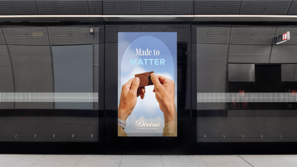
Divine Chocolate goes flavour-first with a bold new identity by Wildish & Co.
The farmer co-owned Fairtrade brand unveils its most significant rebrand to date, swapping dark, predictable cues for joyful colour, hand-drawn illustration and a renewed focus on taste.
Chocolate is having a moment. From craft bars to cult packaging drops, it's become one of the most competitive and creatively ambitious categories in branding. For studios, it's a dream brief. Rich storytelling, along with sensory cues, and the chance to make people feel something before they even take a bite? Yes, please.
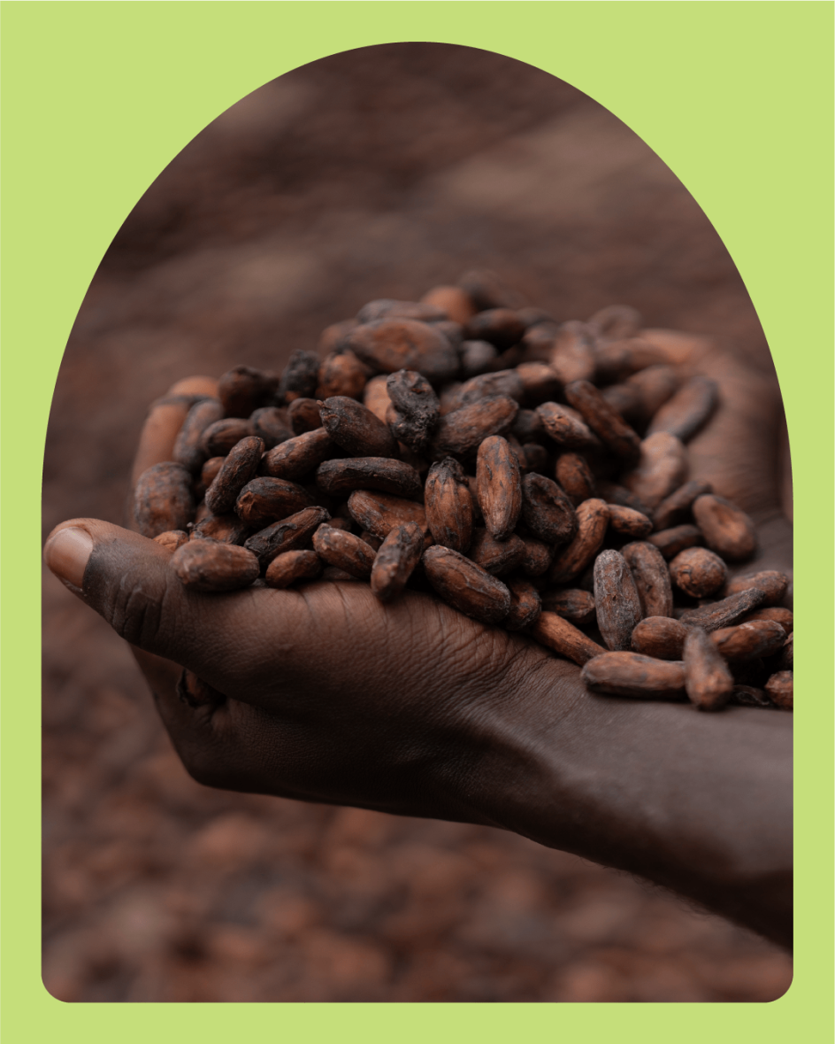
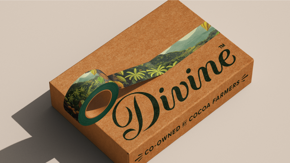
Enter Divine Chocolate. The farmer co-owned brand has revealed a vibrant new identity by London agency Wildish & Co., marking its most significant visual update since launching in 1998. As one of the world's first Fairtrade chocolate brands, Divine has long had a decent story to tell. According to Wildish, this rebrand gives it a visual world that finally lives up to it.
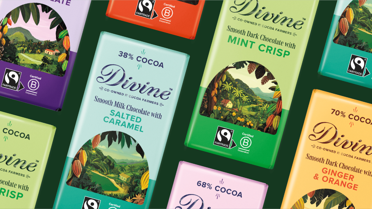
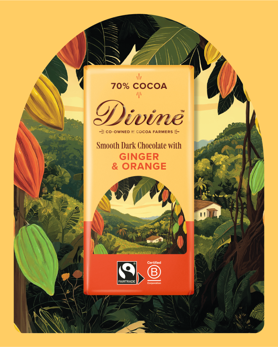
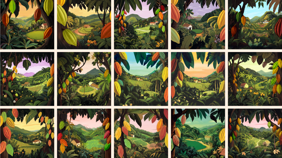
The new packaging is confident, colourful and full of character. Hand-drawn illustrations bring Ghanaian cocoa landscapes to life, while a refreshed typographic approach signals a clearer shift towards a premium, flavour-led positioning. It feels joyful and expressive, without losing sight of the farmers at the heart of the operation.
The rebrand was designed to modernise Divine's visual identity, strengthen shelf presence and help reposition the brand as exceptional chocolate first, with ethics embedded rather than shouted. Wildish & Co. was tasked with creating a new packaging system and visual toolkit to better communicate taste, quality, and aspiration while staying rooted in Divine's Ghanaian heritage.
Early results suggest the change is working. Post-launch testing shows a significant uplift in shelf standout, taste appeal and overall brand attractiveness.
Illustration is central to the work. Wildish & Co. explored a range of visual directions, experimenting with landscapes, cocoa pods, people and farm scenes in styles ranging from detailed realism to more graphic, print-inspired approaches. The final hand-drawn style strikes a careful balance. It feels warm and human, but elevated enough to signal quality.
Typography also plays a key role. A new serif, Holise Medium, was introduced for headlines and on-pack messaging, bringing a sense of craft and refinement. It's paired with Divine's existing typeface, Proxima Nova, which gives that extra clarity and familiarity across longer copy and wider brand communications.
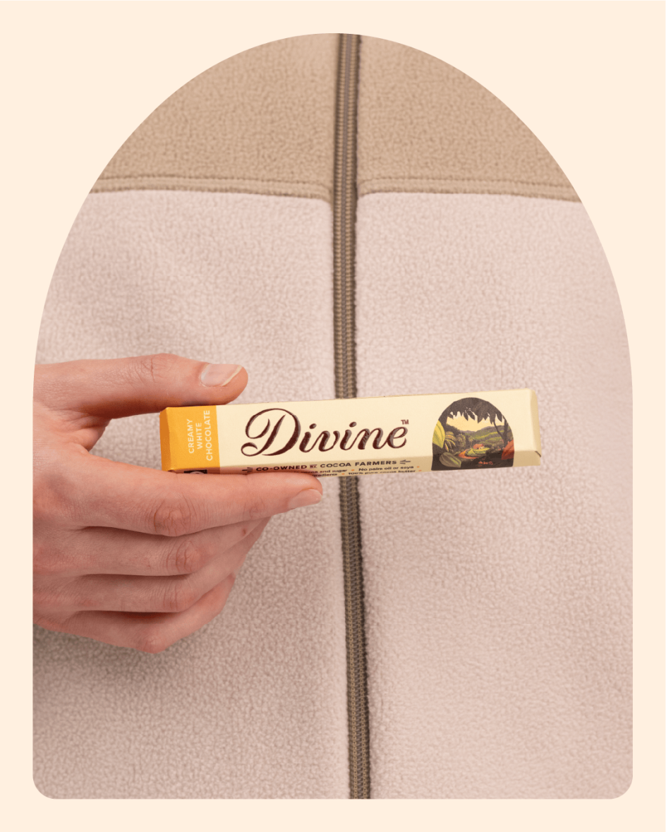
Colour does much of the heavy lifting, too. Rather than relying on dark backgrounds and subtle patterning, the new system puts flavour front and centre. Dark green and cream form the brand's foundation, grounding the identity in nature, farming and sustainability. From there, brighter and more expressive colours are used across the range to help each bar stand out.
An extended palette of deep, bright and lighter tones is used to differentiate flavours, with contrast carefully managed to ensure legibility and impact in busy retail environments.
"We knew we had a strong story, but we needed a brand world that truly reflected it," says Lydia Stubbins from Divine. "This rebrand allows us to feel premium, joyful and led by taste, while staying proudly co-owned and rooted in our Ghanaian heritage. Wildish & Co. helped us create an identity that brings renewed energy and emotion to the brand, while giving us the flexibility to grow."
The fresh identity has been designed to scale across year-round products, seasonal ranges and future category extensions. In a premium chocolate market that often plays it safe, Wildish & Co. has created a system that feels distinctive, expressive and unmistakably Divine.
Sam Fresco, MD at Wildish & Co., adds: "In confectionery, having a good story is no longer enough. Brands need a visual voice that cuts through. Our aim was to help Divine rediscover its confidence and express its personality more clearly. By leaning into colour and illustration, we created a system that feels recognisable, ownable and built to last."
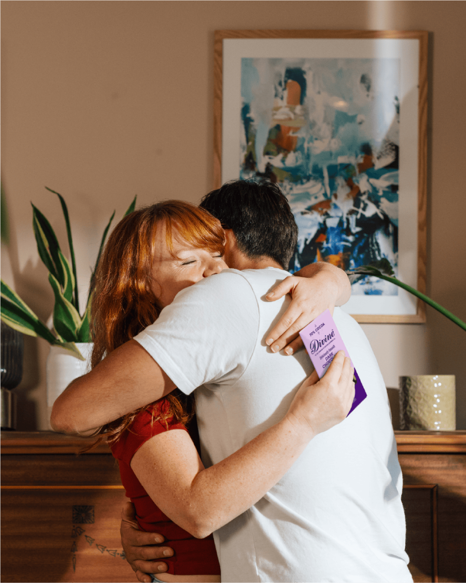
Ethical credentials are no longer a differentiator in themselves, which is why Divine's new identity aims to demonstrate that doing good and looking delicious can go hand in hand.
Editor's Picks


Trending


Podcasts


Editor's Picks
Further Reading