Universal Favourite gives Flaus the retro-futuristic treatment
Sydney-based design studio Universal Favourite has designed a funky identity for Flaus, the first eco-friendly electric flosser brand.
Credit: Universal Favourite / Flaus
Originally launched in 2021 on IndieGoGo, Flaus was fully funded in under 3 hours, skyrocketing it to the top 1% of IndieGoGo campaigns of all time. Its success shouldn’t really come as any surprise – who among us wouldn’t love to opt for a gentler, more effective flossing method that’s also more environmentally friendly than the plastic-heavy cartons, picks, and floss itself that dominate the oral hygiene aisle?
But even with a brilliant product, bridging the gap between crowdfunding hit and sustainable long-term business success can be a real challenge, especially without a strong brand identity and strategy. For that, Flaus founders Samantha Coxe and Elli Hanson turned to Universal Favourite to create a meaningful brand that speaks both to Flaus’s cool factor and its green credentials. The result is a bold, modern brand that makes choosing Flaus to seem like a fun, natural, no-brainer.
Credit: Universal Favourite / Flaus
Credit: Universal Favourite / Flaus
“Flaus wanted to create a brand that brought flossing into the 21st century but also rose above the swathe of superficial and “trendy” millennial brands emerging as part of the oral beauty boom,” Founder and Executive Creative Director, Dari Israelstam at Universal Favourite told Creative Boom. To do this, the brand needed to bring its environmental ethos to the front without falling into stale “eco” tropes or bland, green-washing messaging.
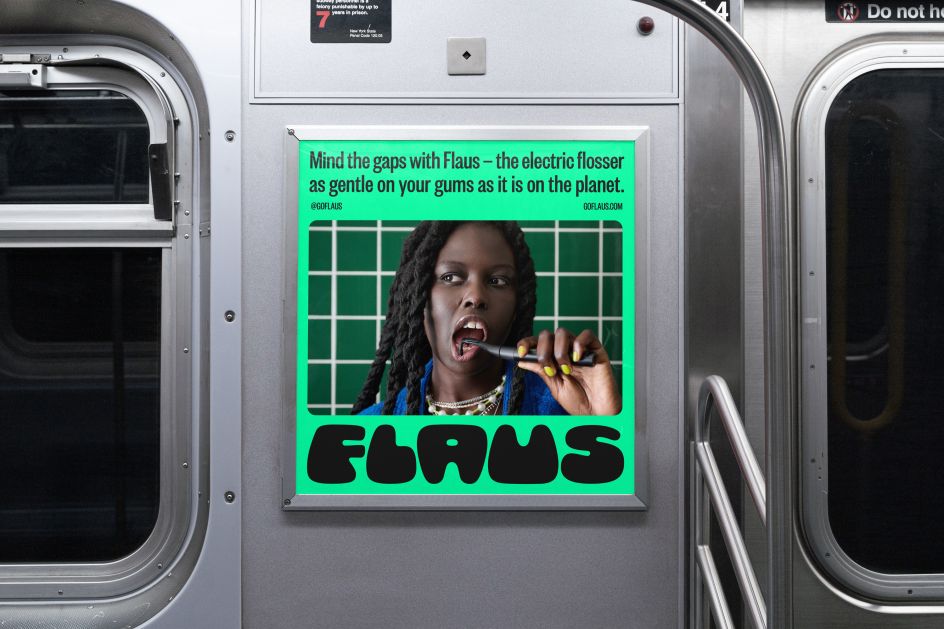
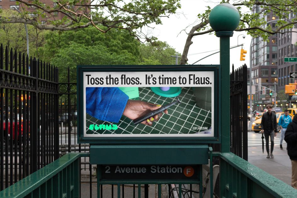
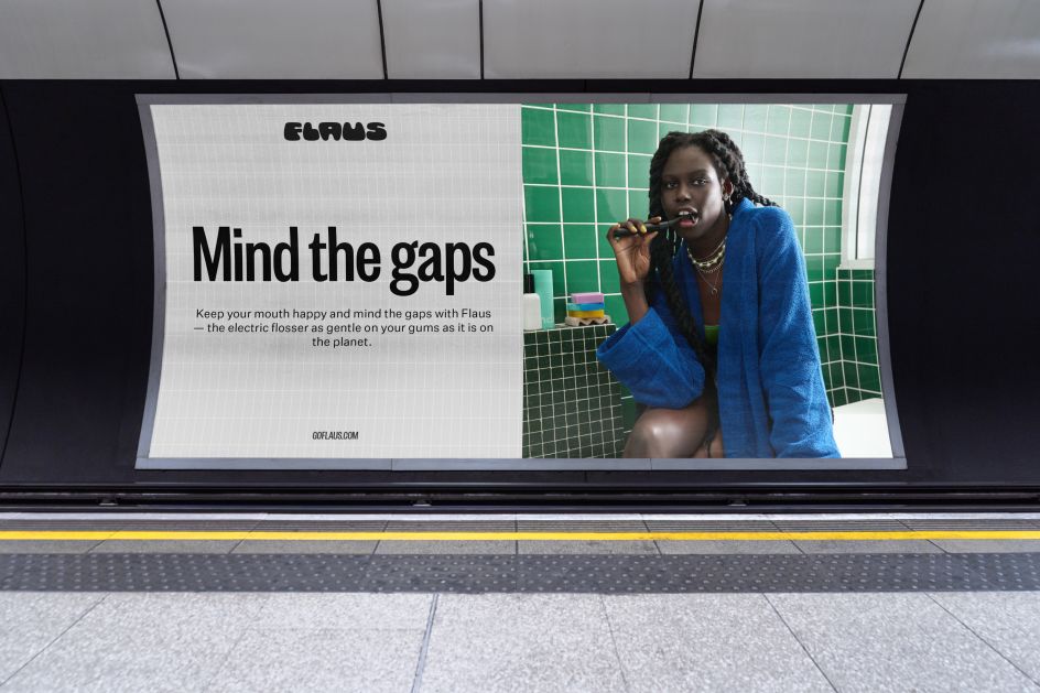
Flaus’s down-to-earth, cheeky tone of voice toes the line between representing the brand’s planet-friendly creds and nodding at Flaus’s cool factor. The visual identity follows suit.
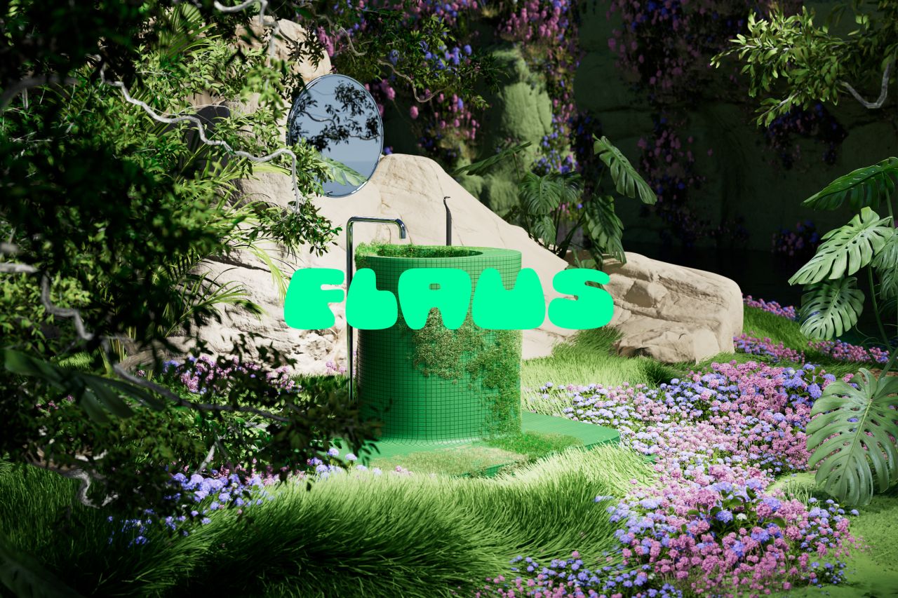
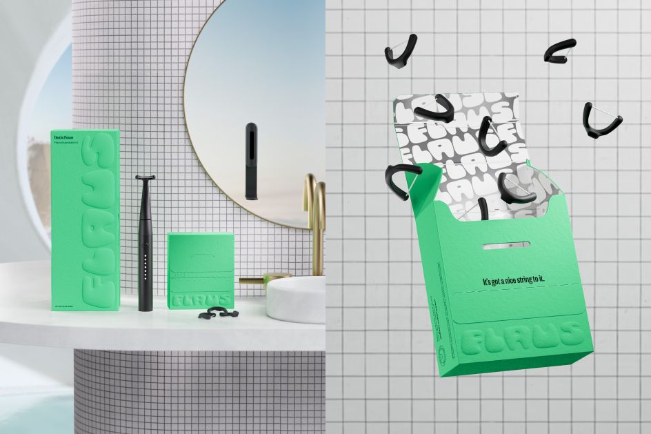
Drawing on retro-futuristic style, the Flaus logo is a customised version CHEE from Ohno Type Co, with both the A and the U taking the shape of teeth. It’s funky and cool and has a natural movement that matches the brand’s place at the intersection of lifestyle, beauty, tech, and environmentalism. “Its chubby, expressive character challenges the category norms of clean, sans serif and subtle typefaces, signifying the brand’s distinct difference in the oral beauty space,” explained Universal Favourites’ Dari Israelstam.
Credit: Universal Favourite / Flaus
To contrast the vibey movement of the wordmark, the Flaus headline typeface, Founders Grotesk X-Condensed, was chosen to represent the brand’s first product — “Tall and lean, it demands attention and trust while retaining a softness and creating balance with the fun of the brandmark,” said Israelstam. Founders Grotesk X-Condensed sits alongside the Untitled Sans workhorse, and both typefaces are used across every touchpoint of the brand identity.
Flaus’s founders set out to develop a modern answer to both our human and environmental hang-ups about flossing, and its new brand created by Universal Favourite captures this mission with a welcome infusion of fun. The bold, best-friends-group-chat vibes in the brand tone to the funky retro-futuristic visuals come together in a blend that stands out from almost every other dental hygiene brand on the market. Hopefully, Flaus is heralding a new era for dental brands – one that acknowledges the holistic function of dental products – for our mouths, bodies, planet, and lives.
Credit: Universal Favourite / Flaus
Editor's Picks


Trending


Podcasts


Editor's Picks
Further Reading