Stink Studios' brand refresh has a custom font that's a 'playful callback' to pre-emoji days
Stink Studios has just launched its first rebrand in six years. The overhaul aligns with the creative advertising and digital experience firm's new company values and a "philosophy that espouses the importance of ideals like craft, humanity, and equity".
Stink Studios has built quite a reputation for its award-winning work for clients such as Riot Games, Nike, and Spotify. Now, the independent global agency is unveiling its first rebrand in six years, marking a fresh chapter for the business. "In a moment where office culture has receded into the background, it's important for creative companies to explain what they stand for and why they're different," says CEO Mark Pytlik. "This isn't just a visual refresh – all of the changes we've made reflect something deeper about the direction of the company itself."
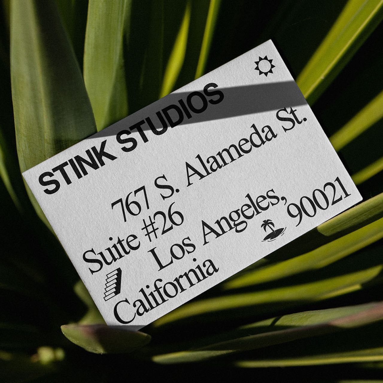
From a visual standpoint, Stink Studios has stripped itself down to the bare essentials, working primarily in black and white and emphasising system fonts like Times New Roman, Helvetica, and Courier. It's perhaps this, that could be described as a bold move, that suggests the agency is going back to simpler times before the madness of the last two years, using classic type and minimalist palettes to start afresh.
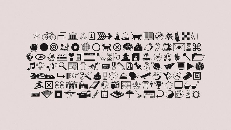
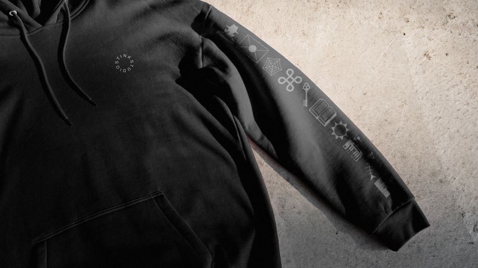
As part of the rebrand, the studio collaborated with type foundry Dinamo to create a custom internal font called Stink Dings, a playful callback to pre-emoji fonts like Webdings and Wing Dings (increasingly a 2022 thing, don't you know).
It's all very nostalgic and comforting, and deliberately so. With over a hundred illustrations, Stink Dings also brings fun and flexibility to the stark, monochromatic rebrand. "The Dings are a reflection of our various studio cultures around the world," explains Pytlik. "We plan to update them frequently so that this design system stays as vital and as current as possible."
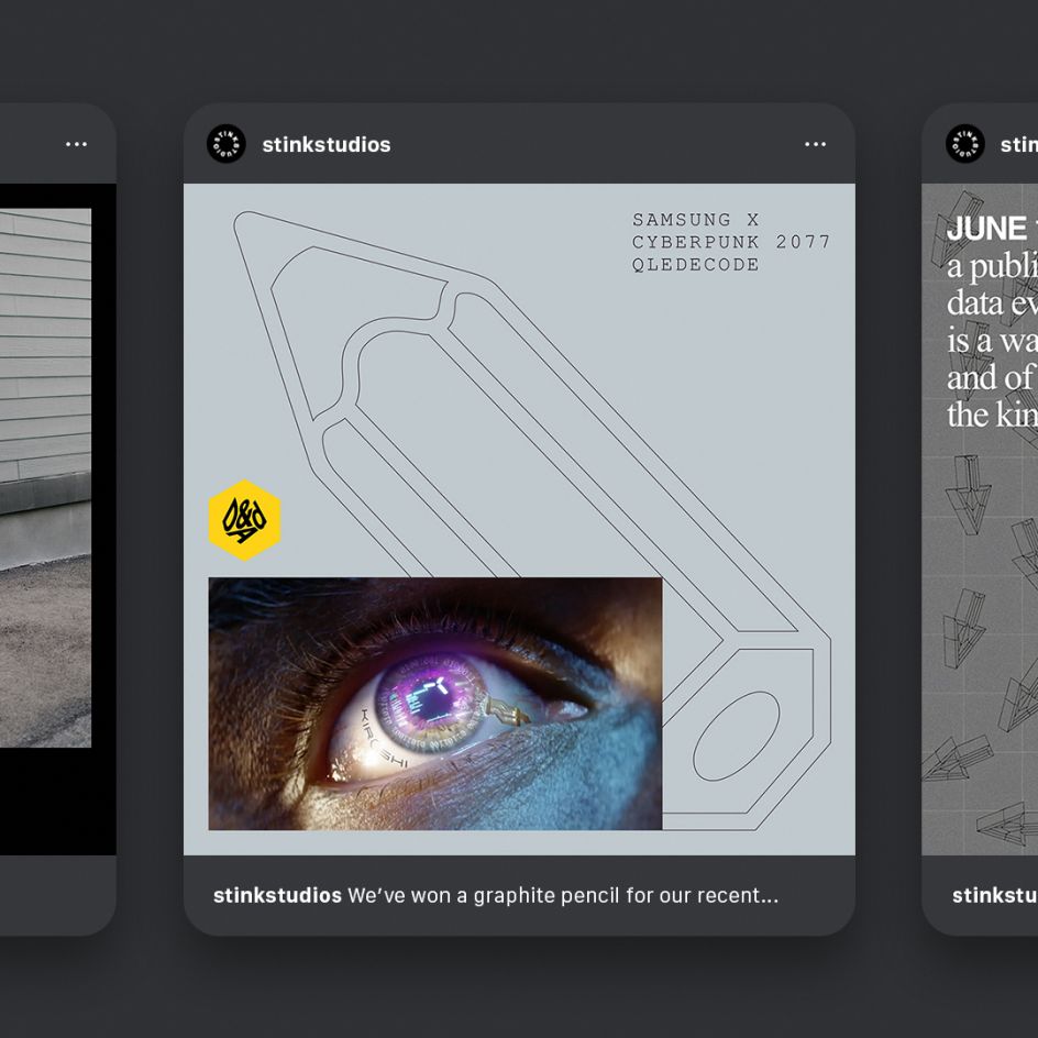
Meanwhile, Stink Studios' new website features recent work from clients like Mailchimp, Wealthfront, Peloton, and more. It also contains a full case study on the Stink Studios rebrand. "Sometimes I feel like we're terrible at telling the world about all the exceptional work we do," says Pytlik – an admission that will sound all too familiar to many of us. "This new rebrand is the perfect frame for our incredible output, and a perfect representation of the company we're building."
Editor's Picks


Trending


Podcasts


Editor's Picks
Further Reading