Ragged Edge reveals 'straight up' rebrand for Batch Organics
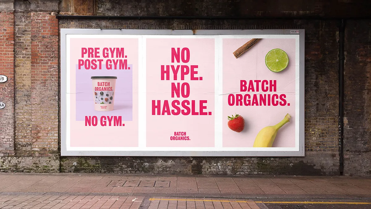
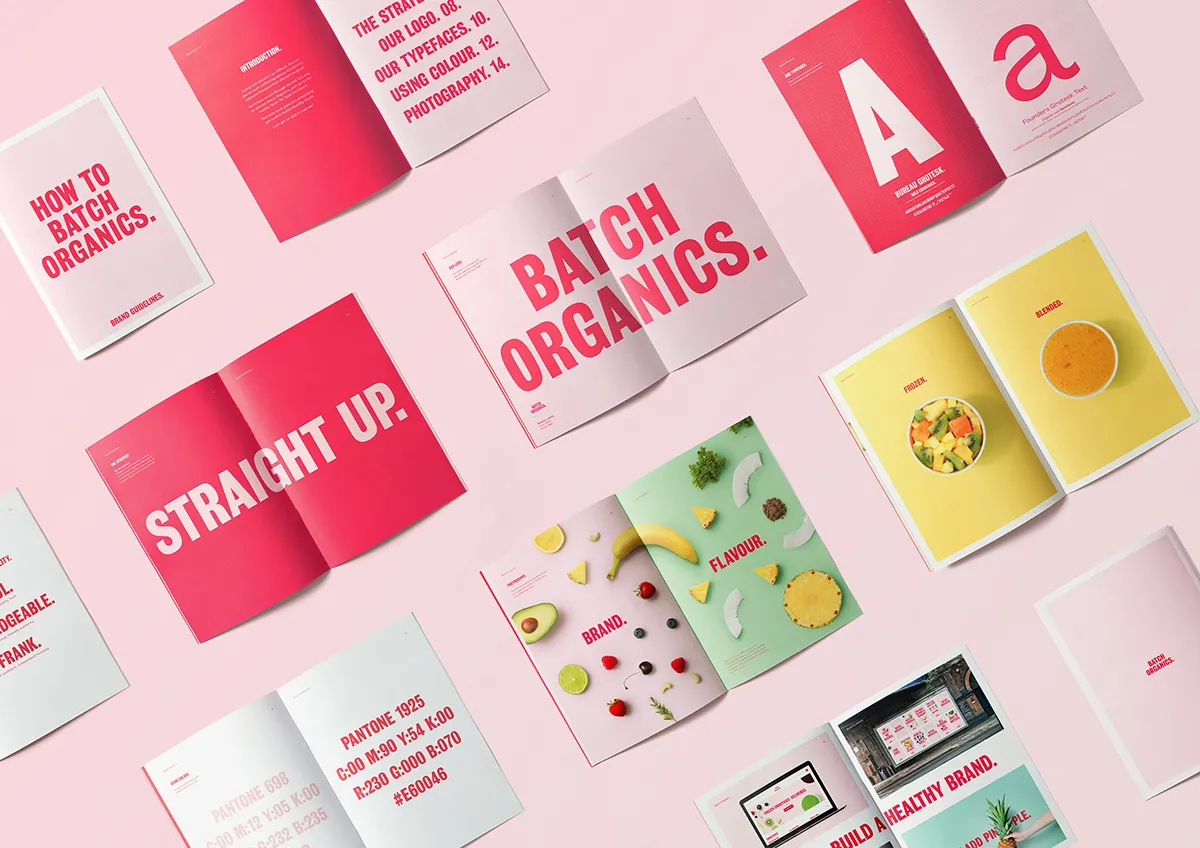
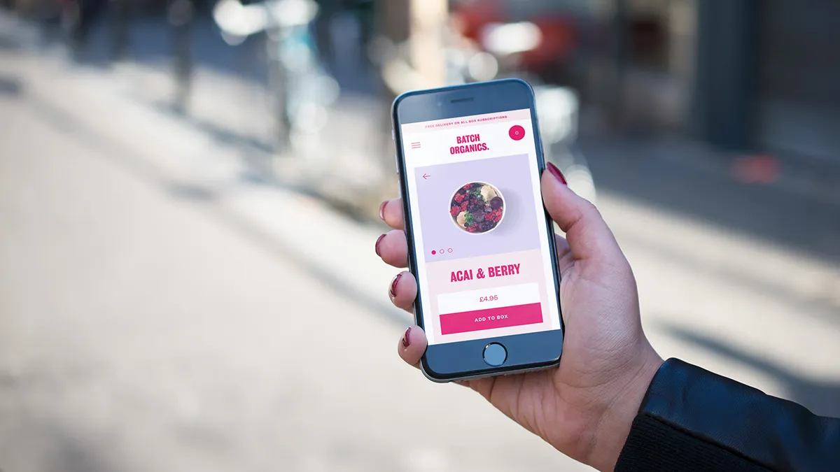
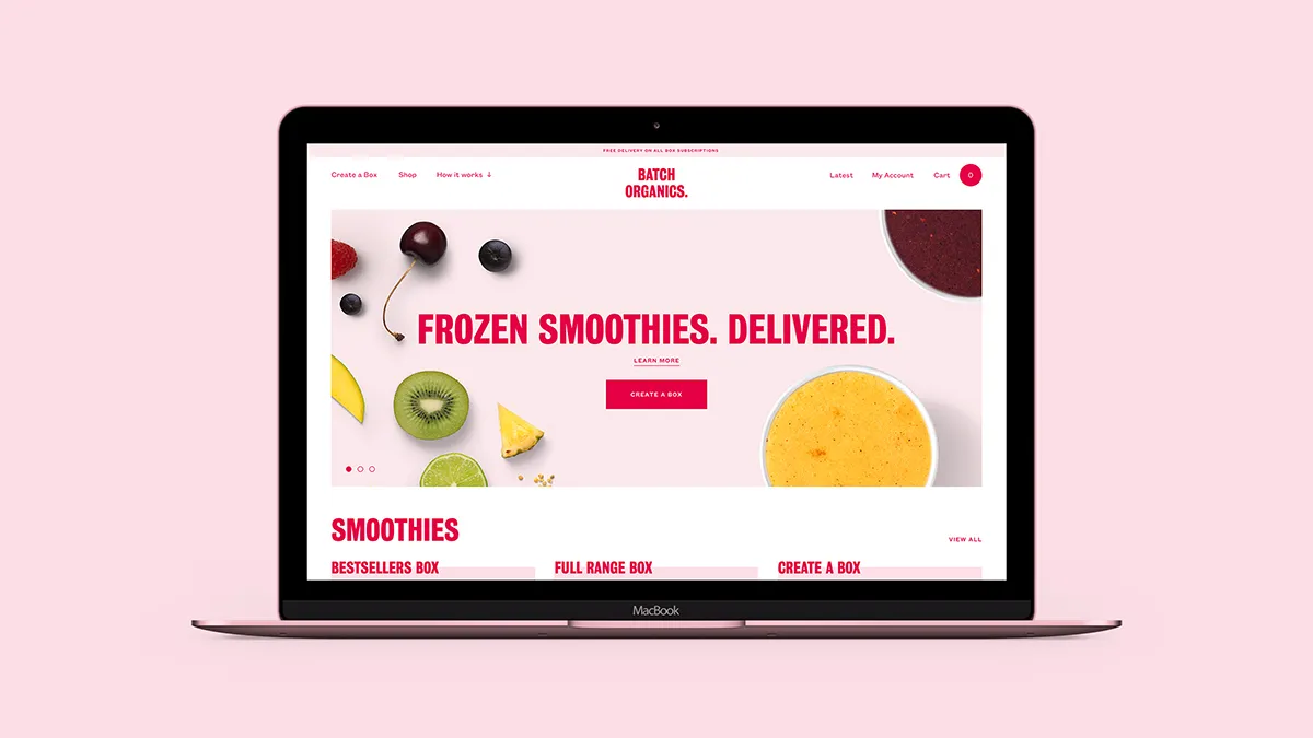
Batch Organics is apparently the no hype, no hassle health food brand for "busy people who want to eat well". Integrated branding agency Ragged Edge was recently appointed to help it stand out in a noisy category with a no-nonsense brand proposition 'Straight Up'. The rebrand has been brought to life by a new name, logo, colour palette, brand typography, visual identity and tone of voice.
Via Creative Boom submission. All images courtesy of Ragged Edge
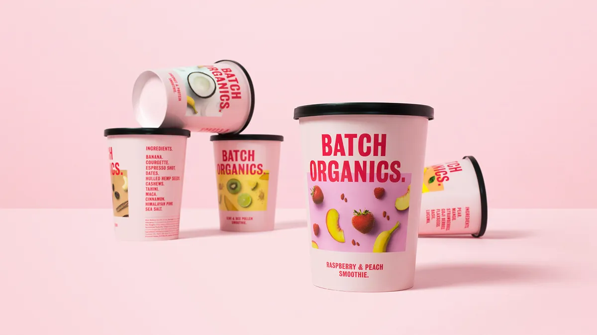
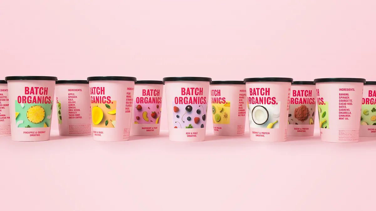
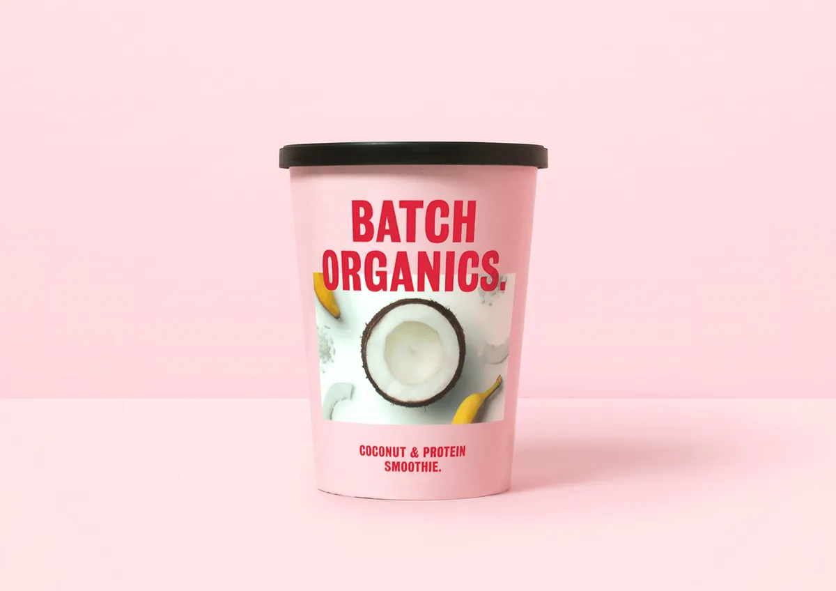
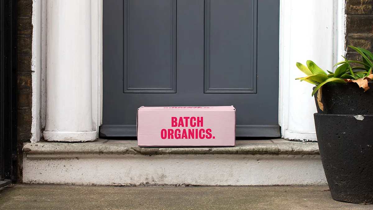
Formerly known as Natural Blender, Batch Organics delivers flash frozen organic smoothie ingredients ready to be blitzed into a delicious and healthy drink that can be enjoyed directly from the recyclable wax paper cups it arrived in, either as a snack or as breakfast on-the-go. CEO Charles Owen says: "The health category is incredibly crowded, so we knew we needed to do something really different to cut through."
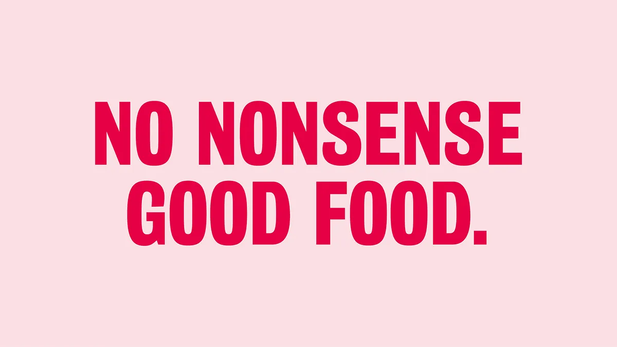
Market research revealed Batch Organics’ audience was already engaged in healthy eating. "They know what’s good for them, they just need quicker, easier ways of maintaining healthy lifestyles," says Max Ottignon, Co-Founder, Ragged Edge. "So we reimagined Batch Organics as the fuss-free, ‘nothing but the truth’ option for people on the go. It’s a brand that’s refreshingly frank and ‘Straight Up’."
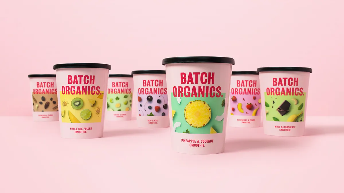
Natural Blender became Batch Organics, a no-frills moniker that heroes the product’s organic goodness. Visually, the handwritten type and fiddly logo conventions of the category were avoided. Instead, a bold, clean brand typography and wordmark create a fresh look that is unmistakably Batch Organics.
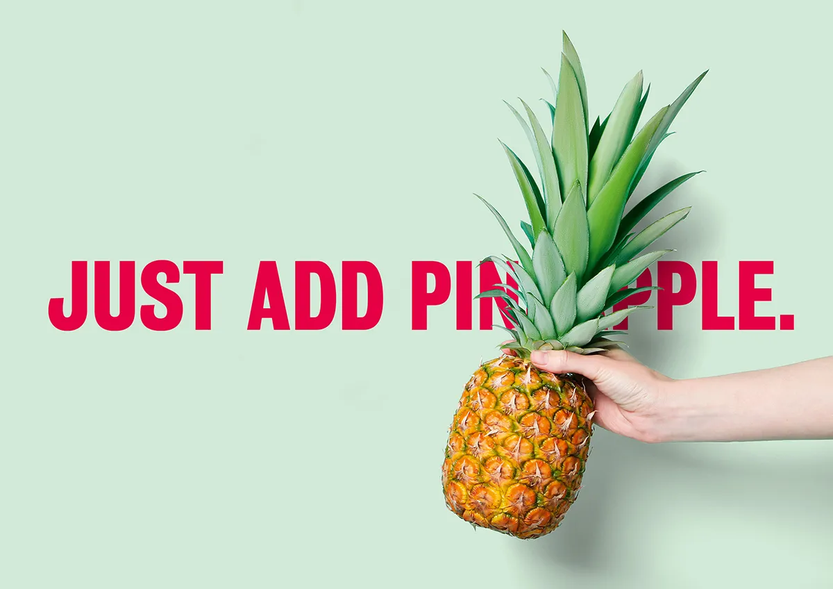
Max adds: "Food brands often package products in different colours for different flavours. To make it stand out, we gave Batch Organics a single colour it could own across a range of products. Verbally, an assertive tone of voice helps bring the new brand attitude to life. Pithy, straight-talking headlines communicate a ‘tell it like it is’ ethos."



Editor's Picks





Trending


Latest Jobs
Principal Software Engineer at BBC Media Tech
Full-time·Glasgow·Up to £83,790
Designer at New Genre
Full-time·London·£36k–£48k
Midweight Designer at All Purpose
Full-time·London·£30k–38k
Creative Content Executive at Cognition
Full-time·Birmingham·£28k–£35k
Account Manager at BUILDHOLLYWOOD
Full-time·London·£34k–£38k
Senior Brand Designer at Analogue
Full-time·Leeds·£38k-£45k