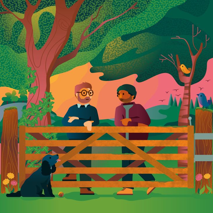
Stephen Cheetham helps to beautifully illustrate the topic of insurance for More Than
Stephen Cheetam is behind this charming series of illustrations and animated elements for More Than, as part of the insurance company's rebrand by Wieden + Kennedy London launched this week.
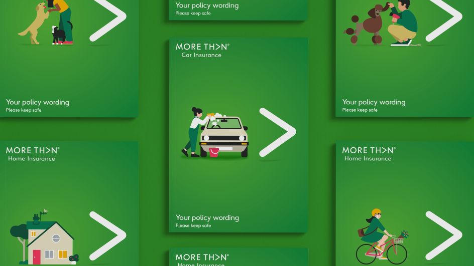
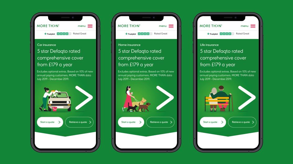
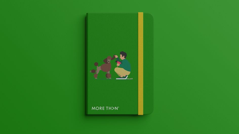
Here, we see a diverse mix of characters going about their daily lives and demonstrating all of More Than's insurance categories – from home and car insurance to travel cover and pet insurance, all against the backdrop of the brand's signature green palette.
"The More Than brand refresh was underpinned by a set of new brand principles, where simplicity, ease of use and care were at the heart of the brand," says Simon Elvins, creative director at W+K. "Stephen's illustration beautifully captures these principles in a way that feels effortless and charming, whilst also creating a distinct new look and feel that informs every aspect of the brand."
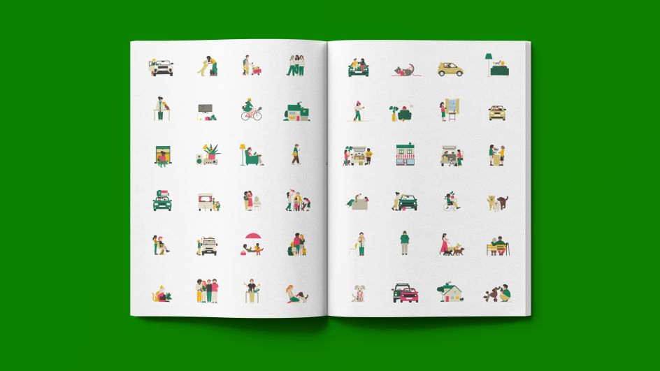
Stephen, who is represented by Handsome Frank, marks More Than as his "biggest job to date", at least in terms of quantity of illustration. The project, in fact, resulted in 70 different artworks in total. "I remember receiving the brief from Simon at Wieden + Kennedy who was handling the rebrand, and getting quite nervous when I got to the page that listed all the illustrations. Seventy is a lot of illustrations…for me anyway."
To manage the task at hand, a spreadsheet was created, affectionately named The Matrix, with colour coded columns and dates, breaking the 70 illustrations into manageable chunks. Every Monday, Stephen would talk to the team at Wieden + Kennedy to discuss progress.
"We wanted to create warm, engaging illustrations to counter the often dry topic of insurance. Trying to convey a little humour into real-world scenes was always the challenge, but one I really enjoyed tackling," Stephen adds.
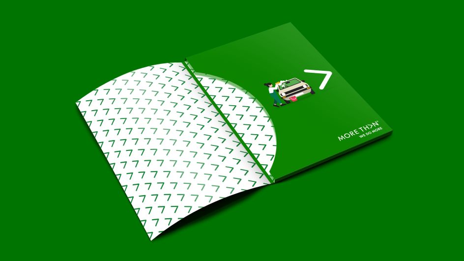
Every illustration had to sit in the same space, to the left of the brand's white chevron logo, on a green gradient background. "There was also the possibility of it needing to sit on a white background, but green was the primary," says Stephen. "Apart from still illustrations, a lucky few were given the animation treatment, thanks to Jonathan Harris at W+K, which made me very happy. Always a joy to see my work move."

The main colour palette was decided by W+K as part of the rebrand, but Stephen was given scope to expand on these if needed, for things such as "skin tones and complementary colours" as well as illustrate "real-world scenes".
The project for More Than took around four months to complete. "Looking at it now as a complete body of work, I’m really happy with how it all came together. And hopefully, it will make the job of organising your insurance a little more entertaining!"
Editor's Picks


Trending


](https://www.creativeboom.com/upload/articles/90/908fdb6378db1e95d12595416f54e6336d5e80b8_732.jpg)
Podcasts


Editor's Picks
Further Reading