Wine designs that celebrate the brave man who fails
"This wine is dedicated to all the brave ones, who thought that it is better to try and fail than not try at all," says Polish studio Foxtrot. "Cheers to them!"

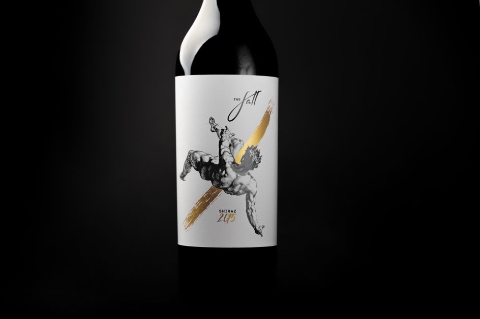
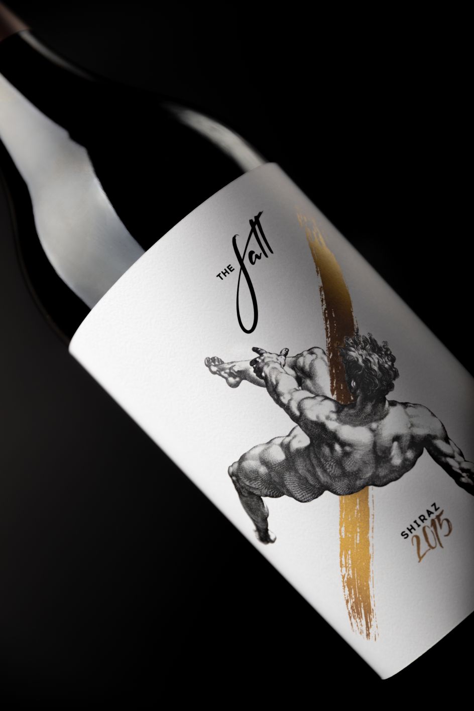
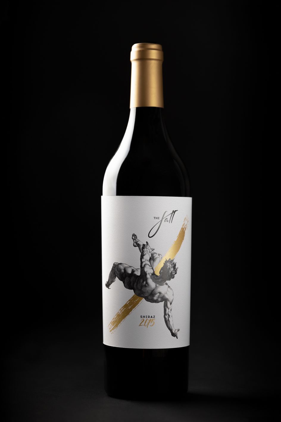
Cheers indeed, but the studio's designs for The Fall wine are anything but a failure. Created using Adobe Photoshop, Illustrator and Lightroom, the labels for the 2015 Shiraz were commissioned by See Wine Company. It perhaps spotted the studio's previous brilliant, considered and artisanal-looking designs for booze—its self-initiated project to create the designs for its own Nalewka, a traditional Polish spirit to give to studio friends and customers.
The labels show a tumbling muscular figure, reminiscent of traditional Greek sculptures or Biblical drawings (hence, we're assuming, the name The Fall—sadly unlikely to be a reference to the Manchester band.
"We wanted to achieve a dramatic look in a symbolic scene of the grandiose failure of a man," says Foxtrot, which is based in Warsaw. The figure is offset with script serif typography spelling out the wine's name; with a modern twist in the more typewriter-like font used for 'Shiraz'. A flourish of bright gold appears like a brushstroke through the middle of the label, which is mirrored in the lettering used for '2015'.
Foxtrot adds, "We composed the thin woodcut drawing with one strike of hot-stamped gold foil, and as a complement, we used clear and gently textured white paper with a natural look."
Foxtrot's previous projects include art direction, branding, print and packaging design and production, web design and illustration work for the likes of streetwear brand Everyday Trippin, skincare company Blanc Naturals and cover design for revered graphic design publication Novum.
Editor's Picks


Trending


](https://www.creativeboom.com/upload/articles/90/908fdb6378db1e95d12595416f54e6336d5e80b8_732.jpg)
Podcasts


Editor's Picks
Further Reading