OMSE creates a home for everyone with its inviting identity for Ark co-living space
Independent design studio OMSE has created a welcoming identity for Ark, a Wembley-based co-living space which aims to provide a practical alternative to living in London.
Anyone who lives in London will tell you it can be a challenge. From tricky landlords who can boot you out at a moment's notice to unaffordable rents and a lack of quality options, settling down in the capital comes with unique hurdles. That's where Ark comes in. Providing homely, consciously-designed co-living spaces aims to make living and working in London more accessible for all.
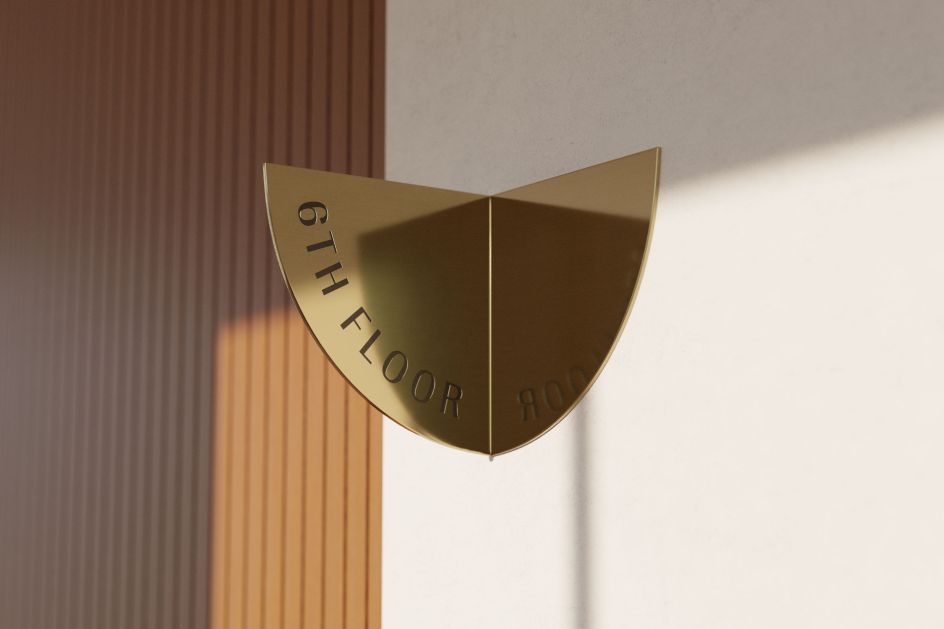
Ark has recently launched its first location in Wembley, and to help the startup set sail, it teamed up with OMSE to create a supportive identity which can adapt to fit the many different boroughs of the city. Taking its visual cues from Ark's name and inviting personality, the OMSE team has created a system centred around a semi-circular form that is also flexible enough to reflect all the different ways members can enjoy the spaces.
According to OMSE creative director Pedro Messias, the new identity had a lot to accomplish. It stands out as a better alternative to traditional housing in London and sets itself apart from other existing co-living spaces. "A key part of the brief was for the brand to strike a balance between being instantly recognisable while being flexible and personal to reflect each location and all the ways people can use the spaces," he tells Creative Boom.
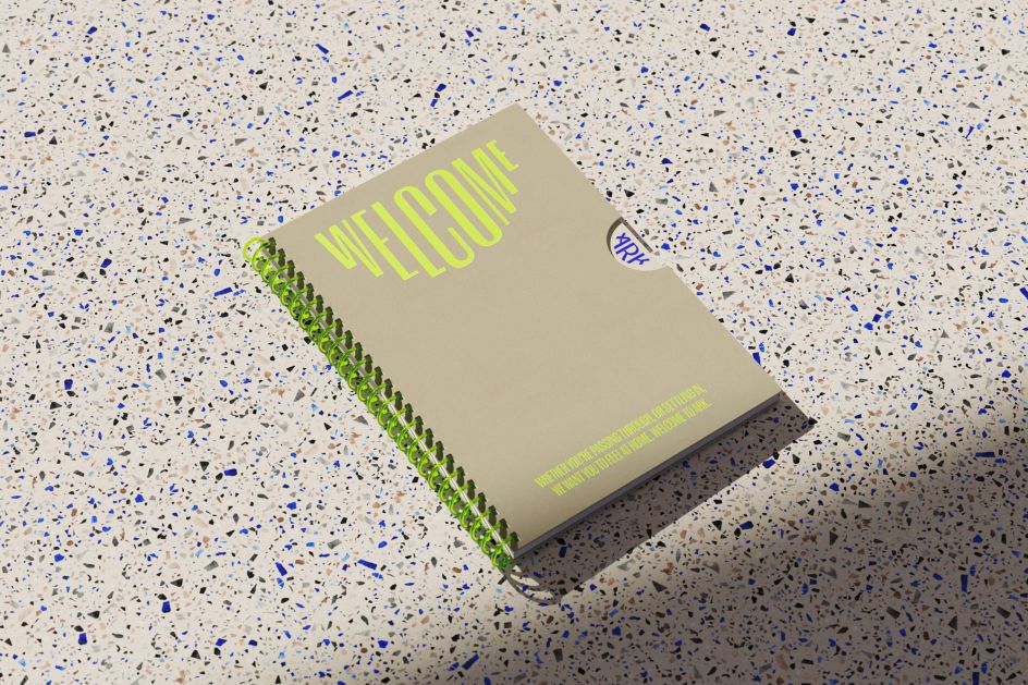
"To do that, we wanted to create a visual motif that could link the visual identity. The semi-circle felt like a great starting point. It acts as a geometric abstraction of an Ark and behaves like a supportive, smile-like structure, which aligns with the brand personality.
"Because it's such a bold, simple form, we could also use it as a guide to set typography in many different styles, display images, develop illustrations and signage cohesively."
OMSE's approach to building the identity involved laying some solid strategic foundations right from the start. The large team had to ensure everyone was on the same page from the off, which meant ensuring everyone was aligned around Ark's vision of accessible, welcoming spaces. "We worked closely with the client team to define a clear vision and brand principles that could act as a north star for everyone involved and guide us through each creative decision," adds Pedro.
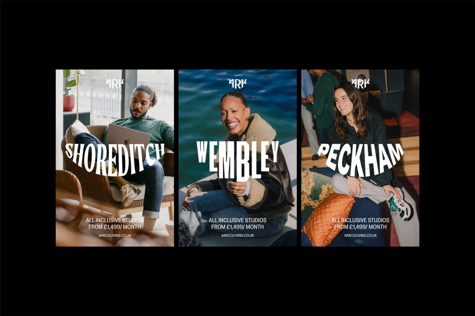
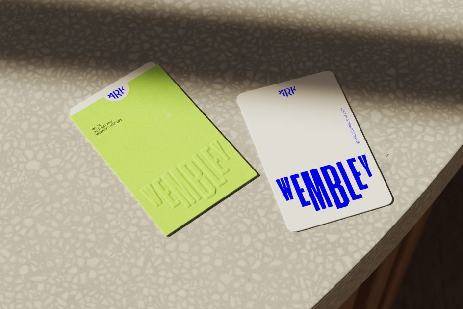
At the heart of Ark's identity is a foundational blue palette. Pedro explains that they settled on this because Ark is home to many people, and therefore its design had to be suitable for people to actually live in. "We needed to develop a colour palette that was pared back and subtle," he explains.
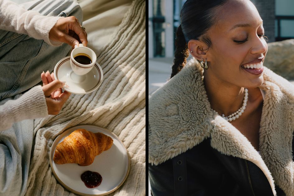
"That said, there's something vibrant about this way of living, and the locations themselves are colourful and rich with culture in different ways. So we used electric blue and green punches to capture that energy."
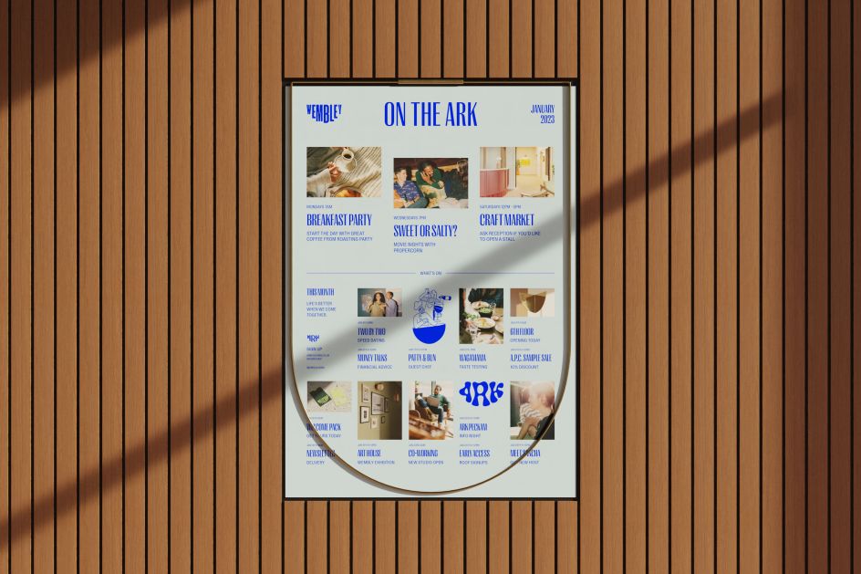
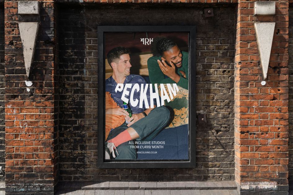
Like with all brands, typography had an important role to play for Ark. By using the semi-circular Ark form as a guide, Pedro says the OMSE team were free to "play with different typographic styles that could capture the vibe of each location and to speak to members in an instantly recognisable way." Instead of being anchored to the same form, he adds that Ark's type language can now continue to grow and evolve to suit its location.
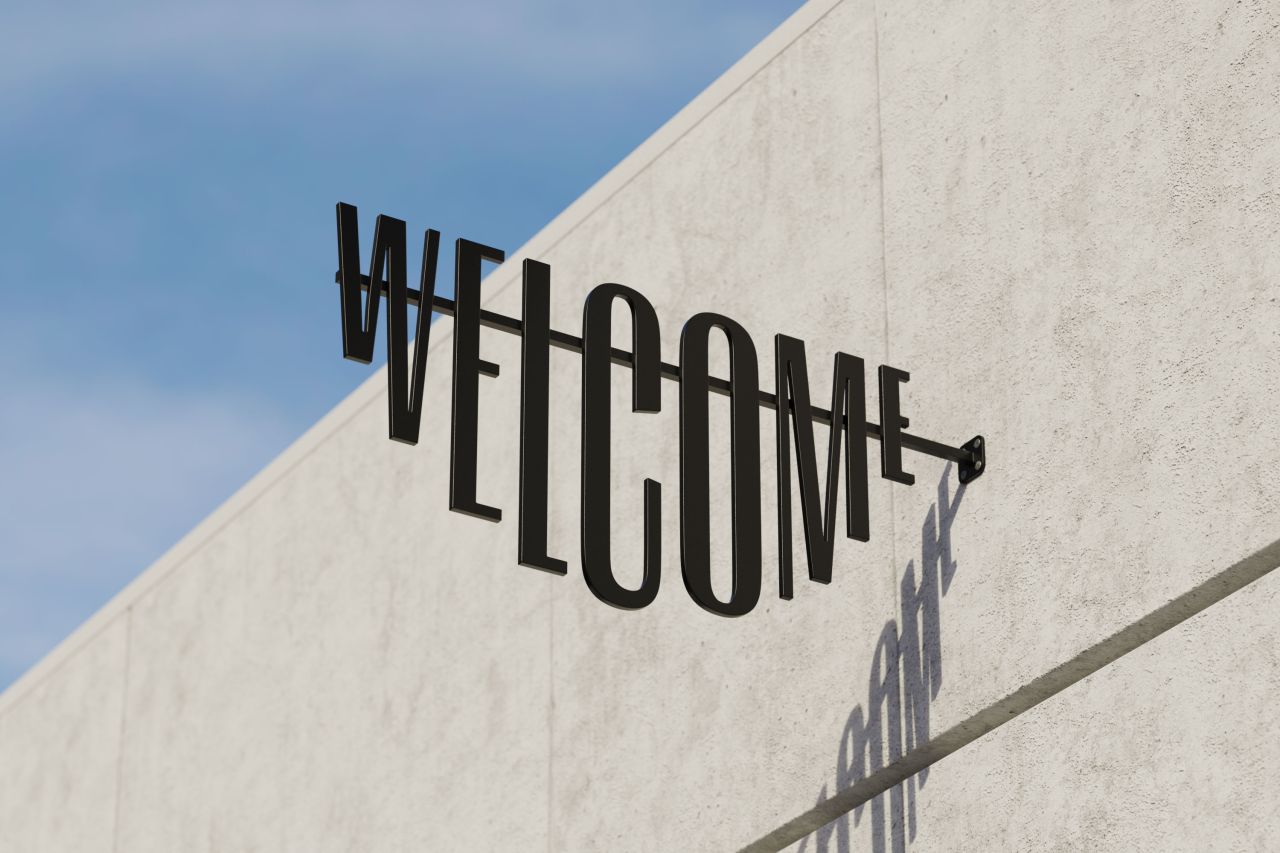
The key to getting Ark's personality across was ensuring it appeared at every touchpoint. This was achieved by letting it inform all of the design elements. "The key for us was to base the brand on a simple idea that could reflect this personality and allow for plenty of flexibility so that people feel like they can take ownership of it, rather than having a monolithic brand imposed on them," says Pedro.
"It all started with the logo, where we used that semi-circular guide that mimics a supportive Ark where everyone is invited to jump on board.
"And the flexibility comes through in the flexible typography system – which people are welcome to personalise and make their own – and through an effortless imagery style that celebrates the people who make up the Ark community."
Editor's Picks


Trending


](https://www.creativeboom.com/upload/articles/90/908fdb6378db1e95d12595416f54e6336d5e80b8_732.jpg)
Podcasts


Editor's Picks
Further Reading