The Poster is a visual history of one of the most powerful and memorable means of mass communication
Could there be anything more powerful or meaningful than a printed poster? Even in the digital age, it retains a much-loved role in connecting with us in a way that both entertains and informs. Now a new book by Thames & Hudson, in association with the V&A, provides us with an essential visual history of what many would argue remains the most effective way to spread a message to millions.
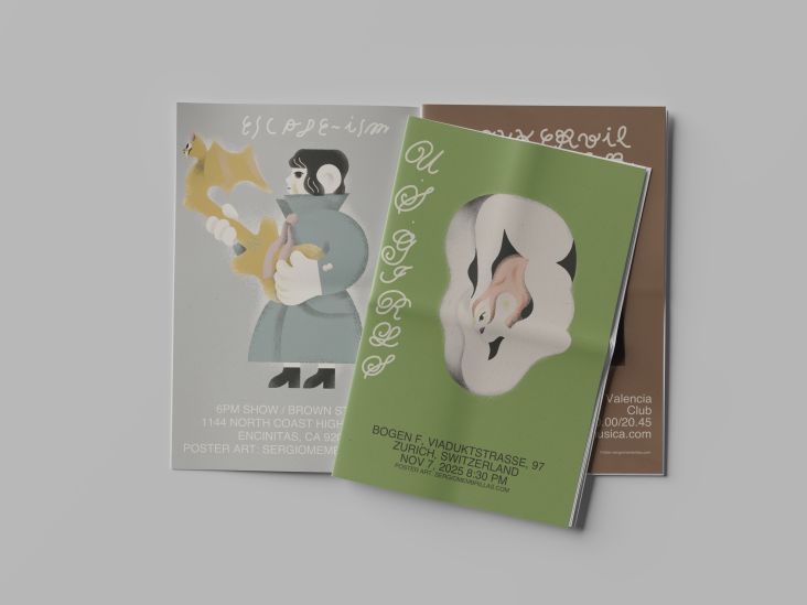
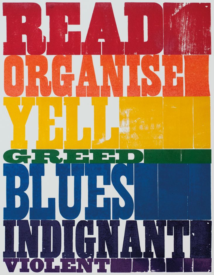
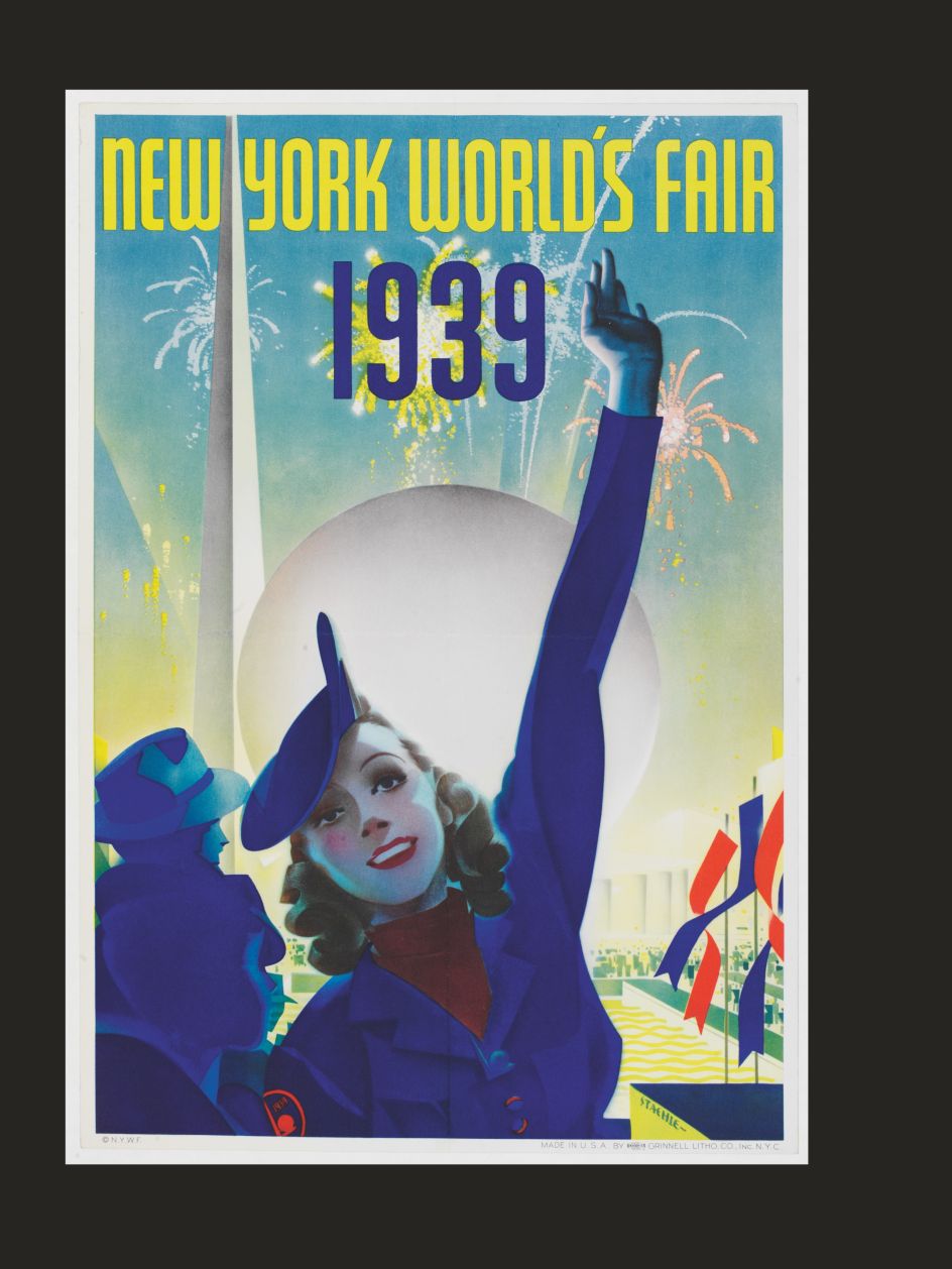
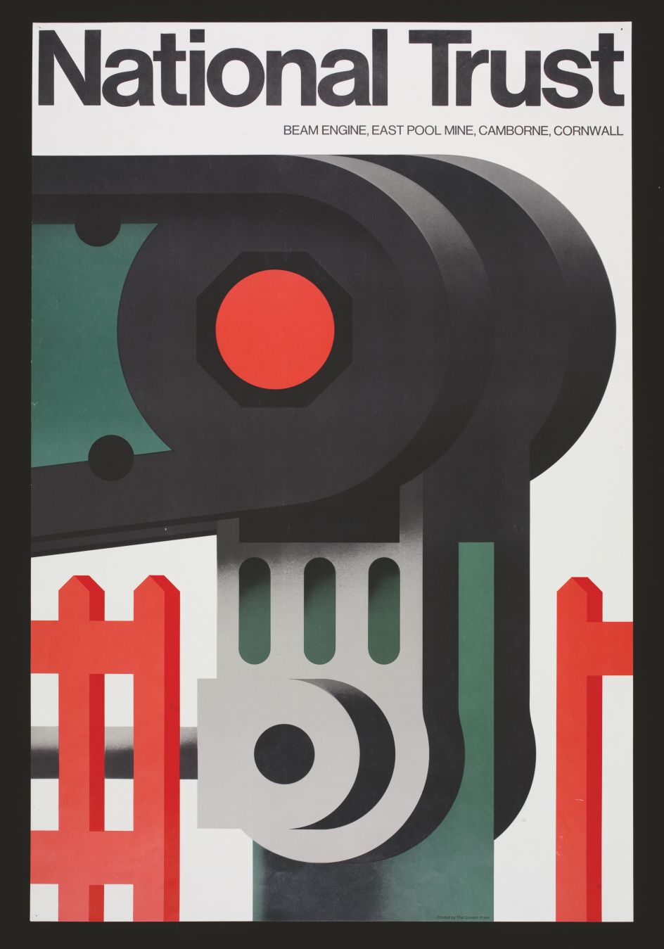
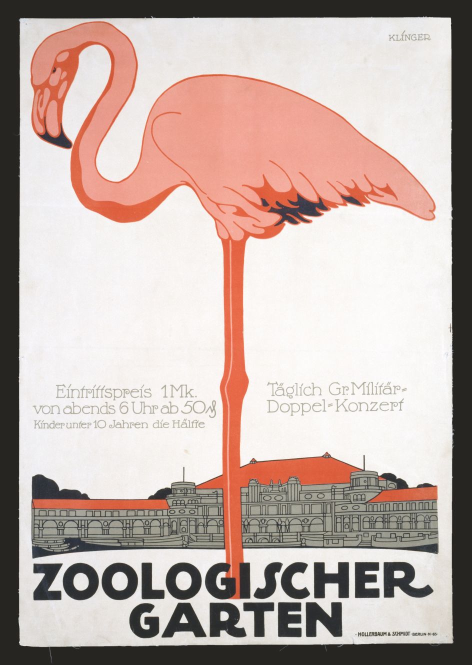
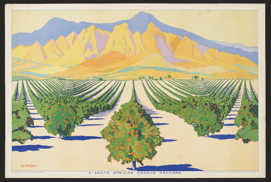
The Poster, edited by Gill Saunders and Margaret Timmers, brings together over 300 examples of poster design and the various ways the medium has been used to tell, to sell, to charm and to spur on change. Organised into seven thematic chapters, each poster is accompanied by a concise commentary that explains the work in terms of its design, printing, content, message and the commercial, social or political impact it may have had.
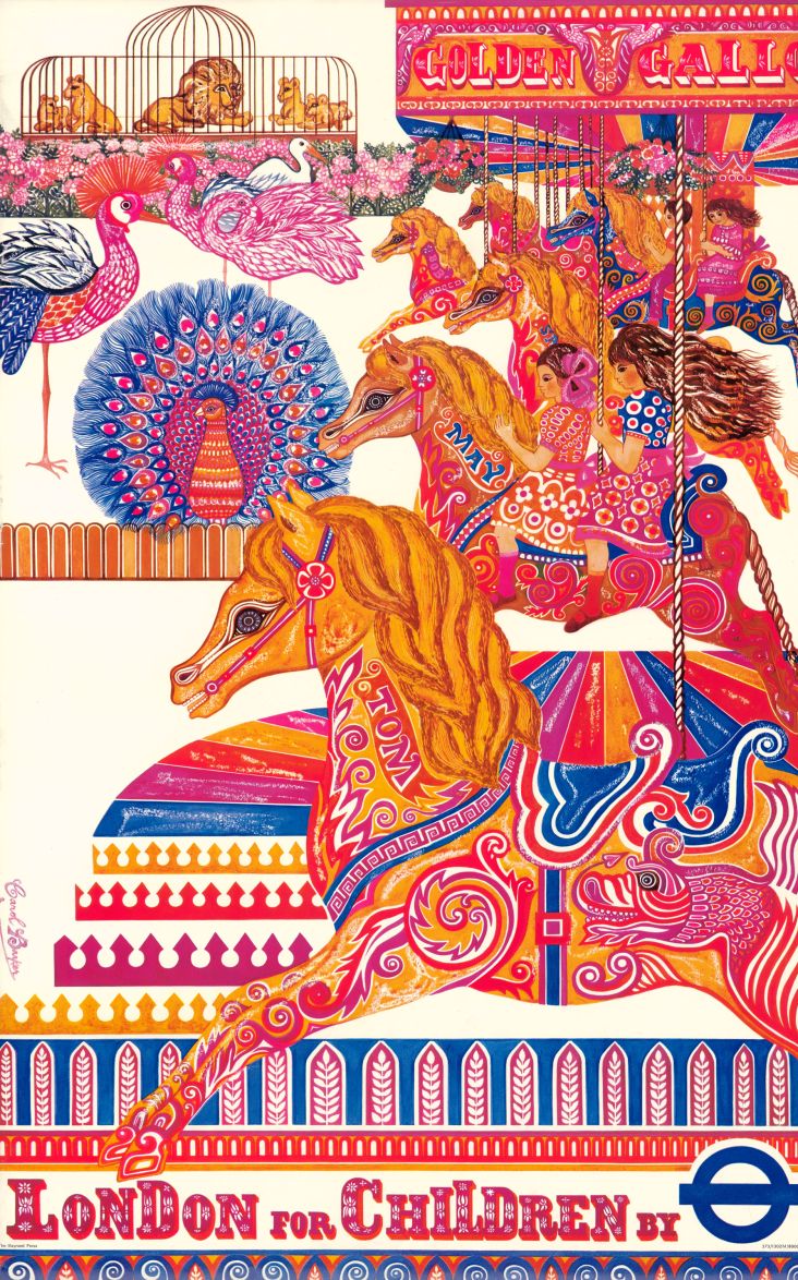
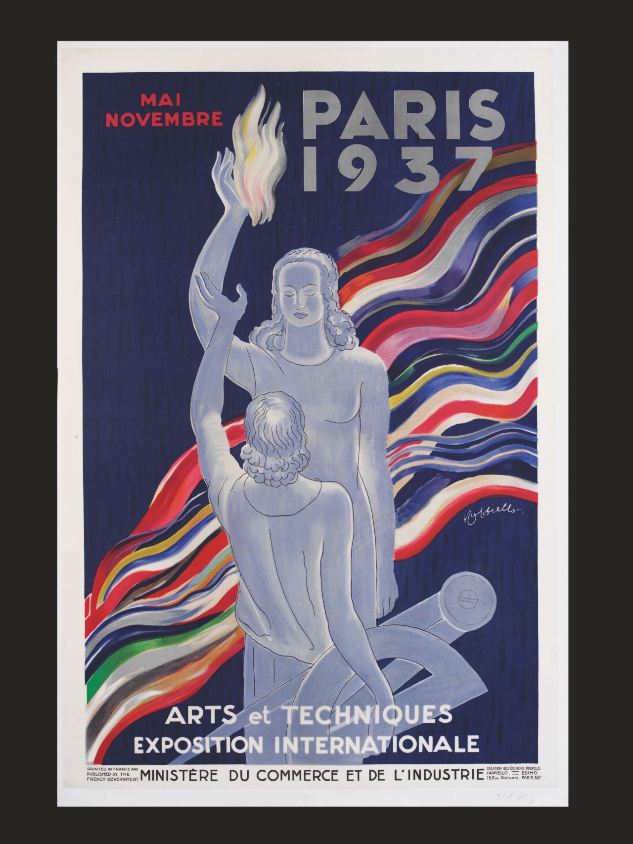
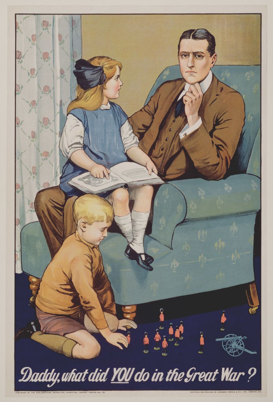
With posters that shook and changed the world, it features works by the masters of poster design that have become popular and highly collectable classics and charts the ebb and flow of styles such as Art Nouveau, Modernism, Art Deco, Psychedelia and Punk.
"The art lies in the graphic approach," says Margaret Timmers, the former Senior Curator of Prints in the Word & Image Department of the V&A. "It's that clever combination of text and imagery that can focus the viewer's eye on the essential selling proposition, whether it is a commercial product, a service, a performance or a political cause. They are a truly popular art form: their graphic language is vernacular and infinitely adaptable to changing times, tastes and styles – one reason why artists and graphic designers have constantly been drawn to the medium."
How did Margaret and Gill narrow down the selection, dating back to the 1880s? A starting point was Margaret's earlier book, The Power of the Poster (1998), which had done much of the groundwork, "identifying some of the must-have highlights of the genre". But some topics, such as travel, had only been "lightly covered" so the creative duo looked again at the V&A archives to feature a broader range.
Were there any themes or trends that they noticed during the selection process? "One fascinating aspect of poster design, as it has developed from the painterly styles of Toulouse-Lautrec and Jules Chéret, is the way it has closely shadowed or directly reflected the dominant artistic styles and movements of the moment," says Gill, Head of Prints in the Word & Image Department of the V&A. "This can be seen very vividly in the work of the great American graphic designer Edward McKnight Kauffer, whose designs demonstrate the successive influences of Cubism and Vorticism, to Art Deco, and Surrealism."
She adds: "Similarly, the sinuous organic forms, black outlines and inventive typography so characteristic of 1960s psychedelic posters for the music industry owe a very obvious debt to Aubrey Beardsley and Art Nouveau. And Surrealism has enjoyed a long after-life in poster design, from its origins in the 1930s to Salvador Dali's 1960s posters for the French Railways, and the witty visuals of the 1980s campaigns for Silk Cut and Benson & Hedges."
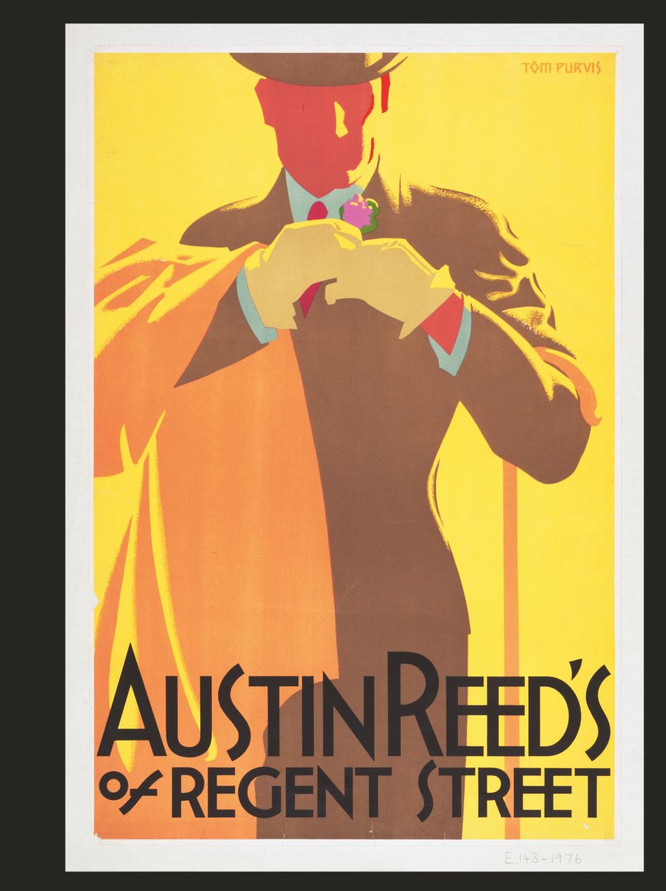
Did they have any favourites? "I'm a big fan of Tom Purvis, who specialised in travel posters for the London & North Eastern Railway in the 1920s and '30s. His posters, influenced by Japanese woodblock prints, with simplified forms and bright clear colours, are sophisticated masterpieces of graphic design in which text is superfluous," says Gill.
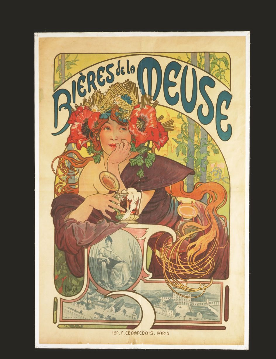
Margaret, meanwhile, loves the poster that Alphonse Mucha designed for the actress Sarah Bernhardt in her role as the consumptive heroine (Marguerite Gautier) in La Dame aux Camélias in Paris in 1896. "He shows her elongated, in profile, almost like a saint in an ornate niche, spangled with stars," she explains. "It's in Mucha's famous Art Nouveau style, full of swirling lines and decorative touches. Mucha's vision of Bernhardt matched her own, idea of herself and she commissioned him to design posters, sets and costumes for her performances over the next six years. This made Mucha's name."
Another "ground-breaking" poster Margaret points out is the one for the Olympic Games in Mexico City in 1968. "Mexico was the first Latin-American country to host the Games, and the organisers wanted to get across the idea of modern Mexico, but also its historical roots," she says. "The poster was, unusually, printed in a square format. It took the geometric 'Mexico 68' logo, which included the Olympic rings, and radiated the lettering out to the four borders in dazzling black and white parallel lines. This was a deliberate reference to the pattern-making traditions of Mexico's pre-Hispanic cultures but was also a brilliant piece of 1960s Op Art. It established how Mexico 68 was perceived and also had an impact on the way that Mexico would be visualised by the rest of the world."
The Poster by Thames & Hudson, in association with the V&A and edited by Gill Saunders and Margaret Timmers, is available via thamesandhudson.com. A must-have visual resource for graphic designers and illustrators, and anyone with an interest in collecting posters and understanding more of our social history through art.
Editor's Picks


Trending


](https://www.creativeboom.com/upload/articles/90/908fdb6378db1e95d12595416f54e6336d5e80b8_732.jpg)
Podcasts


Editor's Picks
Further Reading