Can logos change anything? And why do logos get changed?
Whatever you want to know about designing today's logos, their history or the key players who make them, you'll probably find it in a book titled, you guessed it, Logo: The Reference Guide to Symbols and Logotypes.
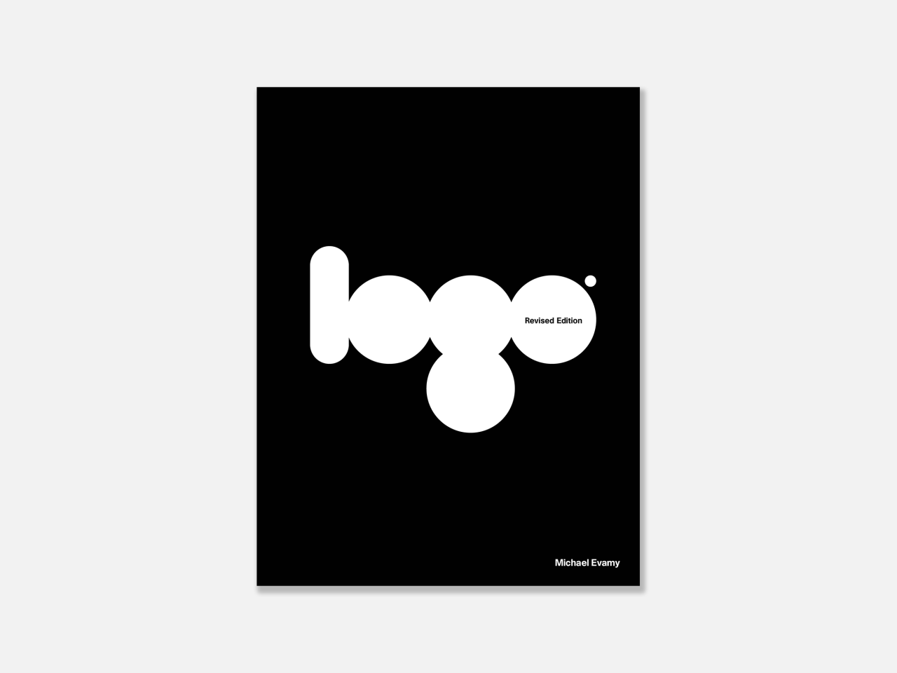
The first edition of Logo was published in 2007, written by design journalist, author and copywriter Michael Evamy. Now, a newly updated volume of the book is being published by Laurence King as a fully revised logo bible for the 2020s with 600 new entries.
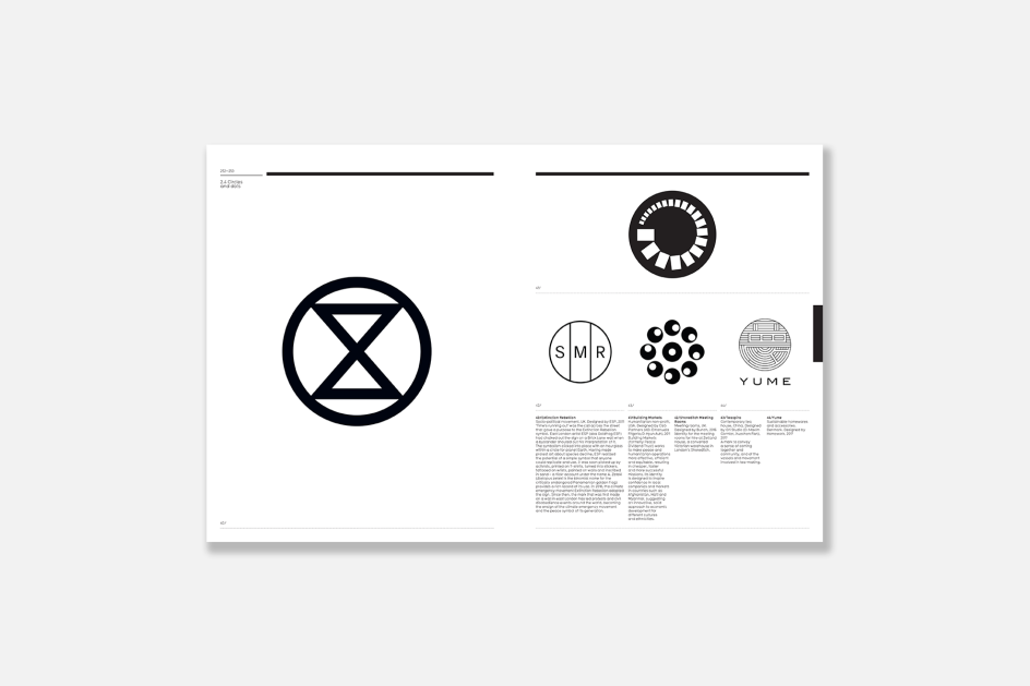
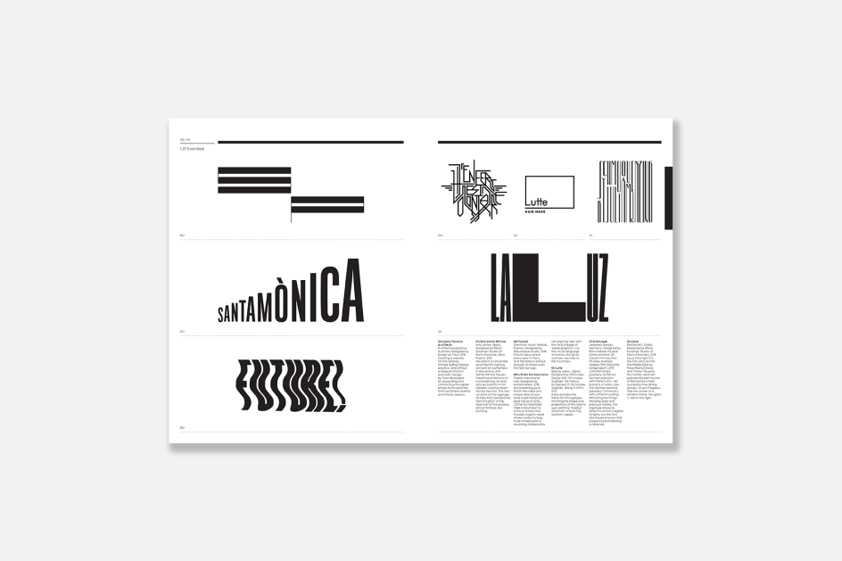
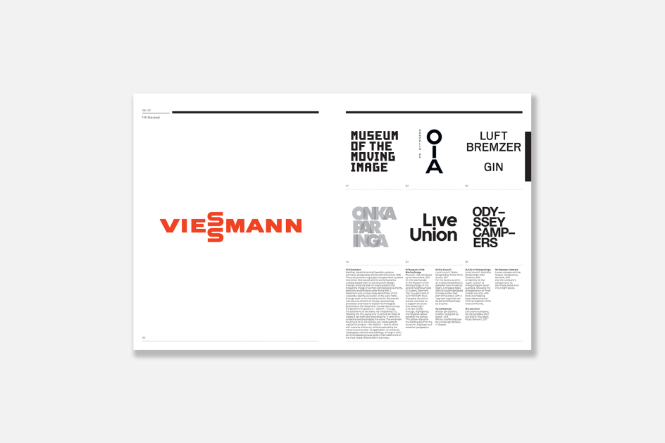
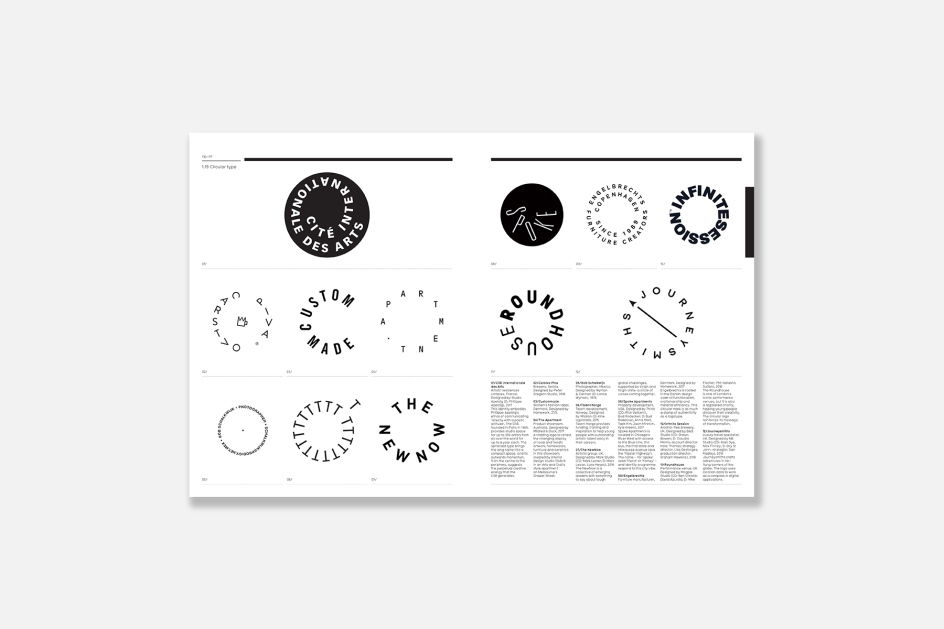
The book features more than 1,600 logos designed by the likes of Paul Rand, Saul Bass, Alan Fletcher and Anton Stankowski, as well as contemporary studios from around the world. These are grouped according to form and indexed by client, designer and sector; and arranged across more than 80 categories according to their distinguishing features. With details about the design accompanying most entries and a new set of 'spotlight' entries, Logo is described by its publisher as "a complete, taxonomical guide to the history, development and style of identity design".
In celebration of the book's release, publisher Laurence King has kindly given us permission to reprint the essay below.
Can Logos Change Anything? And Why Do Logos Get Changed?
Corporate logos help us to distinguish one organisation from another. The way a logo does this is by reflecting, visually, the activities, values, or attributes that represent an organisation – best in the view of the organisation's leaders.
A logo can create expectations of, say, a new business or service but on its own cannot change opinions that have already been formed through personal encounters. It is a firsthand experience of a product or service that endows a logo with real associations and meaning.
Put another way; a logo is like a lens that an organisation holds up to itself. If there is light behind the lens in the form of outstanding product, a memorable customer experience and excellent supplier relationships, it will shine. The logo will offer a piercing beam of positive associations. If there is no light, there is nothing to see. And swapping lenses will not make a blind bit of difference.
If a struggling business changes its logo and nothing else, it will continue to flounder. Successful new logos signify positive change within organisations. The success of Tate's logo in the UK is down to its accurate portrayal of the modernisation and realignment of the four Tate galleries, which have dramatically enhanced the visitor experience. To view it only as a nice bit of type is to stunt its achievement.
A logo change can signal a shift in management direction or revitalisation of corporate culture or values. And there are plenty of other reasons for an identity change or update. A change in the name is an obvious one. It may be that a company has outgrown its logo, the design has become misleading about the company's range of activities, or simply looks dated. Intricate older logos can fail to reproduce well, especially in electronic media, or there may be a legal need to switch a symbol.
A change of identity is occasionally part of a larger campaign to shed an unhealthy reputation. Philip Morris Companies renamed itself Altria Group in 2003, adopted an abstract mark of a grid of richly coloured squares and set off on a public relations and philanthropic charm offensive, none of which was able to disguise the fact that its products could kill.
Symbols that became controversial may need to be shuffled offstage. Robertson's, makers of jams and marmalade introduced its 'Golly' man in 1910 after the son of the founder noticed children in rural America playing with black rag dolls made from their mothers' discarded clothes. In 2002, after sustained pressure from groups that considered the mascot racist, it was pensioned off. The company insisted his withdrawal had nothing to do with political correctness, attributing it instead to the character's dwindling popularity with children. Another notorious example is British Airways' u-turn on its ethnic tail-fins after former Prime Minister Margaret Thatcher draped her handkerchief over the rear of a model 747 to register her disapproval.
It is always tempting to ditch an identity when times are tough, but it is never an answer in itself. Few are the businesses with the confidence to stick by their logo through thick and thin. A notable exception is Apple, whose rise to global domination began with the Mac, with the iMac and continued with the iTunes and the iPhone. Its logo was not looking quite so tempting or iconic, though in the mid-90s, when the company was still churning out beige boxes and chancing its arm on concepts such as the apple Newton. As the father of modern logo design Paul Rand has often been quoted as saying the Chanel logo only smells as good as the perfume it stands for.
Does this mean that it doesn't matter what the logo looks like as long as it functions as a sign? Pretty much. However, the best signs are highly visible. Communicating quickly and clearly and clarity, especially in today's business environment, is not easy to achieve. Also, logos are not like traffic signs; they do not belong to a system of similar logos. Each one must be unique or, better still, memorable if it is to work as a marker of identity. Furthermore, if it is to have any kind of shelf life, it must resist design fads and fashions. All of this takes a lot of design.
Editor's Picks

 for Creative Boom](https://www.creativeboom.com/upload/articles/06/063686a9a3b095b9b1f0e95df917ed4bd342be1b_732.jpg)


Trending
 using <a href="https://www.ohnotype.co/fonts/obviously" target="_blank">Obviously</a> by Oh No Type Co., Art Director, Brand & Creative—Spotify](https://www.creativeboom.com/upload/articles/6e/6ed31eddc26fa563f213fc76d6993dab9231ffe4_732.jpg)
 by Tüpokompanii](https://www.creativeboom.com/upload/articles/58/58684538770fb5b428dc1882f7a732f153500153_732.jpg)


Podcasts


Editor's Picks
Further Reading