Jay Z and No Age designer Brian Roettinger on music as a 'gateway drug' to design
It's no secret that some of the most exciting, boundary-pushing and considered design work is the product of beginnings that are a far cry from the clean white Post-it note-strewn walls of design studios.
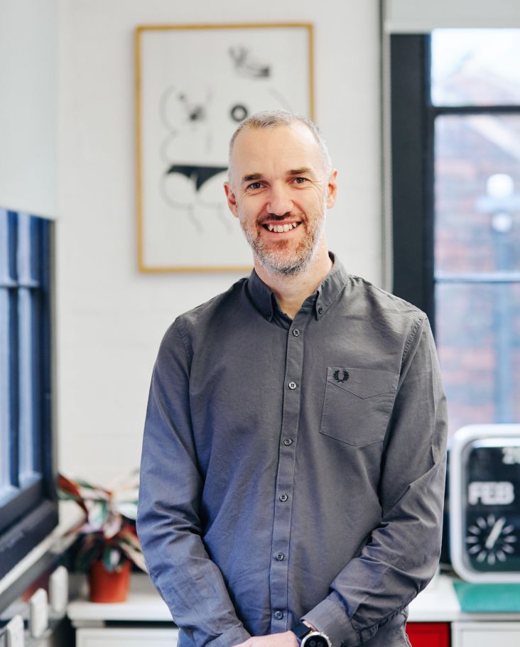
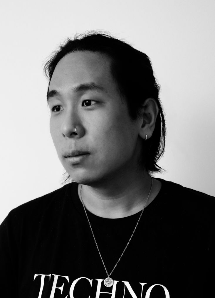
Brian Roettinger. Credit: Michael Schmelling
Instead, they're often born of designers that honed their craft, making flyers, designing posters and records for their friends (or themselves), and LA-based studio Perron–Roettinger is no exception.
Co-founder Brian Roettinger is now a two-time Grammy-nominated artist and graphic designer who's designed cover art for the likes of St Vincent and JAY-Z, winning Rolling Stone's Album Designer of the Year award in 2009.
However, his design beginnings are inextricable from his past as the bass player in a band, playing shows and designing records for other acts in the same scene, like No Age, Liars and Beach House.
Alongside Willo Perron, he's now one half of the studio Perron–Roettinger, which works across print, book design, identity, interiors and live projects. With a focus on cultural brands and music, the studio's way with typography is both beautiful and innovative, sitting within a design approach that's brave and holistic.
We spoke with Roettinger about music as a "gateway drug" to design, the changing nature of album design, how skateboarding informed his design work and more.
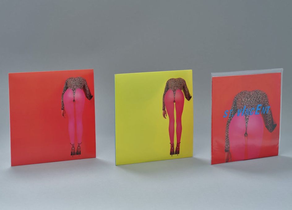
Designs for St Vincent
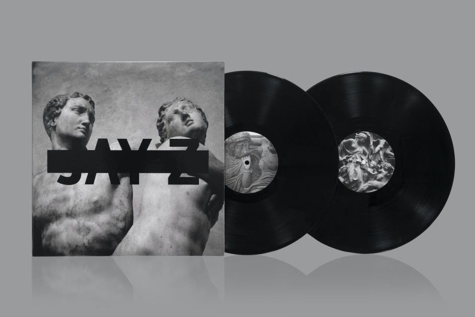
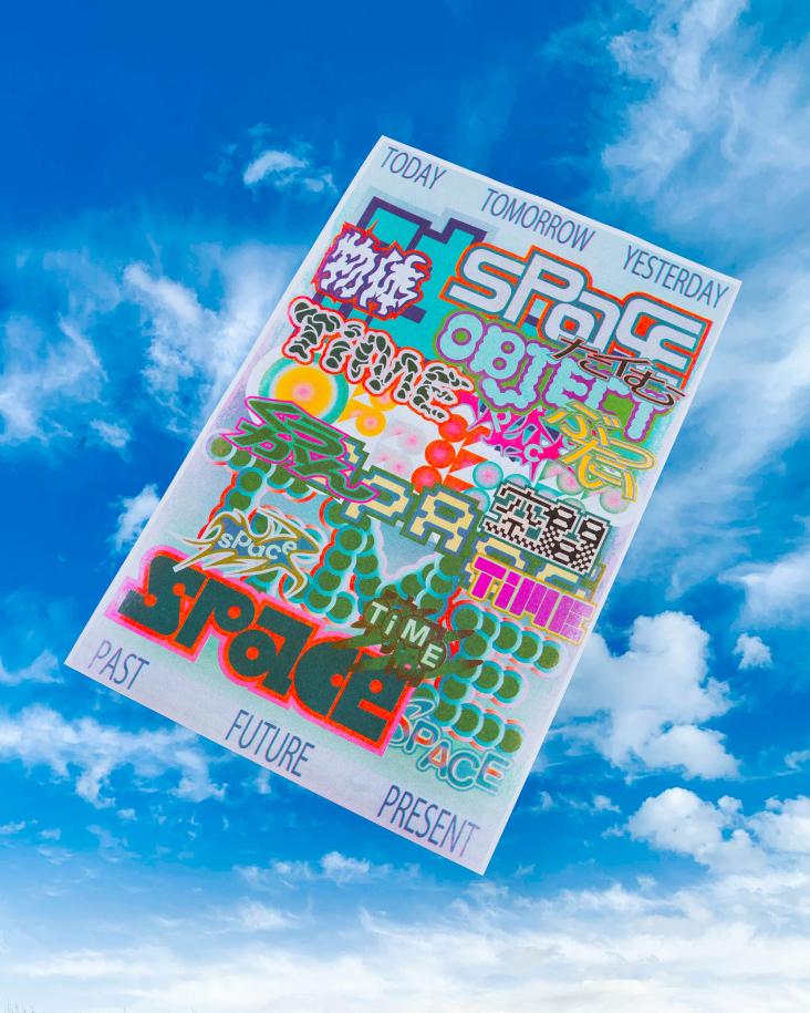
Jay Z Magna Carta Holy Grail designs
How's everything been going with the studio over the last couple of years, especially with the pandemic?
We've been busy; it never really slowed down. But it felt like there was a natural pivot away from the music side of our practice with the effects of the pandemic, especially on live music, and artists stopped putting out records for a little bit. All the music stuff went dormant for a while, but we were okay with that. It felt like a natural thing for us.
So is music how you started as a designer?
Yeah, I would call it the gateway drug. Without music, at least in my practice and experience, there would be no design: it's what shapes the way I think about design, how I look at design, and even the first pieces of design I ever made were always for bands or music.
Before I was thinking about design I was playing bass in bands and hanging out with a lot of my friends who were in bands. With that came "let's make some merch, let's make t-shirts, let's put out a record." So I started designing records and started putting out records. It gradually grew from there.
Some of the bands that I would tour with got bigger, so the records I made for them got more visibility, and I've continued to work with those bands. I stopped putting out records for a moment and then went to school for design. When I finished design school, I realised I need not just focus on design for music. So my first real professional job was working at an architecture school in Los Angeles as the in-house art director and designer.
Designs for No Age
Designs for No Age
How was that?
It was a hit-the-ground-running type of job. Every day, something had to either be designed or go to print or there was a new project in the works. It moulded me and taught me how to juggle and manage projects and navigate different mediums within design – from designing an installation to a book, the website, signage or creating a video and making identity collateral. As architects, they question every little gesture and move. It was great.
To go back, were you playing in a band and touring and designing at the same time? Who were the bands you mentioned who you designed for that got pretty big?
Bands like No Age, Liars, Beach House…I was just doing the designs because we were friends, we all kind of all grew up with each other, so it was just a natural thing, "do you want to design our record?"
Were you still doing music stuff while you were working at the architecture school?
Yeah, it was juggling two worlds: it would be cultural work at the Institute day-to-day, and then when I went home, I would like work on sort of books for galleries with artists or albums with bands. When I started to get more and more work like that, one day after five years working there, I just realised I didn't need to work at the school anymore.
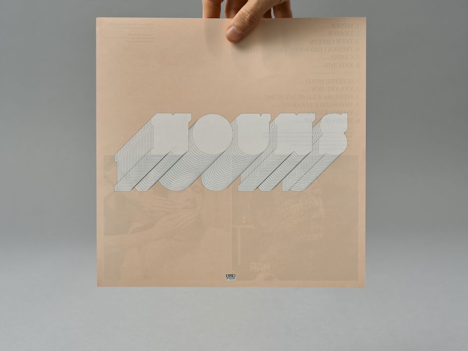
Designs for No Age
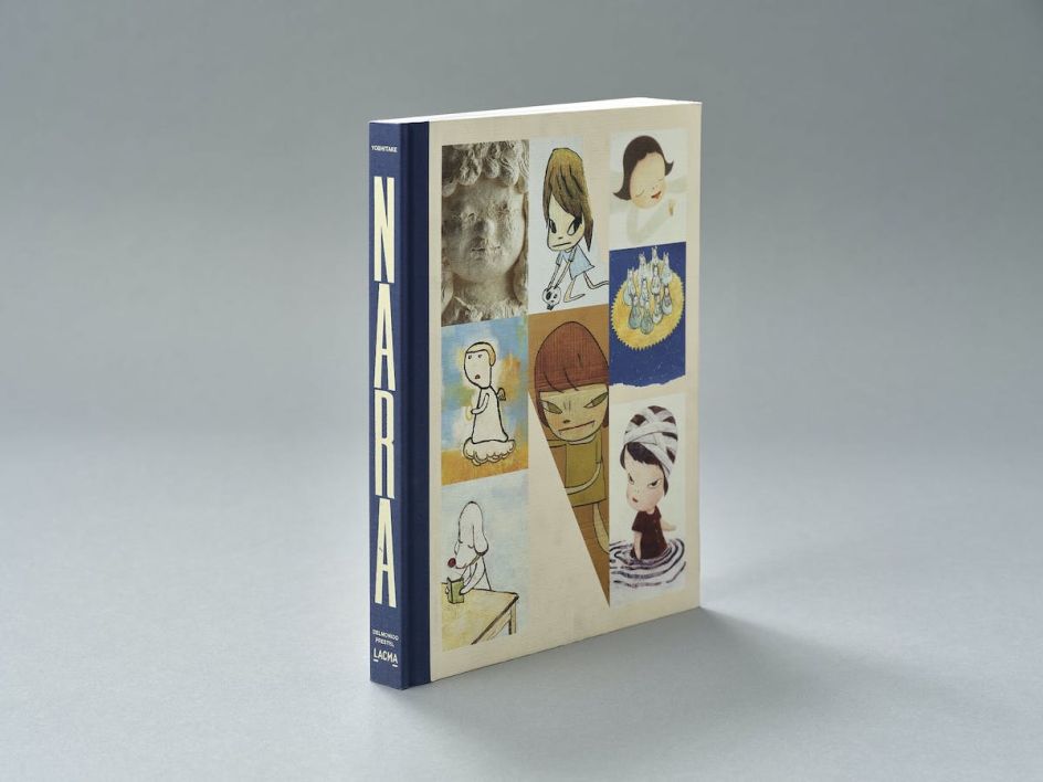
Nara book design
Are there any broad similarities or differences between working on music and art or cultural projects?
They're the same, but there are differences. With music stuff, I think you have to deal with a lot more people from the label people from management. A band might have six people that all want to bring something to it. There are a lot more people involved.
How did Perron–Roettinger form?
In about 2009, I formed my own studio, which was just doing music and cultural work. Willo [Perron] and I had our own practice, and we merged in 2017 after many conversations. We knew each other from a mutual friend, and we'd worked on a handful of projects together before starting the studio.
The first project we worked on was the Jay Z Magna Carta Holy Grail record. We got to do all these great things with the design and the object and all these different formats. We pushed the format of vinyl and CD, so it was a great project. The studio kind of just grew from that.
How willing do you think clients generally are to allow you to push those boundaries?
It's all depends upon the artist: if the artist can understand [design] and wants to go with ideas that are a bit out of the normal expectations. I think it's gotten a little more accessible now, with multiple versions of records: limited edition, vinyl, deluxe vinyl…I think labels are now more willing to go on that journey with you because people buy it more than maybe they were before. It always also comes down to the scale of the artists: what their budget is or how many units you're making.
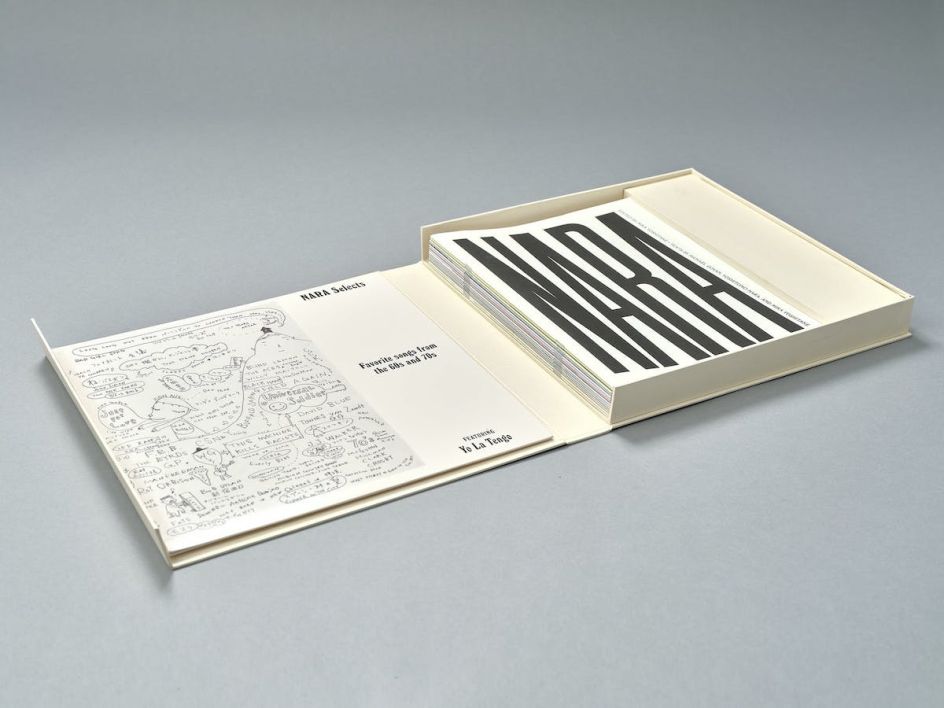
Nara book design
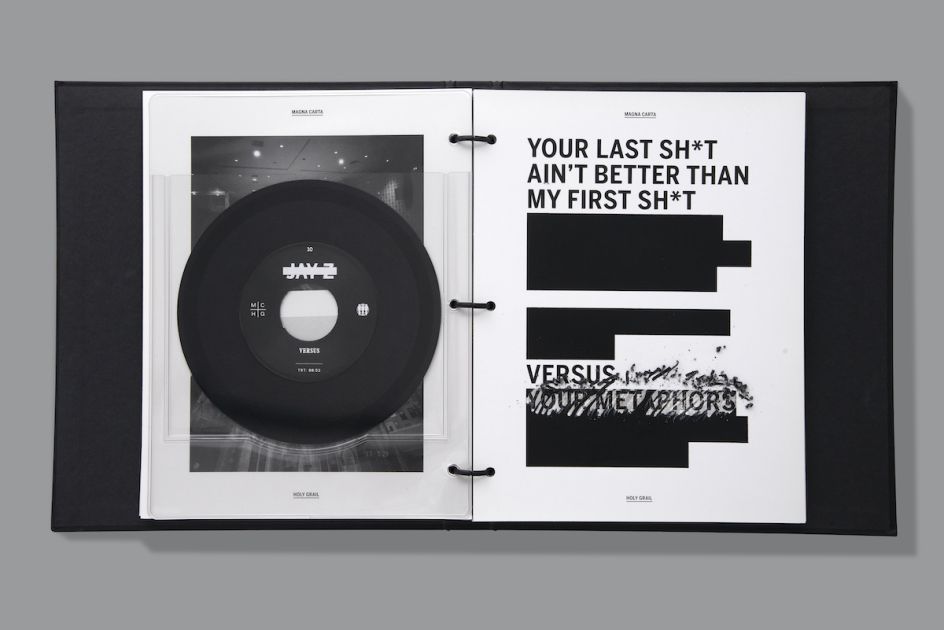
Jay Z Magna Carta Holy Grail designs
Is there anything else you've noticed that's changed over the years in terms of designing for music?
One thing that changed with music is that that the album cover began to shrink and diminish: we started with an LP 12 by 12, then skipping a few formats, we went down to CD, which is five by five, then we're going into online, mp3 and iTunes, which is two by two, now we're looking on our phone, which is one by one. So what we're able to do visually and what sort of stories we can tell within one image is very different now you're relying on a little square. I think what started to happen for a while was people were like, "Oh, just make it a photo," as it was being designed for that one format. You couldn't play with scale as much because if you had something small for an LP, once it got to one inch, you would just never see it. So you had to design multiple versions, depending on the format.
Over the last eight years or so, something that's slowly come into the discussion is the idea of bands having one creative that oversees everything across the board. And this is something that we always strive for and champion – having one brain in charge of the album, packaging, merch – one brain to tell the whole story.
Before that, the label would commission music videos from one person; there may be one company that just does the merch, maybe one designer that does the album cover, someone who makes some billboards and some ads. And so, at the end of the day, it feels like it's not under the same roof, and it can be a bit messy. Now, labels, especially artists, are willing to have that one point person, that one creative, that tells the story and is in charge of the visual language and world-building.
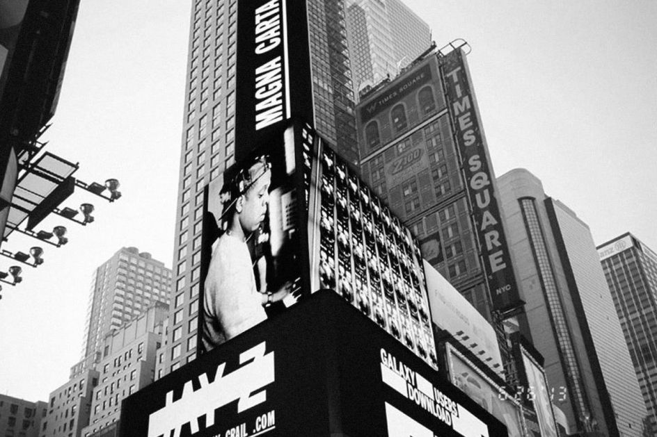
Jay Z Magna Carta Holy Grail designs
Can you give me any examples of your own work the embodies the idea of that entire world of one creative vision?
Out of our projects, we look at the [Jay Z] Magna Carta record, which we're talking about, that the march, the album, and the tour sort of all had a similar feel, even though it was like, it's less about making one. One sort of gesture and applying it to everything, it's more about the aesthetics of the photography, sort of the visual language of photography, that the tone of the photography to the tone of the videos, all kind of So, as they had, they had a similar meaning a similar feeling. Even the St. Vincent willows, St. Vincent, mass abduction, like, you've done? Yeah, so in mass abduction, the album, packaging, to the videos to the tour all kind of felt like you were watching, and you were like, you were in this world with that character.
Do you feel like you have to like the music that you design for?
It definitely helps. I think having some sort of relationship to it somehow, whether it's liking the person or liking it for the references and its importance in culture.
The Ghia project is gorgeous. Can you explain a bit more about your design decisions?
We started the Ghia project by asking what we wanted it to feel like and emotional resonance we wanted this brand to have. We didn't want anything too strict, for lack of a better word: we wanted it to be exuberant and expressive and feel like something that was the Mediterranean, or came from the south of France, or maybe from an Italian roadside – a lot of personality. Those were our jumping-off points. Everything about the font is custom.
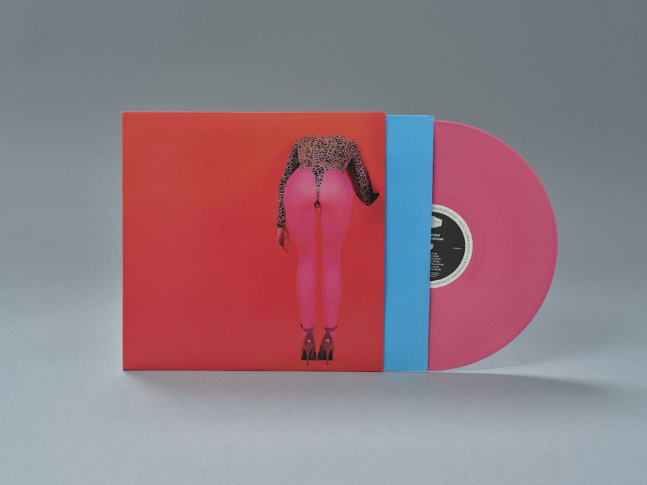
Designs for St Vincent
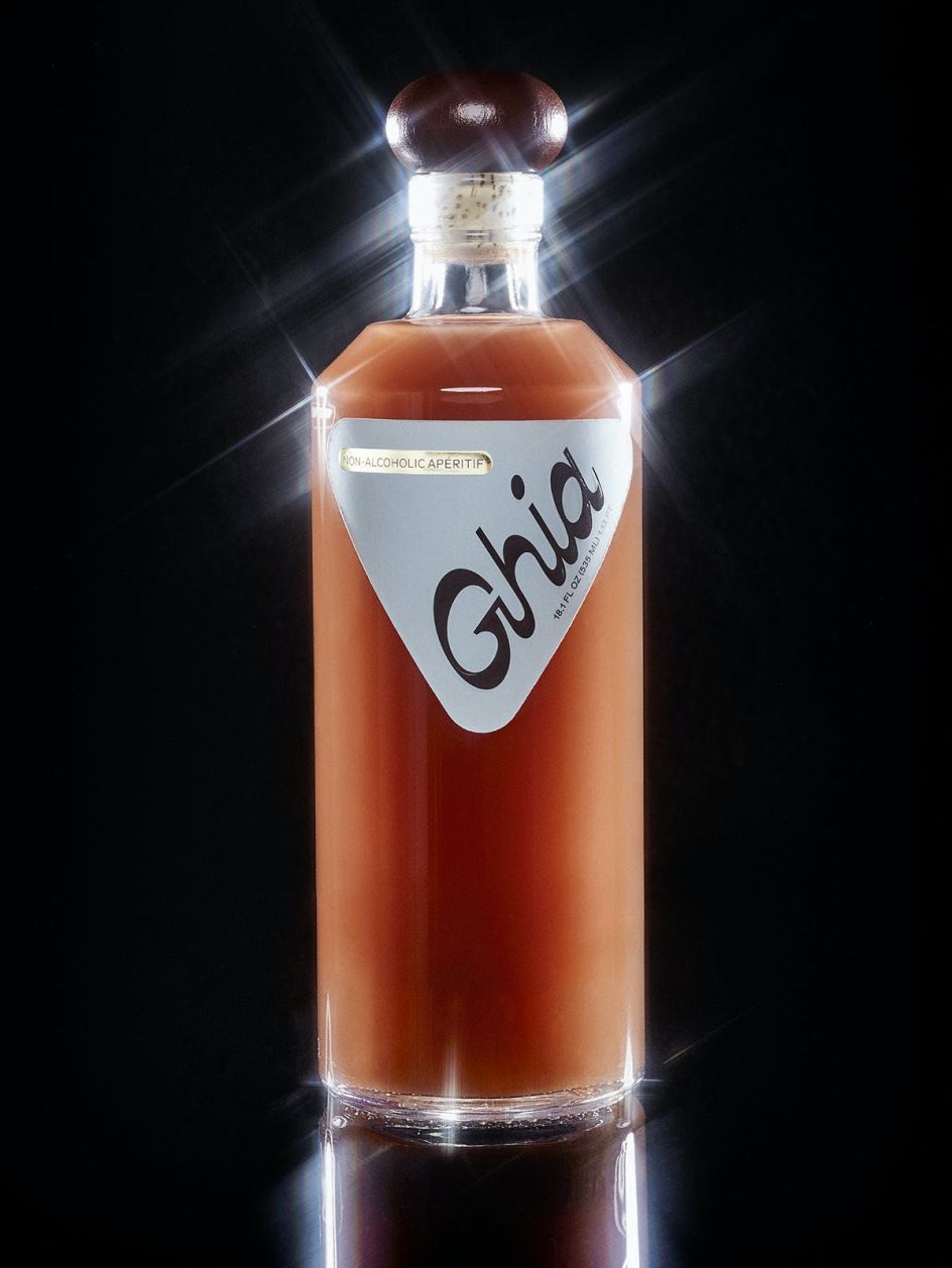
Ghia identity
I love your use of typography across the board. Can you tell me a bit more about your interest in that side of design?
Before I knew what design was, I was interested in lettering and typography coming from looking at skateboard graphics and album covers, and I would draw letterforms and do calligraphy as a kid. When it came to music, it was making the flyers and having to use Letraset lettering or finding other ways to design rather than just doing it digitally, so it pushed the way I thought about letterforms.
Once I went to school, the design programme was shaped around type design, and still, to this day, I always think about the type first rather than the image of a particular aesthetic. I think a typeface can have as much importance as an image regarding how it feels and its aesthetic, and how it makes people feel.
Editor's Picks


Trending


](https://www.creativeboom.com/upload/articles/90/908fdb6378db1e95d12595416f54e6336d5e80b8_732.jpg)
Podcasts


Editor's Picks
Further Reading