America's oldest weekly magazine reveals new identity, crafted by Athletics
The Nation has been speaking truth to power since 1865. Discover how Brooklyn design studio Athletics helped make it fighting fit for the 21st century.
In recent years, it feels like political journalism has receded into the distance, under pressure from a storm of clickbait, the rise of social media, the dumbing down of TV, and a general apathy towards political debate beyond an animated minority of partisans.
So we were intrigued to see that the oldest weekly magazine in America, The Nation, has officially revealed its new look courtesy of Brooklyn design studio Athletics.
Originally founded by abolitionists in 1865, The Nation's legacy has always championed the use of independent journalism to achieve a more democratic and equitable world. Through nurturing both emerging and esteemed writers, it continues to engage with the issues and movements that inspire the passions of this generation and the next.
The brief
Prompted by the need to better reflect their audience in 2023, The Nation approached Athletics to revamp, amplify and modernise their overall website experience. The aim of the redesign was to reinforce the publication's position at the forefront of progressive political and cultural discourse.
"As our country and the world undergo extraordinary and tectonic shifts, these times demand that The Nation be ever bolder, willing to unleash our imaginations and ready to think anew," explains Katrina Vanden Heuvel, editorial director and publisher at The Nation.
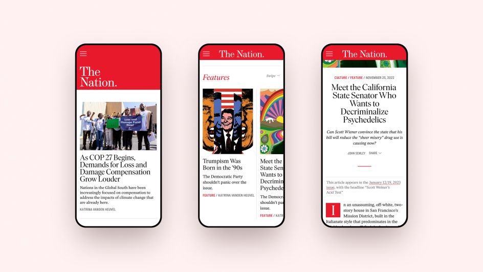
The Nation's new editorial platform is designed to engage more deeply with new and existing users while celebrating its modernity and relevance. This includes re-envisioning brand behaviours for digital while improving user journeys and taxonomies, simplifying article types, and increasing subscriptions and conversions.
Design elements
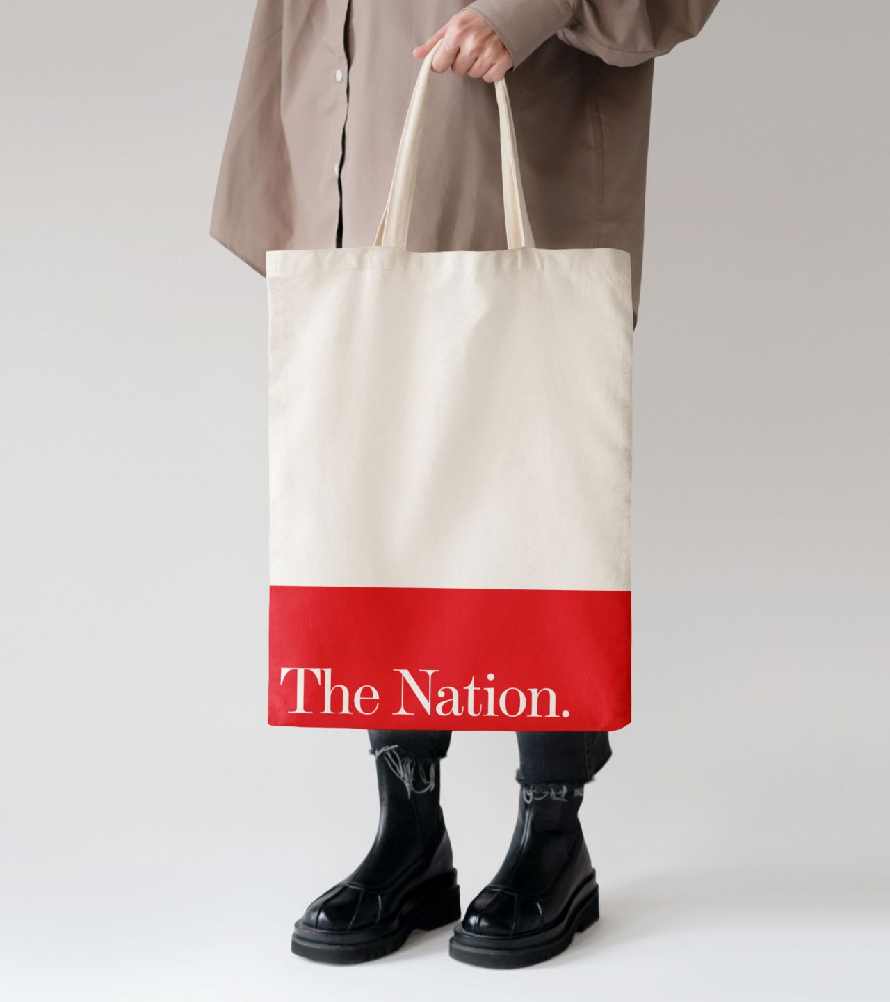
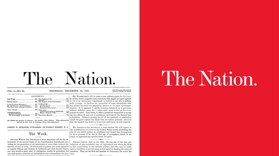
The new brand is contemporary but does not shy away from The Nation's heritage. The masthead has been updated with a strong use of scale to allow the brand to be bold and imaginative while retaining clarity and precision.
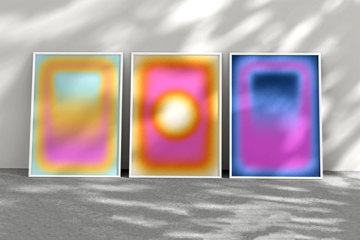
The title's signature red is a driving signifier on the updated site experience for both brand recall and wayfinding. The openness of the white printed page is retained in digital, while red rules are used for information delineation. And the secondary colour palette has been expanded to introduce optimistic tones and visual flexibility without overpowering the core brand colours.
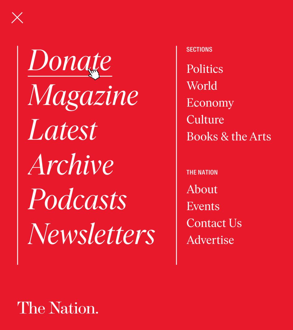
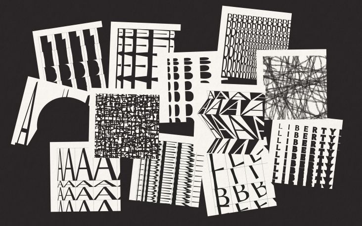
For the wordmark, Athletics worked with Tré Seals of Vocal Type to improve its legibility in digital formats while retaining a reference to its long history and original masthead. A flexible approach to the wordmark was also developed to better accommodate responsiveness and scaling.
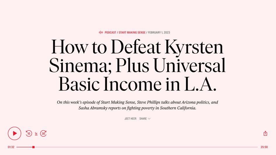
Above all, the new site is driven by content versatility, and the homepage's flexible architecture is designed to respond to breaking news, big announcements, and thematic suites of articles. This means the political and cultural news, opinion, and analysis The Nation is known for can be easily organised while preserving advertisement modules.
Editor's Picks


Trending


Podcasts


Editor's Picks
Further Reading