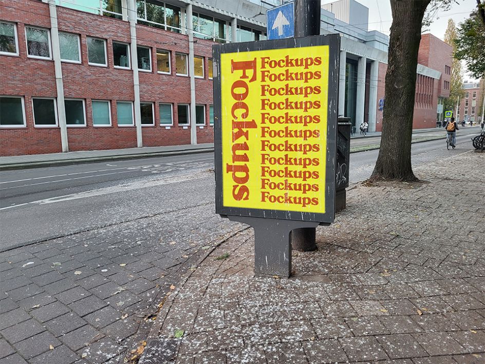
Fockups is back: funny mockup templates that offer a more realistic view of your designs
For pitches, campaigns and websites, mockups form the basis of many client projects in the creative industry. But are they sometimes a little too polished? Dutch designer and art director Wytze Hoogslag seems to think so. And he's back with more realistic templates for you to play with.
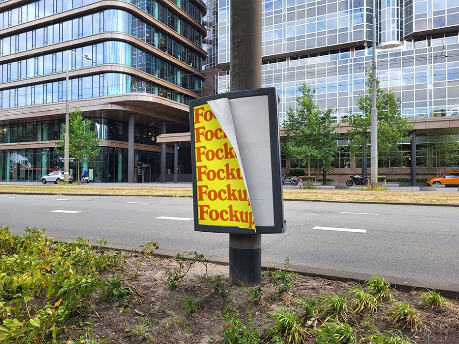
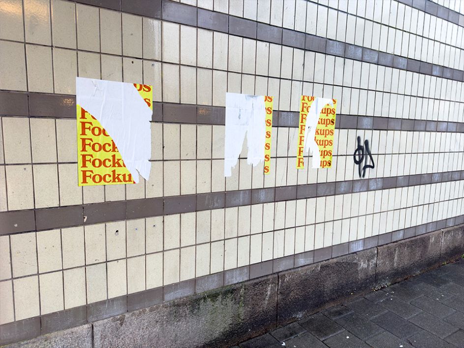
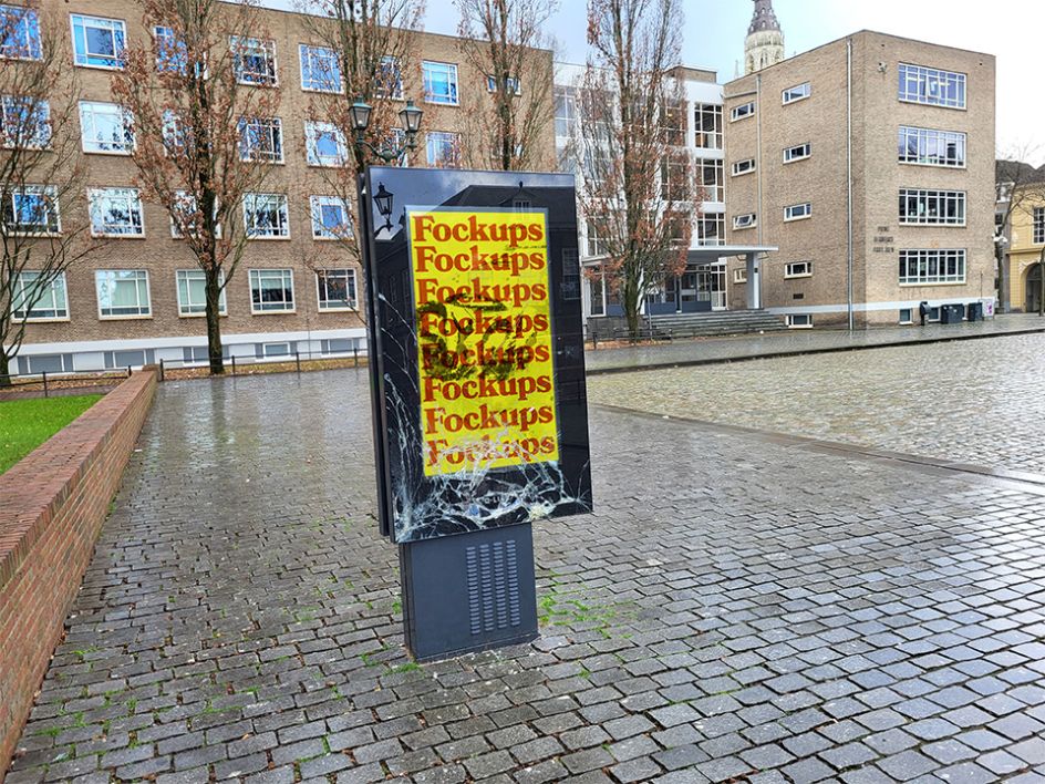
Launched as a side project in the summer of 2022, Fockups was a glorious bit of fun that became very popular with designers and illustrators worldwide. It offers a hilarious alternative to the usual glossy mockups that grace our screens, streets, and portfolios.
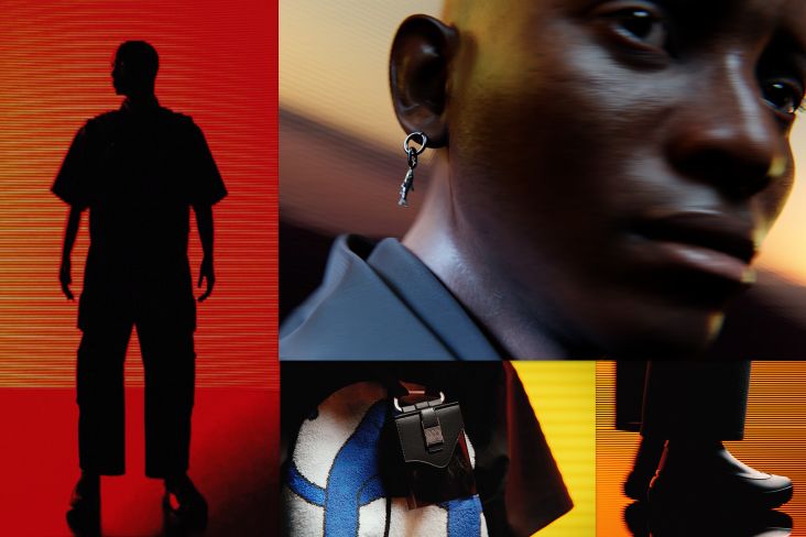
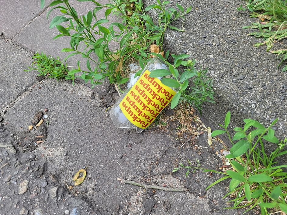
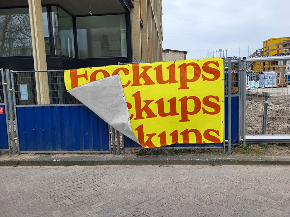
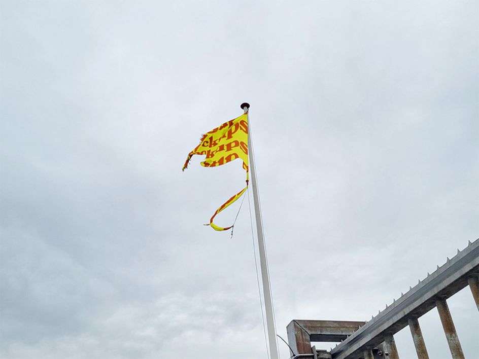
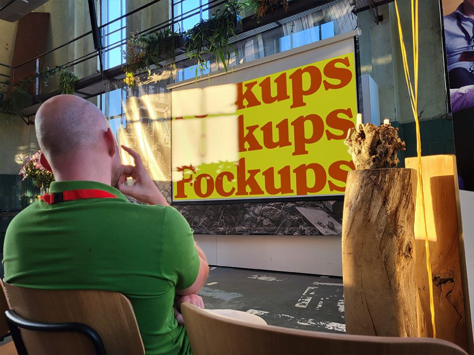
And now, its creator, Wytze Hoogslag, has released round two, which yet again features mockups in the real world, including everything from a glorious, pristine urinal to a tattered outdoor flag. Your designs will never look so good. There are ten crazy mockups to display your designs in Fockups Two, including several A-size poster holders, a broken bottle and its ripped label, and a presentation.
What sparked the project? "As a designer, I use mockups to 'sell' my idea, which somehow feels awkward," Wytze tells Creative Boom. "Most of the time, there is no budget to print stuff properly, or it only gets printed on A3 instead of the billboard you've presented. When a billboard is out on the streets, it looks sad due to weather conditions. Perhaps an app design on your phone gets an extra layer due to the broken glass. This awkwardness between selling expectations versus the harsh reality was the starting point."
On looking for these scenarios to photograph and transform into templates for the rest of us to download and play with, Wytze says no AI is used; everything is real. "As a designer, I walk a lot to develop ideas. This is how I find my Fockups. When I see one, I stop and take a picture."
Interestingly, Wytze applies some rules in his scavenger hunts: the framing of the picture should not be too symmetrical, as to add to the reality of the scene; it should be a relatable situation, such as posters ripped off a wall; it should somehow decrease the readability of the design; the weather must be grey (standard), and it should be a picture of something that is often mocked, like posters or phones.
It's been almost two years since the first and original drop of Fockups was launched. The response back then was overwhelming, with hundreds of people downloading the funny templates. Wytze puts it all down to our Creative Boom article. "After you wrote about us, it got shared thousands of times on LinkedIn, Reddit, Instagram and blogs all over the world," he says. Well, that's something we love to hear. And the feedback didn't disappoint, either. "There were so many flattering comments, but the one I enjoyed the most was, 'Funny because it's true'. That was the goal I set out to achieve: point out a problem with humour."
His realistic mockups have been warmly embraced by the design community and, more recently, creative education. "I've heard teachers using them in their UX lessons, telling students they should keep the environment of their designs in mind."
Looking at the latest Fockups, most are from outdoor scenes, which certainly paves the way for future ideas. "I am still waiting for the perfect Fockup for a laptop or desktop," he says. "I imagine a sad office space, with dead plants and a screen with marks of greasy fingers. And a t-shirt, worn by someone with sweaty armpits."
Wytze has plenty of other ideas brewing, too: "I'd love to create Fockups from a specific city, like Fockups Berlin or Fockups Tokyo. This would be a great addition and a good reason to go on a working holiday."
Since the introduction of Fockups, Wytze has co-founded the Dutch studio Thansk with Jochem Koopman. Its name came from a typo of 'thanks'. "Embracing these imperfections is something we use in our process and, of course, also resonates in Fockups," Wytze tells Creative Boom. In that case, we can't wait for Fockups Three.
Editor's Picks


Trending


Podcasts


Editor's Picks
Further Reading