Young Stargazers playful new identity is a guiding star for youth-centred branding
Northamptonshire-based graphic design studio Beanwave has created a playful and refreshing identity for Young Stargazers to encourage budding astronomers to look to the skies. With its innocent and colourful approach, the new identity is a welcome change of pace to the more edgy aesthetics usually used to appeal to youngsters.
Space is cool enough as it is, so how do you make it appeal to a young demographic that's usually targeted with trendy characters and cynical buzzwords? For James Bristow, director and designer at Beanwave, the answer was to take the opposite approach and present astronomy with the reverence and fascination that it deserves.
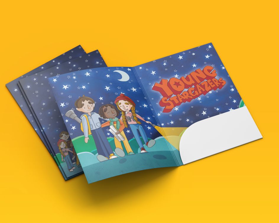
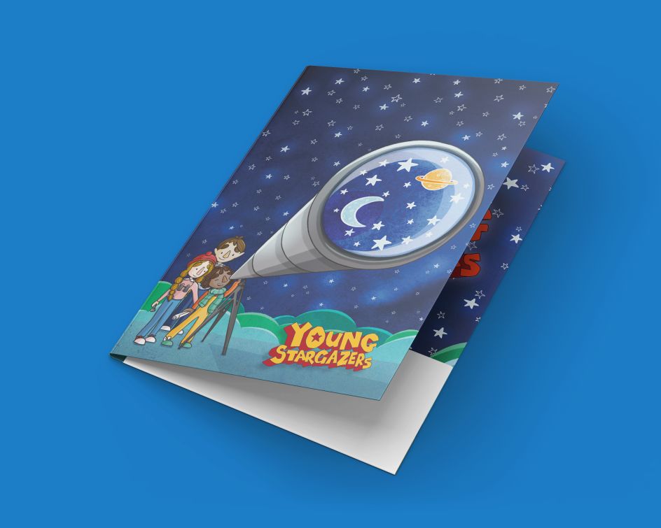
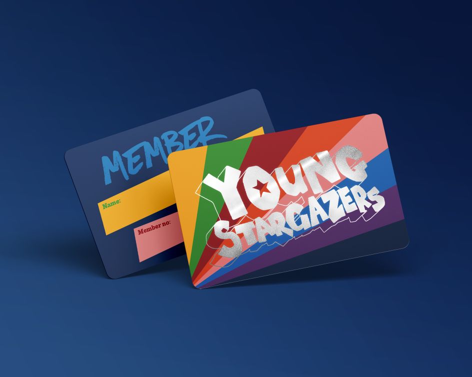
Having been approached by the renowned institution, the Society for Popular Astronomy (SPA), Beanwave was tasked with creating a new look for their Young Stargazers kit. This also included designing folders that young kids interested in stargazing could use to build up information sheets about astronomy.
For a studio such as Beanwave, which believes in the power of creativity, ideas, and beautifully crafted graphic design and brand identities, this was a welcome challenge. Looking past the potential of an identity based purely around a logo, typeface and colour palette, Beanwave wanted to take a more human approach and explore the themes of discovery and friendship that would encourage children to get interested in stargazing.
"We collaborated with illustrator Jess Bolam to create a warm and friendly, inclusive gang of young children," James tells Creative Boom. "Nice kids. Not geeks, but definitely not 'too-cool-for-school' either. It's such a cliché to try and make everything for kids pretend to be cool or edgy - you know the kind of thing, whack a pair of sunglasses and a backwards baseball cap on a kid carrying a skateboard."

As well as taking a sincere approach to the theme of the branding, the illustrations also buck contemporary trends by doing away with flat colours and clean lines. Anything that looked computer-generated was out. According to Beanwave, children "needed a strong sense of texture and depth, particularly for the night sky" to be engaged with Young Stargazers.
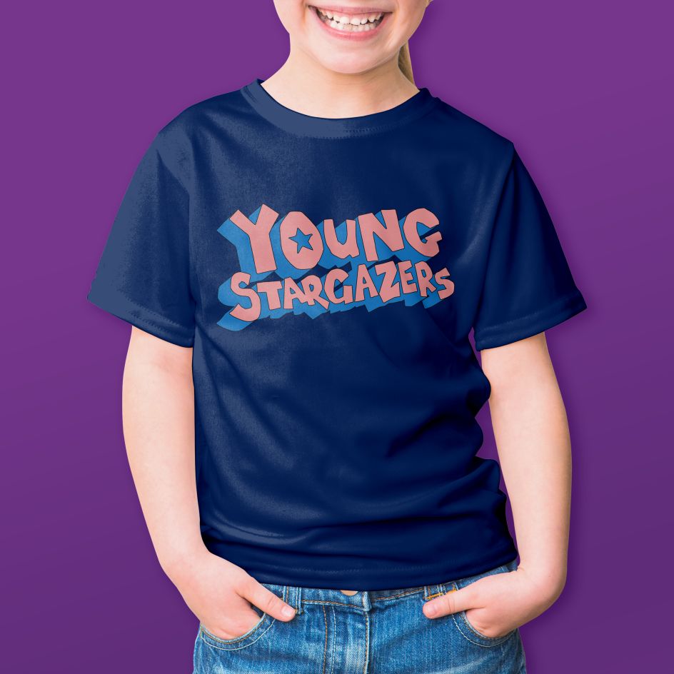
Combined with a loose, hand-drawn typographic logo and a flexible colour palette that creates an innocent, playful feel, the identity is a pleasant change of pace in the world of youth branding. Appearing on membership cards, folders and other goodies, the SPA now has a unique and appealing brand to encourage the next generation of stargazers.