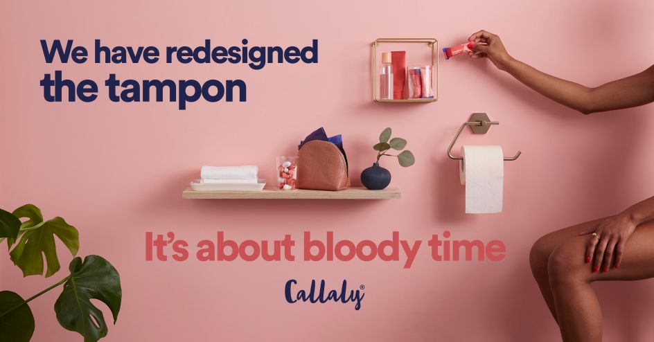
'It's about bloody time': Design Bridge's new identity for Callaly hopes to 'revolutionise femcare'
Design Bridge has partnered with Callaly, a startup subscription brand of organic cotton period products, with a shared mission to "revolutionise femcare" for women.
The brief was to transform it from its previous focus on a single product, the Tampliner (an innovative 2-in-1 tampon and liner combined), to a personalised brand experience that delivers a full range of customisable period products, tailored to individual women's needs.
Creative Director Chloé Templeman says: "Where the majority of period products looked generic and 'undesigned', we had to disrupt the category and create a genuine emotional connection for consumers through beautifully crafted design."
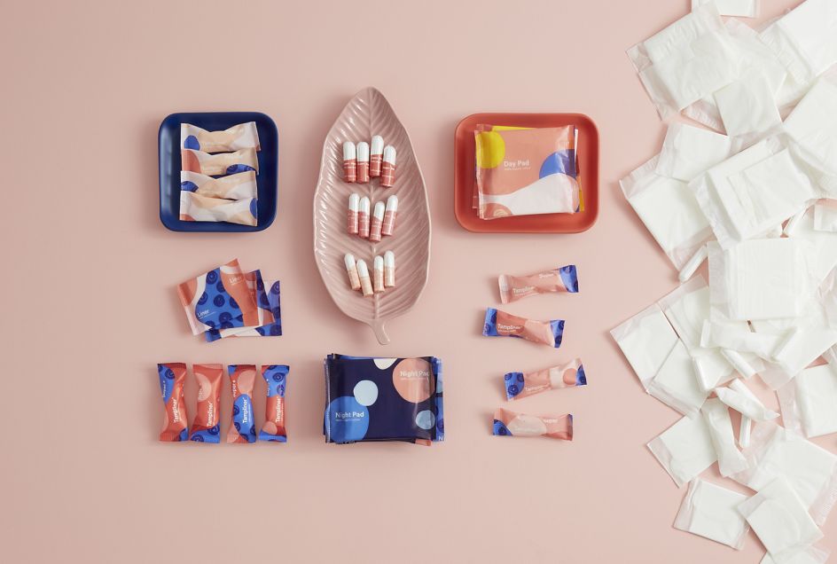
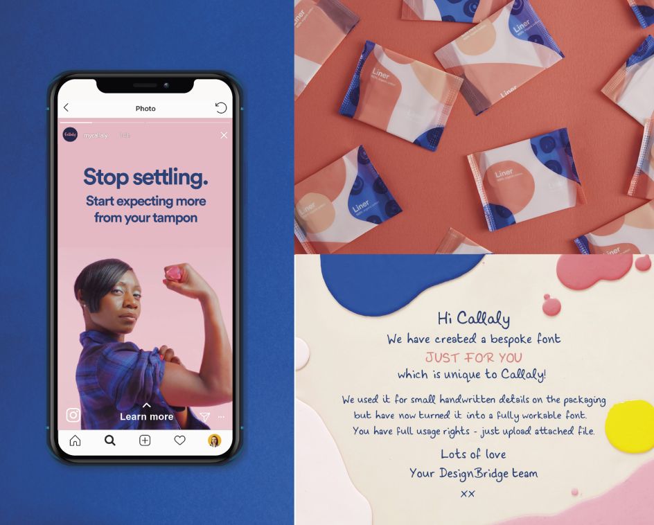
Design Bridge worked across many aspects of the brand; from the sustainable packaging to consulting on the website's look and feel, art directing photoshoots for their social media and creating a suite of animated icons to further bring the brand to life online.
The London studio also had the challenge of working to the brand's Certified B Corporation status – companies with a proven track record of meeting the highest standards of social and environmental performance, balancing profit and purpose. Design Bridge's 3D solution was to create a flexible system of postable boxes that use completely sustainable, recyclable materials. The boxes are made from FSC recyclable cardboard, and the wrappers for the individual products inside are all either compostable or biodegradable. This new flexible system has been designed with the future in mind, set up so that the currently hand-packed boxes can be filled through an automated line production method as the brand grows.
When it came to the new visual identity and customer experience, Design Bridge wanted to challenge the norms of the femcare category and create something that people would genuinely enjoy receiving and opening.
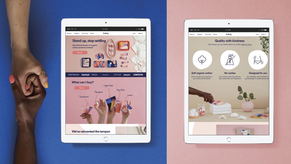
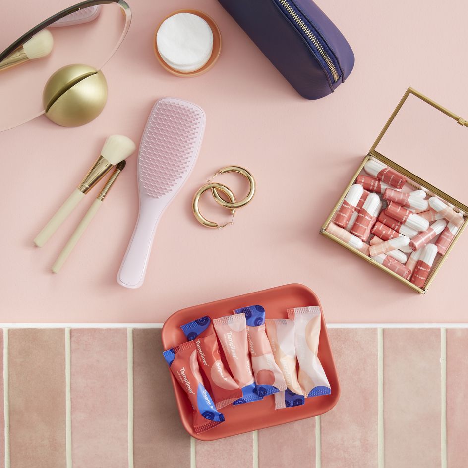
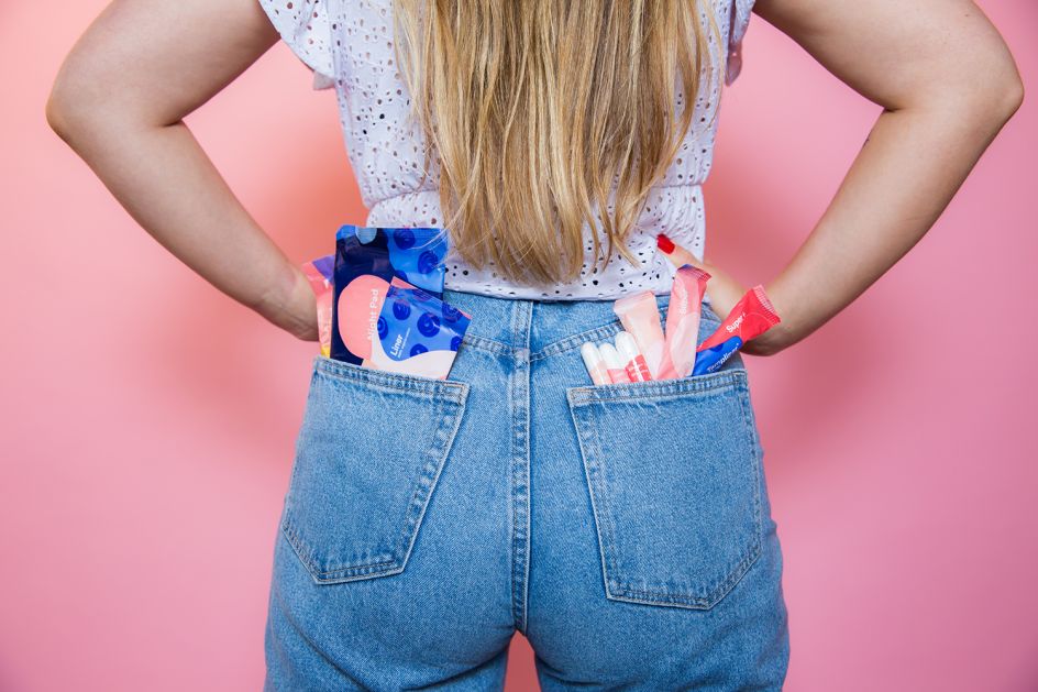
Applying minimal branding to the exterior of the postal packaging for discretion, the new visual identity features bold pops of colour and a contemporary graphical style to shift Callaly away from traditional feminine hygiene cues, where products are consigned to the bathroom 'cabinet of shame', and into a more lifestyle space where they can sit proudly amongst beauty brands and cosmetics products.
Design details include a playful wave-shaped tear-strip that creates a beautiful, fluid opening experience as the box 'petals' elegantly unfold to reveal the contents. There's engaging information about the brand and products on each 'petal' to communicate Callaly's sustainability credentials. Plus you'll see a call to action that urges you to recycle the packaging after use and the ability to elegantly re-seal the box, for ease and discretion.
A bespoke typeface was created in-house at Design Bridge to complement the brand's conversational and approachable tone of voice. A bookmark has also been embedded in the packaging to promote Callaly's Book Club, which is run via the brand's social media channels. Watch this video to see an overview of the project.
Kate Huang, chief marketing officer at Callaly, said: "We're on a mission to inspire people with periods to expect more from the products they use, by finally putting customers' needs first. We're reinventing products and the way they are bought, providing a personalised service to suit each person's cycle. The female-led team at Design Bridge completely understood our brand's mission and the mindset of our customers, and they brought valuable personal insights to the table."
Editor's Picks


Trending


Podcasts


Editor's Picks
Further Reading